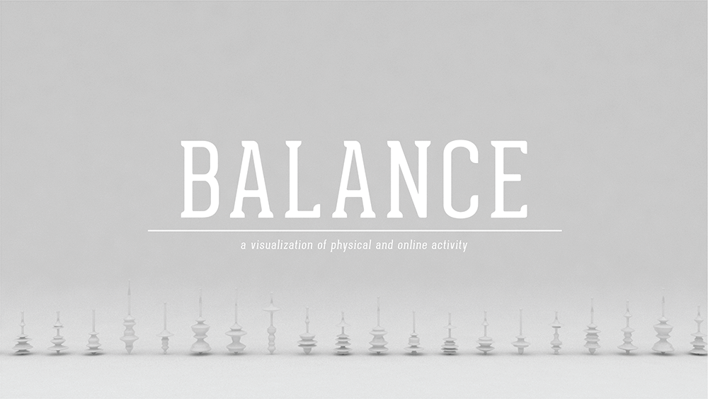
Balance – a physical visualization of my physical and online activity.
The initial goal for my visualized selfie project was to somehow create physical visualizations of my physical activity (acquired from my fuel band), and my online activity (acquired from my phone). Originally I wanted to add color to the visualization based on the recording of my mood that day, but I realized that it would only further clutter the visualization.
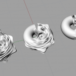
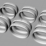
In my first attempt at the visualization, I took the fuel band data and mapped it to the surface of a torus, which subsequently deformed the torus. Then I scaled the torus based on my online data usage. The visualization did not end up working well and was really hard to read. The next iteration I mapped my fuel band data by physically deforming the surface of the display area of the fuel band. The intent was to attempt to draw a connection between the visualization and the fuel band itself. However, the visualization came out a bit muddied.
In the final iteration I made it my goal, to allow my data to physically affect an object. So to represent the balance between the two sets of data, I opted to create spinning tops. The fuel band data creates the contours for the top, and my online activity graphs scales the top to shift the center of gravity, allowing or not allowing some tops to spin.
-
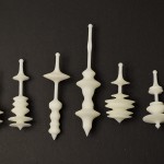
- Photo
-
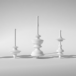
- Render
-
- Iteration 1
-
- Iteration 2
-
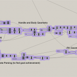
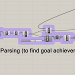
- Grasshopper Script
-
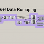
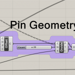
- Grasshopper Script
-
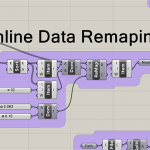
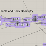
- Grasshopper Script
-
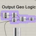
- Grasshopper Script
-
- Grasshopper Script
-
- Grasshopper Script
-
- Grasshopper Script