

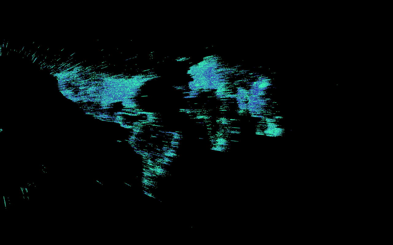
The locations of the dots were determined by the x-y coordinates of the hotels, the colors were determined by the hotel prices (blue -> green = less expensive -> more expensive), and the heights were determined by the length of the hotel name.
I was not entirely sure how to visualize the map in an interesting way (information visualization isn’t my strong suit), so I decided to take a simpler approach to the visualization and was more concerned about observing the relationships between variables. I am someone who is fascinated by patterns, so I wanted to use the map to determine whether two seemingly unlike attributes of the hotel were correlated with each other in any way. Thus I decided to compare price with the length of the hotel name. I hypothesized that longer hotel names would have higher prices (because they tend to be more exotic / ‘fancier’)–and it turned out that the data actually seemed to support that theory (somewhat). Another interesting–but unsurprising–find was that Thailand has the hotels with the longest names, whose data points tower well over the rest.
Github code here.