Category Archives: 32-visualization

mmontenegro

02 Mar 2015

USOPEN Women’s Twitter Popularity -webGL/Three.js

vis_c
Live App: http://womenstennis.fusion-sky.com/

I am a big tennis fan and decided to see if the tweets a player gets in a game reflects in the persons performance. In other words, I wanted to see if the fans were tweeting players hopes up (or down) and predicting the outcome. many interesting patterns were found, which made me very happy! :)

I initially tried to use Tamboo but couldn’t use it because Twitter API only allows you to get tweets that are 30 days old. Given that the USOPEN had been a couple of months back I did a parser to parse “Topsy”. After finishing my parser, I had to parse the data multiple times to get all (or almost all) the tweets one player got during the day of her game. It took a  long time…

After aggregating the data, I cleaned it up using some text analysis libraries.  (Total around ~15,000 tweets) Once everything was done, or as done as it was going to get thanks to lack of time, I started visualizing it.

I decided to use webGL and Three.JS because I really wanted to learn it.

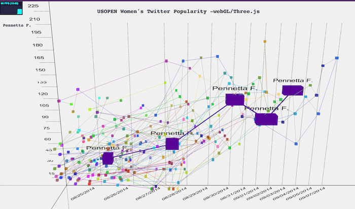
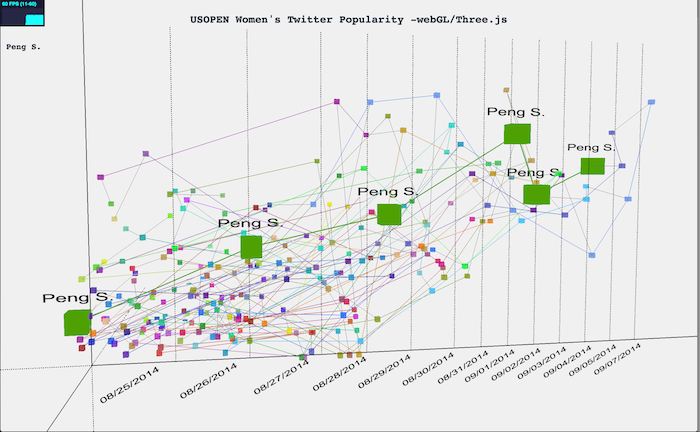
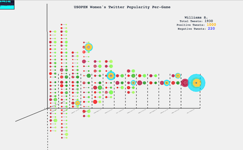
The bar in the bottom represents each day of the USOPEN. The players that played that day appear inside the bars. The Left bar represents the amount of tweets they got. If the player lost that match, it is also reflected in the Z axis.

vis_2

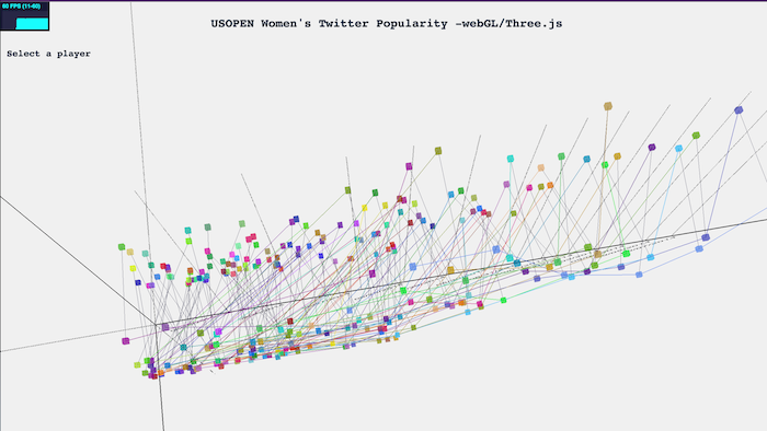
There are 128 players in total, and each one has a “unique” color. This way you can see her progress across the graph. Each player is also connected with her self so it is easier to follow (the connection is again with the same color as the node). And then, in a dark blue, each player is connected to her opponent.

vis_0


——————

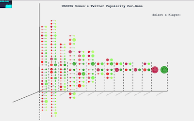
After critic day, I decided to select this project for improvement. I redid the visualization by rethinking how I wanted to display the data. I decided to give more emphasis on what was happening in each game by focusing on the winner/loser data and their tweets.

With this in mind, I made a bracket time visualization with the winners in the right in shades of green, and the losers to the left in shades of red.  The size of the circle represents the amount of tweets that player got in that game.  If you hover over the player you get to see more information. The orange circle represents the amount of positive tweets and the purple the amount of negative tweets. The rest are neutral. Apart from the extra information; all the games of that player glow up for the user to see the success of that player.

You can still navigate the interactive visualization with the arrow keys and the mouse (zoom, etc.)

vis_update2

vis_update3

I really liked my final iteration, I think re thinking it and really focusing on the data was crucial. But I couldn’t have done it without the feedback I got :)

Live App: http://womenstennis.fusion-sky.com/
Code can be found:https://github.com/mariale888/Tennis_Visualization_WebGL


Grave Date Visualization Alex Sciuto Infovis

Screen Shot 2015-03-01 at 9.12.36 PM

Tweetable Summary: Who are the 4.5m people buried in US National Cemeteries? @SciutoAlex makes a graph about it. Hint: They’re almost all WWII privates.

Online Home: http://sciutoalex.github.io/va-grave-visualization/
Github Repo: http://github.com/sciutoalex/va-grave-visualization/

Introduction

War often defines a generation. The rise of the term, “Greatest Generation” for those who served in both World War II and Korea, highlights how war, especially ones with wide participation, binds a group of people who are similarly aged. I’ve always been curious about generations, and those who don’t fit neatly into a pre-defined group. This project visualizes generation based on their war service.

Inspiration

Lee Byron’s Stream Graphs
NYTimes Federal Reserve Comparison
Cubism JS Library
3d Topographic Maps

Process

My general process was sketching, data cleaning, and implementation.

notes-vis

I had hoped that the data cleaning would not take long, because the data appeared pretty good, but I found that the data was very poorly recorded, and there were many factual errors. For example, veterans were recorded to serve in wars they had not yet been born. Or veterans birth dates didn’t contain century indicators—”01/03/07″ could refer to 1807, 1907, or 2007. I tried heuristically fixing errors, but in the end, I removed a lot of data that was clearly incorrect.

Dealing with 4.5 million records was a challenge for me. My options to deal with this were either to subsample if I wanted to investigate individual veterans or aggregate if I wanted to look at trends. BUT I WANTED BOTH. I had wanted to tell individual veteran stories while showing how they connected. In the end, I dropped the individual strain, and instead focused on trends.

If I were to to do this again, there are a few changes to my process I’d make. I wish I had more fully thought through my ideas and selected one to do more sketching. My sketches were nuggets of ideas, but when implementing it, I found I had a lot of blanks. I filled in the blanks, but it took a lot more time. Another change: Data is hard to sketch with. My ideas for how the data would look didn’t fit reality. I think that I would split up implementation into two steps. The first step is making the raw visualization as quickly as possible and seeing if the form of the data matches the sketch, then sketching more based on that.

Insights

Screen Shot 2015-03-01 at 10.05.26 PM

  • Note how the first part of the twentieth century was really an outlier in terms of wars. World War II, surrounded by Korea, World War I, and Vietnam, were huge wars, unlike anything the US has seen
  • Notice when the records start. Beyond the Civil War dead, the first dead are Civil War veterans starting in 1890. Before the Civil War, it appears few people were buried in National Cemeteries. This is confirmed by noting that Congress created National Cemeteries in 1867.
  •  Notice the years where wars have equal weight. If you were born in 1900-1905 you were equally likely to fight in WWI and WWII. 1925-1935 birth years are likely to fight in WWII, Korea, and Vietnam
  • Notice how we have more wars from 1950-present, but they are smaller. Partly this is better record keeping, but it also notes the changing role of the US in global politics.
  • Notice how WWII disrupted the normal death distribution for 1940-1944. No other war had such a large effect on the data.

distr

dave

01 Mar 2015

Tentacles representing passwords generated based on their user base

Untitled

10 million username-password combinations were recently released. I found the 10 most popular passwords and calculated the number of users for each one. I then spread them out into 26 groups, based on the starting letters of their usernames (I threw out ones that start with symbols or numbers because they were a negligible amount of them). Then, for each of the 10 most popular passwords, I generated 26 tentacles, representing the starting letter distribution of the passwords. The lengths of the tentacles are normalized by the most frequent starting letter of the usernames of each password. In other words, the size of the tentacles are equivalent to a histogram distribution of the letters.

In every password tentacle cluster, there exists at least one massive tentacle. This is usually the letter “s”, which a disproportionate amount of usernames start with. Some other letters also stand out, such as “b” or “m”. Finally, for the password “dragon”, its most frequent username’s starting letter is actually “d”, beating out “s” as in most other passwords. I wonder why this is the case…

I originally wanted to visualize this via a bipartite graph, with edges going between clusters of usernames and passwords. However, this would generate too much clutter, so I decided to visualize each password individually. Next, I decided that 2D space is still too cluttered, and since tentacles look like graphs in 3D space, I decided to just modify my existing tentacle generation code.

The 10 most popular passwords, in order:

123456
password
12345678
qwerty
123456789
12345
1234
111111
1234567
dragon

Their visualizations:
[sketchfab id=”b23ae121b26b4ef588fb6b37a2a63edf” height=”480″ start=”0″ controls=”0″]
[sketchfab id=”09e6fa5d6d3949b58e10bbf30bcfd6ce” height=”480″ start=”0″ controls=”0″]
[sketchfab id=”af63bf1839264a718c7120de532cbe8a” height=”480″ start=”0″ controls=”0″]
[sketchfab id=”2d9b5ba689254c09a20e7daf99bcb93d” height=”480″ start=”0″ controls=”0″]
[sketchfab id=”6910767c593c4b0b99f3a548e3bba8a9″ height=”480″ start=”0″ controls=”0″]
[sketchfab id=”ba5e6a6c37ab4a029d68be71fb25c593″ height=”480″ start=”0″ controls=”0″]
[sketchfab id=”ff86e8bb79414250aa4ce79f549a4ca7″ height=”480″ start=”0″ controls=”0″]
[sketchfab id=”39145b7c8c63405b82f2fb676a98ebc0″ height=”480″ start=”0″ controls=”0″]
[sketchfab id=”378d8822236541ed9c9648dbb0f90cec” height=”480″ start=”0″ controls=”0″]
[sketchfab id=”0b1b8b094f5643a7a16885f041b55f67″ height=”480″ start=”0″ controls=”0″]