Category Archives: 32-visualization

jackkoo

03 Mar 2015

Visualizations of the audio and replay files from finals of the WCS 2014 Starcraft Tournament. This is intended to be a celebratory piece of starcraft e-sport, rather than a technical analysis.

Here is the rendering process (note the audio gap due to applause at the end of video)

Please view the full size version:


The yellow is an audio visualization of the sound clip I pulled off youtube from the official broadcast. The rest of the info was extracted from the replay file from the WCS website. The red and blue blurs are where the players’ camera are focused on relative to the minimap. The text lines are actions that have been taken during those times, matched with the seconds. There is however sometimes problems with the audio and the data files syncing in time, but its usually not over 10 seconds. I annotated the images with some interesting aspects and/or comments about the game.

The reason why I made this clip is due to celebrate the passion and emotions that occur in starcraft. There have been other visualizations of sc2 replays, however they have all been technical. There was a moment in time when I watched day 9’s video about his sc2 life. Before that moment I did not think about esport as something so emotional, since I viewed games as entertainment. After hearing his life story about what drove him to be a professional, I gained another perspective on starcraft. Which is that people really really really care about the game, and extreeeeemely pasionate about it. (It has 3.5 million views btw)

It was important to include the audio which included all the cheering and feelings of the audience and caster. The commands are made so that they only apear if they have been clicked on multiple times within a second. (SC2 players have an APM of 300, meaning that they perform 300 actions every minute.) If a single second has an extremely high amount of commands, such as some of the annotated baneling moments, they are actually visible via rendering / stacking.

The reason I chose spheres rather than a linear bar graph was that I wanted to move away from analysis, and focus more on the feeling of the game. Showing moments when players panic and increase their APM, or showing the mood of the audience and casters from the audio clip. The red and blur blurs show the progress of tension as they overlap views with one latter on in the game.sc22


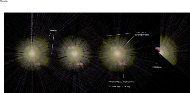
Here is the video of the game I visualized:


Github (Audio files are not included.)


Ron

03 Mar 2015

As my primary 3X assignment, my information visualization maps the relationship strengths of each character in the Dilbert comic strip.

Running for close to 25 years and a favorite of mine, nearly 10,000 Dilbert comic strips have been written by author Scott Adams. Like relationships visualizations that have been done for TV show characters (see this one for the show Lost: http://intuitionanalytics.com/other/lostalgic/), I found myself curious about the relationship strength of the Dilbert characters based on the number of  appearances with other characters in the comic strip. I previously scraped the transcripts after accidentally finding them at dilbert.com. I also downloaded every strip in GIF format, initially thinking to possibly manipulate the strip, but its panels varied from time to time — most of them are three panels wide but others deviate from them to include six or seven panels. So I decided to do something with dialog captured in the transcripts. It’s clear that different workers performed the transcriptions from year to year since they are inconsistent; some simply describe the scenario and provide quotes without attributing them to the characters at all, while others include the character’s name (which is more what I expected and found useful) before the quote. Nevertheless, I wrote a Python script to parse through the scraped text that contained the character references, looking for instances of names to determine if he or she made an appearance in a particular comic strip. I then compared these appearances to the concurrent appearances of others in the strip and determine the relationship strength between a pair of characters. The relationship pairs and encounter count was saved to a CSV and used by D3 to graph the network with nodes and edges. I expected Dilbert to have frequent encounters with his boss and Dogbert, for example, but I didn’t know how strong his other relationships were. There are over 30 characters that have appeared in the Dilbert strips at least once. To declutter the network graph, I removed any interaction counts less than 10 (by comparison, Dilbert and his Boss has over 1500 interactions). The edges connecting the characters were colored and thickened based on the interaction count (darker and thicker edges indicate higher number of interactions).

sketch

In addition to his Boss and Dogbert, Dilbert shares a strong relationship with co-workers Alice and Wally. And Dilbert has infrequent encounters with his mother (Dilmom; only 10 observed interactions). The generically named “Woman” is usually a character with whom Dilbert will go out on dates.

I found using D3 hard because of its relative lack of documentation. There are lots of examples, however, and I used one of the forced layout examples as a starting point.  But it wasn’t obvious how the parameters worked until I just started turning knobs to see what happened. I was hoping to spread the network graph out a little bit so there’s more space between names. With more time, I would include an interactive element that would allow the user to click an edge (link) and see the interaction count between two characters, possibly shown over time.


Screen Shot 2015-03-03 at 2.07.44 AM

The github link is at https://github.com/ronkim/homework32


rlciavar

03 Mar 2015

UPDATE: I finished my data visualization. I made a visualization of the past show locations of my top bands according to last.fm. Here it is with the coordinates plotted to a map. (yay)

Click to see gif 

data_viz_small

It turns out one of my issues in making the map was that my json file had a few errors. (it turns out it’s really hard to see these errors at 4 in the morning).

Screen Shot 2015-03-15 at 12.20.28 PM

OLD: My data visualization is still a work in progress. I spent far too much time trying to decide what to visualize and therefor had little time to try and visualize it. I am working on creating a visualization of the past performances of my top 10 artists in the last 12 months according to last.fm. Maybe I can use this to predict where my favorite bands are likely to perform next. Maybe it will influence by relocation decisions when I graduate (probably not). Either way I thought it would be a fun way to learn D3 (spoiler, there is no fun way to learn D3). Here’s what some sketches.

IMG_1556 IMG_1554

So far I have scraped last.fm for my top 10 artists in the last 12 months according to the number of plays. I used this to further scrape for all the past performances by those 10 artists. I used that data to find the location (in latitude and longitude) for those performances. The next step will be figuring out how to load my json file of artists and coordinates into a D3 world map as points on the map. I have been unsuccessful thus far.

Either way, here is a picture of part of my json file, I suppose it is a visualization of sorts, though maybe only appreciated by computers.

Screen Shot 2015-03-03 at 1.49.30 AM

Thomas Langerak – Dataviz

[iframe src=”http://thomaslangerak.nl/IACD/dataviz/” width=”640″ height=”500″]

This vizualization is best viewed on the following website, please allow a few moments before the page is loaded completely:
http://thomaslangerak.nl/IACD/dataviz/

This is my main assignment since I wanted to learn more about D3js.

Summary:
Related artists are shown by means of a datavizualization made with D3. It is interesting because is shows a different few of how artists appear similar.

Discussion:
In this datavizualization I make use of the data previously gathered. I started out with a single artist (the Eagles) and searched on LastFM for five similar artists. For those 5 artists I did that same, continuing till I had almost 4000 links.

I have chosen for this visualization because first of all I want to learn D3js, secondly I wanted it be dynamic and last but not least I thought this kind of layout may gain me some new insights on how artists are ordered in such questions.

What I is extremely interesting: I failed in the aspect that I do not account for capitals. LastFM has the tendency to be inconsistent with regard to be spelling (eg. the Eagles are apperently not similar to The Eagles), though they are not directly related they are floating almost on top of eachother in the vizualization. This tendence me to believe that somehow that this is a more valid presentation on similar artists.

GitHub:

https://github.com/tlangerak/dataviz

pedro

02 Mar 2015

-stacking building shapes of your city @pveloso13

The question underlying this project is: what type of building shapes compose your city? How can we measure it?

Firstly, the project stores thousands of building shapes from OpenStreetMap. Then, it uses algorithms to evaluate the shape of the buildings according orthogonality, dispersion, angular variation, edge variation, etc. With this analysis it normalizes all building shapes (so they end up with the same area) and creates a ranking. The examples below use dispersion criteria, so the ranking starts in the bottom left with the most compact buildings (usually, circular or regular polygons), then it fill each row with buildings less and less compact. The final layout was largely influenced by the clustering presentation of les villes rangees, so that the original map is presented side by side with the stacked shapes.

The interesting aspect of the project is that it work in different scales. From a certain distance the stack form a general pattern in which different cities can be analysed. For instance, note how Brasilia’s stack looks like a very ordered sequence of horizontal lines composed by rectangular buildings. These lines are occasionally interrupted by unexpected strange buildings. In opposition, European cities have a variety of building types in public and private sphere, so the ranking is much more diverse.

Besides, if you zoom in you’ll see that all the buildings are decontextualized (not connected to urban tissue and with the same size as all the others). So you can look at them as living beings on their owns, with a specific geometry (or maybe with the same geometry of dozens neighbours). In the case of Brasilia, the “outlaw” buildings are lost in the middle of the rectangular neighbours.

I’ll use this project as the base for the final project, incorporating interaction, shape comparison and other features.

[gview file=”http://golancourses.net/2015/wp-content/uploads/2015/03/brasilia1.pdf”]
[gview file=”http://golancourses.net/2015/wp-content/uploads/2015/03/brasilia2.pdf”]

[gview file=”http://golancourses.net/2015/wp-content/uploads/2015/03/siena1.pdf”]
[gview file=”http://golancourses.net/2015/wp-content/uploads/2015/03/siena2.pdf”]

[gview file=”http://golancourses.net/2015/wp-content/uploads/2015/03/paris1.pdf”]
[gview file=”http://golancourses.net/2015/wp-content/uploads/2015/03/paris2.pdf”]

[gview file=”http://golancourses.net/2015/wp-content/uploads/2015/03/london1.pdf”]
[gview file=”http://golancourses.net/2015/wp-content/uploads/2015/03/london2.pdf”]