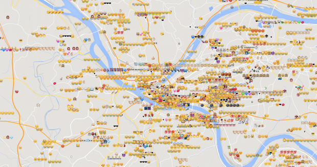
Here’s a map of a subset of emoji tweeted around Pittsburgh. (This file-size-upload limit is killing me.)
Why it’s interesting, and why I made this: Emoji are now more common than hyphens, 1 in every 600 characters typed. More and more communication is being done visually and emotionally, not textually. That’s kind of neat. And I’m always interested in where people do things. Maybe people’s places have something to do with the way they express themselves in emoji, and maybe that’s a window into people’s minds (or better, hearts).
Insights I got from it:
- people repeat the same emoji a lot.
- that “Joy” one (2nd most popular) is super popular in Pittsburgh too. But it seems to be more popular in the south side and north side, and oakland. Perhaps people are more effusive there? Younger?
- what’s the “100” emoji?
- I could tell you where the baseball stadium is, even if I’d never been there.
- same with the zoo.
Ups and downs: I’ll be the first to admit, this is no masterpiece. It’s my secondary assignment for #3, and, well, it could use some work. It’s not very clear to look at, it’s not even very pretty, and like my animated gif (that tweet frequency map) it’s just a big blah dataset instead of an interesting lens into it. But it did get me thinking – I never realized you’d get specific emoji at specific places (like the baseball and zoo ones). The emotions are a mix, as I’d expect, but I’m thinking, it’d be cool to look at, for example, emoji at a baseball stadium after a game, and see if you can tell if the home team won or lost. I bet it’s pretty easy.
Code on github here.