Project 1: Words Across Culture

by aburridg @ 6:56 am 27 January 2010

Here’s a link to my project >applet< .

And…here are some screen shots for each emotion:


Experience:

As mentioned, I used Mechanical Turk to collect most of the information. I was able to get responses from roughly 500 people total in 1-2 weeks from all over the world (which is pretty cool). I only ended up using about 300 of the responses–some participants did not fill out the survey correctly, and I had too many participants from the US and India (150-200 of the data I used were from US and India participants). For each country, I rounded the numbers to 20 to help my program run a little faster, but the trends are all still visible.

Figuring out how to make pie charts was the most interesting/challenging next to collecting the data. I got a lot of help from these two sites: Processing arc() reference and Processing Pie Chart Example. Yep–this project was written in Processing. I had a lot of fun with it…and I learned to appreciate it more after seeing how easy it was to load data from a file (Processing has a lot of cool formatting tricks for that).

You can’t really tell with the pictures, but this project is interactive…the “next >” button will turn white if you mouse over it, and if you click on the “next >” button, another word will show with its respected pie charts. I wanted to make the pie charts morph from word to word, but I decided to keep it simple and clean. I think with the colors and the way the information is displayed, the pie charts look aesthetically pleasing on their own.

So, why is the information I have interesting/useful?

Well, you can learn a lot about how colors and concepts are interpreted internationally. You can also see the relation between different concepts and colors. Some are rather obvious: like the more aggressive concepts (anger, fear) are usually associated with red and black. You can also see how some words which have no cultural context, people chose a color that suited their experiences. For example, with confidence, my participants were all over the board–from their comments, I learned that most chose their respected colors because the color looked good on them or they associated the color with a good memory.

That being said, a lot of the trends you see in the data are pretty obvious. For example, for “Jealousy” all the Western cultures picked green predominately due to the coined phrase “green with envy”. Or, most people associate “Anger” with red because “people’s faces turn red” or “red is the color of blood”.

Another interesting observation is with “Happiness”. Most western cultures associate happiness with yellow while other cultures associate it with “green” because green seems to represent fertility and prosperity according to their religions.

I did want to display the comments–but a lot of them were redundant. I might add them on later…because I plan to continue with this project and collect more data to use for my final project.

Critique
Pro’s:
I did think I showed my data broadly and accurately. And, I did get some interesting results. I like the way the pie charts work–they’re very easy to compare against each other.

Con’s:
However, I don’t think 300 data points is necessarily enough to make an argument. I think I was a little too ambitious and probably should’ve sticked to pulling something off the internet, practically (however, I don’t regret my choice too much because I learned a LOT about obtaining my own data, and the process, though trying, was fun!). I also wish I could make the display a little more interesting.

Jon Miller – Project 1

by Jon Miller @ 5:26 am

Get Adobe Flash player

Update:
I have attached a zip file here: (link) containing an html file that opens the flash object without resizing it. Download both, then open the html file. Thanks everyone for the positive feedback!

Concept
I wanted to explore something that might be completely new to people, including myself. Password lists are widely available online, however, they are predominantly used to gain access to accounts, and occasionally viewed as a curiosity. I decided to look at the content of the most commonly used passwords to see what I would find.

Development
After exploring the various databases for awhile, I decided to sort by category a database of the most popular 500 passwords myself and with the help of a friend. Although this would introduce some personal bias into the data, I felt it would be more useful this way to us, to allow us to see what people find important, and to compare the relative popularities of related things. For example, while it might not make much sense to compare “132456” with “jordan”, it could be more interesting to compare “mustang” directly to “yamaha”.

I also included a sample of a much larger database, so that people can observe random passwords scrolling by. Having looked by now at several hundred passwords, I have come to appreciate the value of simply reading them, recognizing things such as childhood artefacts and obscure motivational phrases.

Findings
People most often put (presumably) their first names. Names which coincide with famous people (for example: Michael Jordan) are more popular. Other names, such as Thomas, are simply very popular first names. Other very popular choices are profanity and sexually related words, which perhaps shows more about what people would prefer to think about when they think no one is looking. Other major categories include references to pop culture, sports related passwords, and incredibly easy to guess passwords, such as “password”. This might be a reflection of the apathy or ignorance to the ease of which one’s account can be cracked. However, it might also be a reflection of the fact that these passwords come from sites which were hacked – most likely social networking or other noncritical websites. Thus, a password list from, say, a bank or a company would be less likely to contain such obvious passwords.

Looking at individual passwords, we can see that many of them educate us about many popular cultures: for example, “ou812” is an album by Val Halen, and “srinivas” is a famous Indian mandolin player. Of particular curiosity is “abgrtyu”, which is not a convenient sequence of keys like “asdf” or “qwerty”, has no apparent cultural origin, and yet is still in the top 500 list. One theory is that the word was repeatedly autogenerated by spam bots who created accounts. Another theory is that it is a fake password, added to the list to prevent people from plagiarizing this particular password list, similar to the way real dictionaries will add an imaginary word so that thieves can be easily caught.

We can delve further into the categories and look at what people seem to value in their vehicles and the brand names – there are american made sports cars at the top, with higher and lower vehicles appearing further down the list. Curiously, “Scooter” appears 5th – perhaps because of its recognition as a band as well?
Looking at the randomized database of several million passwords, there are many more references to things, many of which I do not recognize, some of which I do. They range far and wide, from minor characters in videogames to storybook villians. Many passwords here are similar to the top 500 passwords (which should come as no surprise).

Thoughts
This journey has been a highly speculative one, involving many google searches leading to cultural references and lots of browsing over seemingly random assortments of words and phrases. It is refreshing to see that people choose overall more positive things than negative (for example, “fuckme is soundly ahead of “fuckyou”, though both are popular passwords), and it was interesting to reflect on my own choice of passwords.

I chose to program this in Flash, not because I felt it was most suitable for the task (given its lack of file I/O, it could be argued that it is the least suitable), but because I want to become a better Flash programmer.

Further steps would be to make the interface interactive somehow, so that the people on the internet could sort words their own way, perhaps slightly similar to refrigerator magnets. This way people could see what everyone thinks, rather than deal with my personal opinions on how they should be sorted. Perhaps also user submitted passwords could be added to the list.

Project 1- Color Changing Fruit

by caudenri @ 3:30 am

Download the project here…
gradient_interface_jan26.jar

I’ve been thinking about doing this project for quite a while in the general sense of measuring the color change in foods over time. For this project, I attempted to measure the change of color in an apple, an avocado, and a banana while exposed to air over time. In the future I’d really like to try measuring the color of many other things.

To collect the data, I made a white foamcore box and attached a webcam facing in so I could put whatever I wanted to photograph in there and be able to somewhat control the lighting and have a consistent background. I set the camera to take an image every 10 seconds for the apple and avocado, and every 5 minutes for the banana since I figured it would take longer. I still underestimated the amount of time I would need to achieve a dramatic change in color and going back to revise this project that will be the first thing I work on. As you see, the banana’s color didn’t seem to change much and it represents over 48 hours of image-taking.
Making images of the apple

I was a little bit disappointed with the color quality– namely because it’s very hard to detect much of a difference from the beginning of the gradient to the end, and the colors are very muted. I used Hexadecimal color in order to easily save the strings to a text file and read them out again, but I may try using HSB and see if I can get a little better color quality and distinction. This problem could also be fixed by using a better camera and taking the images over a longer period of time.

I had wanted to end up with photoshop color swatch tables or gradients that users could plug in, but I simply ran out of time to work with this, and I plan to go back and try to do this with the project. Another thing I wish I had done is be more careful with the lighting when taking the images– I covered the box where the images were being taken but I think they were still effected by the lighting changes in the room, which you can see where there is an abrupt hue change in the gradient.

Project 1 – kayak.com visualization

by rcameron @ 3:28 am

Download OSX Executable (~1MB)

The setup is you click your location and based on data pulled from Kayak, Bezier curves are drawn to possible destinations. The weight of the lines represents how cheap or expensive the ticket is. Thicker = cheaper.

On the back end, I wrote a Ruby script that polled for flights between the cities shown on the map. Since Kayak only allows 1,000 hits/day, I had to limit it in some way. That constraint led to only looking for flights for the next weekend.

My biggest disappointment was not getting the Bezier curves to animate in Processing. On top of that, the current city choices are pretty limited.

Tesserae: Making Art Out of Google Images

by Max Hawkins @ 2:47 am

Tesserae

After the critique last week I decided to change my topic from mapping the colors of the tree of life to comparing the meaning of words in context. This idea came from the realization that images of closely-related species take on different colors based on whether that species lives in captivity or in the wild. One chimpanzee had a green hue in the visualization whereas its close siblings were all yellow. It turned out that the difference was due to green leaves in the first chimp’s environment and the yellow zoo-bedding in its siblings’ environments.

My final visualization (named Tesserae, the latin word for tiles) was created in order to display these differences visually and allow people to test hypotheses about the contextual meanings of words like the names of the two chimps. It uses an HTML interface that allows users to type in related words and see their visualizations side-by-side.

One frustration I had with the previous project was that the color average used to color the nodes lost the rich textures of the underlying images, leading to an uninteresting visualization. To remedy that problem I took 15×15 pixel chunks out of the source images, preserving the textures while obscuring the overall image. This allows the visualization to become an composite that abstracts away the meaning of the individual pieces, making the user to focus on the relationships between images rather than the images themselves.

Since all of the images are downloaded and client-side, no two visualizations are the same. The tiles are arranged randomly on load and the images themselves change as Google’s search index updates.

Analysis

In practice Tesserae is more useful for aesthetics than for practical comparisons between words. I’ve been using it more often as a story-telling tool than a data analysis one. This visualization is a good example. It uses the search terms “stars,” “earth,” and “sun” to paint a picture of our solar system.

Some meaningful comparisons do exist, however. They just seem harder to find. One that I found a little interesting was the difference between the names “Alex” and “Alexandra,” shown below. Tesserae does all image searches with SafeSearch off, so the image for Alexandra is full of pink-tinted pornography. Alex has no porn and is a washed out gray. If I put on my “culture” hat for a second, this might say something about how the internet views women and men differently.

There are a few more examples worth looking at on the project’s website.

Room for Improvement

Aside from the performance issues listed on the project website, I can think of a few places where the visualization could improve:

Since it only grabs the top eight images from Google Images it’s easy to pick different images out of the composite. A larger number of search results might be beneficial but is cumbersome to implement using Google’s search API.

A save button could be added to make it easier to share generated visualizations with friends.

The original photos that created the mosaic could be displayed on mouseover. This would make it easier to find out why a mosaic turned an unexpected color.

[Tesserae]

Project-1 The Smell of…

by kuanjuw @ 1:50 am

“The Smell of…” project is trying to visualize one of the five senses : smell. The way we used in this project is very simple: collecting the sentence in twitter by searching “what smells like” ,and then use the words to find the picture from flickr.

How would people describe a smell? For the negative part we have “evil-smelling, fetid, foul, foul-smelling, funky, high, malodorous, mephitic, noisome, olid, putrid, rancid, rank, reeking, stinking, strong, strong- smelling, whiffy…”; for the positive part we have “ambrosial, balmy, fragrant, odoriferous, perfumed, pungent, redolent, savory, scented, spicy, sweet, sweet-smelling…” (Search on Thesaurus.com by “smelly” and “fragrant”). However, compare to smell, the adjective of sight is a lot more. So, how do people describe smell? Most of time we use objects we are familiar with or we tell an experience for example: “WET DOG” or “it smells like a spring rain”.

In Matthieu Louis’s “Bilateral olfactory sensory input enhances chemotaxis behavior.” project, the authors analysed the chemical components of oder, and then visualize the oder by showing the concentration of different odor sources  . In the novel “Perfume”, Patrick Suskind’s words and sentence successfully evoked readers’ imagination of all kind of smells, and moreover, Tom Tykwer visualized them so well in the movie version that we can even feel like we are really smelling something.

The project “The Smell of…” is developed by processing with the controlP5 library, twitter API, and Flickr API. First, users will find a text field for typing in the thing they want to know the smell.

In this case we type in “my head”.

After submitted,  the program started searching the terms “my head smells like” in twitter. Once received the data, we split the sentence after the world “like” and then cut the string after period ‘. ‘. So it came up with all the result:

Figure.2 the result of searching “my head smells like” from Twitter.com

Third, the program used these words or sentences as the tag to find the image on Flickr.com::

Figure.3 The result of image set from flickr.com

So here is the image of “my head”.

For now I haven’t done any image processing so that all the pictures are raw. In the later version I would like to try averaging the color of every photos and presenting in a more organic form, like smoke or bubble. Also,  the tweets we found are interesting so maybe we can keep the text in some way.

Figure.4:: The smell of “my hand”

Figure.5 The Smell of “book”

kuanjuw_project_1-100127d

20*20 PPT20-20

Project 1

by guribe @ 1:04 am

Visualizing beauty trends in America from the past ninety years

Click on the link below to view my information visualization for project 1:
My Information Visualization

Where the idea came from

When I started this project, I originally wanted to compare data from the Miss America or Miss USA pageant and compare it national obesity rates by state. Knowing that both obesity rates and standards for beauty have risen, I was intrigued by the comparisons these two datasets would create. Eventually, after several iterations and variations of this original idea, I decided that 1) I did not want to be limited to creating a map of the United States by using state by state data and 2) I wanted my visualization to have some sort of interactive element.

At this point, I decided that the data I had collected about the past Miss America winners was strong enough to produce a visualization that would show trends in our culture on its own without needing the comparisons of other datasets.

Using Processing, I aimed to show general changes amongst the Miss Americas through graphs and timelines that included photos and data about their height, weight, body mass index, and waist measurements.

How I obtained the data

I collected all of the data by hand, from various websites, Wikipedia, and Google image searches. I did not find any websites where parsing or scraping would have been useful, so I decided not to use these techniques. Instead, I manually collected data of each of the winners’ height, weight, body mass index, and waist measurements, as well as finding as many pictures of the winners as possible for the timeline.

The idea for this type of data collection came about when I found a page in the pbs.org website dedicated to the Miss America pageant that included most of the past winners’ stats. I used this page for most of my data and filled in the holes with my own Google searches.

Some discoveries I made along the way

The most challenging part of this project for me was working with Processing. I had only used it once before (not including project 0) mostly just using it to capture video.

Through this project, I became more familiar about how to use Processing to create drawings and interactive elements. Although the final applet may seem primitive, programming with Processing in this way was extremely new to me and I feel much more confident now about using Processing in the future.

While I was working on the project, I realized that I was more interested in the pictures of the timeline than in the graphs. If I could change the project now, I might make more of an emphasis on the images than the other data I had. It would be interesting to see a composite Miss America similar to the project shown in class about people who look like Jesus.

My self-critique

In retrospect, there are several changes I wish I could have made to this project. First of all, I feel as if I wasted much time rethinking my concept for the content of the project. More time was spent thinking of new ideas than actually creating the project which caused my final product to suffer.

Secondly, I feel as if the interactive elements fall short of my initial ambition. I wanted this to be extremely interactive; and although it is interactive in some ways, it seems no more interactive than a common website. The ultimate experience turned out to be much less exciting than I was hoping for.

Thirdly, I wish I had put more thought into the visualizations of the graphs. They are quite static and a bit boring, and especially after seeing what other students in the class have created, I feel as if it could have been more compelling.

More specific changes I would make if I had more time to work on this project would include making the scrolling action for the timeline less jumpy, and plotting the yearly data in the graphs instead of only plotting the rounded average of each decade. I would also strive to make the graphs more interesting and create a stronger interactive element.

Project 1 – Moving

by sbisker @ 12:29 am

this post is a work in progress…coming wednesday afternoon:
*revised writeup (below)
*cleaned script downloads

Final Presentation PDF (quasi-Pecha Kucha format):
solbisker_project1_moving

Final Project (“Moving”) :
solbisker_project1_moving_v0point1 – PNG
solbisker_project1_moving_v0point1 – Processing applet – Only works on client, not in browser right now; click through to download source

Concept

“Moving” is a first attempt at exploring the American job employment resume as a societal artifact. Countless sites exist to search and view individual resumes based on keywords and skills, letting employers find the right person for the right job. “Moving” is about searching and viewing resumes in the aggregate, in hopes of learning a bit about the individuals who write them.

What It Is:

I wrote a script to download over a thousand PDF resumes of individuals from all over the internet (as indexed by Google and Bing). For each resume I then extracted information about where they currently live (through their address zipcode) and where they have moved from in the past (through the cities and states of their employer) over the course of their careers. I’ve then plotted the resulting locations on a map, with each resume having its own “star graph” on the map (the center node being the present location of the person, the outer nodes being the places where they’ve worked.) The resulting visualization gives a picture in how various professionals have moved (or chosen not to move) geographically as they have progressed throughout their careers and lives.

Background

Over winter break, I began updating my resume for the first time since arriving in Pittsburgh. Looking over my resume, it made me think about my entire life in retrospect. In particular, it reminded me of my times spent in other cities, especially my last seven years in Boston (which I sorely miss) – and how the various places I’ve lived, and the memories I associate with each place, have fundamentally shaped me as a person.

How It Works

First, the python script uses the Google API and Bing API to find and download resumes, using the search query “filetype:pdf resume.pdf” to locate URLs of resumes.
To get around the engines’ result limits, search queries are salted by adding words thought to be common to resumes (“available upon request”, “education”, etc.)

Then, the Python script “Duplinator” (open-source script by someone besides me) finds and deletes duplicate resumes based on file contents and hash sums.
(At this stage, resume results can also be hand-scrubbed to eliminate false positive “Sample Resumes”, depending on quality of search results).

Now, with the corpus of PDF resumes established, a workflow in AppleScript (built with Apple’s Automator) converts all resumes from PDF format to TXT format.

Another Python script takes these text versions of the resumes and extracts all detected zipcode information and references to cities in the united states, saving results into a new TXT file for each resume.
A list of city names to check for is scraped in real time from the zipcode-lat/long-city name mappings provided for user input recognition in Ben Fry’s “Zip Decode” project. The extracted location info for each resume is saved in a unique TXT file for later visualization and analysis.

Finally, Processing is used to read in and plot resume location information.
This information is drawn as a unique star graph for each resume. The zipcode representing the person’s current address as the center node, cities representing past addresses being the outer nodes.
(At the moment, the location plotting code is a seriously hacked version of the code behind Ben Fry’s “zipdecode,” allowing me to recycle his plotting of city latitude and longitudes to arbitrary screen locations in processing.)

Self-Critique

The visualization succeeds as a first exploration of the information space, in that it immediately causes people to start asking questions. What is all of that traffic between San Francisco and NY? Why are there so many people moving around single cities in Texas? What happened to Iowa? Do these tracks follow the normal patterns of, say, change of address forms (representing all moves people ever make and report?) Etcetra. It seems clear that resumes are a rich, under-visualized and under-studied data set.

That said, the visualization itself still has issues, both from a clarity point and an aesethetic point. The curves used to connect the points are an improvement over the straight-edges I first used, and the opacity of lines is a good start – but is clear that much information is lost around highly populated parts of the US. It is unclear if a better graph visualization algorithm is needed or if a simple zoom mechanism would suffice to let people explore the detail in those areas. The red and blue dots that denote work nodes versus home nodes fall on top of each other in many zipcodes, stopping us from really exploring where people only work and don’t like to live, and vice versa.

Finally, many people still look at this visualization and ask “Oh, does this trace the path people take in their careers in order?” It doesn’t, by virtue of my desire to try to highlight the places where people presently live in the graph structure. How can we make that distinction clearer visually? If we can’t, does it make sense to let individual graphs be clickable and highlight-able, to make it more discoverable what a single “graph” looks like? Finally, would it make sense to add a second “mode”, where the graphs for individual resumes are instead connected in the more typical “I moved from A to B and then B to C” manner?

Next Steps

I’m interested in both refining the visualization itself (as critiqued above) and exploring how this visualization might be tweaked to accomodate resume sets other than “all of the American resumes I could find on the internet.” I’d be interested to work with a campus career office or corporate HR office to use this same software to study a selection of resumes that might highlight local geography in an interesting way (such as the city of Pittsburgh, using a corpus of CMU alumni resumes.) Interestingly, large privacy questions would arise from such a study, as individual people’s life movements might be recognizable in such visualizations in a form that the person submitting the resume might not have intended.

Project 1: The World According to Google Suggest

by Nara @ 12:17 am
Nara's Project 1

Nara's Project 1: The World According to Google Suggest

The Idea

The inspiration for this project came when I saw this blog post a couple of weekends ago, wherein the author typed “why is” followed by different country names to see what Google Suggest comes up with, resulting in some interesting stereotyped perceptions of these countries. I opened up Google and tried a few searches of my own (I’m Dutch, so I started off with “why is the Netherlands”) and discovered that unlike the blog post had suggested, not all countries came up with stereotype-like phrases; many of them were legitimate questions. So, instead, I tried a few queries like “why are Americans” and “why are the Dutch” and found that when phrased that way, focusing on the people rather than the countries, one was much more likely to see stereotypes and perceptions rather than real questions.

I quickly realized that it shouldn’t be too difficult to write a program that queries Google for searches in the form “why are [people derivation]” for different countries and see how we stereotype and perceive each other. When I presented this idea in class last week, my group members suggested that in addition to querying Google.com, I should also query other geographic localizations of Google such as Google.co.uk.

The Data

One of the trickiest parts of this project was figuring out where/how to get the data, as it seems that Google fairly recently changed its search API from the old SOAP-based model to something new, and most of the documentation and how-to’s on the web focus on the old API. I also couldn’t figure out where Google Suggest fits into the search API and finally decided to give up on the “official” API altogether. I finally discovered that one could obtain the Google Suggest results in XML format using the URL http://www.google.com/complete/search?output=toolbar&q= followed by a query string. (This URL works for all geographic localizations as well; simply replace “google.com” with “google.co.uk” or what have you.)

All my data is obtained using that URL, saving the XML file locally and referencing the stored XML file unless I specifically tell it to scrape for new data. I did this because this is not an official API, unlike Google’s real APIs which require API keys, so I wasn’t sure if they would get upset if I am repeatedly scraping this site. The results don’t seem to update all too frequently anyway.

Input

The program takes as input a CSV file that has a list of countries and the main derivation for the people of each of those countries. For example, “United States,American” and “Netherlands,Dutch”. These are later used to construct the query strings used for scraping Google Suggest.

Another idea that I had was to color-code the results based on whether each adjective or phrase has a positive, negative, or neutral connotation. Patrick told me that such a list does exist somewhere on the web, but I did not manage to find it. So, it currently uses an approach based on manual intervention. The program also takes as input a CSV file with a list of adjectives followed by the word “positive”, “negative”, or “neutral”. It reads these into a hash table, and each adjective gets associated with a random tint or shade of the color I picked for each of the words (green for positive, red for negative, blue for neutral). When the program is set to scrape for new data, it writes any newly encountered adjectives/phrases to the CSV file, followed by the word “unknown”. I can then go into the CSV file and change any of those unknowns to their proper connotation. This approach currently works quite well because it currently has a listing of some 100 phrases, and each time it scrapes for more data it finds fewer than 5 new phrases on average. Of course, this manual intervention isn’t a long-term solution and ideally a database could be found somewhere that can be scraped for these connotations.

Filters

I did purposely filter out some of the phrases that are returned by the searches. For example, phrases of the style “[why are the dutch] called the dutch” were common, but did not contribute to my goal of showing stereotypes and perceptions of people; these are the more legitimate questions that I’m trying to avoid. Unfortunately there wasn’t really a good way to do this other than providing a manually-edited list of certain keywords associated with phrases and phrase patterns I deliberately want to exclude.

The Results

You can see the program ‘live’ here. I say ‘live’ because as noted above it is referencing stored XML files and not querying Google in real time. However, it is ‘live’ in the sense that you can freely interact with it.

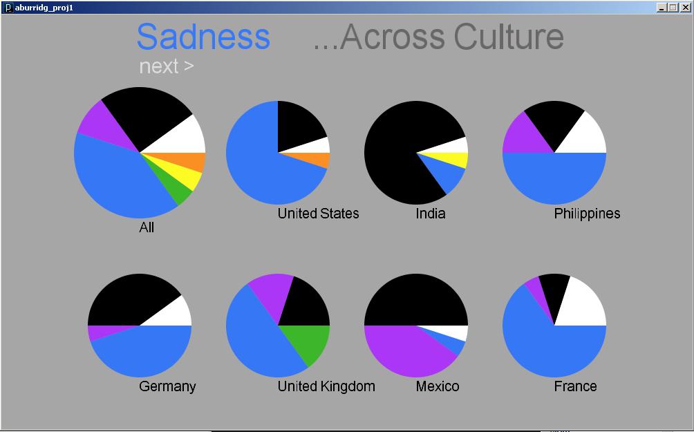
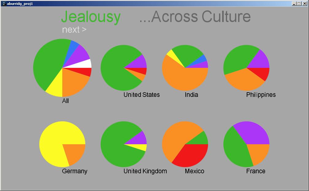
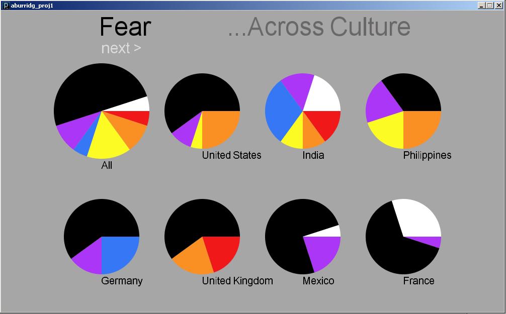
The program currently displays the results for 24 different countries and 6 different versions of Google. I tried other versions of Google but it seems to only work for the geographic localizations of English-speaking countries; other localizations tended to only yield results for fewer than 10 different countries.

Not all countries came up with a lot of different words and phrases associated with them. I actually originally started out with a list of about 30 countries, and I had to take out a few that just weren’t yielding any results. There are still a few left that do not have many, but I decided to keep them because I did not want to create this false perception that because all the countries shown have a wide range of results, any country queried will have that wide a range. My list, I feel, is much more honest and shows that people simply aren’t doing as many queries on Danish people as they are about Americans. I also felt compelled to include at least one country for each continent, which sometimes was difficult, especially in the case of Africa and the Middle East. So, one might wonder why I chose to keep some of the countries that do not have very interesting results, but there actually was good reasoning behind my final list of countries.

The Visualization & Interface

The interface is pretty barebones and the visualization is readable but not terribly beautiful or compelling. I actually started out intending to use the treemap for comparisons available on ManyEyes, but I tried to implement the algorithm in the paper they reference and didn’t get very far. (I had little time to work with and I have no experience implementing an algorithm described in a research paper.) So, I opted for this much simpler approach, inspired somewhat by the PersonalDNA visualization of personal qualities like a DNA strip with longer widths for qualities that are more dominant. It is basically like a stacked bar graph.

As far as interactive features go, the user can:

  • Hover over any part of the “DNA strip” to uncover words that do not fit (ie. the label is wider than the part of the strip).
  • Click on a word or phrase and see all the countries that have that trait, ranked by the percentage of their search results that that phrase takes up.
  • Click on one of the tabs on the bottom to examine how the attributes change when different geographic localizations of Google are queried.
  • Click on the name of a country to dim out the other countries. This setting is retained when switching tabs at the bottom, making it easier to examine the changes in a specific country across the different geographic localizations of Google.

The Future

Here’s a few things I would’ve liked to implement had I had more time:

  • Including something about the number of queries for each query string; possibly allowing the user to rank the occurrences of a phrase by number of queries for that phrase instead of by percentage of that country’s queries.
  • An ability to filter the list of countries in various ways, such as by continent.
  • Relating it to a world map, especially with the colors. For example, a simple SVG map of the world could be color-coded according to the most dominant color for each country. The results could be interesting, on a country as well as a continent level.
  • Having data moving and shifting using tweens, rather than just displaying the data in one frame and then the changed data in the next frame.
  • A prettier interface with more visual hierarchy.

The Conclusion

All in all, I’m not dissatisfied with this project, although I view it more as a good start to a project rather than a finished piece. It has a lot of opportunities for further development, and I hope I do get around to expanding and refining it more someday, but in this case I just simply did not have the time. I was out of town this past weekend for grad school interviews, and I had 2 other projects due this week as well, one on Tuesday and another also on Wednesday. It’s been a hell of a week with very little sleep, so even though I recognize the weaknesses of this project, I admittedly am quite happy and proud of myself for getting something up that works at all.

The zip file with the applet and the source code can be found here.

Fortune 500 Visualization

by paulshen @ 10:35 pm 26 January 2010

Most of my writeup is at http://in.somniac.me/2010/01/26/fortune-500-visualization/

Mac OS X Executable

Presentation [pdf]

Critique

I’m rather pleased with how the visuals and interactions turned out. On the other hand, I was a little disappointed with the visualization; it wasn’t as interesting as I had hoped, but still interesting! For the interaction, there is the problem of presenting the large amount of data in a limited space. To overcome this problem, I allow the user to pan the camera, although this has its limitations as well. The number of companies and time frame one sees at any time is smaller.

Potential Features
  • The interaction makes sense but can be optimized more. Possible zoom in/out
  • One may want to do a lookup of random company name. This would probably be another feature to implement, allowing the user to look up companies by typing.
  • It may be interesting how companies enter and leave the top 100.

I feel I achieved a lot technically on this piece and learned more C++ during the process.

My main negative critique would be the arguable lack of “interestingness” and “usefulness” of the piece. Instead, I used this as an exercise on designing a way to display multi-dimensional data. During my exploration, I also tried to color in the companies according to the industry of the company (interesting to see trends of industries). However, I ended up not accomplishing this because of the difficulty of producing this data. I wrote a script to scrape the Fortune 500 site but they only categorize the companies in 2005-2009, which would leave most of the image uncategorized. I also tried scraping Wikipedia but the articles were too inconsistent.

NYC Schools and SAT Scores

http://in.somniac.me/2010/01/26/nyc-schools-and-sat-scores/

Mac OS X Executable

This was just an idea directly inspired by stumbling upon the data set. The outcome, again, wasn’t as interesting as I’d hoped, but it was a fun exercise.

Looking Outwards: The Third & The Seventh

by paulshen @ 1:48 pm

I don’t know if this work is in the scope of this class but it’s so beautiful I’m going to share anyways. (I’ve already done another Looking Outwards)

The Third & The Seventh from Alex Roman on Vimeo.

This piece is completely computer generated, save some minor details (the person, the airplanes,…) Computer generated art has been around for a while but this piece really awed me in how photorealistic it is. A little back story, I believe the guy quit his day job to dedicate to working on this.

Jon Miller – Looking Outwards 3 – How to sew an electronic circuit

by Jon Miller @ 4:30 am

textile electronic circuit

This is not so much a looking into a finished project as it is looking at possibly a different medium. In posting this, my hope is that someone may find it interesting enough to incorporate into a future project.

I feel there has been a trend towards making things more “organic” – somehow capturing lifelike essence with technology. Textiles have the property of being flexible and contain a certain physical randomness to them due to the infinite “joints” among the fibers, an area where electronics and mechanical devices often fail.
Given the previous two assertions, I think there is an opportunity to explore electronic textiles as a medium in order to give more “lifelikeness” or “organicity” to what currently appear to be clever simulations. For example, perhaps a mechanical dog would take on more life if it were covered in a loose “skin.” This skin would hide its hard surfaces and machined joints much like real skin covers real bones. Then, while perhaps not looking more similar to a real dog, it may still take on a more organic appearance, the effects of which might be cute or creepy, but at least hopefully interesting.
Without experimentation I am unwilling to make any further conjectures, but I think this could be a possible future area for computer art, especially if the piece involves physical movement.

Source: link

Project 1 – INFORMELATNO FISUALIZATION

by xiaoyuan @ 2:39 am

Get Adobe Flash player

Looking Outwards #3

by rcameron @ 12:47 am

Snow Stack is a demo built to highlight Webkit’s 3d CSS effects. It was created using only HTML, CSS, and JavaScript. It’s pretty amazing that this is being rendered in a browser, but since it only runs in Safari currently, it might not take off just yet. Nonetheless, it’s quite impressive.

The images are loaded in from Flickr, so clicking on an image will take you to Flickr.

Arrow keys move around and spacebar zooms in.

It only runs in Safari on Snow Leopard unless you have the latest build of Webkit.

http://www.satine.org/research/webkit/snowleopard/snowstack.html

Looking Outwards #3

by areuter @ 8:53 pm 25 January 2010

I found an interesting interactive graphic on the New York Times website which offers a glimpse into how different groups of people spend their time.  I thought the arrangement of this visualization was interesting because it almost looks upside down…I’m not sure if this is a good or a bad thing, but I wonder how the designers chose the order of the layers (like putting “sleep” on the bottom).  It helps that you can click on the graph to see particular areas individually.  On the other hand, the chart does make it easy to spot trends over time.

Some observations I made:

  • People with kids tend to spend more time working – is this because they are providing for their family, or avoiding it?
  • The higher one’s education, the less likely they are to watch TV and the more likely they are to be using the computer
  • More people who are unemployed spend time on education, household activities, and TV than those with jobs.
  • There are more men who travel (to work?) very early in the morning than women.

Link:

http://www.nytimes.com/interactive/2009/07/31/business/20080801-metrics-graphic.html?ref=multimedia

Looking Outward-freestyle: Jamming Gear

by kuanjuw @ 8:15 pm

Jamming Gear / フリーデモ from So KANNO on Vimeo.

Just saw this from TEI
Music is controlled by the rotating gears. The size of gears change the speed and the direction of rotation decides whether play forward or backward.

The design is beautiful and elegant.

An effective graph

by Max Hawkins @ 6:00 pm

Looking Outwards: Brainball

by paulshen @ 4:09 pm

Brainball

http://smart.tii.se/smart/projects/brainball/index_en.html

I found this installation navigating the Ars Electronica archives. This piece uses state-of-the-art technology to critique our competitive nature. Two players compete by achieving calmness and passivity. A system measures the biological signals in the players’ brains to produce this metric.

I think it makes an interesting point, how the advancement of technology is supposed to make our lives easier but often induces more stress. This is also true of competition, which often cause adrenaline rushes. This piece encourages the opposite and presents this concept using advanced machines.

The following is the given description by the creators.

“Brainball” is three projects in one: it’s a game, it’s art and it’s R&D. Two players sit at a table facing one another. Their brainwaves are registered and then analyzed and interpreted by a Macromedia Director application that controls magnets mounted beneath the table. These magnets, in turn, influence the direction of a ball on the table’s surface. The ball rolls towards the player whose brainwaves indicate a higher state of relaxation. Here, the use of cutting-edge biosensors opens up interesting human-machine interaction possibilities.

We live in a world in which everything seems to be moving faster and faster. New technologies that are actually supposed to make our lives easier lead to a spiral of incessant acceleration. More and more people suffer from exhaustion and stress-related health problems.

walking in the cloud

by Cheng @ 12:55 pm

Pilots navigatDavid Rumsey Collection: (Verso of) American Airlines system map. Route of the flagships in relation to the air transport system of the United States … Prepared for American Airlines, Inc

This is how pilots confirm their route in the 3D space.

Visually, lights standing high up from ground form a path for pilots to follow. The red flashing lights we see at night against the sky, when view from above, form some sort of zodiac for pilots and direct them to destination. It’s interesting to think about cities as nods of light flow. Could Boston be the North Star for pilots?

Auditorily, morse code style of beeps works like curbs for road drivers.

Looking outwards: Freestyle

by xiaoyuan @ 11:47 am

http://www.newgrounds.com/portal/view/320416
OMG, this is cool! These worms operate with inverse kinematics! THey swim around! They eat humans! They attack humans and the humans lose limbs and bleeed and die! 😀

« Previous PageNext Page »
This work is licensed under a Creative Commons Attribution-Noncommercial-Share Alike 3.0 Unported License.
(c) 2016 Special Topics in Interactive Art & Computational Design | powered by WordPress with Barecity