Project 1: Minute II

by areuter @ 11:56 pm 31 January 2010

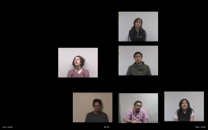
Minute (II) is an interactive application which allows the viewer to examine how people’s backgrounds affect their perception of time–in this case, a minute. Previously, in Minute (I), I asked several people to perceive a minute while I recorded them, and afterward, fill out a survey on their background (do they drink coffee, how much did they sleep last night, etc).  From this I created a video in which the participants’ minutes are arranged in a grid; their exact placement roughly determined by one aspect of their background.  There appeared to be some correlation, but it was difficult to tell due to the limitations of using a discrete grid structure on a continuous set of data.  For this iteration, I decided to break away from the grid and place the minutes along the x-axis based on the currently selected background criteria (the y-axis is random).  Most importantly, I implemented my goal of making the information interactive (using openFrameworks), so that the viewer can investigate the specific background information that they believe might influence a person’s perception of time.  This also makes it possible to include a huge database of minutes, and then randomly select a subset of them to play each time the application is run.  One other modification was moving the actual elapsed time from the center of the screen to the bottom so that more emphasis is placed on the participant’s relative perception of time (potentially a result of their background) than how “accurate” they are.

Please contact me if you would like a copy of the application, the ZIP is pretty large (74 MB)…

Looking outwards simulation

by xiaoyuan @ 9:27 pm

This is a proposal for a motion control system for moving animated characters in a space. It is pretty impressive, because you don’t need to specify reactions based on specific conditions; the movement is computed by the system itself based on a value function. The transitions between different motion types are smooth.

However, this seems to be for walks on a plane. It is also too dependent on pre-made motion capture, as the walk cycles are not generated by the system.

Looking Outwards – Pixel City

by Max Hawkins @ 8:13 pm

Pixel City

You may have already seen this because it was pretty popular with the blogs a few months ago, but I really enjoyed and thought I would post. In a series of blog posts Shamus Young, a long-time 3D game developer, explains how he created this procedurally generated city simulation. It was eye-opening for me to see his thought process.

[Pixel City]

CityEngine

On a similar note, this CityEngine software is a powerful tool to create realistic-looking city plans based on a city map and a simple set of rules. Really cool.

[CityEngine]

AVR Simulator

Probably not related, but interesting nonetheless: I found a computer simulator for AVR (Arduino) chips that could prove indispensable when testing more complicated physical computing projects.

[SimAVR]

Looking Outwards — Simulation

by aburridg @ 8:06 pm

So, I was not sure how to go about looking for artwork for this topic. First, I looked at liquids…I was pretty hungry at the time, and a YouTube user made a nice compilation of completely digitally fabricated simulations of thick liquids seen on commercials (mostly chocolate):

Then, I think, like the example in class, there are actual “art” pieces (albeit more commercial as well) that also simulate organic life:

The wilder beast stampede from The Lion King (excuse bad quality):

I was obviously taking a trip down memory lane while eating chocolate when I found those too. But, from the wilder beast stampede you see a simulation of Craig’s Reynold’s “Crowd Path Following” in the video.

Here’s another piece called “blender predator prey simulation with boids particle system.” It examines the properties of flocks, the same “Crowd Path Following” mechanic in addition to an “Avoidance” behavior from the larger birds of prey. It’s pretty hypnotic–unfortunately, since it’s YouTube, this video doesn’t have spot-on quality either. If you enlarge the window, you get a nice view though:

Here’s another example of birds’ flocking. In this one, a flock of birds follows the green ball and avoids the red ball.

I am very interested in flocking/herding behaviors. I definitely want to utilize and investigate more into the topic for my art project.

Looking Outward – On the Simulation of Man-Made Rules

by sbisker @ 6:18 pm

My last project on resumes had me thinking a lot about the nature of rules, and how they are applied and misapplied in our society. The prompt to discuss “Simulation” got me thinking about the things we simulate and the things we don’t – and why.

If you look under the hood of a simulation, you’ll see that the foundation of any simulation is rules. Lots and lots of rules, applied over and over again, maybe in response to various stimuli (in the case of physics simulation), or maybe randomly (in the case of evolution) The rules that we simulate seem to be heavily biased towards natural phenomena (physics, light, genetics). Are there less obvious rules – in particular, man-made rules – that we can simulate? Can we simulate the rules that *people* have, for things like social interaction? And if we have real people as actors in the simulation, is it really a simulation anymore?


SimCity – An early simulation of man-made rules

Simulating man-made phenomenon and rules is not new (as any video game player can tell you.) What’s interesting, though, is that rather than “guessing” these rules, now we seem to have an opportunity to use the ACTUAL real-life man-made responses to stimuli and input around us in simulations.
For one, cities and other man-made systems are starting to make their data from actual events in life available to the public. What if, in SimCity, instead of using a set of probabilities to determine how pissed off your town gets to a tax increase, we could in real time find a city who had made a similar tax increase with a similar population, and use *that* city’s real reaction to the tax increase in your simulation? It’s still a simulation, in that an actual town doesn’t have its taxes raised – but it’s based on real reactions.


UPS Tracking – Using the real world as a tool for simulation

For another, the ubiquity and cheapness of digital devices means that we can actually use man-made rules and systems being applied to real items *in real time* to our simulations. A concrete example of a system that everyone can play with is the United Parcel Service – a huge, man-made machine designed to get packages from point to point in arbitrary times (with the rules designed to create a profit.) With tracking numbers, a computer can see, for any package, how far and how fast it travels in real time. What’s interesting about this is that you can today imagine a simulation, cheap enough to build at home, that uses programming and cloud services like L-Mail to *physically mail packages* in order to calibrate itself. We can use real-world encounters to make further decisions about, say, when to send packages to make sure everyone receives them at the same time…effectively creating a hybrid physical-digital simulation tool that takes into account the real operation of UPS. What we’d use this particular example for is beyond me – maybe to know when to send admissions letters for college so everyone gets them at the same time? But it’s wicked cool that it’s even conceptually possible. And it translates to many other man-made systems, from tax filing to phone dialing to using Mechanical Turk to get people to ride the bus places.

Weird, huh? So where does that leave us? This resume project has made me interested in simulations that take into account real decisions make about real people. What if, as part of a simulation, I sent off 100 fake resumes to 100 actual companies? As in, I use a computer to create 100 fake resumes, maybe based off those of real people, and *actually* – not simulating – mail them to 100 companies across the united states. And say, 10 of those resumes were offered interviews. My algorithm can see which have gotten interview requests (by logging into the fake person’s e-mail) and pick 10 resumes to be the “most fit” resumes, and kill off and mutate the old resumes accordingly, before coming up with a new batch of 100 resumes, to send off again to a new set of companies. Such a simulation would use real-life HR decisions as its own engine – but yield “simulated” results that point out rules in our employment decisions that people don’t even realize. With sites such as EarthClassMail L-Mail and (more generally) Mechanical Turk , there’s any number of “physical” man-made systems of rules we can access programmatically in our simulations.

Looking Outwards – Simulating Movement

by Karl DD @ 6:14 pm

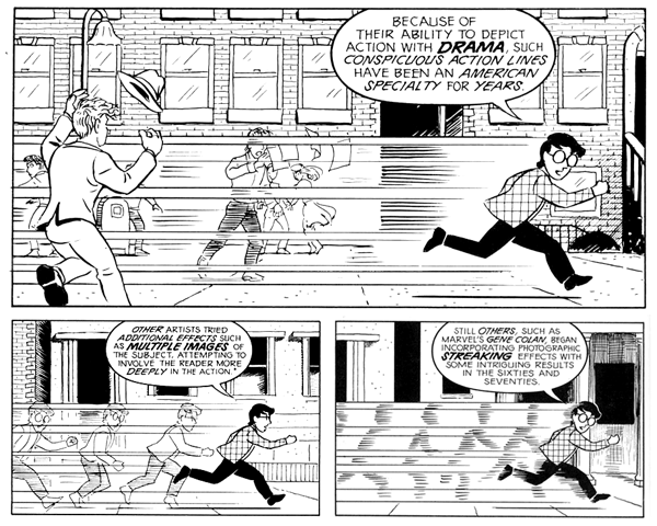
For my ‘Simulation’ project I am interested in how the movement of an object can be emphasized or represented in a static image.

One approach is to present a history of movement in a single frame. This has been a common technique in ‘sequential art’, see Scott McCloud’s Understanding Comics.

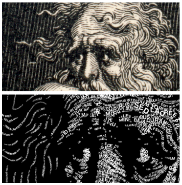
This approach has been used in a number of other fields/projects/research. The below example is from the Recreating Movement project by Martin Hilpoltsteiner.

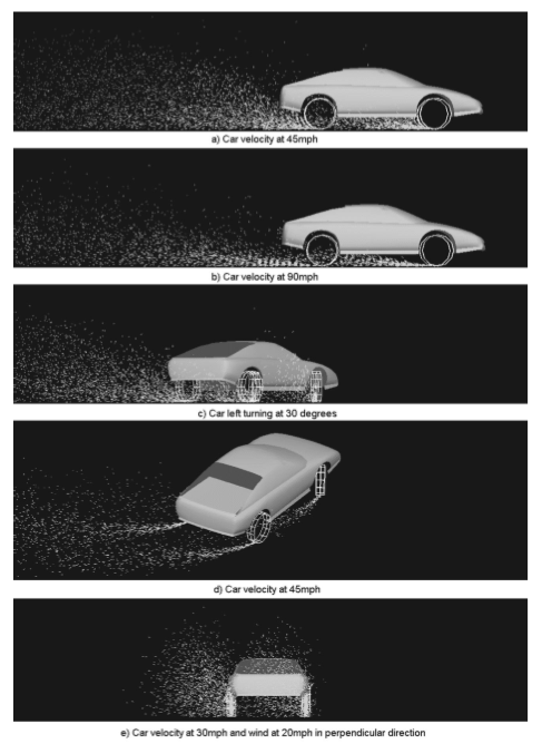
Another approach is to show how the moving object affects the environment. In this case a speeding car creates a path of dust. The below example is from Real-Time Simulation of Dust Behavior Generated by a Fast Traveling Vehicle (PDF).

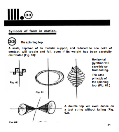
Paul Klee’s Pedagogical Sketchbook also addresses the fundamentals of how to represent motion with static lines. As does the work of Futurism.

Learning some math, any suggestions?

by jsinclai @ 4:35 pm

Hey all,

So I’m certainly a bit behind on my computer graphics and math skills. I haven’t taken any math since single variable calculus in High School, and I’ve never taken a graphics course. Anyone know any good tutorials or crash courses from which I could learn some of the principles?

I might even consider buying a textbook if it’s a really useful reference.

Thanks for any direction,
~Jordan Sinclair

Looking Outwards: Simulation

by paulshen @ 3:49 pm

http://dmtr.org/mtv_rewind/

This project uses particle system simulations to model the letters MTV. This is similar to the fabricated text that was shown in class on the first day.

One thing I see a lot of in the simulation category are particle simulations. The artist describes a set of laws, using complying with physics, and lets objects run wild in this programmed world. As this category suggests, there is beauty in defining the world and the laws that govern within, somewhat God-like.

http://roberthodgin.com/flocking-for-nervo/

Robert Hodgins does some spectacular work and I really wished he would released his source code so I could see the mathematics behind it all, but he’s hesitant on doing so, understandably. He simulates a flock of birds, perhaps even some of the ideas shown in the steering simulations shown in class. But the execution is also beautiful; the visuals are realistic.

Looking Outwards – Interactive Physics

by jsinclai @ 12:46 pm

Crayon Physics Deluxe from Petri Purho on Vimeo.

Crayon Physics is an incredible game that applies the laws of physics to your drawings. Balls roll, hammers hit, see-saws catapult objects when a heavier one is placed on the opposite side, and you can even create intricate pulley systems. I really like the concept for the game because all interaction and creativity is left to the user.
This feels like a child’s dream come true; what if my crayon drawings came to life? (Ironically, there is a game called “Drawn to Life,” but it doesn’t seem to offer this same realization of creative objects). The user is not constrained to anything but their imagination and the (simulated) laws of physics.

http://fantasticcontraption.com/
Fantastic Contraption seems like another fun interactive physics game, except here you use predefined physics objects to achieve your goal. What I like about this one is the community tools available for people to share their creations and contraptions.

This post was inspired by the following videos:

(2:00 to 3:30) This first video shows a demo of “Half-Life 2” at the E3 Expo in 2003. I remember being in complete awe after seeing life-like physics in an interactive environment.

This tech demo shows “Digital Molecular Matter” which simulates the physical properties of different types of materials.

Looking Outwards – TextDraw

by ryun @ 8:41 pm 28 January 2010

During the TEI conference, I had chance to see many interesting works. One was the text visualization. Basically, with this system you use a pen as a drawing tool and the system shows the text as you draw with the pen. The interactive visualization was quite interesting. Users can choose the fontface, brush type, txt file you would like to see.  While you draw the shape it also detects how hard you are drawing(pressure) so it shows the drawing in a dynamical way.

I thought this visualization shows good interaction and shows the text visually with drawers’ intention and emotion. But, also at the same time, there is a questions too: Is there strong connection between the user’s drawing and the text itself? Because they can be so easily separated in this interaction. It is a difficult problem but important.

Project 1 – Inbred Music

by jsinclai @ 8:26 am 27 January 2010

So, I have an awful taste in music. I am absolutely in love with this obscure type of techno called Happy Hardcore. Essentially, it’s underground British rave music. I don’t know how it happened, but it did, so I have to live it with.
Anyways! Ishkur’s guide to electronic music says that “ALL the world’s Happy Hardcore is made by only 12 guys, who have more pseudonyms than a shark has teeth, and who churn it out at such a feverish pace you’d almost think that there’s probably a program that makes it for them. Just randomize the key values, get Sugar from YTV to sing the lyrics, and away you go.”

I wanted to know if this is true.
Is my favorite genre of music controlled by 12 individuals who lack any sense of originality and who must rely on each other to create anything considered music?

I pulled a ton of data from Discogs (like IMDB for music). The data was poorly structured, and not very crawlable, so I had to do a bit of manual tinkering around to download a single artist. Once I had an artist’s real name, I could then pull their data (all their aliases and all the groups they were in) using the Discogs API, which returns some awfully structured XML…

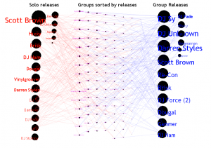
The visualization itself shows three columns of information. The first shows every artist and a circle. The size of the circle represented their number of releases under their solo name and all their solo aliases. The third column had the artist, but this time their circle represented the number of tracks released by groups they were in. The middle column shows all the groups, again, sorted by number of tracks released by that group.

One of the main problems I had was many dimensions to my data, and wanting to show all of them. I had things like number of tracks, number of aliases, tracks per aliases, number of groups, tracks per group, members per group, and I probably could have figured a way to see who remixed who (but that might be a separate project…). In the end, I realized I needed to just focus on one piece: how artists were connected to each other through groups. Everything else at that point was peripheral. Unfortunately, I already had a substantial amount of code and couldn’t find myself starting over. I then was stuck with a visualization that wasn’t very scalable (there are still a lot more artists with a low quantity of releases that were not included).

Regardless, I think this visualization is a great start. I’d love to keep working with this data if I had more time, to further realize this vision.

Future Steps:
-Comparison should be much easier. I had a few mechanisms in place, but as the codebase grew, they broke and didn’t scale.
-I’m really interested in the difference of “inbredness” of different genres, so I’d love to throw a couple of these next to each other.
-The current visualization isn’t scalable at all. I think the best way to scale something like this would be to use something similiar to the “well formed eigenfactors” visualization we saw, though, I’m still unable to conceptualize how I could tie my data into that.

Download Source code and Data Files, as well as the song used 🙂

Project 1 – Pin Numbers

by jmeng @ 8:18 am

IDEA:
To examine people pin numbers for what patterns people tend to lean towards when using a 10-digit keypad arranged in a 3 x 3 grid (with outlying zero). I wanted to examine trends in the numbers and patterns “drawn” when typing in pin numbers. Also to see if these trends changed by sex — more or less patterned. And finally, to see if pin numbers are really as divers as we assume they should be and see what would be considered the “safest” pin.

DATA:
I created a survey through Google Documents Forms and posted it on a facebook event, as a question on Yahoo! Answers, in an email to my sorority d-list, and apart of a blog post on this course’s blog. I imagine that most of the people who filled out the survey were facebook invitees. 600 people were invited to the event, 164 people filled out the survey, and 71 were willing to give up their pin numbers. All information gathered can be viewed here.

PROCESS / ANALYSIS:
I tried to look for patterns by grouping the numbers in different ways:


Benford’s Law – “The first digit is 1 almost one third of the time, and larger digits occur as the leading digit with lower and lower frequency, to the point where 9 as a first digit occurs less than one time in twenty” (Wikipedia).
The image above is an analysis of the numbers by splitting them up in to pairs of digits (blue = first two digits, red = middle two digits, green = last two digits) so that all numbers are between 0 and 99. The height of each bar is the number of times that number appeared in a single pin number. Benford’s Law was quite accurate for the data, but I wanted to look at more patterns in the hand movement used when typing in the numbers.


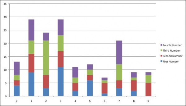
I then tried to look at patterns by when each number was used in the pin number. The image above graphs the numbers 0 – 9 against their densities based on which number they were in the pin number (blue = first number, red = second number, green = third number, purple = fourth number).


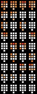
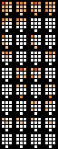
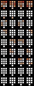
I finally used processing (for a loooong time) to create the series of images featured above. The leftmost image is an analysis of all the data collected, the middle image is for female information only and the right most image is for male information only. From four different keypad representations from left to right show the digit used as that number in the pin number (left most pad is first digit of pin, right most pad is fourth digit of pin, etc…). The top-most row is densities of a number for all data in that set. The darker the color, the denser the population. The following rows show data by numbers repeated during pin numbers by showing which numbers were repeated by density and when in the pin number. I found that 50 out of 71 people (70%) had repeating digits in their pin numbers, including: 19 out of 28 guys (68%) and 31 out of 43 females (72%), two of which had a digit repeating 3 times.


I am currently working on, and have not finished an interactive model that graphs densities of digits based on digits that the user inputs. I will probably show a non-complete version in class if possible.

REFLECTION:
I think my project went fairly successful. I was very shocked to see that so many people were so willing to give up such private and valuable information, and online nonetheless. I am pleased with the data I found and can only imagine that there are so many more number patterns hidden that I did not find. I really like the three images produced above but would’ve really enjoyed being able to interact with something. I have only used processing a few times before and tried to challenge myself to analyze all of the data using processing, and not by using excel or just looking at the numbers. In retrospect, I probably should have just found what I wanted to visualize and then hit up processing, instead of using processing to find patterns and see if it is an interesting visualization, but I did learn a lot about the language and environment that I hope to make use of in other projects.

project files

Project 1: Pursuit of Happiness

by davidyen @ 8:16 am


(My project also has issues viewing in a browser due to loading textfiles. Here’s my project.)

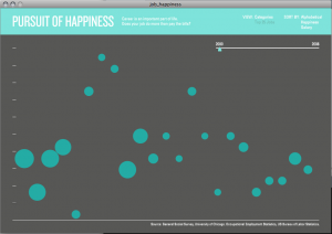
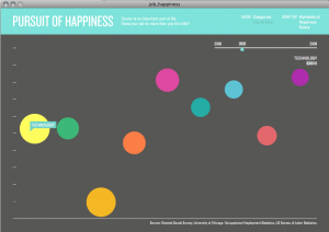
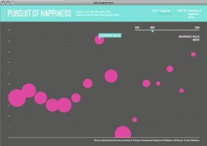
My project looked at visualizing people’s happiness, as it relates to their occupation and their salary. I used two different sources of data: University of Chicago’s General Social Survey, a large, comprehensive opinion survey conducted pretty regularly since 1972, and the US Bureau of Labor Statistics’s Occupational Employment and Wage data. Among routine questions including occupation, age, gender, etc., the GSS has a question about how happy people are in their life. Cross referencing this with the salary statistics from BLS, I hoped to gain insight into whether people were really happier if they earned more money.

I think I underestimated the complexity of the data and the interface necessary to effectively explore it, so I didn’t manage to fully implement some features I had intended. Overall, I’m pretty satisfied with the outcome as far as representing my idea, given the time, even though it is incomplete and there are some technical and design issues.

My greatest trouble with this project was working with the data. The GSS and BLS data had to be comparable across occupations and span many years (I originally planned 1972-2008) however BLS only provides 1998-2008 and GSS simultaneously provides data only every other year starting in the 90’s. The main issue by far was the occupational codes. Standards changed every few years and I had to write 7 different parsers in Processing to convert the data to something usable, and even then I found that there was errors in the data translation (you may notice that postmasters earn an unusual amount of money in my viz).

Some features that I plan to implement are sorting the data, scraping BLS.gov for occupational descriptions to give a little insight into each job, and a more organic softbody interaction with the bubbles. I had originally placed a lot of emphasis on getting the softbody interaction to really capitalize on the buoyancy as happiness idea, as well as have the various occupations/industries pushing past each other.

Project 1: Contrast

by jedmund @ 8:05 am

Contrast is a tool that compares tagged images from Flickr across different days. The user can define all information. The ultimate goal was to allow the user to clearly see the difference in color between the two dates entered. I haven’t quite made it there yet, but even through the visual “map” created from the small thumbnails, you can begin to see how the colors on these two days might differ.


At first I wanted to make a highly interactive piece in Processing, but in the end I’m a lot more proficient with PHP. Making it in PHP meant I’d run into a lot less problems, and ultimately, I’d have a lot more to show. Regardless, speed is still a real issue (that stems from the generation of color palettes of each image), so that’s something I hope to work on in the next few days. I’d also like to port it to Processing as time allows to get some really nice interactions that PHP doesn’t allow.

I’ll post more as I update it!
download contrast

Project 1 – ESPN Jersey Numbers

by ryun @ 7:27 am

IDEA

My project is about “Jersey numbers”. When I was a middle school student, NBA was so popular in Korea, I was one of the big fans of it. Back then, I noticed that a lot of famous players had numbers such as 23, 32, 33, 34. Maybe it is because the basketball heroes had such those numbers (ex. Kareem Abdul-Jabbar had 33, Magic Johnson had 32 and so on). In this project I wanted to see if there is any pattern of popular jersey numbers according to the specific sports, positions, ages and even salaries. This is the reason why I came up with this idea.

DATA

It took a while to make such a huge data sheet. From ESPN website, I copied and paste team by team. Finally I could get almost all the current players information containing their age, position, height, weight, jersey numbers even salary.
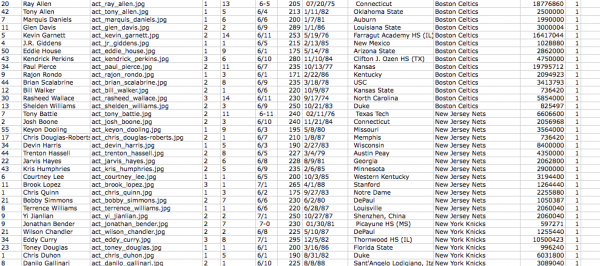
Total 3272 players(383 NBA players + 1261 MLB players + 1628 NFL players). I was able to get all the NBA players pictures but due to the time limitation I decided not to handle the other sports players. This is why you do not see the pictures of MLB and NFL players.

PROCESS
I used Processing to visualize this data. I categorized the data by numbers, sports, positions, experience, salaries, and so on. I tried to apply the color code to make the visualization more clear.
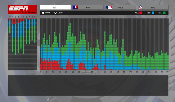
There are two graphs – one is to see what numbers are popular to use as a one digit (i.e. 34 is counted as 3 and 4) and the other is to see the popular numbers as a whole. Each sports has options to choose so that you can sort and filter the players by positions, experience and salary.

ANALYSES
As I expected, I was able to see a certain patterns for each sports. I want to show some interesting patterns here.
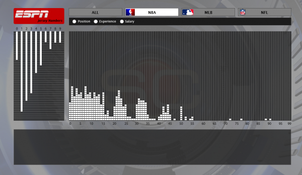
As far as I know, NBA players can wear any number they want unless other players in the team have the number already. But surprisingly, you can see the numbers over 50 are not so popular.
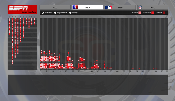

The position wise, you can observe the small size players such guards wear small numbers(light color) and big players such as centers have big numbers – it this coincident?
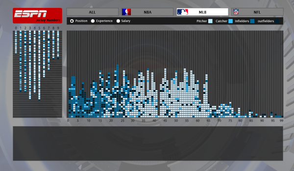

There is a strong pattern that pitchers(light color) have over 25-65 and infielders and outfielders have small numbers (1-25).
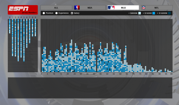
Another interesting thing in MLB is if the player are new or low salary, they mostly wear big numbers. I assume that their numbers here are their temporary numbers in case that other players wear it already so they have to wear leftover numbers. This indicates that big numbers are not very popular in MLB too.
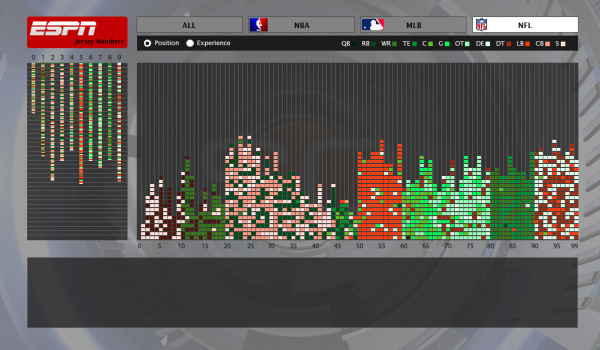
In NFL I was able to get a very strong pattern. Because NFL players usually wear their numbers by positions you can see this interesting visualization.

CONCLUSION
Accrding to Benford law (the first digit is 1 almost one third of the time, and larger digits occur as the leading digit with lower and lower frequency, to the point where 9 as a first digit occurs less than one time in twenty.), I was not able to get a strong outcome to support it. But I can guess that MLB and NBA players do not tend to have large numbers. And Some article indicate that number “12” is the most popular in NBA but not with my data. FYI, number 1 and 7 was the most popular.
It was so fun to see such patterns but I wish I had more time to play with it more. Maybe I could have compared with more of other sports with more other categories. In HCI perspective, the interface has some things to fix and improve such as cursor shape for mouseover features, Y axis on the graphs should have indicators , maybe could use more effective colors to compare each others. But with the limited time, I am pretty happy with this result.

DOWNLOAD

Source file (16.2M)
Presentation slide (6.5M)
project 1 – infovis.

by Mishugana @ 7:24 am

presentation

looking outwards #3 – simulation of color blindness

by Mishugana @ 7:21 am

http://www.webexhibits.org/causesofcolor/2.html

this site is great…. the Causes of Color project is really interesting, but this color blindness simulation meets these requirements for a simulation:

interesting concept

good application of coding

artistically compelling…

I only wish i could upload my own images or maybe see a live cam view.

this site  simulates a zombie outbreak. it is a lot of fun.

http://www.kongregate.com/games/BinarySpace/zombie-outbreak-simulator

Assignment 1: The Modes of William Shakespeare

by Michael Hill @ 7:20 am
GDE Error: Unable to load profile settings

From the beginning I was quick to discover that I would have to pull back on the scope of this project.  I simply wanted to display too much information.  Initially I had intended to show a wide variety of statistics along with each characters influencing dialogue.  This proved to be too much.  Instead I chose to take a more straight forward approach and find a way to display the play itself in a unique way.

While prototyping this display method, I discovered a few things I thought were particularly interesting:

Poetry From "A Midsummer Night's Dream"

The picture above shows lines of poetry spoken within “A Midsummer Night’s Dream”.  I found this visual representation of speech rather unique.

One Partial Scene and Three Whole Scenes From "Titus Andronicus"

Another feature I found interesting was the obvious distinguishing line between scenes (as seen above).

Aftermath and Breakdown

Overall, I am happy with my final “poster” results.  I do wish that I had been able to make this an interactive piece (which I may go back and do for posterity’s sake).  One feature I would have liked to have been able to include is a “Last Words” pop up which would show a character’s last words in the play.

It would also be nice to figure out a method in which to display all of a play on screen at one time and still have it be relatively readable.  I found that it was nearly impossible to display any of the plays I tested in a window less than 2000 pixels.  Images ranging from 10k-20k pixels in width were the best for display, but were impractical when it came to navigating

Resources

The Complete Works of William Shakespeare came as a single file from Project Gutenberg:

http://www.gutenberg.org/etext/100

I then removed the Sonnets and extra text placed there by Project Gutenberg.

During the process of parsing the large “Book” of plays, as well as each of Shakespeare’s plays individually, I found Java’s Class Pattern Documentation particularly helpful

My Book Parser

My Play Parser

Please be sure to check out the full version of the PDF displayed above.  Google’s PDF reader is not capable of properly displaying a file of that size.  Thanks! -M

presentation slides (.ppt, .pdf)

Looking Outwards Freestyle

by davidyen @ 7:11 am

I wanted to share two things, the first just came out but has started to make the rounds in the design circles, Feltron’s Annual Report for 2009. http://feltron.com/index.php?/content/2009_annual_report/
Nicholas Feltron has been publishing Annual Reports on his own life for 5 years. They’re wonderfully designed and feature some computationally driven data visualization, and some personal not-data driven stuff that makes the whole thing more interesting to read. I really liked how he presented quotes describing him as data, in this years report.

The second is the computational artist who helped Feltron with the processing work driving his visualizations, Zevan Rosser. http://www.shapevent.com. His archived Processing sketches are really interesting and exploratory, have a look: http://www.shapevent.com/archive.html.

Price of liquids. Looking outwards #2 – freestyle’d

by Mishugana @ 7:10 am

http://cockeyed.com/science/gallon/liquid.html

this is a nice infovis project that I believe was spawned from a smaller version of this chart.

the smaller version spawned from a discussion about the price of oil in comparison with other liquids of equal volume.

the pictures are humorous and it really makes you think about a subject in a new light and makes you excited to ask questions, which is what infovis should do.

gasoline is pretty cheap…

black ink toner will cost you an arm and a leg….

Next Page »
This work is licensed under a Creative Commons Attribution-Noncommercial-Share Alike 3.0 Unported License.
(c) 2016 Special Topics in Interactive Art & Computational Design | powered by WordPress with Barecity