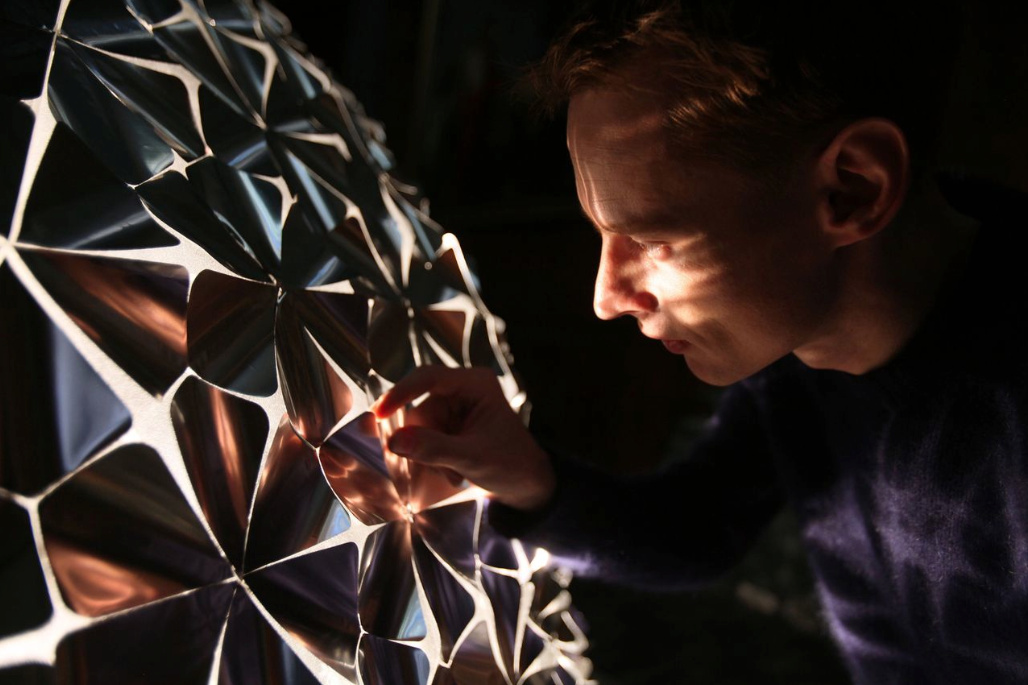
Category Archives: Uncategorized

Haris Usmani

19 Feb 2014

MirrorFugue

By Xiao Xiao

This project explores music collaboration across space and time, communicating through sound and gestures. The system has two modes: “Reflection” and “Organ”. In reflection mode, the player can see and hear what is being played in the reflection of the keys while in organ mode, the virtual player’s hand appear as projected hands on the keys themselves. Anyone can be the virtual player, you could even play with yourself or collaborate with another miles away. I personally liked the project as it preserves the aesthetics of the instrument while enhancing interaction between the two worlds (the real-time and the virtual) by sound and vision. Xiao used MIDI keyboards, wide-angle cameras, projectors and MAX/MSP to build the prototype.


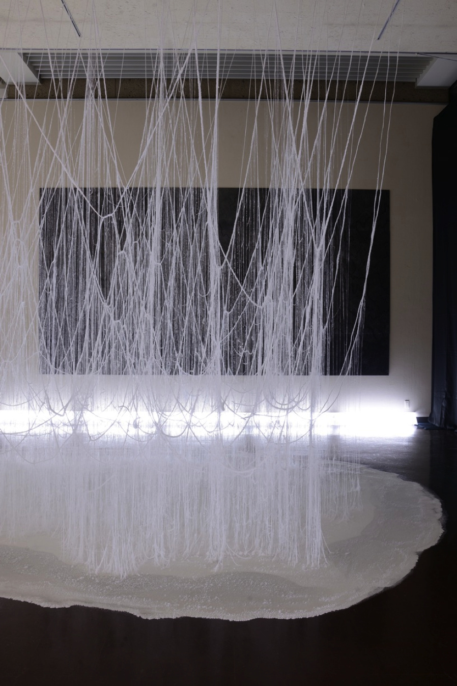
“The Treachery of Sanctuary”


by Chris Milk

This is an art installation that consists of three panels that represent the process of creative inception. The artist who conceptualized the project was very close to the idea of how birds live (in fact he mentions he lives on the beach!), and so he used the motion of birds to convey his point across. The first panel tells us about inspiration, where the individual’s shadow disintegrates into birds that fly away. The second panel presents the impossibilities- the moment where outside forces start to limit or kill the ideas we come up with; here the individual’s shadow is eaten away as birds fly towards it and snatch a part away. In the third panel, the individual learns how to make the idea work- its where ‘you and the idea transcend’. The individuals shadow appears to grow wings in this stage. It’s made possible using Kinect to detect the person and interact with his body motion. What moved me most about it was how people reacted to the installation- skip to the last few minutes of the video to see the gestures and emotions people show.
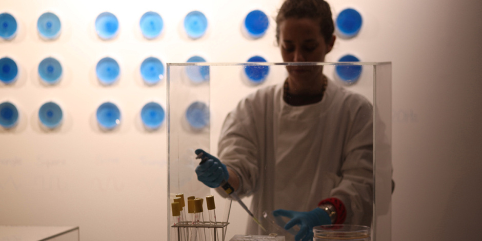
 

Voice Spray

By Rafael Lozano-Hemmer

This is a sound art installation where the participants can come in and speak into the intercom. Their voices are converted into flashes of light, and a unique pattern of blinking lights is generated which traverses over the light array. Near the end of the audio, the participant can hear chunks of the last 288 recordings made on the device, so this project keeps accumulating the last 288 recordings done on it.

Chanamon Ratanalert

18 Feb 2014

For the past few weeks, I’ve been collecting data about myself for what I thought was going to be my quantified selfie. My plan was to see the correlations between how much work I have, the sleep I get, my mood, the weather, and how much junk food I eat. I always knew it was a shallow idea, but it was a starting point. Last week, after I was appalled at the large pile of clothes on my floor during my upkit2 work days, I started logging “how many things are on the floor” at around 9pm each day.

My project has now shifted to focus on this floorspace issue. However, I have very little data now that I’ve changed it. I also don’t know how to progress from here, or how to visualize it. Others (Wanfang and Harris) suggested that I take progressive photos of my floor to better capture times of day and how much is on the floor. The issues I have with this is privacy and feasibility of taking these pictures due to the arrangement of my room and the existence of my roommate. Also, after thinking about it, the stuff on my floor is generally consistent within a day; meaning that if there are 5 things on the floor at the start of my day, there will be about 5 things on my floor when I get home. This is generally due to the fact that the things don’t move on their own when I’m not around. In conclusion, it’s more of the day to day change that will be varying. My thoughts right now are to take a picture of my floor right before I go to bed. This will pretty much be the time in which I’ll have decided to either clean my room or not give a flying poop and leave it the way it is.

From these pictures, I’ll hope to generate a program to gather the percentage of floorspace left of my floor (in comparison to a picture of my floor when it’s clean, if that’s even possible). From this, as Kevyn suggested, I can visualize the floor junk in comparison to a stack of books representing how much work I have.

I think how much sleep I get, restlessness, etc. (things I gather from my FitBit and AskMeEvery questions) count a great deal into my messiness. It is not just a matter of what I have that day that makes my room messy, but what I could have the next day or have had the previous days. For example, I may not have a lot of work today, but if I just had a long streak of work and sleepless nights, then I’ll be too exhausted to care about my tidiness.

My current 2 ideas on possible visualizations are as follows:
1. A Predictor: I will analyze the data and synthesize some sort of correlation between work, sleep, and mess. Then I can create a software system (or physical, but less plausible) in which you can adjust amounts of work or sleep given to me and see how messy my room might be. I would then send this to my mother and tell her to get off my back about cleaning my room. Or to my roommate as a warning and apology for my side of the room having been struck by a tornado.
2. A physical somewhat abstract creation: I’m obsessed with somehow finding a project I can do that is physical. As much as I love communication design and lack the skills of an industrial person, I desperately love tangible objects and wish I could create something for it. I would probably create some sort of sphere or cylinder in which a person could turn it over in their hand and follow the work flow (possible color-mapped with light colors representing light work and darker colors representing heavy work load). Those portions of the object would be bumpy or somehow physically changed to represent the mess. I don’t want to create anything too abstract otherwise the data collection will have been useless, so we’ll see how far I can take this idea.

I have class right now, so those are all my thoughts for now. I’ll figure it out.

Kevyn McPhail

17 Feb 2014

Project 1:

Long Distance Art

Project 2:

Appseed

Project 3:

HypoSurface

I chose these projects because of my interests in the digital representation and recreation of analog activities.

As someone who has been looking into with getting robots to work intuitively with humans I am really impressed with the first project by its ability to translate human movement to the robot arm. What is interesting about the project is that even thought the robot and the artist are pretty much perfectly in sync, you can see that the robot’s drawing is a close but slightly modified version.  But this is probably due to a lot of technical faults such as the sensing and reaction timing of the robots in addition to the motors getting up to speed, etc… However this project is still pretty amazing and a good precedent for a potential capstone project.

I was really interested the second project because of how it very elegantly touches on the ideas of digitally representing analog items very well. Especially since it makes it very easy to prototype application interfaces. It removes a lot of steps in between sketching and wire framing to interface development.

Lastly the final project caught my eye because of its flexibility  in interaction. The hyposurface responds to almost any type of physical interaction with the wall. The three key interactions that it responds to are sound, light and touch. But it can also respond to a mix of these senses. From an architectural stand point, the hyposerface can introduce a whole new perception of spaces, allowing them to be responsive to it’s inhabitants. It can also change the way buildings perform allowing spaces to be, literally, shaped by the emotions and physical reactions of a building’s users.

Yingri Guan

16 Feb 2014

Stunning – Lotus Dome

Lotus Dome is a simply stunnning installation by Studio Roosegaarde . They invent their own materials which is made with mylar. These materials respond to different human activities.

1bc350257fbb9dd09b88c0ddd1883feb 77a1e7070d9eb830a0e6be1ecb4698d1

Interesting – Nurit Bar-Shai’s “Chemical Tweets”

I think this interactive piece is very subtle and provocative. Bar-Shai basically invented her own system for people to have interaction with. I believe context is one of the most important factor when talking about interaction design. The idea of using biochemical substance to generate stunning images to represent visual and audio inputs is really interesting.

9892ffb8e23e805f82daf8b2b89e1716_vice_670 538346808199689e7861c1deaf1aabc8

Crystal Forest

This project is interesting because Onishi Yasuaki created an environment for people to interact with. There’s also interaction with the nature. By brilliantly utilizing combination of tree branches and fundamental concept of crystal growth, he was able to generate this forest like installations. Again, the artist has created his own system of interactions.

925a05364d7416162f42f50adecd4916

Kevyn McPhail

11 Feb 2014

Here is my D3 visualization of the activity of Curbed:NY. A little background on curbed, the website shows the different architectural and real estate development and sales in a region. So what I did was use create a custom scraper that gets the amount of times that neighborhood is mentioned. Finally, I graphed that data to see how different neighborhoods compare to one another. One interesting find is that I did not expect Harlem to have a lot of activity. I did some more reading to see that the district is beginning to undergo a period of gentrification.

I hate javascript, its an annoyingly funky language that’s not very explicit on what you need and when you need it. I had a lot of issues with types of variables being passed/not passed through some functions (callbacks) and had to jerry-rig the code quite a bit…but I got the hang of it around 2am the night before this was due and above is the result of my dance with javascript!

git

Kevyn McPhail

11 Feb 2014

In this project, the goal was to map 500,000 data point, each being a hotel in the world. I knew right off the bat that I was going to have to deal with efficiency with plotting the points, however I wasn’t really sure what or how to plot them. So I went with my instinct and did a little sketch in processing. This helped a lot. It helped me test a the different methods of plotting the points. I ultimately chose to plot a globe and the part that surprised me the most was how the hotels give you rough outlines of countries and continents. I then moved from processing to C++ to gain a little bit of speed with parsing. From there I added the interaction of choosing how far you want to travel, what rating of hotel you want, and your max price. Then plotted in red, the hotels that meet your criteria. The most challenging part of this project was trying to figure out how C++ runs through your code. Initially I was having problems with the interaction where functions were called when variables were called. which was perplexing but I figured out how to make the interaction work. It was a great project!

git

Screenshot (7)

Screenshot (8)

Joel Simon

11 Feb 2014


Words to come.Screenshot 2014-02-11 09.07.03 Screenshot 2014-02-11 09.06.40 Screenshot 2014-02-11 09.06.33


http://www.youtube.com/watch?v=LlNuBs8LI4o

Interactive Map – Constellations

I visualized the ratings of hotels (stars) across the world.

MAP :  acrylc.github.io/constellation

GITHUB :  github.com/acrylc/constellation

The map renders poorly in the iframe below because it is not responsive, I’m working on fixing it. The mapbox layer could be embedded, but I’ve styled the hover over tooltips in javascript so I decided to share an iframe of my webpage instead.

Process

I was very interested in mapping the hotels in the browser because i wanted to see whether it would be possible to map an interactive map of such a large dataset.  I cleaned the csv in the terminal using csvquote and awk for simple data manipulation such as cleaning invalid hotel ratings (there were 200,000 invalid hotel ratings, all of which were set to -1).

I could not use Mapbox’s JS api because the dataset was too large, so I decided to use Tilemill to render mbtiles and upload those instead. The CSV file was too large to upload in Tilemill. Instead, I converted the CSV to a shapefile using QGIS. Bellow is a screenshot of the shapefile in QGIS.

I then played around with styling the markers in Tilemill.

Afterwards, I uploaded the mbtiles to Mapbox. The process was not fun. It used up 600% (?!) of my cpu for 3 hours. Since the upload speed increases exponentially with the number of zoom levels uploaded, I restricted the upload to a small range of zoom levels. I’d like to upload more detailed zoom levels later.

Yingri Guan

11 Feb 2014

FaceTracker + ofxUI

With the idea to build a program where people can try out different hairstyles before they decide on a haircut. However, the FaceTracker is not working in openFrameworks.

Yingri Guan

11 Feb 2014

Volcanoes

For this project, I am working with the volcanoes around the world. The dataset scraped using Kimono is available here. However, I don’t have my D3 program working and just have a work in progress to show.

Screen Shot 2014-02-11 at 8.46.06 AM

Screen Shot 2014-02-11 at 8.38.25 AM