Category Archives: Uncategorized

Austin McCasland

11 Feb 2014

The structures which extend off of the face of the globe represent the number of rooms each hotel has. In doing so I am trying to visualize the portions of the earth with the greatest capacity to hold people. Places like Europe, or the East and West coasts of the United States appear mountainous instead of flat owing to their high density and size of hotels, while places like Africa simply disappear from view.

Video: Here

Better Video To Come when I’ve gotten a better capture

image15

image14

image12

image10

Shan Huang

11 Feb 2014

Demo available here

Wikipainting is like a wikipedia of paintings. It is a really lovely online resource because it provides tons of high resolution images – and everyone loves high res images! I really enjoy browsing the site in my spare time and running into unexpected works for artists I’ve never heard of. I also secretly really want to scrape all the beautiful paintings on the site and save them somewhere on my disk. So for my data scraping project, I scraped all self-portraits found on wikipaintings.org and visualized them based on a timeline:

screen1

Technology wise I used the beautiful soup library which turned out to be really handy for interpreting HTML pages – as many have recommended. I did not run into much trouble to make the scraper work. I scraped all the image urls found in Wikipainting‘s self-portrait genre, along with some other information like artist names, styles of the paintings and urls to the work detail page. But I overlooked a detail – the page displays a scroll bar for artists with more than five self portraits but I god damn forgot to parse it. As a result I missed a good amount of the data and only got 400+ entries in the end. I plan to fix it and rescrape the site in the near future.

Anyways, the process went pretty smoothly overall. I made a grid layout in HTML/JS and fed data to it using the D3 library. I haven’t used D3 before but picking it up wasn’t that challenging. After some tutorial reading, fiddling around with D3 sample code and debugging, I have my visualizer working: http://shan-huang.com/600SelfPortraits/index.html. (Layout design shamelessly stolen from REI1440 project website. )

I think the result is pretty interesting. It’s super fun to dive in and see how (crazy/talented) human being’s self perception evolves over time. Here are screen shots of some amazing self-portraits I discovered through my visualizer:

7^ Self-portrait by Alexander Shilov. Though finished in 1997 it weirdly has the Renaissance look and feel as if it were a portrait of someone from the 16th century…

6 ^ I really, really like this piece for many reasons, color being the most apparent one.

5

^ Another nice black and white piece.

4

^ Another gorgeous piece from the old masters.

Github: https://github.com/yemount/proj2-portraitscraper


Chanamon Ratanalert

11 Feb 2014

friendsdataVisualization of anyone who has appeared on Friends as scraped from IMDb using KimonoLabs and represented in D3.

The app can be played with at https://friends-nejoco.backliftapp.com/.

<< getting the d3 visualization on here correctly is still being worked on. please hold >>

Friends

Hover over a circle to see the actor and how many episodes they were in.

Tweet this: “Hardcore Friends fan @jaguarspeaks visualizes cast info. How did Jack and Judy beat Janice?! http://bit.ly/1cz4fXd”

Watching an episode of Friends while doing my homework (as I usually do), gave me the idea to scrape the actors of the show and the number of episodes in which they’ve appeared. After visualizing this data, it shows that the 6 main characters are all in every episode (most shows lack this quality for whatever reason–pregnant cast members, movie deals, etc.). Something I found surprising from this data was that some characters that are vital to the show and seem so prevalent were only in less than 20 episodes, such as Maggie Wheeler as Janice*. What I like about my visualization is that it shows how many people have been on the show, how some are so memorable and some get the response “who is this”. It also opens up exploration from needing to pick and examine specific bubbles. The visualization opens up for discussion the significance of characters over the quantity of their appearances. Golan suggested that I could go further map a character to how many lines they’ve spoke–I’ll definitely enhance this project in the future.

Github: https://github.com/chanamonster/FriendsScrape

— side notes —

In the effort of saving time for the other projects, I used kimonolabs to scrape my data. My initial idea for scraping was the Academy Awards nominees (best actor, best actress, best director) to see the actors and directors that were consistently nominated, which generally indicates talented people. However, after scraping the wikipedia listings, I realized that there wasn’t that much information and Wikipedia’s structure created some issues with how kimono scrapes the data. This is something that I will go back and work with in the future.

*Janice is one of the few characters in almost every season, similar to James Michael Tyler’s Gunther. But Gunther appeared in 148 episodes in comparison to Janice’s 19. She even appears less often than Monica’s parents Jack and Judy, which I found interesting. ** My friend told me just today (2/12) that she had been playing around with the Backlift app version (1st) of my visualization and found the exact same character’s 19 episode appearance interesting to discover, too.


Yingri Guan

11 Feb 2014

Hotel Plot

Screen Shot 2014-02-11 at 4.44.06 AM

Nighttime lights visible on earth by NASA

earth_lights_f-1

After plotting these coordinates of the hotels, I started thinking about the specifics about the reason of their locations and wondering about the relationship with human economic activities. After further research, I found this stunning image of lights at night shot from the space. Interestingly, the greater the light intensity, the denser of hotel locations. The two maps almost look identical.  A much more intensive research “G-Econ” used 35 measures to compare the geographical and economic data sets across the globe. I think the locations of the hotels along says a lot about the geographical, economic and social aspects of the world.

Code from openFrameworks:

#include "testApp.h"

//--------------------------------------------------------------
void testApp::setup(){
    
    // Load a CSV File.
//	csv.loadFile(ofToDataPath("hoteltest.txt"), "~");
	
//	cout < < "Print out a specific CSV value" << endl;
//	cout << csv.data[0][1] << endl;
//	// also you can write...
//	//cout << csv.data[0].at(1) << endl;
//	
//	cout << "Print out the first value" << endl;
//	cout << csv.data[0].front() << endl;
//	
//	cout << "Maximum Size:";
//	cout << csv.data[0].max_size() << endl;
    
   // csv.loadFile(ofToDataPath("hotel_latlong.txt"));

    ofBuffer file = ofBufferFromFile("hotel_modified.txt");
    while (!file.isLastLine()) {
    vector  values = ofSplitString(file.getNextLine(), "~");
       if(values.size()>=6) {
            float lon = ofToFloat(values[5]);
            float lat = ofToFloat(values[4]);
//            string name = ofToString(values[1]);
           
           coordinates.push_back(ofPoint(lon, lat));
        }
    }
    
      mapImage.loadImage("earth_lights_2011x600.jpg");
    merMap.setup(mapImage.getWidth(), mapImage.getHeight(), -180.0000, -70.0000, 180.0000, 70.0000);
 
      ofSetWindowShape(mapImage.getWidth(), mapImage.getHeight());
}

//--------------------------------------------------------------
void testApp::update(){

}

//--------------------------------------------------------------
void testApp::draw() {

    ofEnableAlphaBlending();
    ofSetColor(0,255,255);
    mapImage.draw(0, 0);
    
    for(int i=0; i

Andrew Sweet

11 Feb 2014

I used Kimono Labs and Excel for this project. I decided to grab the top 1000 movies of all time as claimed by the NY Times, and plot the number of movies on the list per year.

The curve was relatively as I expected. I expected relatively low numbers very early on, a middle point in history where we claim the “best films” come from, and then a drop as time declined slightly. I was surprised, though it makes sense, that there were so many spikes, some years where tons of great, noteworthy movies were released, and years where there are none of any real note. Kimono Labs was a great tool to work with, and made the whole process painless and quick. After some data cleanup and reorganization, I managed to plot the number of movies in the top 1000 list over time.

Screen Shot 2014-02-11 at 3.59.28 AM


Screen Shot 2014-02-11 at 3.59.58 AM


Screen Shot 2014-02-11 at 3.57.35 AM


Screen Shot 2014-02-11 at 3.42.44 AM

Andrew Sweet

11 Feb 2014

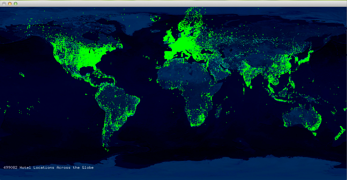
Given the database of all hotels in the world, I decided to run a TFIDF (Term Frequency Inverse Document Frequency) algorithm upon the hotel names, dividing the hotels up by countries, treating the countries like documents. In other words, given any country in the world (ie Germany), I can return a list of the most German ways to name a hotel, by comparing all the ways Germans name hotels to the entire corpus of countries, on a term by term basis.

The two addons I used were ofxCsv and ofxUI. I compiled the two of them together, but didn’t really end up utilizing ofxUI for anything practically speaking, due to the minimalist aesthetic I decided to go for, creating my own scrollbar rather than one from ofxUI.

The final interaction allows you to scroll through a text list of all of the countries in alphabetical order, alongside a few terms that are how those countries distinctly name hotels. Unfortunately, the algorithm I’ve written for the TFIDF is extremely granular, much moreso than what would realistically be required for an accurate data visualization. For this reason, my program has been running for a couple of hours and I’ll sleep on it and hopefully the numbers will have crunched fully. After the numbers of crunched, the program should export the data as a csv so that next time I open it up it should just load in the data and you can interact with it right away.

[UPDATE] After realizing my algorithm wasn’t optimized after running for 48 hours, I updated the code (from a horrendous O(n^3) to a manageable O(n^2)) and within a couple of hours, the algorithm finished. In a lot of ways, the results weren’t totally surprising. What I noticed were a few (unsurprising) trends: smaller countries tended to have their largest cities as disproportionately popular terms; countries tended to be divided among language lines; the term “Hotel” occurred much more often than I had expected considering the TFIDF process. What I suspect is that many smaller countries tended to use the term “Hotel,” while larger countries did not. For this reason, it could still be considered a disproportionately large portion of the entire corpus of appearances for those small countries.

Next steps? I’m very pleased with the general outcome of this project. My TFIDF is functional and fairly optimized. I plan to thread it as to increase speed up further. Top results also included the term “&” and a few other things I had to clean up in post, so I now know how to preprocess some of the data to ensure my results are better next time I use it.

I plan to use this algorithm for my data-selfie assignment, in which I will be using the entire corpus of my Facebook and text messaging, and very the inputs slightly to get a wide range of results (comparing how I talk to each user, comparing how I talked to a given user over time, using n-grams rather than individual terms, comparing how I talk to men vs women, comparing how women talk to me vs how men talk to me, etc.).

Spencer Barton

11 Feb 2014

Hotels of the World: Soap & a Globe

C++ and openframeworks was a whole new can or worms for me. I knew it would be tricky and I was not let down.

It began with linker errors on provided examples. I switched from VS to codeBlocks and was much happier. From there I needed to tackle the data. I quickly learned that real world data is not clean. Our dataset had NULLs scattered throughout, random unfilled sections and unlikely hotel addresses. For both of my attempts to visualize the data I did much cleaning and reduction before loading into the programs.

Attempt 1: Globe

Screenshot 2014-02-11 01.52.29

I took the simple approach of mapping hotel locations to a globe. The globe image was logical and the red dots showed well. Simple zoom, tilt and pan is implemented.

Github

Attempt 2: Bars of Soap

Screenshot 2014-02-11 01.50.51

Screenshot 2014-02-11 01.51.13

I got to thinking about hotels and I remembered all those bars of soap. Every morning at every hotel I’ve been too I get a new bar of soap even if the one I used the night before is in fine condition. I used this as inspiration. Hotel capacity by country was mapped to the area of the bars of soap in the visualization. The data being of US origin was skewed heavily towards the US and common US tourist destinations. Nonetheless it is interesting to note the shear volume of soap spent daily. This may be a gross approximation but I imagine the order of magnitude is close enough. I went for the pile of soap because this is a pile of disposed bars of soap. The user can pick-up the bars of soap.

Github

Andrew Russell

03 Feb 2014

ofxTonic

This is a wrapper for the Tonic Audio library. This library provides a simple interface for efficient audio synthesis. You can generate and combine various types of waves (sine, triangle, square, etc) and add effects to them. This looks like a great go to library for any basic audio synthesis needs.

ofxUI

This is a great UI library which provides a lot of good default widgets with a nice look. I can see myself using this library for any UI I need in openFrameworks.

ofxKinect

Having good Kinect integration is key when you want to combine skeleton tracking with audio synthesis…

Paul Peng

30 Jan 2014

I remember at the very beginning of this class Golan was like “you should really make sure to do these looking outwards posts” and I thought “I’m going to do these looking outwards posts!” It is now the third week of the semester and I have just made my first looking outwards post.

Manfred Mohr – Early Works

manfredmohr-uhf81 CIS:E.105-2008 manfredmohr-geometrichints

I am so happy that I found out about Manfred Mohr. More accurately, I am so happy that I remembered about Manfred Mohr, since I was briefly introduced to his Random Walks last semester in Electronic Media Studio II but was probably too busy playing Forget-Me-Not to remember his name. The main reason I enjoy his work and his earlier work in particular is due to the combination of the facts that it is computationally generated and that it is very stripped down, especially in comparison to the flashy color-filled compositions and fractals that populate the realm of generative art today (god I fucking hate fractals). His work is clean, concise, classy, and relies not on infinite levels of detail and vibrant colors but instead the raw power and mutability of an algorithmic composition, relying not on complexity of the surface but a much deeper complexity. Although this minimal aesthetic is probably due to limited resources at the time, I find his early works to be highly refreshing and indicative of the look I seek to build off of when I make my own generative compositions. His later works are okay, I guess.

Matthias Dörfelt – Mechanical Parts

matthiasdorfelt-mechanicalparts1 matthiasdorfelt-mechanicalparts2 matthiasdorfelt-mechanicalparts3

In this project, the artist programs a robot to make drawings for him. At first I thought it was dumb since I thought the robot would just draw out prerecorded drawings from the artist but then it turned out that the drawings weren’t prerecorded but instead randomly generated based off of a set of linear forms programmed into the robot, who would draw them in arbitrary combinations to produce decidedly not-computational-looking two-dimensional forms. This project surprised me since for some reason I never realized that you could utilize pre-drawn marks in generative art to as flexible and varied of an extent as this project demonstrates, even though it should have been obvious that you could since plenty of people already do that with literature. It really stretched my notion of the type of images that generative art is capable of, and also acts as an interesting way of preserving the artist’s drawing style from this period of time. The drawings are pretty cute as well, although a few of them are super phallic for some reason?

Various openFrameworks Users – Dolphins

alg-dolphin-saves-jpg dolphin-f Dolphin_color

When it came to picking out a work that I was highly disappointed in, I quickly chose the numerous dolphin-centric apps created using openFrameworks. The reason I was highly disappointed in these virtual dolphin experiences was because none of them actually existed. It’s a real let down when you hear about the flexibility and power of so-called “new media art” and yet you can’t find a single application about dolphins. :(