In my last post, I was mixing and matching generativity and infoVis, and this post is really no different — hopefully between the two, I’ll have delivered a complete blogpost on both topics.
Heartbeats — realistically.
A powerful and biologically accurate simulation of the beating human heart, with applications in medicine, pharmacology, and general awesomeness. This is great data viz on a number of levels, from the code to the graphics to the articulate video describing the purpose of the simulation. What I particularly love about this model is that despite the complexity of the mathematics and biological phenomena involved on the back end — and without abandoning that complexity — the researchers have created a simulation that is so aesthetically pleasing, in a way mirrors the deceptively simple elegance of the human body itself. How many people actually realize that heartbeats are this nuanced?
Daily dose of words: Shakespear(e) & Silenc(e).
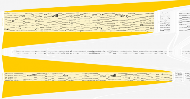
Understanding Shakespeare
I’m a little bit bitter about anything in InfoVis that tackles Shakespeare, mostly because I’ve done a bunch of meddling with it myself, and then saw a kickstarter campaign with thousands of dollars of funding for essentially the same thing I’d abandoned. In //any// case, I really enjoyed these windows into William’s classic texts. They manage to convey a lot of data while still looking typographically appealing, which is something that a lot of word/language-based pieces seem to neglect. I feel an interesting tension when I look at these pieces. On one hand, they’re great (as the creator realized) as large posters; the immense amount of text contributes to visual interest. On the other hand, I wonder if I could learn something a little more meaningful if I weren’t shown //everything//. Making these interactive with more filtering options would enhance them a lot. My biggest lament? : Where is The Tempest?!
Another project with text that is easy on the eye, and curious in concept. I’ve always wondered how the number of silent letters varies from language to language. When learning foreign languages, one feels surprisingly aware of all the ‘stuff’ one is skipping over in pronunciation: french seems to swallow everything, whereas german seems like all sharp stops and well defined vowels. Yet it’s difficult to ascertain whether this is reality or just perception. In my opinion, the most successful iteration of this project is the version where the ‘silent’ letters are moved to the bottom of the page, so one can easily visually compare quantities. One qualm: very few of the silent letters are truly ‘silent’; removing them — even from the title word ‘silenc(e)’ — has a drastic effect on how the word is said. So I guess my question is: what are we really trying to filter for here?
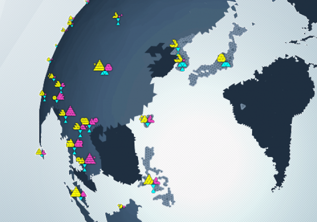
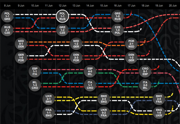
Soccer Stats. Because soccer is awesome, but the data viz is so poor…?
As somebody who tries very hard to coerce all my friends into playing fantasy champions’ league soccer while everybody else in the country plays fantasy NFL, and who therefore is always trying to answer questions like ‘who should I field this week?’ … ‘what’s a holding midfielder?’ … ‘offside?’… and ‘what country is [X] club from?’ I feel like I’m hyper aware of how hard it is to find good visualizations of soccer statistics, rules, and history. Below are two sort-of-nice but sort-of-anemic attempts at saying something about the world’s golden sport. The first actually tackles FIFA’s development work, which has the potential to be a fascinating socio-political resource as well as a sports’ resource, but the content is disappointingly shallow. The second is the interactive map from last year’s Eurocup, which I found charming, if simplistic. It’s also incorrect: Germany should’ve been the last team standing. [cough… hack… cough]