Category Archives: project-2

Bueno

06 Mar 2013

So, Caroline and I have decided to collaborate on a project together.

A few inspirations and references we hope to draw from for this:

  • Here is an awesome article about how virtual reality does and does not create presence.
  • Virtual presence through a map interface.  Click
  • making sense of maps. Click
  • Obsessively documenting where you are and what you are doing. Surveillance. Click
  • Gandhi in second life. click.
  • Camille Utterback’s Liquid Time.
  • Love of listening to other people’s stories. click
  • Archiving virtual worlds

A few artistic photographs of decayed places:

Our thoughts concerning all this surrounded Carnegie Mellon and “making your mark”. People really just past through places, and there is a kind of nostalgia in the observance of that fact. Furthermore, what “scrubs” places of our presence is just other people. There is a fantastic efficiency in the way human beings repurpose/re-experience space so that it becomes personalized for them. We conceived our project as having people give monologues and stories that can be represented geographically, using Google maps. Their act of retelling would also be a retracing of their route.

Some technically helpful links:


Here is a video sketch I did of me “walking” through a little personal story of my car incident on Google maps. This example video I made is of really crappy quality, so I apologize in advance. I was making it in kind of a rush and didn’t have time to figure out proper compression. I will upload a better version later.


Sequence 01 from Andrew Bueno on Vimeo.

~Taeyoon

02 Mar 2013

For the love of Samsung

Background

Samsung is a a multinational conglomerate company with it’s headquarter in Seoul, South Korea. Samsung holds financial, political and cultural supremacy in South Korea and is rapidly expanding globally. It is comprised of industrial subsidiaries, as well as entertainment, commodities, food market and much more. It is the archetypical Chaebol, a single family in control of the matrix of corporations and enterprises.

Samsung_Shareholders_CitiAug12

Corporate Group Share holding structure.

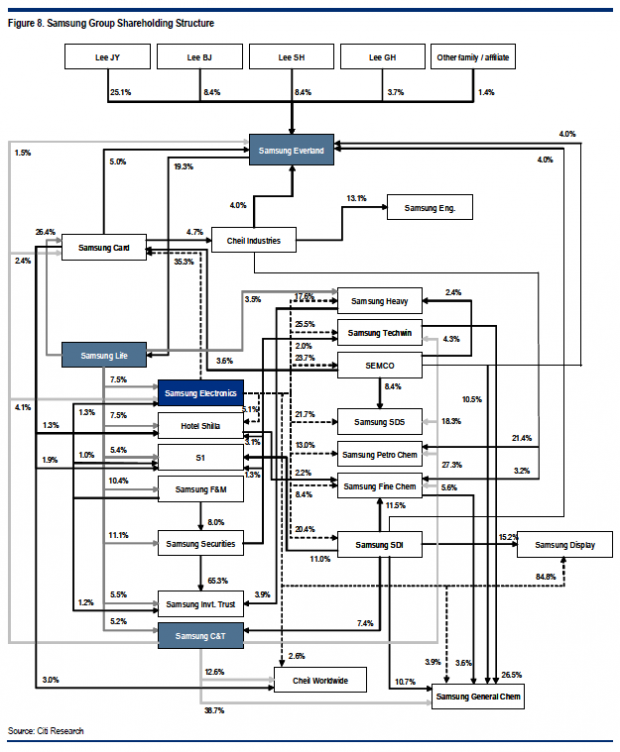
[Image 1] This diagram, created by Citi Research, shows much of the assets and profit going into Samsung Everland. It is a company that manages a Samsung theme park in the outskirt of Seoul among other services. It was the heart of controversy regarding illegal inheritance of wealth within the family that resulted in 9 year trial between 2000 ~ 2009.

0229-a04-1

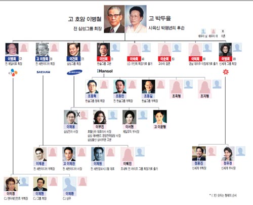
An illustrated family tree of Samsung owners.

While Samsung is cherished as the economic backbone and the pride of nation, it also attracts criticism in market monopoly and subsequent inflation, the way wealth and power is inherited and ties to the politics via arranged marriage. The family members attract celebrity-like attention as well as notoriety for their lavish lifestyle and significant role in arts, culture and sports. [Image 2] They are also subject of popular imagination, often times romanticized in K-pop drama series about arranged marriages, scandals and of course, they are the epitome of Gangnam Style.

62066_63733_4156

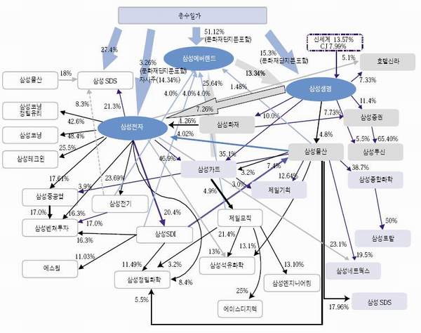
Illustration of C.E.O family and subsidiaries.

[Image 3] shows similar relations as the image #1, however with focus on the relationship between Everland, Samsung Life (insurance), and Samsung electronics. It was found in an online newspaper reporting on the correlations of various subsidiaries and the Chaebol family.

[Image 4] shows the corporate shareholding structure with subsidiaries in different colors. Download this PDF samsung

One of recent issues with the company was regarding passing on of power from Lee Gunhee to his son, Lee Jae-yong as the vice-chairman and his daughter Lee Boo-jin as the head of Everland and Hotel Shilla. Lee Gunhee and the Samsung heirs were accused of stealing from Lee’s father’s trust, as well as series of controversies when he was “found guilty of embezzlement and tax evasion in Samsung’s infamous slush funds scandal.”

1-s2.0-S0147596711000369-gr21-s2.0-S0147596711000369-gr3 
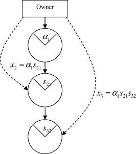
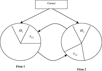
[Image 4/5] Two images on top illustrate Chaebol’s shareholding structure, that is of Pyramidal, on the left and Circular, one the right. Source Their tricks and strategies have been political and social controversy in South Korea, because of it’s tremendous scale as well as how politicians continually forgive their misbehavior. It explains South Koreans’ shared an ‘affective’ relations to Samsung.  

samsungcong

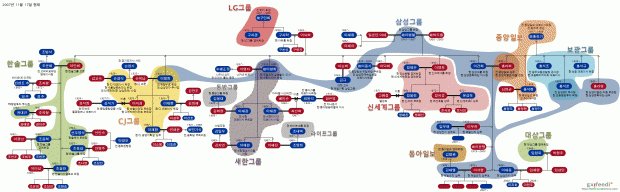
[Image 5] The image illustrates the familiar relationship of different Chaebols, Media and press, and politics. Samsung is the blue terrain that intercepts with most of other conglomerate.

When the power shift is complete, the Lee junior will be the third in Lee family to become ‘the emperor’ of Samsung. It is no doubt that the inheritance of power resembles the family on the North of border.

+ + +

Project Idea

Inspired by Golan’s comment (from the lecture) to work with data that means something to me, I’d like to search for public data on Samsung as well as other private and speculative datas on their shareholding structure. The goal is to create simple and elegant visualization of the network between subsidiaries and the Chaebol family. I appreciate the aesthetics of Mark Lombardi’s simple drawings and research and the technical achievement of They Rule.  While the illustrations I collected for the proposal are interesting, it is largely based on subjective decisions, and have been influenced by their political intentions. I’d like to create an objective view of the network that reflects complexities of the corporate structure.

Technical tasks

1. Identify data. Collect and parse data on corporate shareholding structure, translate necessary information and create a set of csv files that can be used for visualization. I did a brief search online and I fear there might not be a public data available in excel or txt file. I might need to hand craft the data from Annual report, or work with other available data on Samsung.

2. Create 2 dimensional visualization of selected data with Processing or Openframeworks. I will need to learn to use various techniques and libraries. Priority is to create systems which can be used to process various data, because each subsidiaries and sister companies may have different relation to the parent company and the family. The goal is not to create aesthetically pleasing interface, but to become familiarized with working with complex and incomplete sets of data. This is the technically challenging part of the project, therefore I will make a separate post as I make progress.

3. Translate the visualized data to other form. This is where aesthetic interest plays an important role. I’m thinking of using the data to generate 3 dimensional form to 3D print, via OpenScad or Grasshopper with Rhino. I’m new to both platform, so it will take some time to develop. I might call for collaborator on the phase 3 if will be more interesting.

+ + +

Pardon me, this assignment is a month too late. I’ve been super busy organizing workshops and exhibitions in Seoul. Check out some hackers and media artists we met for Demo-Day Seoul. Now I’m back in NY, and will continue to follow this class. I’m impressed and encouraged by other student’s work! The time frame for this assignment will be about three weeks from now, so hope to make visible progress by March 23rd, while I may continue to work on it afterwords.

thanks!

ty

Meng

18 Feb 2013

A Data Generative Art Project: Global Economy Rosalization

I used Processing to visualize global economy in an artistic way. The flower-like Lines Sketches are generated from four key index date from IMF. More information about the data are in the end of the passage.

Before I get the data visualization project, I pay attention to  World Economic Forum in January, and had a glance of the Report. The global risks is  especially interested to me, but the data charts and forms are very difficult to read.I feel, as a general reader, I am not read the data as serious as professional analysts. Instead of reading the data, I am feeling the data. So I choose global economic related visualization as one of my initial ideas. I want to the data to be more impressive, generating more feeling in the common reader, the data not only serve as a media facilitate reading (Even thought I feel this goal is not achieved when I read the wef report).
Also, I feel meaningful data generative art is not only an random generative fun/eye candy, but interpreting one media to another – to build a bridge between different dialogue. Maybe the interpretation is not very powerful/impressive, but I learned how to interpret by interpreting the economic to roses.

I chose Processing as my coding environment, and started by drawing a line-rose with some magic numbers. The picture is pretty rose-like. But after using the real data. The economy of the countries kinda freak out, not like a rose at all( or like a crazy rose).
Screen Shot 2013-02-18 at 7.49.33 AM

I basically learn coding/processing by myself. During my time writing this, feel my code is not well written (I feel puzzled at when there are more than one ways of writing it but I can’t tell which is the better way),for example, not-efficiency, bad structure. I want to write elegant code. If anyone could take a look at my code at github and pointing out some problems, I would be very glad! (Thanks in advance!)

http://www.weforum.org/reports
I have to admitt:

Finally, this is the source code at git hub
https://github.com/mengs/EconRose

PS: About Data
Data Source:
October 2012 World Economic Outlook
IMF http://www.imf.org/

Selected Data Items:
GDP
Inflation
Population
Government Revenue

Total sample:
185 Countries

Ersatz

17 Feb 2013

Screen Shot 2013-02-17 at 9.03.37 PM

Description

Twitter Faces is a real-time data visualization of agregated people mood in cities around the world. Every two minutes, the application gets the latest one hundred tweets
around a city and does a basic sentimental analysis. Then an average mood is calculated, based on the number of positive and negative people comments, and visualized as a smiling or a sad face.

Implementation

diagram

The application is divided in two, a server and a client. The server is implemented, using server side JavaScript with Node.JS and the client, uses Processing’s little brother – Processing.js, so the visualization could be loaded on every major browser, without the need for additional plug-ins, like Java or Flash. Procesing.js is also supported on almost every modern mobile browser, but for now it runs rather slow, so for a better support on mobile, I will need to use something different, like CSS3 transforms and animations, or an SVG framework like Raphael.JS.

Sentiment Analysis

For the sentiment analysis, I have decided to use the most basic algorithm. I would scan every tweet and count every positive or negative word, found in a word list. The average mood is calculated like this: MOOD = POSITIVE WORD COUNT – NEGATIVE WORD COUNT, if the MOOD is equal to zero, the tweet is marked as neutral, if the MOOD is higher then 0, the tweet is marked as positive and if MOOD is lower then 0, as negative.

I have looked into using Sentiment analysis sites, like http://sentiment140.com, but most of them were paid services and querying an additional API would slow things down, so for this project I decided to go with something free and fast.

Server Side

The server side script, runs on (you guessed it) the server :) It’s implemented with Node.js, using Socket.IO and Twit modules. Every two minutes the script will download the last 100 tweets from four cities (London, Cape Town, New York, Sydney – all English speaking), then it will do a sentiment analysis and save the aggregated results as an array. On the other side, it will listen for client connections and will respond to all requests for data.

Client Side

The client runs in the user’s browser and the application could be loaded in almost every major browser version. When loaded the application connects to the server and request all aggregated city data. Then from the average sentiment data, it will generate a face expressing the mood of the people tweeting around the city. The application runs in real time, so all face changes, on new data, are animated. I really wanted to make the face looks more lively, so I have implemented some animations, like rolling and closing eyes, running all the time.

Source Code: Github
Demo: http://www.kamend.com/demos/twitterfaces/

Yvonne

10 Feb 2013

I’m trying to make a data visualization using an animal shelter dataset I found here (https://data.weatherfordtx.gov/Community-Services/Animal-Shelter-All-Animal-Cases/2ek5-qq7s). I have 29,600 animals since 2007. Information includes animal type, breed, gender, name, arrival date, arrival reason, etc. At the moment I am currently trying to create a visualization using toxiclibs that involves particles. Each animal is a particle that moves into and out of the shelter on a time basis. I’m trying to get it so you can organize the particles to understand the data in different ways (number of black animals vs. other colored animals in the shelter, number of euthanizations, number of dogs vs. number of cats).

I’m also interested in other items of data, such as the number of pounds of animals euthanized. As well as reasons for shelter arrival and so forth. I’m also working on a code that enables a user to click on a particle and get the animal’s name and other data.

I guess I don’t have it entirely fleshed out because I’m unsure what I am capable of producing. At the moment I have a particles system working and my API data is finally coming into Processing correctly. I just need to get the two to work together and produce something interesting.

I have rough sketches, but unfortunately I left them at studio and don’t have photos of them. I’ll bring them to class on Monday.

Michael

10 Feb 2013

Update 2/11/13

Woo!  The good news is that I figured out that I don’t need to split the image and can just serve chunks of it at a time using some more complex Sifteo commands, which eliminates the blind spots and should enable me to scroll smoothly using tilting gestures.  The slightly bad news means that I need to rewrite a lot of stuff, and so I’ve posted a new list below.

1. Get the newest image from a dropbox or git repository (Probably trivial)

2. Write processing script to resize and convert images and autogenerate a LUA script (Needs a rewrite…)

3.  Regularly run the processing script, re-compile, and re-upload to the Sifteo base (Maybe not too hard)

4.  Figure out how to rotate images (Done by rotating orientation, which is a good move.)

5.  Figure out how to pan around a larger image with one cube, and then make this tilt-dependent.  (Done, but needs to be smoother.  Takes a leaf from both the sensor demo and the stars demo.)

6.  Fix some weird scrolling issues and do image edge detection and handling (In progress)

—— These are optional but will let me do images that are 4x larger ——

7.  Devise a scheme for managing asset groups better on the limited cube resources (tough but interesting)

8.  Devise a scheme to predict which asset group will be needed next and load in a timely manner to keep the interaction smooth (Hard but very interesting and possibly publishable)


2/10/13

This post is meant as a living document to track my status on Project 2.  In my sketch, I made a list of steps that needed to be completed for the project, along with their estimated difficulty.  Now that I’ve made some progress and added a few things to the list as well, I figure I’ll update this post regularly to reflect where I’m at.

The general idea of the project is to create a system to allow children to explore large images on a small scale by using arrangements of Sifteo cubes as windows through which to view the larger picture.  This is an extension of my Project 1 work with Sifteo cubes

1. Get the newest image from a dropbox or git repository (Probably trivial)

2. Write processing script to chop images and autogenerate a LUA script (Done.  Also generates a short .h file to store the number of rows and columns.)

3.  Regularly run the processing script, re-compile, and re-upload to the Sifteo base (Maybe not too hard)

4.  Figure out how to rotate images (Done.  There may be more elegant ways to do this.)

5.  Figure out how to pan around a larger image with one cube, and then make this tilt-dependent.  (probably tough but essential to a good interaction.)

6.  Devise a scheme for managing asset groups better on the limited cube resources (tough but interesting)

7.  Devise a scheme to predict which asset group will be needed next and load in a timely manner to keep the interaction smooth (Hard but very interesting and possibly publishable)

Ersatz

07 Feb 2013

Twitter Faces

Does social networks have emotions? For this project, I would like to experiment and try to put a face and extract expressions from Tweets around the world. The idea is to get a decent amount of recent tweets around the center of a big city, for example New York, do a basic sentiment analysis and extract an average mood of the people posting. The application will run in real time and I will query for new tweets every 5 or 10 minutes, this way I could create a lively face, that constantly changes mood and expressions. I think it will be really interesting to see the overall mood of people in a certain city, are they happy when there is a big event coming up, or are they sad, if something bad has happend. For the moment, I will use a really basic sentiment analysis, using only dictionaries with positive and negative words, but along the way, I could switch to a more complex method, if I find something suitable for real time processing.

Here is just a quick sketch I did in Illustrator, just to show how the application might look. The idea is that the face and expression changes will be animated, so we could get that lively feel. Also, I could list the most mentioned positive or negative words.

Twitter Faces

I will probably implement the app in Openframeworks, but I am also thinking about doing an online version, probably using Processing.js

Any comments are welcomed!

Elwin

06 Feb 2013

Generative Art

I had a hard time choosing which topic I should do for my assignment. Information visualization seems more approachable to me, but I’ve decided to go for generative art since I’ve never really done anything like that before.

Concept: Thalassophobia

In my initial concept, I Wondered if it’s possible to create something abstract that provokes the feeling of thalassophobia and giant sea creatures with generative art.

The abstract art could be made out of dynamic dark blue/green/grey colors blobs or blurry particles, which will move very slowly across the screen. I’m also thinking to combine this with dark ambient music to create suspense, and if possible project this in a cave projection system. This all sounds very interesting to me, but I have no idea to be honest where to start yet since I’ve never done any kind of artsy (abstract) visualization before. This could be challenging…

Process

Creating generative art is tougher then I thought. It’s quite difficult to find good tutorials online, explaining the fundamentals and guide you through the process. I went through several books and finally got my hands on Matt Pearson’s “Generative Art: A practical guide using processing“. This is truly an amazing book. It helped me to understand various types of generative art. But even with the basic knowledge, I felt clueless on where to start. I ended up tweaking a lot of the examples, trying to combine different sketches, but I didn’t like any of the results. The deadline is getting closer and closer, and I’ll need to prioritize and make decisions based on time, knowledge and capability to code something artsy. In the end, I modified my initial concept and I experimented with some code.

Eye of Cthulhu

I threw away the idea of adding dynamic colors and motion, and went for black and white and static rotation instead. I made minor tweaks to Matt Pearson’s Sutcliffe Pentagons code and played with the variables to create various effects. For the ambiance and suspense, I was able to find an audio track from Svartsinn & Gydja – Terrenum Corpus which worked very well with the generated visualizations. Also, I was able to get permission to use the cave projection system at the ETC, but I haven’t tried projecting my visualizations yet (will try that Monday).

As for the art, it uses the Sutcliffe Pentagons algorithm, but I’m using 32 sides instead of 5 sides and it projects fractals to the outside. I added 2 to 4 additional Sutcliffe Pentagons next to each other, varied the radius, strutFactor with perlin noise to create the effects below.


The results are quite cool, but I’m not completely satisfied with the overall goal. It feels like I should do more or be more bold in the experimentation, but again I felt stuck during my development process. As a post-mortem, I think I was a bit too ambitious coming in this project with zero knowledge for creating generative art. I would need to take more time to gain more experience, develop stronger coding and math skills for future artwork.

Bueno

06 Feb 2013

We recently confronted a problem in Great Theoretical Ideas in Computer Science that had to do with wrapping rope around pegs in such a way that removing any one of them would cause the entire mass to fall. The proper answers were, I thought, rather aesthetically pleasing, and as a result I have decided to see if I can create the ultimate knot. There’s actually a lot of mathematical theory behind knots – here’s a diagram i found with only a few minutes of searchging:

I’d like these knots to be generated in a genetic fashion. Perhaps i give the knot maker a specific task to fill, and see what knot best fulfills the task. Perhaps instead I go for visual complexity, or ease of replication by a human being. Imagine chaining together multiple knots…

I would like this program to be able to “play back” how a knot is tied. This generated animation could itself be a point of focus of the project.