Stopping The Dead // by Richard Johnson and Andrew Barr

Interesting project: I only recently started watching The Walking Dead and I couldn’t help it but to finish watching all 3 seasons in just a couple of weeks because the show is just that awesome. Naturally, finding this infographic immediately caught my attention. The data visualized on the image is very very detailed. The artists captured all on screen zombie kills, linked them to the person who killed it and with which weapon, and even put them in chronological order in which they were killed in all 27 episodes!!!
How long will we live — and how well?
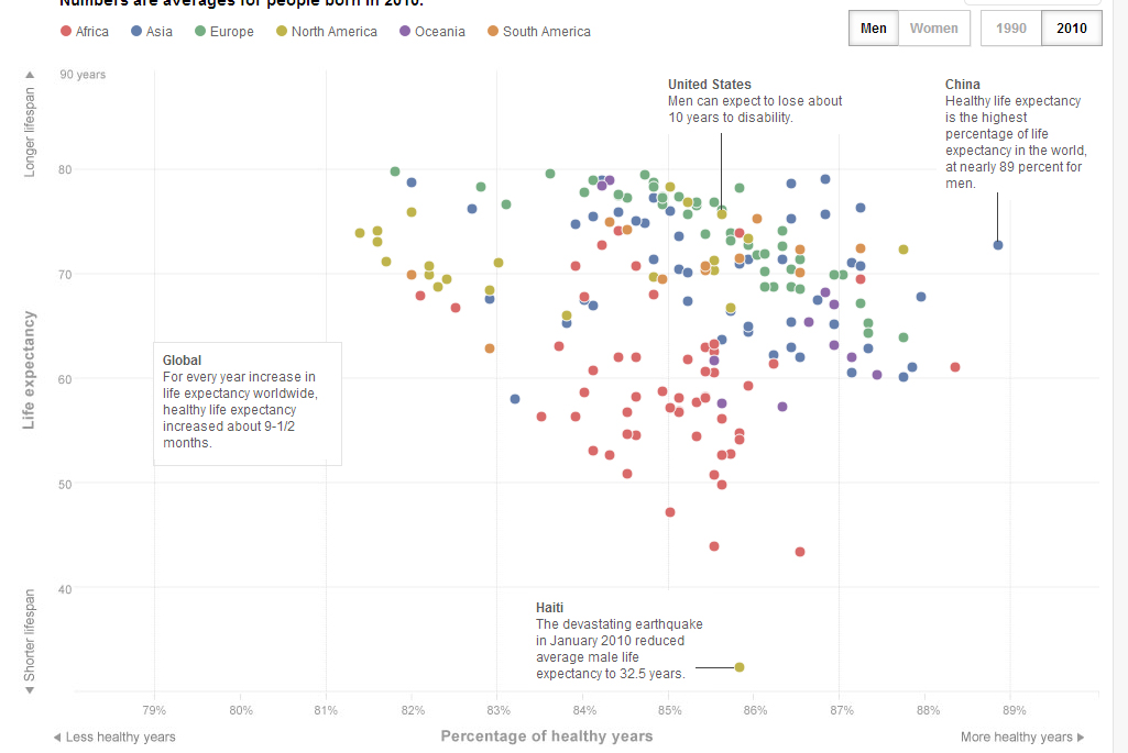
Provocative: I think this is a very interesting data set which will and has lead to discussion on the internet. Especially when the information is also visualizing “Healthy years” in addition to the Life Expectancy. Men in China have a lower life expectancy of 72.9 years compared to the 75.9 years for men in the US. But what’s interesting is that Chinese men has a higher number of healthy years (64.7) compared to their life expectancy, which results in a difference of 8.2 years. The US men live 65.0 healthy years, which means there’s a discrepancy of 10.9 years. While I’m not certain if this is true, this makes me wonder about the accuracy of the data and the reliability of the data providers. How well is everything documented by researchers, government, medical institutions? To my surprise, they even have results for North-Korea. Entire article link
OrgOrgChart // by Justin Matejka
Well-crafted: A Beautiful visualization with nodes, colors and organic change over time. The OrgOrgChart (Organic Organization Chart) project looks at the evolution of Autodesk’s organizational structure and a snapshot was taken each day between May 2007 and June 2011, a span of 1498 days as data. Each day the entire hierarchy of the company is constructed as a tree with each employee represented by a circle, and a line connecting each employee with his or her manager. Each second in the video is approximately 1 week of data. I wished they could have slowed the video down so analyze and watch the changes in data more carefully.