Cool Visualization Stuff!
Ladder of Abstraction – Bret Victor
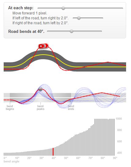
This isn’t exactly a visualization of a dataset, but it’s a visualization and an explanation of an approach toward visualization (if that makes any sense). The article explains that complex systems can be better understood when the system is viewed at multiple levels of abstraction and control. The author illustrates his point by using a simple toy example of a car driving along a curvy road. I find this interactive addition to be particularly useful in understanding the author’s point, and as a result, I have used this strategy in some of my past projects. Bret Victor (large ego aside) does an effective job of illustrating a complex approach using the approach itself. In summary: The best way to understand a complex system is to view it both from the eagle’s perspective as well as the ant’s perspective, and everything in between and sideways. For those of us that learn by interacting, we need the affordances to change the system and move up and down the ladder of abstraction.
Thinking Machine 4 – Martin Wattenberg
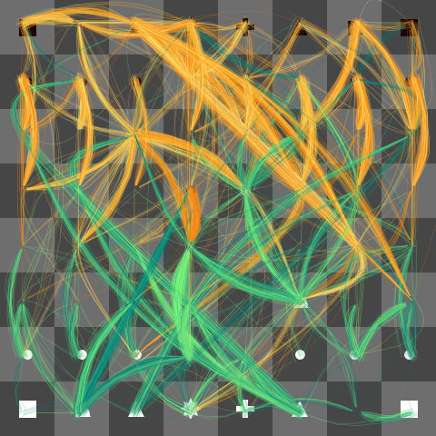
Unfortunately the game itself wouldn’t load for me, but I still find this compelling enough to write about. It also is an example of something which could be considered both a visualization of data and a generative form. Wattenberg and friends have created a chess-playing program that differs in one unusual way: It reveals the computer opponent’s “thoughts,” or its anticipation of your possible moves and its best maneuvers through multiple iterations. By playing the game, the number of possible futures can be seen to converge to victory, loss, or stalemate. I find this interesting as humans are constantly evaluating both their own internal state and the internal states of those around them. We’re fairly good at it, I would argue, but we still can only guess. For computers, though, we typically have very little insight into individual decisions made in order to serve us a particular set of outputs. Sometimes their actions seem unprompted. Why is my hard drive spinning furiously? Is it backing something up? Updating software? Do I have a virus?
I envision a future (hopefully a result, in part, of my thesis) where computers and humans work together in true collaboration to solve complex problems with massive amounts of both abstract context and quantitative data. In order for this to come to pass, the mind of the computer must be as transparent as the user’s own.
Health Infoscape – GE, MIT SENSEable City Lab
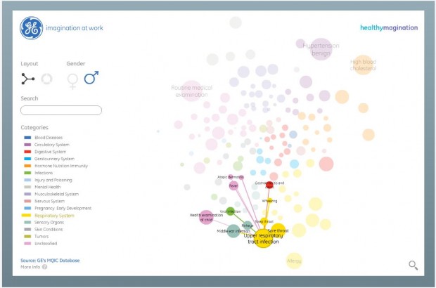
The goal of this application is to show the link between various symptoms in terms of which ones are likely to accompany others. I think this is a fantastic dataset (7.2 million patient records) but only a mediocre visualization. Clicking a symptom reveals its nearest neighbors. These can be sorted by color-coded categories like mental health, and the set is divided by gender. The user can also switch between circle or cluster mode. It’s certainly pretty and not without its uses, but I feel like it falls short of being truly informative or “useful.”
Here’s what I would like to see: First of all, links should be persistent so that multiple symptoms can be selected at one time. Second, individual and joint Bayesian probabilities should be displayed or at least represented clearly in some manner such as line thickness. Third, links should fade once these probabilities drop below a certain threshold. Fourth, perhaps, these changes should exist in an advanced mode, for people who prefer things simpler… see the Ladder of Abstraction, I suppose.