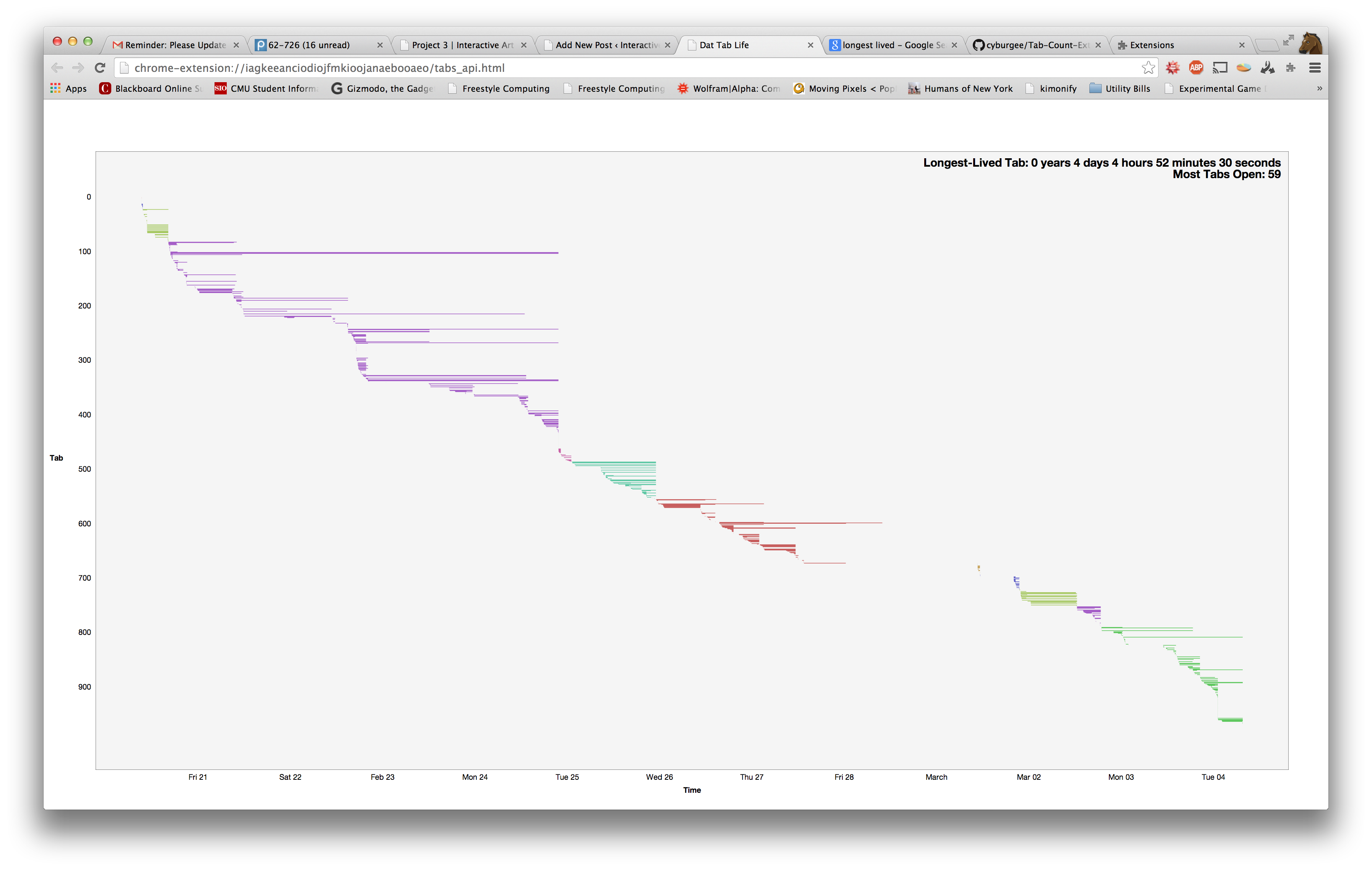
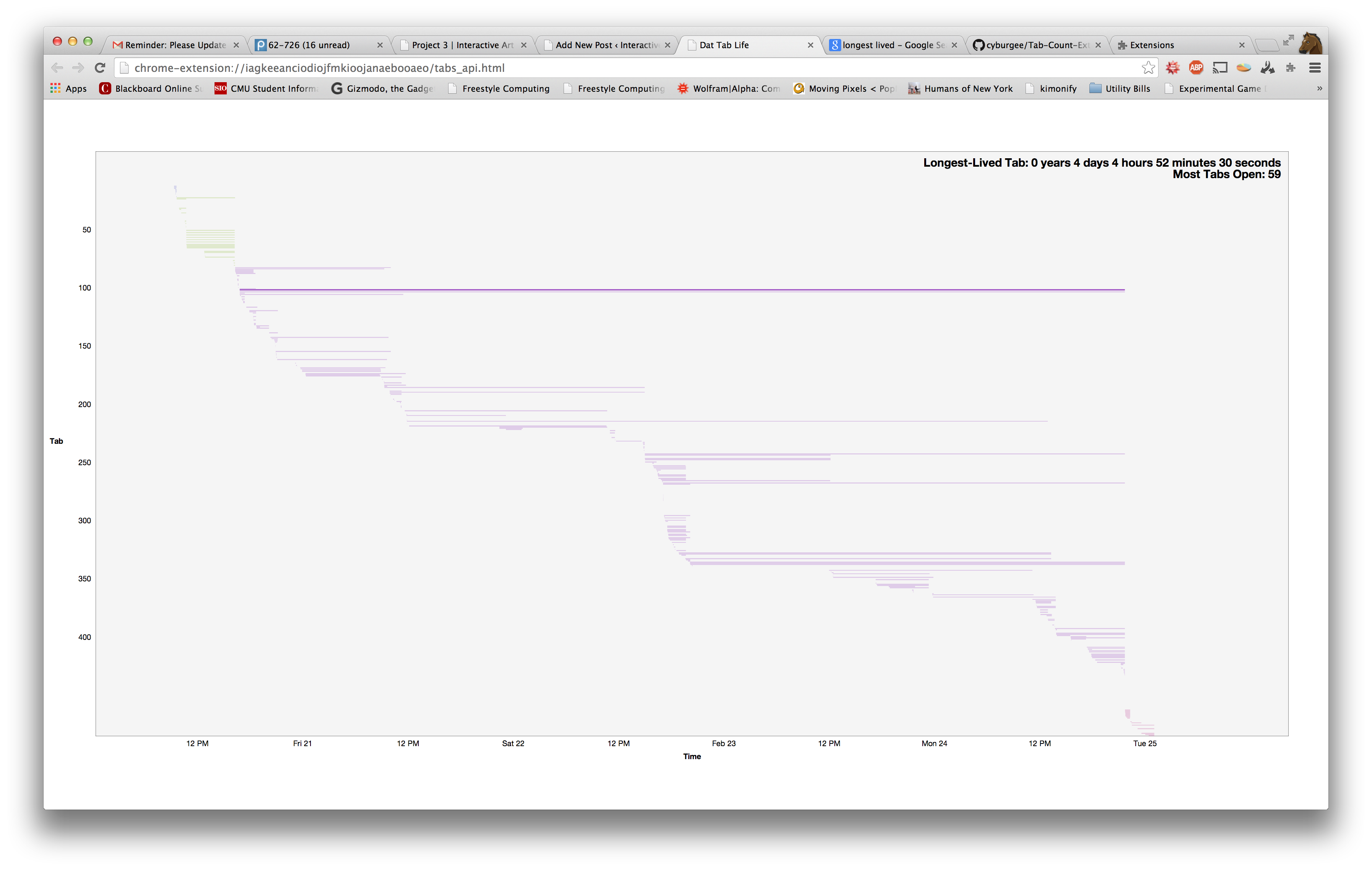
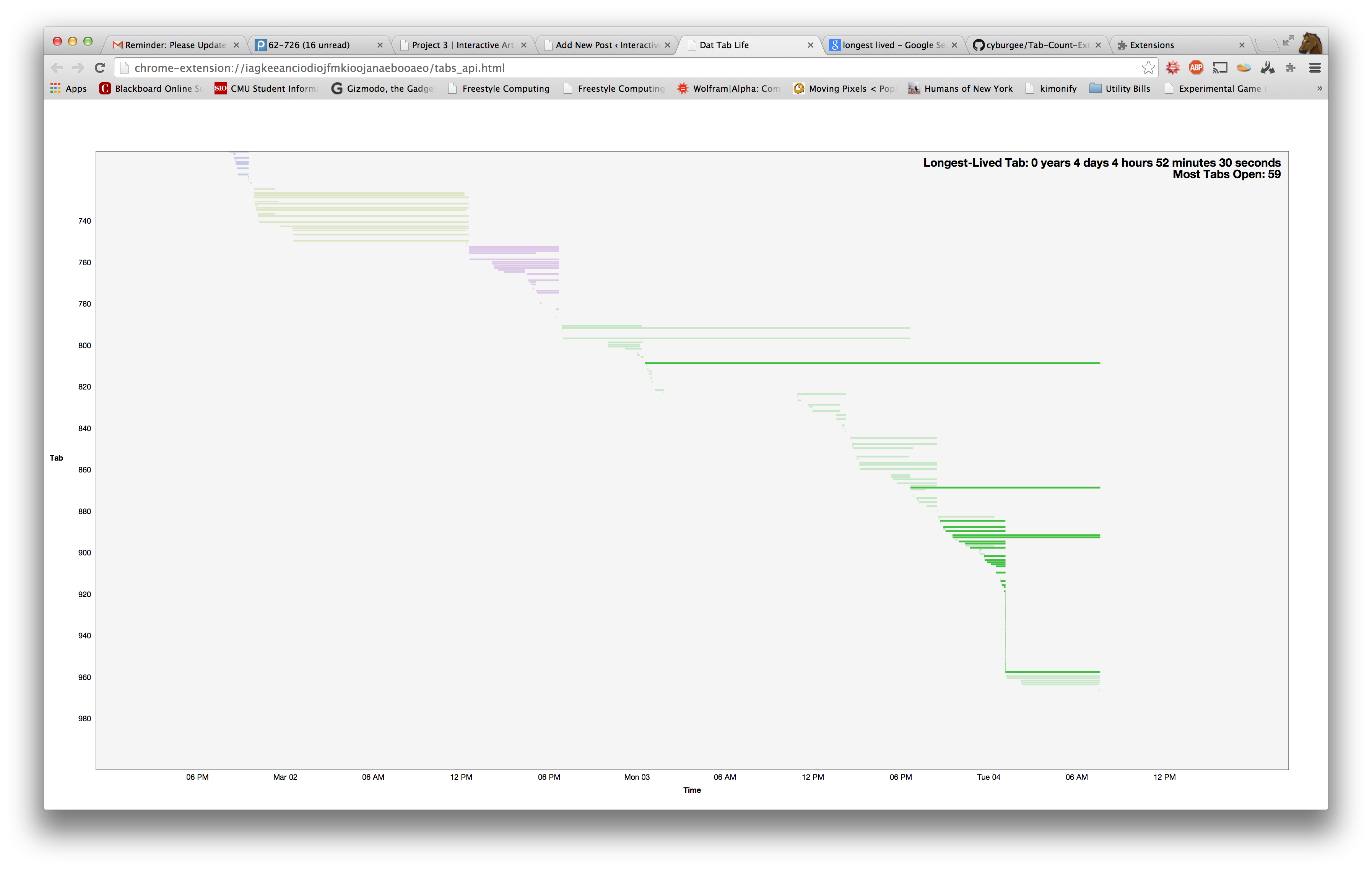
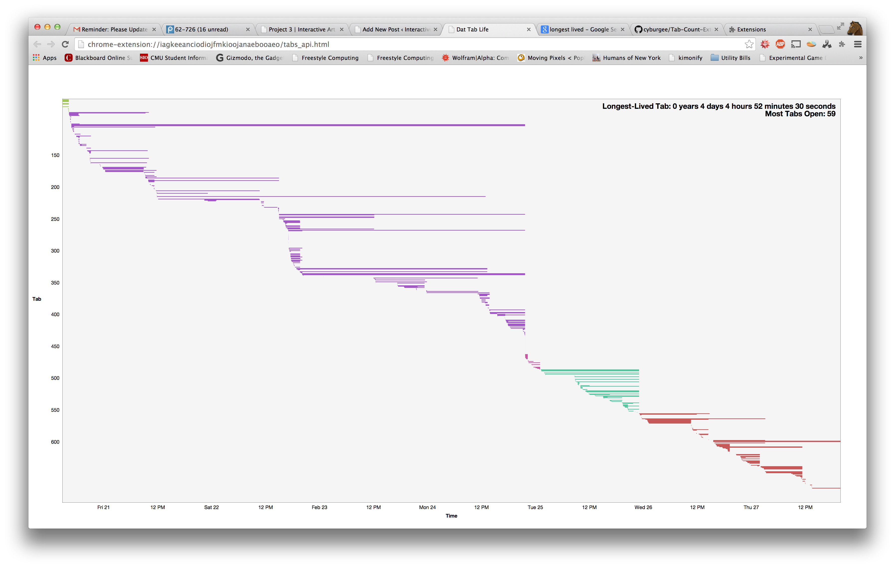
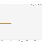
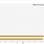
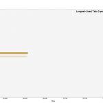
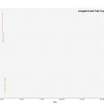
The Tweetable Version: A Chrome extension that allows you to examine the structure of your browsing history.
My ‘Quantified Selfie’ is a Google Chrome browser extension that records and visualizes the lives and deaths of the users’ tabs, providing a new tool to analyze Internet browsing style. I was inspired in a spur-of-the-moment fashion to inquire about the patterns that might distinguish certain people and their way of accessing the Internet, and do so in a way that was content-neutral. After continued use, I could find in my own visualization bursts of rapid tab creation that coincided with times that I was programming.
My transition from high school to college through weekly planners.
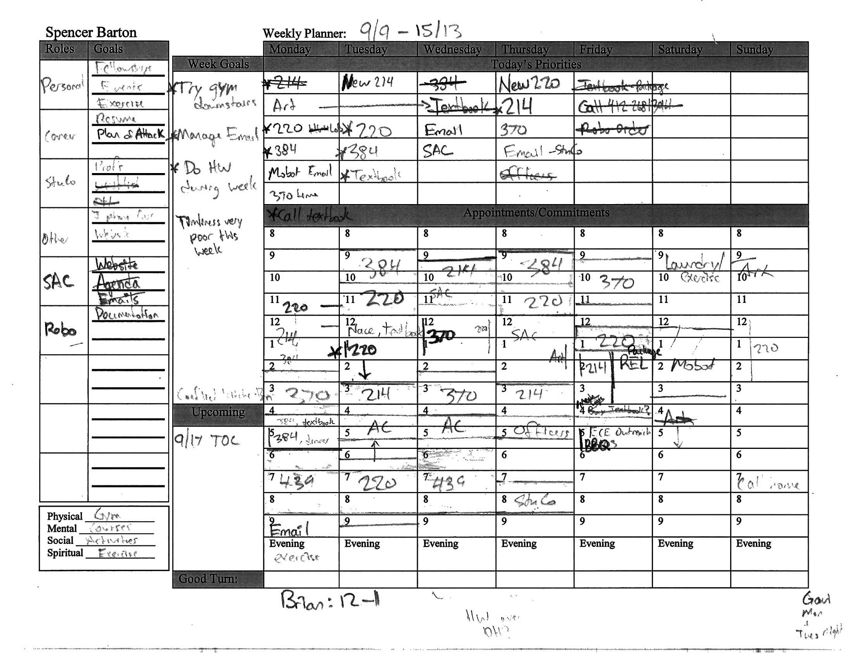
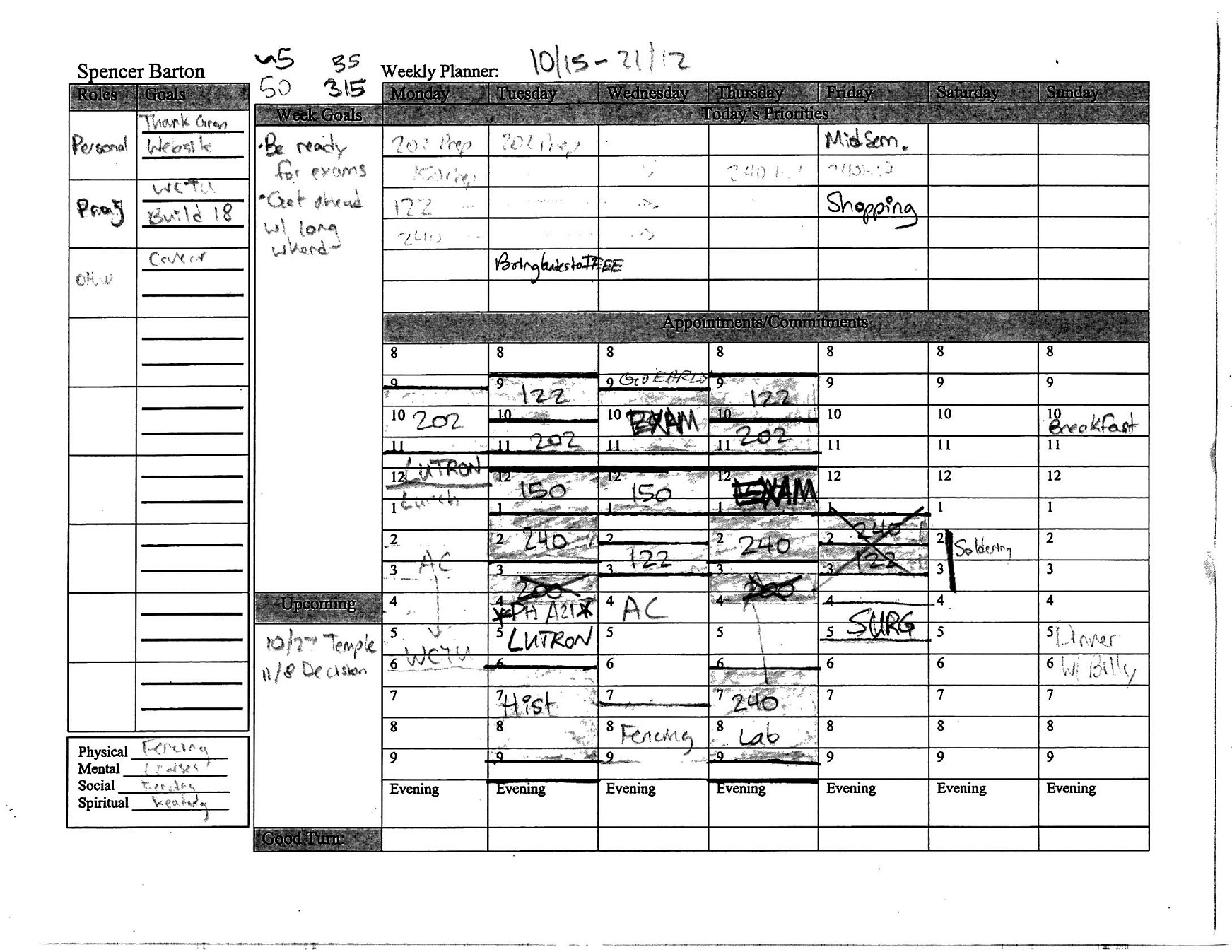
As a senior in highschool I started keeping weekly planners. These planners are a combination of calendar, todo list and weekly goals. I have saved these planners since the beginning. I could not resist using this dataset.
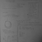
A planner from high school:
Because my planners were all on paper I decided to focus in on a few key elements of the data.
A brief aside – why do I keep all this stuff in paper? Google calendar works much better you might say. I use paper because I have complete control. The interface is however I envision it and data entry is never constrained to text boxes.
For this project I focused in on data in the left half of the planners: the roles/goals category and the week priorities category. The roles/goals category is a todo list organized by activity. For each activity in my life I would then have at most 3 goals. The week priorities category is for goals during the week or major things happening during that week that I wanted to make special note of. I focused on these boxes because these lists contained data with sufficient granularity without the minutia of calendar events. These goals represent the focus and aspirations in my life week by week.
Before continuing into data parsing and analysis it is important to note first that these planners are a variant of Stephen Covey’s version from “7 Habits.” I read that book in the summer before senior year in high school and began with these planners. It is also important to note that these planners overwhelmingly represent my time during school.
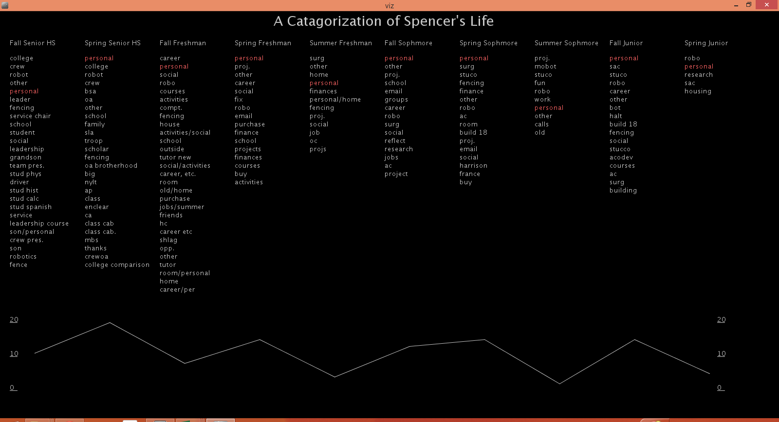
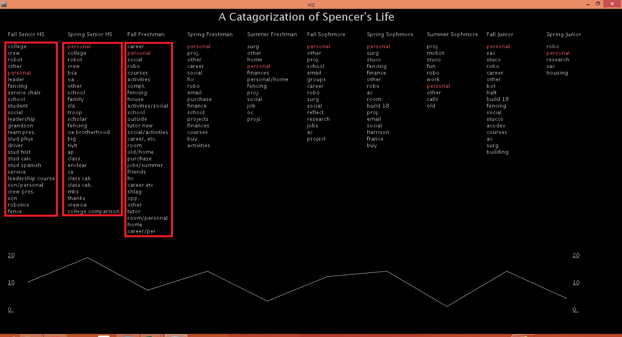
A Categorization of Spencer’s Life
My main visualization focused around the roles/goals section of my weekly planners. I decided to examine just the my roles over time.
Roles represent the major segments in my life at any given time. Most of these things are activities: Boy Scouts, Robotics Club and Fencing. I felt that the most interesting component of this data was focusing on the frequency of occurrence over time.
I created a frequency visualizer in Processing. Activities are organized into groupings by times of my life (high school, summer after Freshman year, etc.). Within each life bucket the activities are ordered by frequency with the most common activities on top. The list of words is a bar graph showing the spread of activities. When you mouse over an activity, that activity is highlighted across time and a line graph is displayed below showing the frequency.
Live page on Github. Code also on Github. Please take a look at the README before diving into the code – it is a mess and will likely never be cleaned up.
Focusing in on the Data
Summary Statistics
I started by looking at a few bits of summary information:
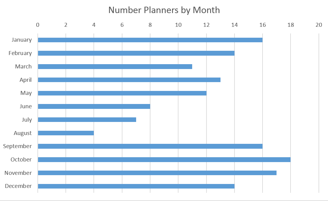
As you can see I started keeping planners at the end of 2010 (senior year high school fall) and have been keeping planners since then. I’ve been fairly consistent about filling them out since then though it is worth noting that I never completed all 52 weeks in a year. This is mostly because I did not fill out planners during breaks. This can be better seen in this graph of the number of planners by month:
The months were I am in school as the most heavily represented. I only really need time planners when my life gets complicated/stressful so the summer is significantly less represented. I did still fill out some planners in the summer, particularly when I had a job the past two summers.
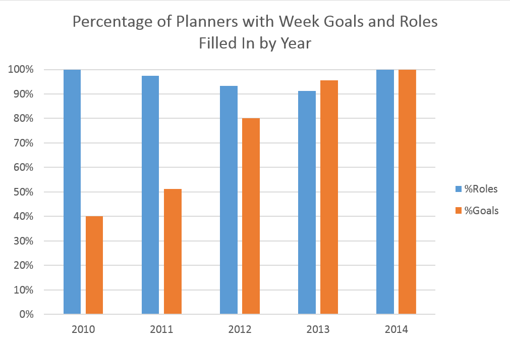
The above chart shows usage patterns over the years. I focused in on only two sections of the weekly planners: the roles/todo list section and the weekly goals. As can be seen I started using weekly goals much more in my college years. I think this has more to do with the structure of high school work versus college work. In high school assignments were daily so there was less need to write weekly goals looking at longer term projects. Life in high school was also much less complicated.
Specific Insights
One of the first things that I noticed in my visualization was that I was more active in high school and first semester freshman year. By active I mean that my spread of activities was greater. This can be seen in the visualization by noticing that there are more activities in the first few sections in my data. This seems to refute the data above that shows high school to be a simpler time based on goal writing. However, I think that the real insight here is that while I was more involved in high school, life details like social activities and laundry were more a concern in college which resulted in more goal writing.
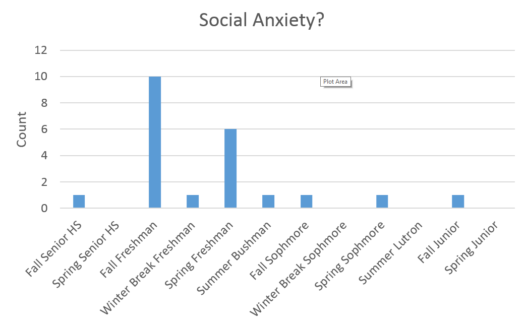
I found the social category interesting and I noticed a pattern:
Apparently I was feeling socially anxious enough to put social activities on my todo list during my first year of college. As for after freshman year I would like to think that I became more socially mature but perhaps work simply drowned out the social stuff. Also of note, In the chart above Summer Bushman and Summer Lutron refer to where I was working. There were no records for the summer between high school and college.
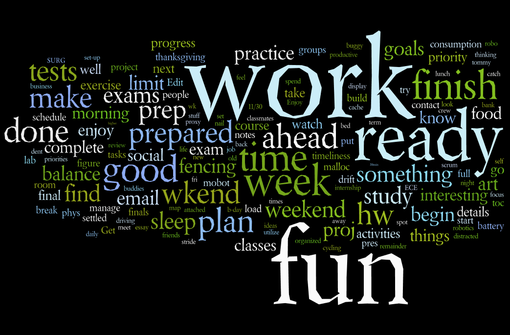
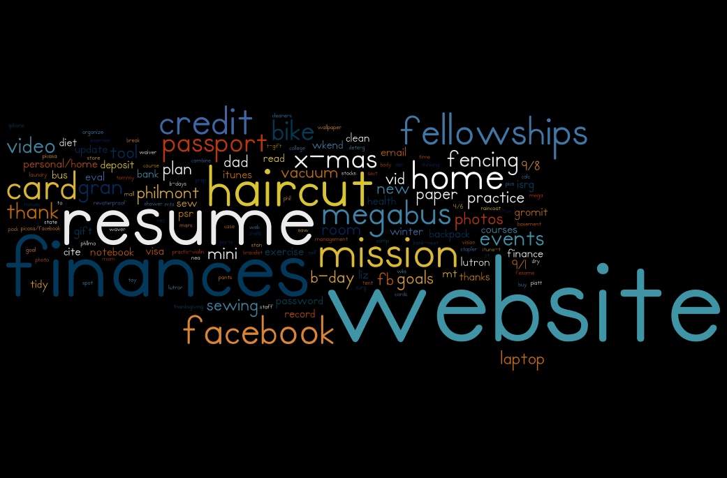
Speaking of fun and work, below is a cloud of common words in my weekly goals.
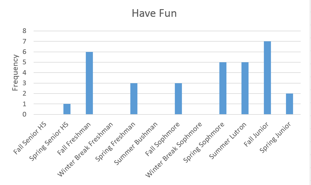
Fun and work seemed to trump the others. Work was not a surprise as it is common for me to write weekly goals like “work on my website.” Fun was a bit of a surprise. I decided to dig a bit deeper by looking at frequency over time:
I really started to tell myself to have fun in college. By telling myself to have fun that usually meant that I currently wasn’t having fun or felt stressed. It is interesting to see spikes my first semester and a rising trend in recent semesters (note that I am currently in Spring Junior). However I find it more interesting what happened between semesters. Most breaks I felt no need to tell myself to have fun except for Summer Lutron. Last summer I worked at Lutron Electronics and I did not enjoy the experience – perhaps it shows?
Other Findings: Website
A look at the specific tasks associated with the personal category:
For some reason I’ve been putting off creating a personal website. This is apparent when I look at the personal category above. I started writing website as a task beginning sophomore year a few weeks after the career fair. I’ve been writing it as a goal since then and well its not done yet. Here is that first occurrence of the dreaded website:
The Process
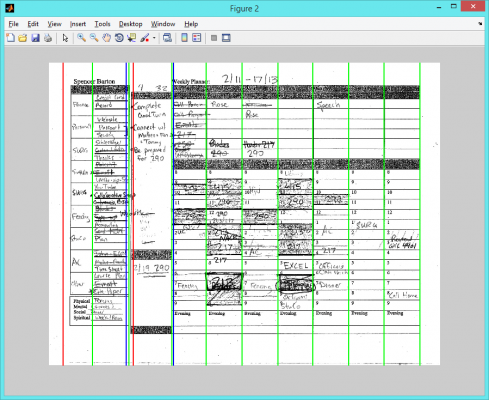
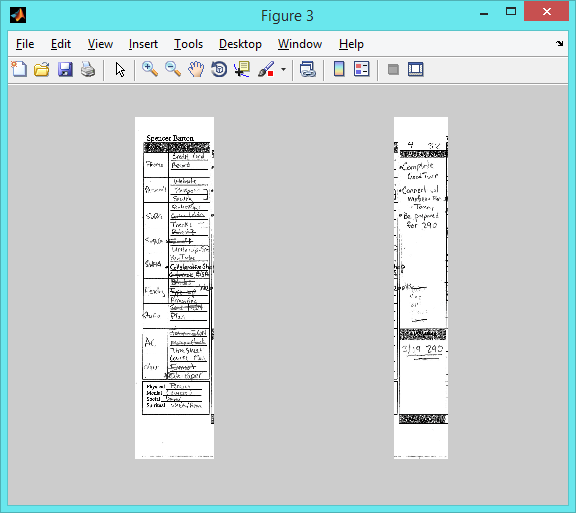
A large part of this project was spent digitizing the paper planners.
Image Processing
I went through quite a process to extract the images
Scan planners, convert format
Rename planners by date manually
Photoshop routine for contrast and rotation
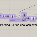
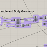
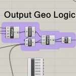
Edge detection and separation into role/goals and weekly goals with Matlab
The Matlab scripts did some edge detection and then found Houghes lines. The planners were then split using the found lines:
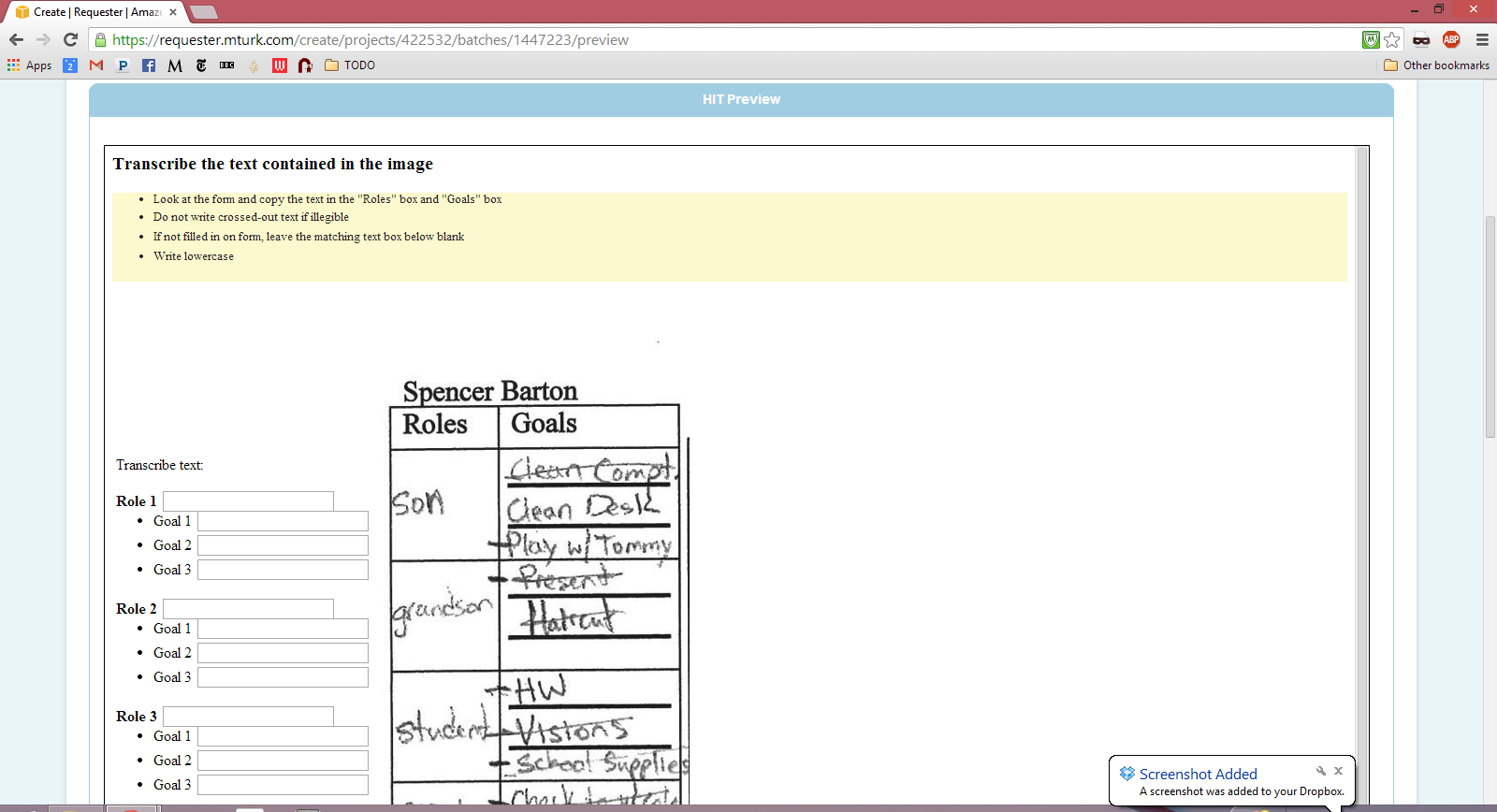
After splitting the planners I used Mechanical Turk to transcribe the text.
Amazon’s Mechanical Turk
Mechanical Turk is an amazing service where you put up a HIT (Human Intelligence Task) and hundreds of people simply do the work for you. This service is perfect for tasks such as text transcription where computers have more trouble.
To use Mechanical Turk I first created a HIT which is a simple HTML form that the Turks fill out. Here is what the Turkers saw for my HIT:
I created two HITs, one for the weekly goals and another for the roles/goals section. I offered 6 cents per paper for the weekly goals and 50 cents for the roles/goals.
Here is how the Turkers did:
The 50 cent task which had 140 transcriptions completed in a few hours while the other task didn’t finish in the 2 days I gave. Obviously there is a happy medium between 6 cents and 50 cents.
Feedback
My summary of the class feedback:
– Technical part good but needed more insights
– Too much (condense data)
– Focus on interesting parts
– Felton report is a great example
– Ask questions and focus in on those
– Need to spend more time diving into the data
Hopefully I have addressed some of these concerns with this blog post.
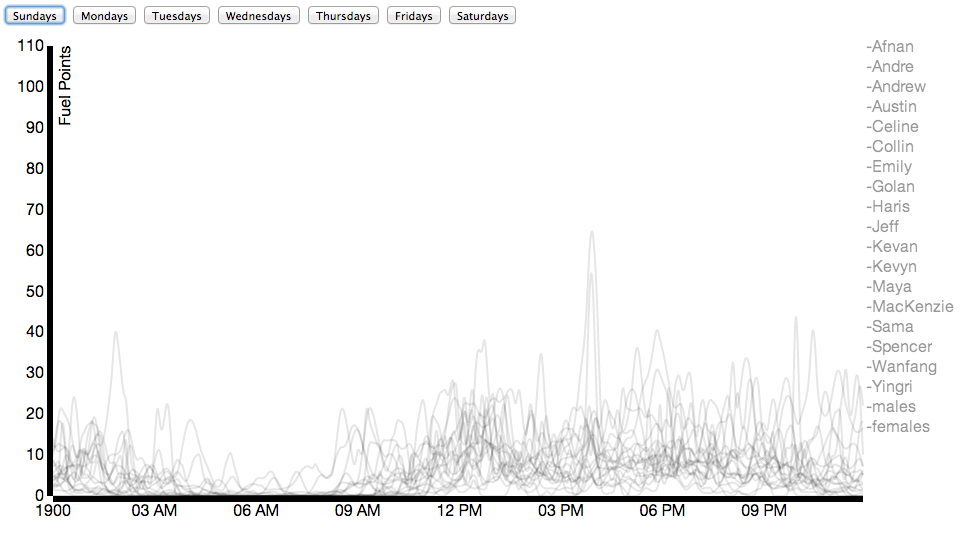
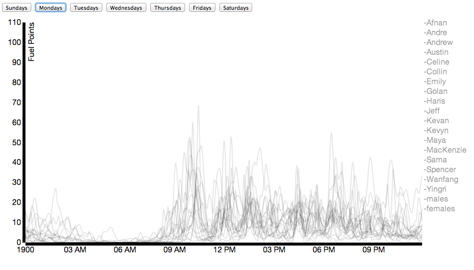
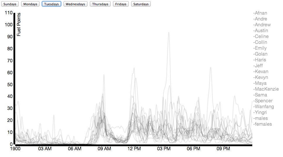
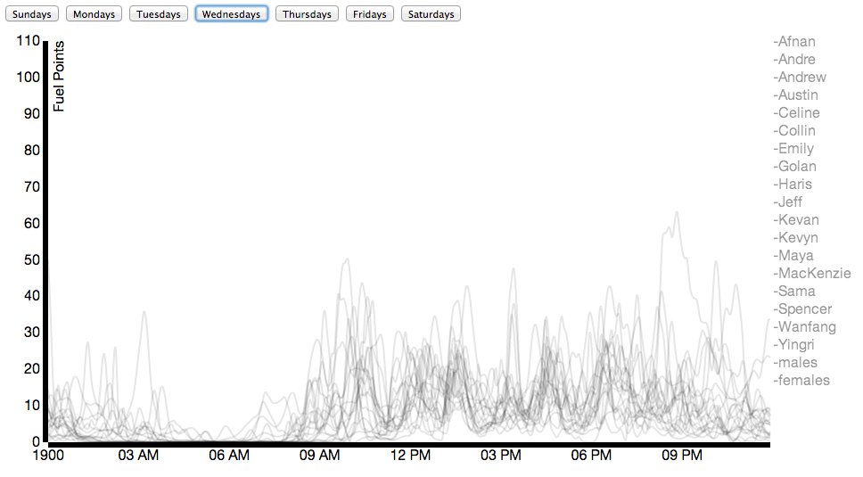
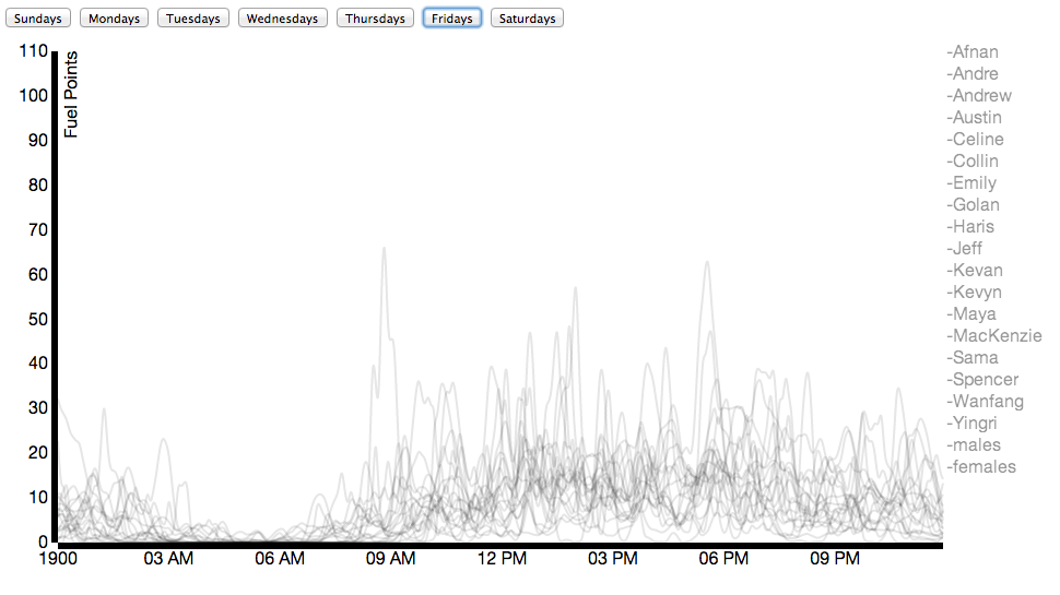
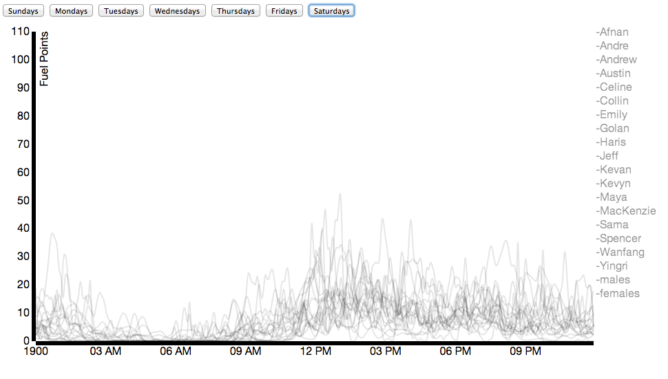
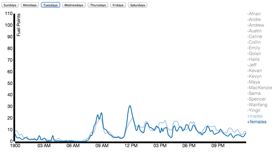
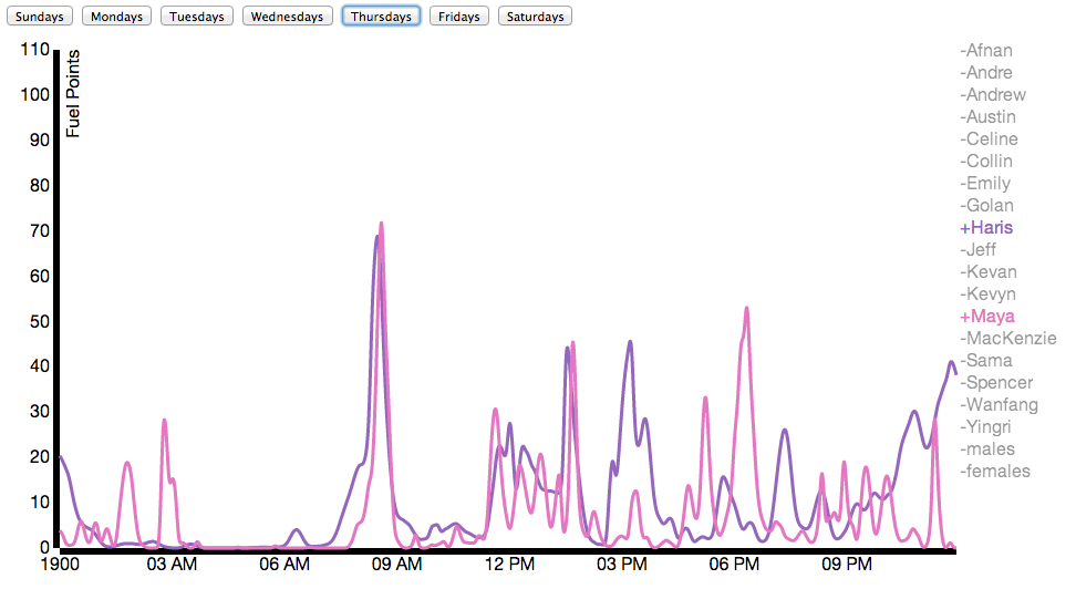
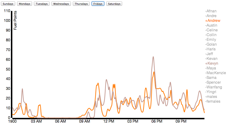
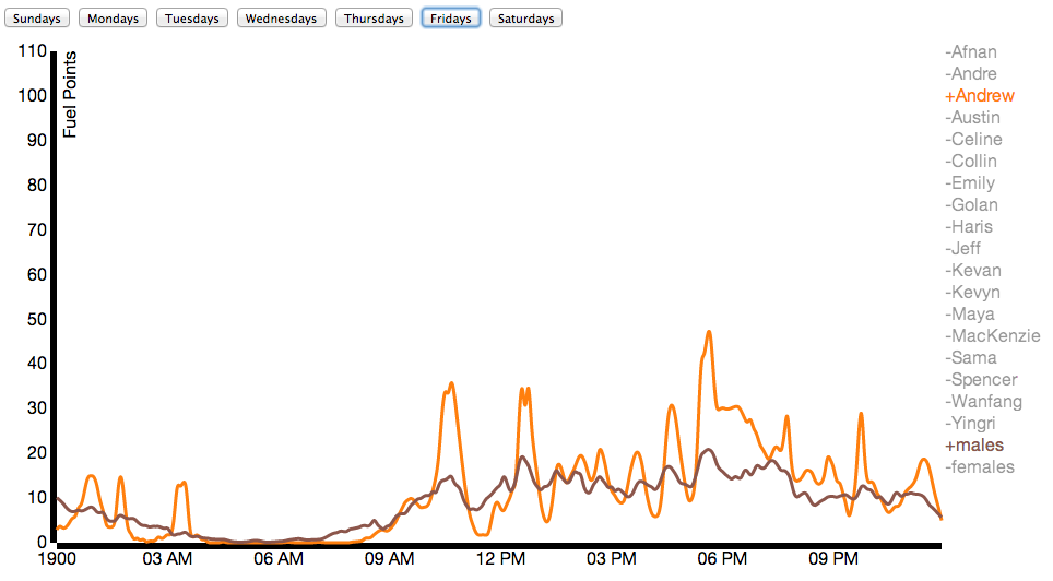
Due to Nike’s generosity, nearly everybody in our class wore a Nike Fuelband between mid-January and the date of this posting (March 3). While Nike offers a public API for viewing the data, it’s not that comprehensive. Using some basic packet sniffing, and borrowing individuals’ fuelbands for < 30 seconds, connecting it to my laptop, and allowing the Fuelband to attempt to connect to api.nike.com website, I managed to collect the each individual’s Access Token, which I then passed to api.nike.com alongside some other parameters to receive a wide array of data, including daily minute by minute fuel data, calories, steps, and distance.
Here I’ve compared male and female activity for the class on an average Tuesday:
You can find on visual inspection schedule similarities between individuals as shown in the next two examples:
Here you can see activity for both individuals fits between scheduled points in time
Here I’ve compared my data to the average male in the class on Fridays.
Chromatic habits of my three years on Pinterest. (Website) (Github)
Video
(Soon to come!)
Process
I didn’t do a lot of sketching, but I did a ton of brainstorming and writing. Here’s the first brainstorm writeup I did (trying to explore general ideas), and here’s a second (when I focused specifically on exploring a visualization around poetry and rap). I’m taking a natural language processing course right now, so I was initially very excited by the idea of analyzing languages and developing a simple n-gram model to compare/contrast different poets/artists and make poetic mashups of different styles. But after feedback and some thought, I realized it was a topic that was very difficult for me to pin down into a visually interesting form. It would have also meant a lot of time getting the data and processing/annotating it, and less time actually developing the visual form.
Challenges in this stage:
Defining a project that focused on the visualization, and not just an interesting exploration (the question of similarities between rap music and
Being specific and isolating a manageable set of data (when I was exploring the
Coincidentally and conveniently, a Pinterest designer and CMU/IACD alum came to visit CMU for a few days, and after talking to him, I decided to explore a visualization with my Pinterest data.
Pinterest is actually my most significant source of personally-interesting data. I faithfully carried around the Fitbit and Fuelband, but my fitness habits are fairly mediocre and don’t offer a lot of insight into my habits, and don’t bring up unexpected representations or ideas or ways of seeing my life (the “weight of rain”). However, I’ve been using Pinterest fairly regularly for about 3 years, and it has the potential to provide interesting information on what I’ve been visually fixated on over that time.
I pulled together a CSV of all the things I’ve ever pinned and spent some time looking at different D3 design patterns, but I ended up mostly hacking together a Javascript production with D3 used mostly to bind data. I felt a lot of the D3 visualizations I found required me to force my data into a specific format, and make it feel more statistics-y.
Challenges in this stage:
Kept on forgetting what it meant for Javascript to be asynchronous
Figuring out what data to use—I stored a ton of information, but ended up really just using the dominant pin color, medium-size image, URL, and timestamp. I realized a lot of other information (e.g. boards that pins came from) were not as interesting for me, or the forms I tried to put them in were more static/artificial.
Deciding how to organize the data. I ended up just organizing by hue (into main color groups) and over time, but this was largely due to technical constraints and my lack of knowledge/time. I think it’d be really cool to look into other (more interactive?!) ways of arranging colors.
Findings
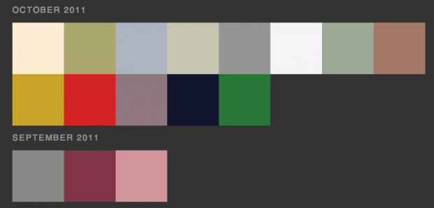
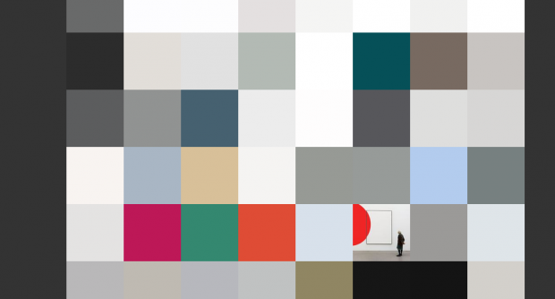
Partly due to how Pinterest calculates dominant pin color (it’s usually the background hue, so a colored subject on a white background is assigned the dominant color white), but also due to my fondness for pinning a lot of products (with white-backgrounded product shots), I ended up with a ton of neutral-colored pins. It seems to be a slightly more recent phenomenon: my early pins are a bit more colorful…
It’s also interesting to see the small periods of bright colors within a sea of neutrals. Some of these are particular patterns—I have a ton of bright purple pins from when Pantone announced the 2014 color of the year was radiant orchid, and I got excited and found a bunch of purple things. Below, there are some bright spots of illustrative poster design in a sea of fashion/architecture photography.
This Visualization pulls data from a national database to show all Priests in America that were either accused, sued, or convicted of sexually molesting their patrons. This was used as data to help tell the story in the play Phaedra’s Love by Sarah Kane.
The goal I set out for with this project was to use data visualization in way that was also performative. This goal was brought upon by the idea the data visualization is thought to be (by many of us in the school of drama) as stagnate and lacking of the raw human ideology/ emotion that you get from interacting and experiencing something straight from another human being. But although it is thought that theatre is able to accomplish this goal already, the materials used to help portray these humane worlds is usually faux visuals, that although are very conceptual in their meaning, aren’t real, thus don’t truly connect the audience back to the a theatrical story telling experience. One that enlightens the audience about not only our own lives, but our world around us. Thus this is where data visualization can come in handy. If combined with theatrical story telling, both forms (science and art) can come together to create a heightened experience that is actually based a raw data from the world in which we live. Which in my opinion is able to heighten the stakes of the play’s reality much more.
Inspiration:
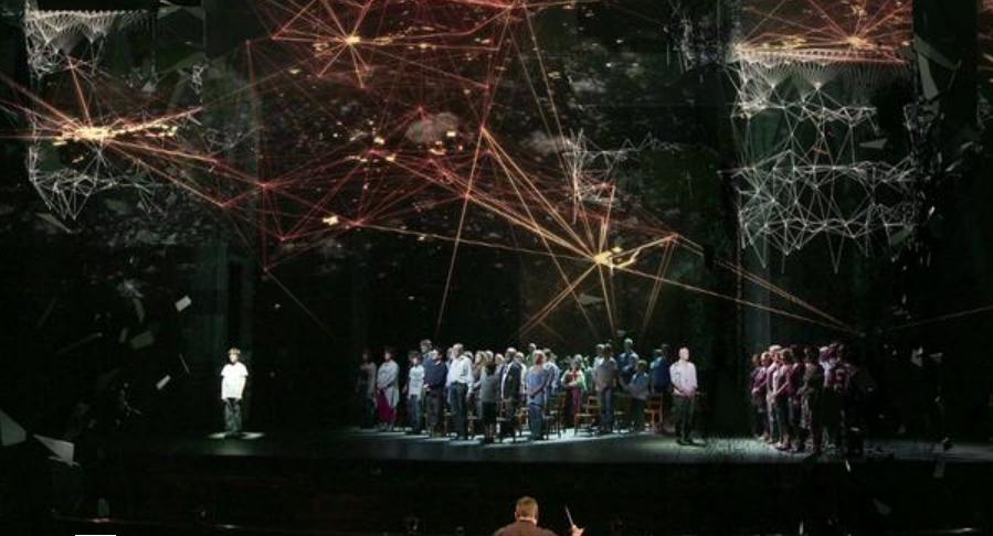
59 Productions: Photo from the production of Two Boys the Opera.
Info Data Visualization is simply just stating the facts (Simple and true) in a way that is visual. I decided to find a play that could benefit from the cold and hard nature of data visualization to help tell it’s story. After much searching, I landed in the world of playwright Sarah Kane. Her play Phaedra’s Love, features a conflict in our society about morals and beliefs. With this the main character, Hippolytus, a vulgar/sloppy prince that doesn’t live by societal order confronts a Priest towards the end of the play. The conversation they have makes the audience question of societies beliefs/ morals and ask us to examine who exactly is the hypocrite in this situation. Is it someone who lives life in a societal examined horrible manner, but owns up to it and doest try to hide it. Or is it someone who calls themselves Holy, and confesses their sin while asking for forgiveness from God after the commit sins, and still expect that they are pure?
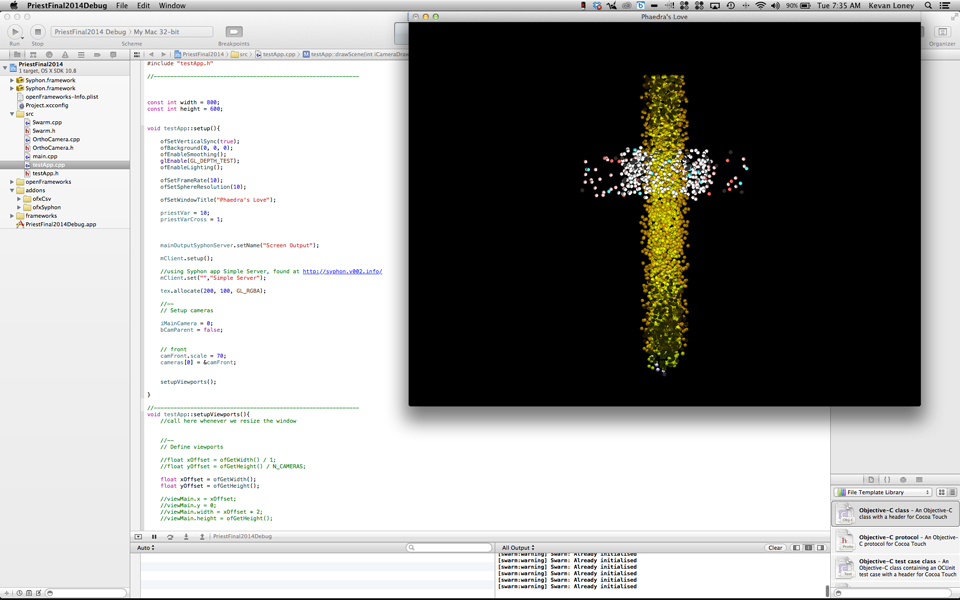
From this Journey, I decided the make the informational data a character in the play. Particularly replacing the physical form of the priest with the info data visualization. This visualization focused on a database of Priest in America who have either been accused or convicted of rapping one of their followers. These Almost 5000 priest would be represented in a single moment to help Sarah Kane’s world ask this question of the audience. I believe that using the data viz in a Theatrical context also enhanced the power of the data to call serious attention to our surrounding society.
The priest in the scene are represented by glowing orbs of light. Each orb is colored according to which category the fell in within the database.
This included those that were…
Accused
Acquitted
Arrested
Charged
Cleared
Convicted
Indicted
Not Guilty
Police Report
Reinstated
Sentenced
Settled
Sued
Screen Grab:
After, when the scene gets to a heightened conflict point between the Priest and Hippolytus, the glowing orbs suddenly (on-cue) conform together into a cross.
Tweetable for first version: “Popular songs are so repetitive, and it’s hard to tell them apart. When in doubt, it’s a pop song. http://bit.ly/1fXr4s9”
Tweetable for second version: “Someone needs to figure out a new structure of popular songs; they’re way too repetitive. http://bit.ly/1jVcja1”
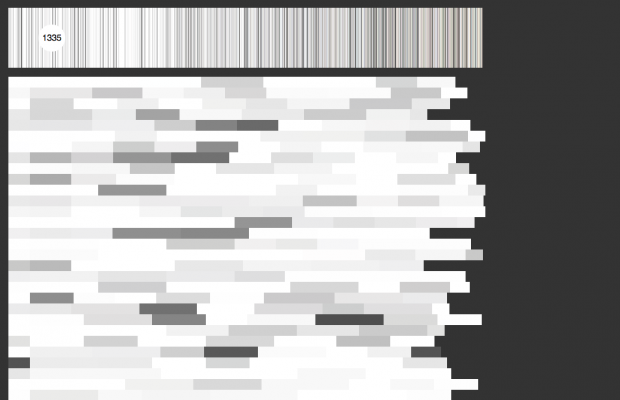
For this project, I didn’t do a quantified selfie, but rather a quantified portrait on how the general public enjoys popular songs, and how repetitive these popular songs are. I always find the most popular songs to be the most repetitive and annoying, so I thought I’d investigate the actual correlation of popularity and repetitiveness. However, since 100 songs per the thousands that come out every year is a small subset, there isn’t really a correlation. That fact made my first draft useless (see image below)
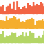
Using the Billboard’s Top 100 songs for the years 2011, 2012, 2013, I created a visualization that groups the 300 songs by genre as pixelated blocks. Each pixel represents a song, and the pixel’s opacity is determined by the song’s repetitiveness. The darker the pixel, the more repetitive.
From this visualization, I can take away at least these 2 things about popular songs:
1. they are quite repetitive
2. they consist of mostly pop, hip hop, and a surprising amount of country
(3. when in doubt about where to categorize a song, make it a pop song)
The technical process involved scraping a website for the Billboard’s top 100 songs for those 3 years, cleaning that data for special characters and hard-to-search artist’s names, using a music API to find the links to every song’s lyrics, scraping those links for the actual lyrics (using Python’s Beautiful Soup), inputing the lyrics into a “repetitiveness” algorithm, finding the genre for every song, grouping all the songs by genre, ordering by percentage, and creating a visualization for it all. The repetitiveness was taken by scanning lyrics for how many times every phrase of a song appears in the song. A percentage is then calculated by (# total phrases – # unique phrases) / (# total phrases).
**Since I changed a lot of my project from the critiqued version, I’m not going to bother embedding it here. Scroll to the bottom for exciting updates**
<<<<< FINISHING THE DELIVERABLES LATER – SORRY >>>>>
After the critique today, I have discovered that everything that others suggested or liked (while I was developing and in critique comments) were boring to Golan, and rightfully so. And the things he suggested I do were the things that I had started with a few days ago before I changed direction. I’m frustrated about letting myself get pulled away by others’ ideas and diluting the data down to meaninglessness. Anyway, here’s what I came up with today: http://bit.ly/1eUk27D
Take aways from this visualization:
1. Individual songs have multiple peaks of repeated phrases, most likely from choruses
2. distribution of popular songs among genres
< >
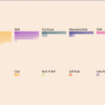
When in doubt, it’s a pop song – Take 2
This is a data visualization of ~300 popular songs from 2011-2013 based on the repetitiveness of their lyrics
Pop Hip Hop Country R&B Hip House EDM/Club Indie Pop Folk/Indie Folk Soul Funk Rock Other
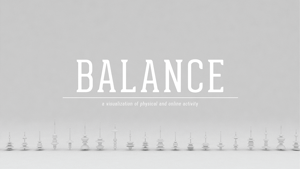
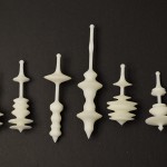
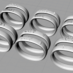
Balance – a physical visualization of my physical and online activity.
The initial goal for my visualized selfie project was to somehow create physical visualizations of my physical activity (acquired from my fuel band), and my online activity (acquired from my phone). Originally I wanted to add color to the visualization based on the recording of my mood that day, but I realized that it would only further clutter the visualization.
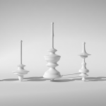
In my first attempt at the visualization, I took the fuel band data and mapped it to the surface of a torus, which subsequently deformed the torus. Then I scaled the torus based on my online data usage. The visualization did not end up working well and was really hard to read. The next iteration I mapped my fuel band data by physically deforming the surface of the display area of the fuel band. The intent was to attempt to draw a connection between the visualization and the fuel band itself. However, the visualization came out a bit muddied.
In the final iteration I made it my goal, to allow my data to physically affect an object. So to represent the balance between the two sets of data, I opted to create spinning tops. The fuel band data creates the contours for the top, and my online activity graphs scales the top to shift the center of gravity, allowing or not allowing some tops to spin.
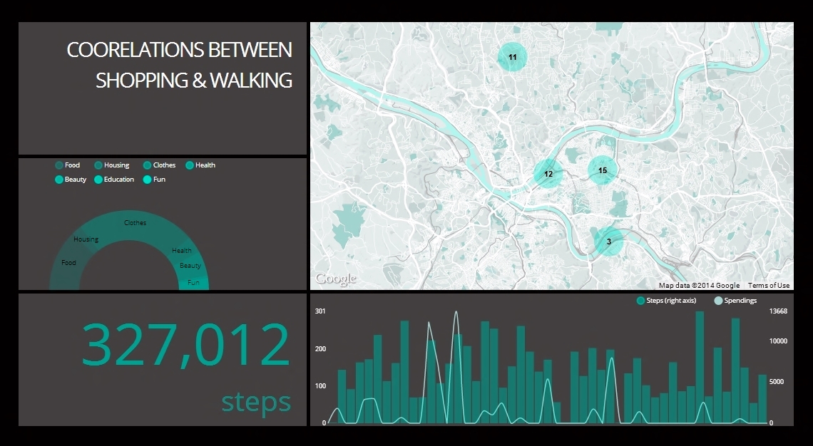
Description I gathered different types of data during the first two months that I spent in Pittsburgh. These include how much I spend every day, how many steps I walk, which places I visit, what songs I listen to and who I interact with.
After today’s critique, I decided to narrow down the diversity of the data-set, and stick with only how much I spend, where I go and how many steps I take. This project addresses my curiosity and interest in highlighting the correlations that exist between my frequent shopping sprees and my walking habits.
Tools I am using Tabletop to access data stored on Google Spreadsheets. I visualized the data using D3, nvd3 and Google Map API.
Hooray for the classic ‘Arduino in the Altoids can’ image!
Sketches:
This project was both a challenge and a joy to work on–in spite of all the hours of pulling my hair out because of OpenFrameworks / numerous Oculus migraines, I was satisfied with the end result and had a lot of fun playing around with it.
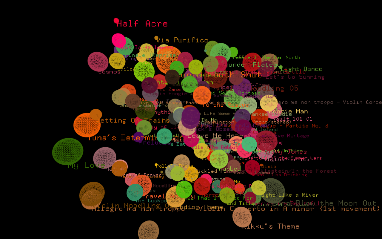
I was never really interested in hardware / physical computing until near the end of last semester in Electronic Media Studio II, when we started to play around with Arduinos. I was interested in getting out of my comfort zone of working with purely virtual visualizations, and decided to explore how tangible mediums can enhance a visual experience. Thus, I used the Oculus Rift with a self-designed Arduino power glove to realize my Quantified Selfie. The data was taken from my iTunes library while the visualization was created in OpenFrameworks using the ofxCsv, ofxOculusRift, and ofxSpeech addons.
Basically how it works is that the user ‘experiences’ the visualization with the Oculus and controls the visuals with the power glove and their own voice. When the user says the name of the month they would like to inspect, a screen showing the number of songs downloaded for that month will be momentarily displayed, followed by the visualization itself. What they see looks a lot like these decorative cotton ball lights I used to own in the bygone days:
(the photo isn’t mine, but I think the lights I had were very similar)
I initially wanted to include algorithmically-generated audio for each month which mashed up all the songs I downloaded during that time (special thanks to Haris for referring me to Tina Liu, who’s developing an algorithmic medley generator for her grad thesis), but the logistics ended up getting too complicated. Nevertheless, I am satisfied with the final product and feel that including sound might disrupt the cohesion of the visualization.
It was really interesting to see the type of music I was in the mood for during certain months and how my music downloading activity could vary greatly at different times of the year.


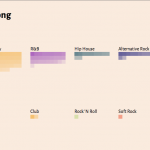

 Pop
Pop  Hip Hop
  Country
  R&B
R&B  Hip House
  EDM/Club
  Indie Pop
 Folk/Indie Folk
  Funk
Funk  Rock
Rock  Other
Other