A View of the Universe
Charles and Ray Eames – Powers of Ten (1977)
A film exploring the exponential power of 10 by zooming from two people having a picnic out to interstellar space and back again to the people then through their bodies to the atomic level.
Juric Gott et al.: Map of the Universe (2005)
Pablo Carlos Budassi: Logarithmic view of the observable universe (2016)

Jer Thorp: Kepler Exoplanet Candidates (2011):
A visualization of the 1236 exoplanet candidates observed by Kepler.
Jonathan Corum: Kepler’s Tally of Planets (2013)
Good ‘Ole Data Maps
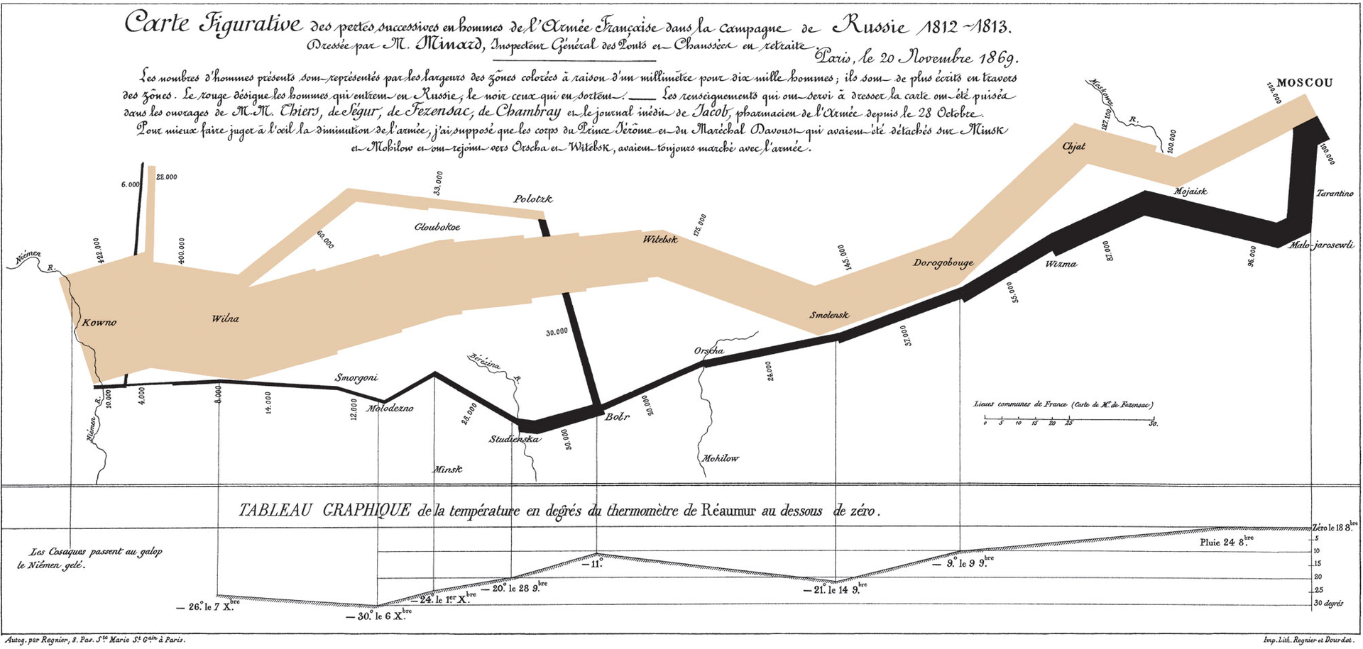
- Tufte’s favorite, Minard’s Map of Napoleon’s March (1869)
- Amanda Cox & Mike Bostock: Maps From the Midterm Elections (2014)
- Tom Giratikanon et. al: Up Close on Baseball’s Borders (2014)
- Fernanda Viegas & Martin Wattenberg, Wind Map (2012)
- CNN: Home and Away (2012). Juxtaposes maps of the hometowns of fallen soldiers, and the places they died.
- Laura Kurgan: Million Dollar Blocks (2006). Blocks in which the government is spending more than $1M/year to incarcerate people from those places.

Sea Level Rise Maps
- Stamen: ClimateCentral Sea Level Rise Map
- Geology.com: Global Sea Level Rise Map
- Benedikt Groß, Speculative Sea Level Explorer
Data or Map Structure?
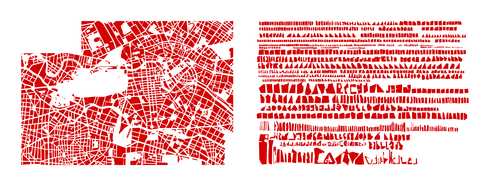
- Ben Fry: Zipdecode (1999) -Sometimes it’s not the data, but simply how it’s organized.
- Ben Fry: All Streets Map (2008)
- Nelson Minar: Map of American Rivers (2013); Mike Bostock’s version
- Dustin Cable: The Racial Dot Map (2013) (…check out Chicago)

And…
But sometimes we must make our own census. “DuBois doesn’t need the polls; he gathered his data from 19 million dating profiles. Politics, schmolitics – he wants to know what we really think about. Who’s shy, who’s bored, who’s sexy. And who wants to be spanked.”
Luke DuBois: A More Perfect Union (2008-2011)
Nick Felton: Annual Reports. One’s understanding of space can be personal.
Hasan Elahi: Track (2001-)
American artist Hasan Elahi has been pre-emptively surveilling himself for the FBI and the Department of Homeland Security, after enduring scrutinous but unwarranted interrogations shortly after 9/11/2001. Elahi explains that he “doesn’t look good in orange.”
Physical (3D) Visualizations
Many of the links in this section are from http://dataphys.org.
When you think of physical/3D visualizations you might think of something like this:
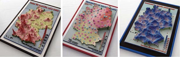
Wolf-Dieter Rase: Physical cartographic visualizations of Germany (2006):
But consider this:
Akiz Ikon: Painting Reality (2011). 500 liters of waterbased environmentally-friendly paint on asphalt spread by 2000 cars on Rosenthaler Platz Berlin.
Marshall Islands Stick Charts (1862).
These physical visualizations show ocean swell patterns, and were built by native Micronesians from the Marshall Islands to facilitate canoe navigation.Straight sticks represent regular currents and waves, curved sticks represent ocean swells, and seashells represent atolls and islands.

Frankfurt Streetcar Load (1913)
Strips of woods glued on top of each other convey the average number of passengers carried between two stops.

Wire Models of Factory Worker Movements (1915).
3D wire models of hand motion paths (or chronocyclegraphs) created by Frank Gilbreth, a pioneer in the study of motion in the workplace.

Marilynn Taylor: Time Pieces (Physical Space-Time Cubes) (2003)
Artist Marilynn Taylor created seven three-dimensional maps (one for each day of the week) in which time is the z-axis and a copper wire shows how she moved across the city during the day.

Rachel Binx and Sha Hwang: Meshu (2014)
A fabrication-on-demand business which 3D-prints custom jewelry graphs based on places meaningful to the customer.

Andrew Spitz: Loci (2013). Software creates decorative objects (memorabilia) about one’s travels.
Ekene Ijeoma: Wage Islands (2015)
An interactive installation reveals the geographies of access to housing in relation to wages. This is presented in the form of a 3D map where elevations are based on median monthly housing costs, ranging from $271 to $4,001.
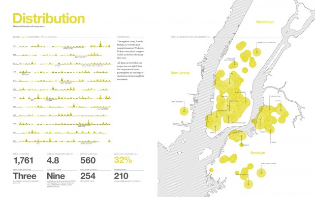
Maddy Varner: 5-Star Graffiti (2014)
Helps us understand a place through situated visualizations.

Visualizations of Electronic Activity
Kyle McDonald: Serendipity (2014)
By Kyle McDonald in residence at Spotify. Every second, a few people hit “play” on the same track at the same time.

Aaron Koblin: Amsterdam SMS (2008)
A visualization tool for SMS messages, built with Processing using data provided by KPN Mobile.
Jer Thorp: Just Landed (2009)
Crowd-Sourcing For Data
Where’s George (Map)
Eric Fischer, The GeoTagger’s World Atlas (2010)
Interactive Version
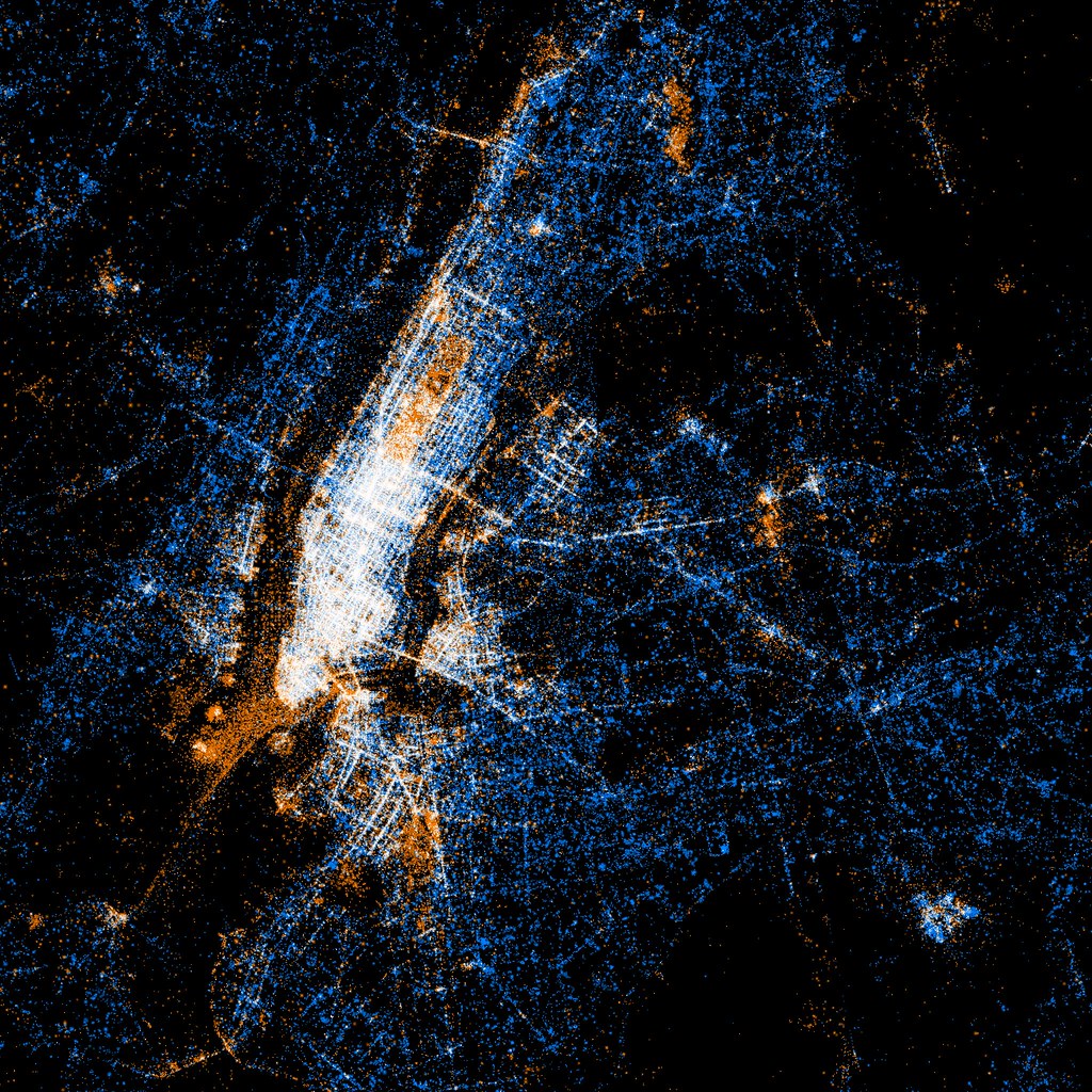
Eric Fischer: See Something or Say Something (2011)
Red dots are locations of Flickr pictures. Blue dots are locations of Twitter tweets. White dots are locations that have been posted to both.
Josh Katz: How Y’all, Youse and You Guys Talk (NYTimes Dialect Map) (2013)
What does the way you speak say about where you’re from? Answer all the questions to see your personal accent map.
Kyle McDonald, Exhausting a Crowd (2015)
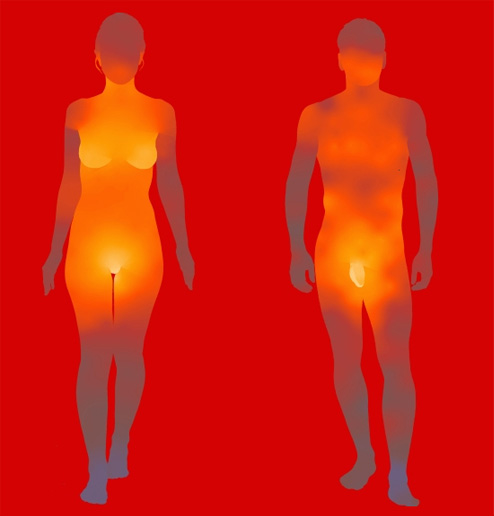
Fernanda Viegas & Martin Wattenberg, Fleshmap (Also see Look)
The artists polled hundreds of people’s opinions about parts of the body, prompting users to rank how exciting several points of the body were to the touch.
Manipulations of Existing Maps
Jenny O’Dell: Satellite Collections

Armelle Caron: The Famous Grids of Iconic Cities, Deconstructed and Remixed (2012)
Jason Salavon: Flayed Figure, Male (1998)
The entire surface area of the artist’s body is printed to scale in this photograph. It consists of over 13,000 half-inch squares of skin and hair rearranged vertically by luminosity from dark to light. The resulting self-portrait is reconfigured so as to reveal the most intimate physical detail while obliterating individual identity.

Bill Rankin: TIME ZONE STUDIES (2002)
With the fixity of time zones and the energy-use calculus of daylight savings, the relation between time and the sun is lost. For residents of the western plains states and most of Mexico, there is never “high noon.” (See also: FAST, Subways, Countries)
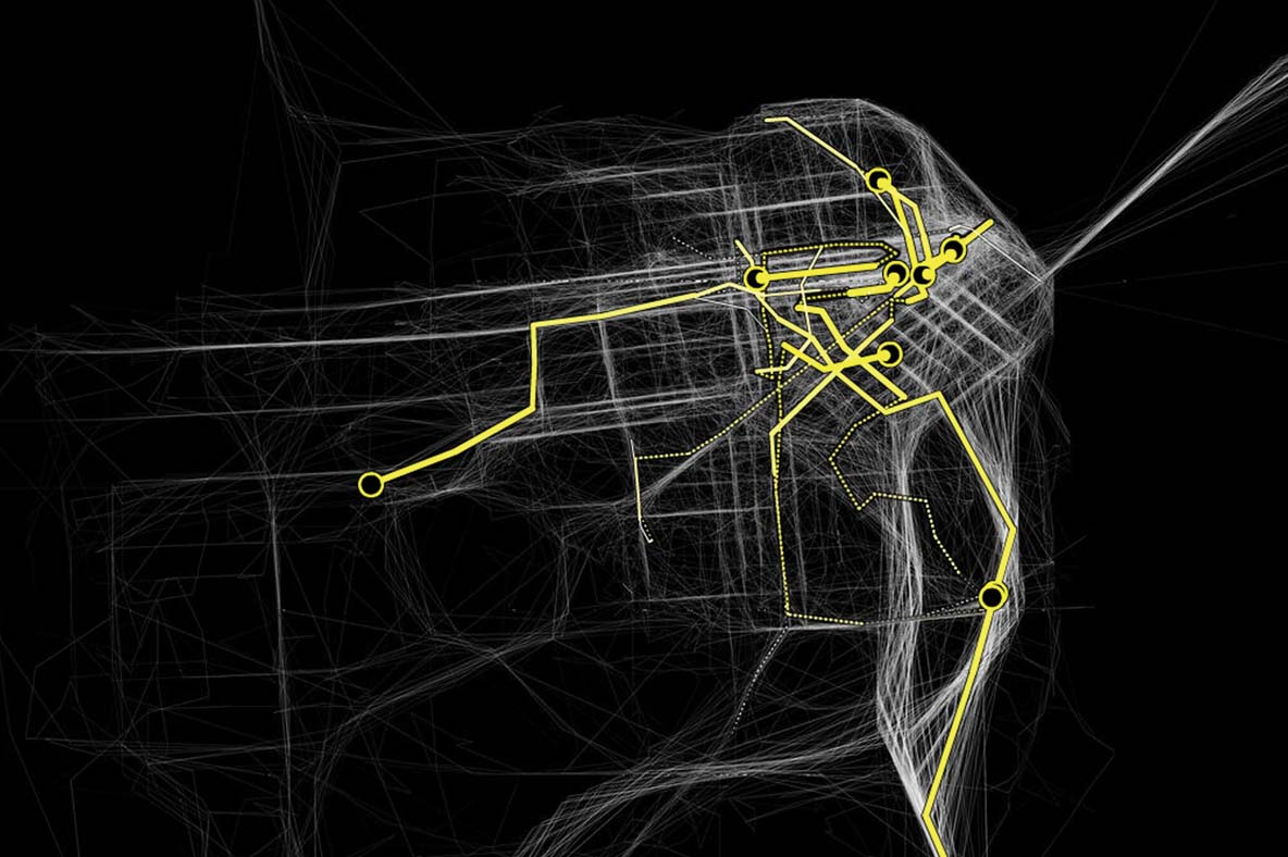
Traces of Movement Through Space
Aaron Koblin, Flight Patterns
A visualization of more than 200,000 aircraft in flight over the U.S. on August 12, 2008,
David Rokeby, Plot Against Time (2007)
Captures the traces of pigeons and pedestrians on Venice’s Piazza San Marco.
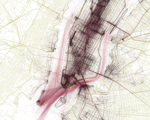
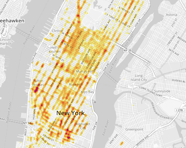
Stamen & Scott Snibbe: Cabspotting
Similar data was collected for the NYTimes Taxi Map by Matthew Bloch (2010).
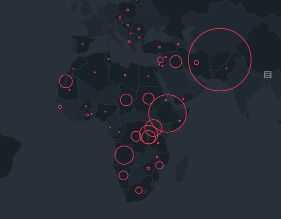
Ekene Ijeoma: The Refugee Project (2014)
An interactive map of refugee migrations around the world in each year since 1975. UN data is complemented by original histories of the major refugee crises of the last four decades, situated in their individual contexts.
Fernanda Viegas & Martin Wattenberg, Flickr Flow
From a collection of photographs of the Boston Common taken from Flickr, our software calculated the relative proportions of different colors seen in photos taken in each month of the year, and plotted them on a wheel.

David Rokeby, Sorting Daemon
The system looks out onto the street, panning, tilting and zooming, looking for moving things that might be people. When it finds what it thinks might be a person, it extracts the person’s image, which is then divided up and arranged according to areas of similar colour.
David Rokeby, In the Offing (2013)
(See also MFTT) Using a database of about 1M images of the horizon seen from the Oakville Galleries building, gathered over 3 years, the work presents a endless and never repeating voyage through this archive, viewed as though through a moving window into the larger image.
Other materials we may get to:
- Slide Presentation: Information_Arts_Critical_Making
- Experimental Capture: Capturing Places
- Experimental Capture: Perspective Capture and Imaging
- Experimental Capture: Time Lapse
- Slit-Scanning
- Trevor Paglen: Photographing Secret Sites and Satellites
Experiences created from non-visual, non-geographic data
- Martin Wattenberg & Marek Walczak, Apartment
- Jason Salavon, TMI (2013)
- Stephen LaPorte and Mahmoud Hashemi: Listen to Wikipedia
Other References
http://www.radicalcartography.net/
http://mariandoerk.de/criticalinfovis/altchi2013.pdf
Eyeo 2014 – Eric Fischer https://vimeo.com/109961239
Trevor Paglen – https://www.youtube.com/watch?v=mApBa2qKVDM (Google)
Trevor Paglen, Six Landscapes – https://www.youtube.com/watch?v=j56s46e97Lo (30c3)
Get data from the Pgh City portal