Making Art / Conducting Culture Research with Large Image Datasets
Golan Levin and Kyle McDonald, 15 March 2016
In this lecture we present some examples of interesting ways in which artists, designers, new-media technologists and culture researchers have explored the use of large image databases. We present cases which are ‘expressive’, and others which are ‘analytic’, and we offer a small handful of approaches (there are many others) which have come to pattern some of this work.
Expressive Visualizations of Large Image Collections
We first examine some ‘visualizations’ of large image collections which operate expressively, poetically, subjectively, or (at the very least) in ways that cannot be unpacked simply as analytic charts.
Let’s begin with a project by Luke Loeffler, a graduate of the MFA program in the CMU School of Art. When he took this course in 2012, he developed a series of visualizations of the 20,000-element IKEA product database, which he scraped computationally. He began with a low-hanging fruit, a visualization in which all of the IKEA items were sorted, analytically we might say, from least to most expensive:
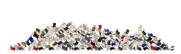
Luke then took the database in a surprising direction. He extracted the contours of each item using simple computer vision (similar to the openFrameworks OpenCV Example), and then placed the items into an enormous Processing Box2D simulation, Junk Tumbling:
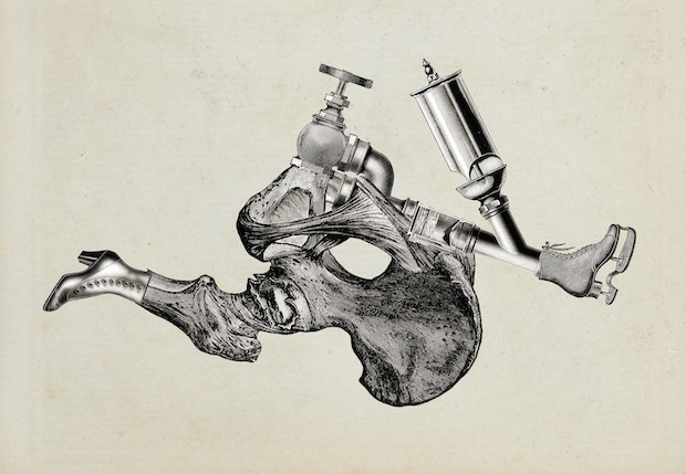
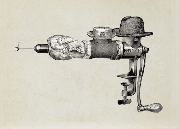
Mario Klingemann (Quasimondo) created Ernst, a Generative Collage Engine, which recombines fragments from a large database of copyright-free historic illustrations.
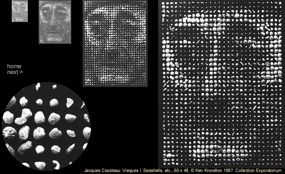
Photomosaics have been done to death and we won’t dwell on them here, other than to show this very early example (1987), a portrait of Jacques Cousteau by computer graphics pioneer, Ken Knowlton:
Collecting Your Own Data
Several examples of art investigations illustrate the idea that your database of images may be something you compile yourself, from scratch.
Celebrated Taiwanese-American performance artist Tehching Hsieh is a leading practitioner of durational performance. His relentlessly methodical project, “One Year Performance 1980-1981” (commonly referred to as Time Clock Piece) follows Hsieh as he punched a time clock in his studio, every hour on the hour, twenty-four hours a day, for an entire year.
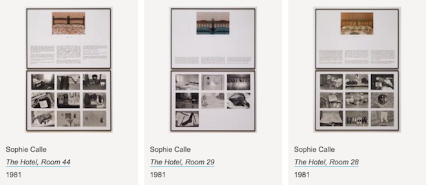
Sophie Calle‘s controversial artist’s book, The Hotel is the result of three weeks spent working as a chambermaid in a hotel in Venice in 1981. She tried to construct a narrative of the lives of the guests by examining itemizing and photographing their personal belongings and the condition the room was left in. (No IRB’s here…) The book contains her observations in the form of a surveillance log accompanied by her photographs. She wrote:
On Monday, February 16, 1981, I was hired as a temporary chambermaid for three weeks in a Venetian hotel. I was assigned twelve bedrooms on the fourth floor. In the course of my cleaning duties, I examined the personal belongings of the hotel guests and observed through details lives which remained unknown to me. On Friday, March 6, the job came to an end.
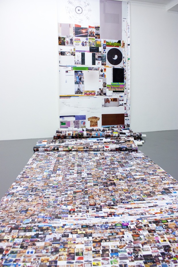
In Blair Neal‘s 10,000 grocery store images, an update to his video project from 2008, the artist manually (and clandestinely) collected thousands of photographs in grocery stores. “All the baby food, all the cigarettes, all the condoms, all the snacks, all the soda..it’s almost all here. Images were taken over about 3 months in 2008 and required over a dozen trips to various stores.” In a model example of sharing in new media arts, Blair has also made his archive of images available as a torrent.
Karolina Sobecka and Chris Baker developed an artwork, Picture Sky (2015), in which a willing public is crowdsourced to take pictures of the sky. “Multiple observers are positioned at GPS coordinates that form the points of a grid. At the moment of a satellite flyover, they take photographs looking directly up. Their images are stitched together to form a single large image, opposite to the one taken by the satellite.” In this way, Sobecka and Baker are able to take pictures of clouds from both sides, simultaneously.
Artist JK Keller has taken a photograph of himself every day for the past sixteen years, and has organized these chronologically into a time-lapse video. (How else could such a database be productively organized?) Keller also makes his image database available for download, through a simple URL scheme.
In his infamous People Staring at Computers project, artist Kyle McDonald developed custom webcam software which he installed on computers at an Apple store in NYC. At regular intervals, his software collected photographs of people using these computers, and transmitted these to a server (and a Tumblr). The project entangled Kyle with the Secret Service.
Data Self-Portraiture is a legitimate approach. Certainly, each of us has an archive of thousands of snapshots. Artist Evan Roth notes that you may already have thousands of images on your own computer that you have collected unintentionally. Roth uses the images that have collected in his internet cache search history, which reflect many aspects of his interests and behavior.
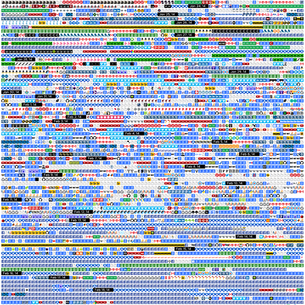
During the IACD course in Spring 2014, CS senior Shan Huang used her personal data in a related way. She collected the .favicons (small browser icons) for all of the websites in her browser’s history, and arranged them chronologically.
In the performance project Important Things, Kyle McDonald collected a 32×32 pixel region centered on his cursor whenever he clicked his mouse. The result was a record of all of the clickworthy things Kyle saw during the project.
And… did you know it’s possible to scrape your own product viewing history on Amazon?
An Approach: Image Averaging
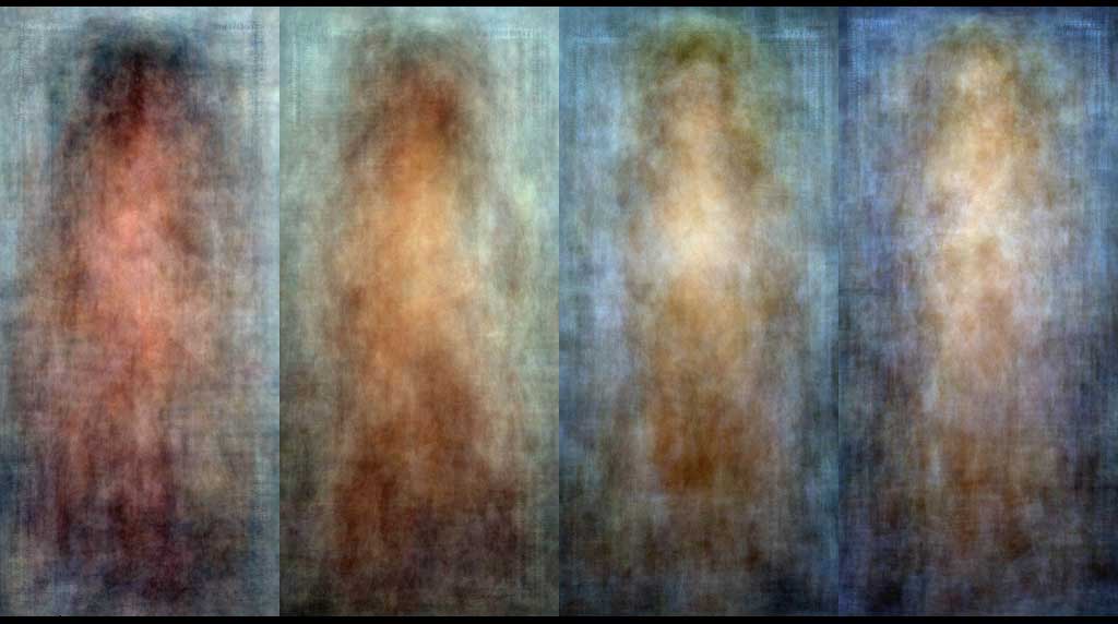
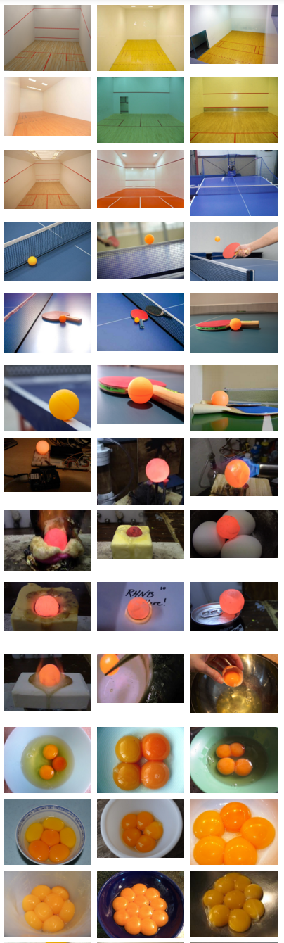
Image averaging is a technique whereby an average is made from a collection of images. As in Jason Salavon‘s Playboy Centerfolds (Decades) project, this technique:
- Represents the centroid of examples
- (Ostensibly) illustrates the category itself
- May suffer for a poverty of details, but…
- May sometimes offer an excellent gestalt
- Requires only ten lines of code.
- The hard part is selecting the subject.
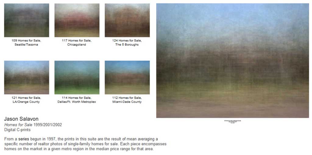
More examples of image averaging include Salavon’s 100 Special Moments and Homes for Sale:
In point of fact the averaging technique was pioneered in the late 1970s and early 1980s by Nancy Burson, then an artist-in-residence at MIT. In her First and Second Beauty Composites (1982), she created weighted averages of female beauty from different decades:
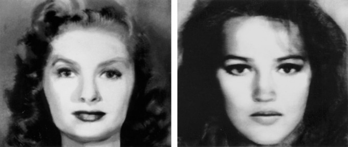
(Left: Bette Davis, Audrey Hepburn, Grace Kelly, Sophia Loren, Marilyn Monroe. Right: Jane Fonda, Jacqueline Bisset, Diane Keaton, Brooke Shields, Meryl Streep.)
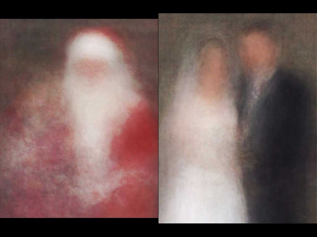
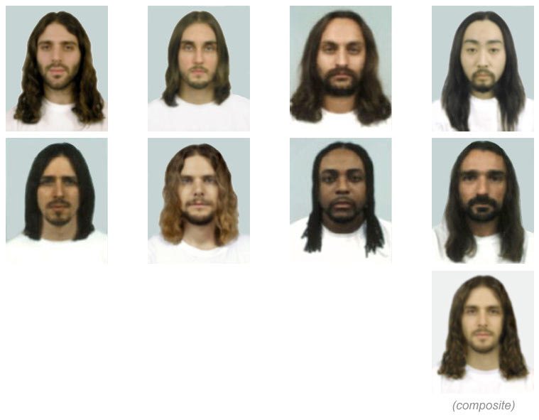
Later, Burson would use classified advertisements to find Guys Who Look Like Jesus, in order to compute a composite sketch of Jesus, as we have come to believe he might have looked:
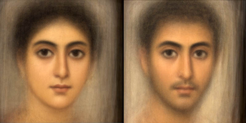
In 2014, Patrick Feaster explored face averaging as a historical technique, presenting “the average faces of Fayum mummy portraits—a genre of paintings created in Roman Egypt during roughly the first three centuries AD—based on 181 total examples (ninety-seven female portraits and eighty-four male portraits), most of which I scanned from a few books borrowed from Indiana University’s Fine Arts Library”:
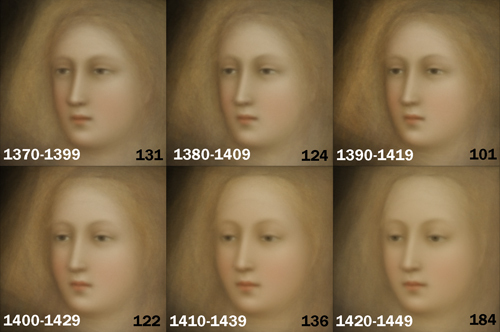
In a related experiment, Feaster “averaged the faces in overlapping thirty-year groups while still shifting forward in time at ten-year increments”, revealing a century-long shift in the representation of faces that coincides with the transformation from Medieval to Renaissance visual idioms:
 \
\
An Approach: Associative Image Sequencing
In her project, I’m Google, Dina Kelberman has produced an astonishing tumblr in which a sequence of images are positioned visually in a colorful grid that slowly changes as the viewer scrolls through it. Images of houses being demolished transition into images of buildings ….
A similar approach is used by Dutch artist Sebastian Schmieg in Search by Image, Recursively, Transparent PNG, #1 (2011), in which the artist locates and reports his process as follows:
- search by image, recursively
- starting with a transparent png (400×225px)
- 2951 images, 12fps
- december 9th, 2011
- netherlands
An Approach: Alignments
LeBirdie by Christine Sugrue (2004) involves image search and alignment:
A true master of this form is CMU MFA alumna Cassandra C. Jones, who meticulously aligned thousands of online photographs to produce this remarkable video, Eventide (2004), that recreated the precise timing of a virtual sunset. Jones’ process was completely manual.
Domenico Quaranta curated an important exhibition, Collect the WWWorld: The Artist as Archivist in the Internet Age. This exhibition featured much work of this type, including this project, jaws.gif (2012), by Caroline Delieutraz, and
Matthieu Delorme’s Hundred Sport Pictures (2012):

Another now-classic work of this kind is the interactive browser project, Pointer Pointer (2012) by the great StudioMoniker.
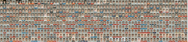
The the Midnight residency series on Times Square, Luke Dubois collected more than 1 million selfies from Instagram that were taken in the Times Square vicinity. He then aligned their eyes. [Video]
.@RLukeDuBois shares his summer residency project: a #TimesSquare portrait of Instagram selfies. #ResidencyTSq pic.twitter.com/zuOgiiraiH
— Times Square Arts (@TSqArts) February 1, 2016
Analytic Visualizations
Whether due to the use of the visual idioms and conventions of data graphics; or an aspiration to neutrality, objectivity, or intersubjective validity; or a hope to provide a clear and simple interface to a large database; or simply the provision of open-ended interactive tools for data comparison, filtering, and browsing– a number of visualizations could be called analytic in their approach and sensibility.
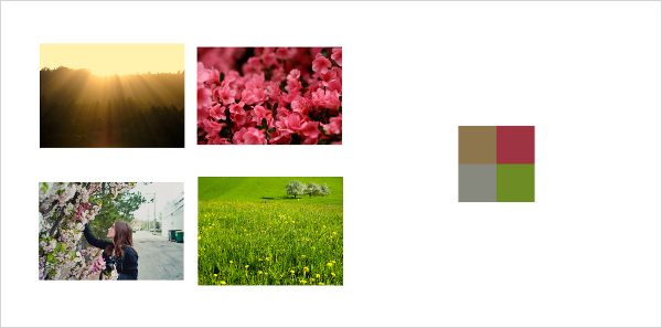
In A Million Seasons (2013) by Shinseungback Kimyonghun, the artist attempts to describe images of four seasons with a million photos each: “A million Flickr photos tagged ‘spring’ are collected, and each photo is turned into one pixel with an average color. The one million pixels from one million photos compose an image of Spring. The images of the rest of the seasons are created the same way.” The work is impressive for its sheer scale.
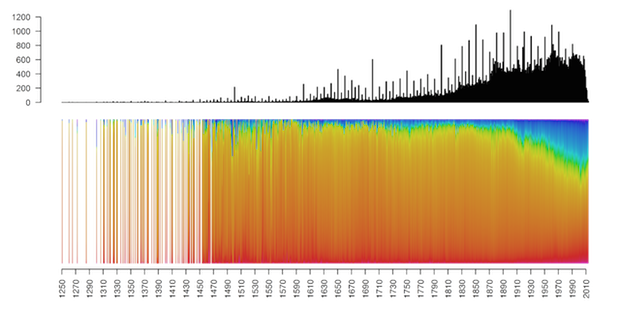
This project by Martin Bellander shows the changing relative use of different paint colors, across more than 121,000 paintings created since the year 1250. As you can see, blue chromas have become much more common in the past hundred years.
See Bellander’s other work, too.
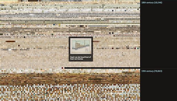
Interactive viewers provide a means for seeing both the overview, as well as the individual elements, in large datasets. For example, Brian Foo‘s new NYPL viewer provides rich, multidimensional and direct access to 187,000 documents in high resolution.
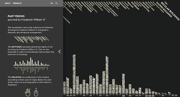
In the new project PAST VISIONS penned by Frederick William IV, developed by Christopher Pietsch and others, a visualization displayas a collection of several thousand historical drawings by Frederick William IV alongside a thematic and temporal arrangement.
Special Mention: Lev Manovich et al.
For the past 6 years, Lev Manovich et al. have been developing compelling visualizations through their Software Studies Initiative. They have many relevant projects, including visualizations of game play, large cultural image corpora, movies and film, etc.; here are a few.
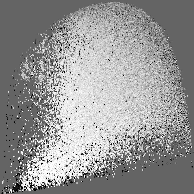
In Temporal Plot Visualizations (2012), Manovich acquired large numbers of images through the targeted scraping of social media, and then organizes these along simple quantitative scales that nonetheless can offer intriguing information about people’s photo-taking tendencies. Here for example are 33,292 photos from Tel-Aviv, April 20-26, 2012, sorted by time and hue:

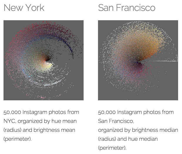
In Manovich’s Phototrails, different photographic ‘signatures’ for major world cities are revealed by organizing tens of thousands of Instagram photos according to their hue and brightness. Weirdly, there do seem to be significant differences.
In this related work, Manga Style Space (2010), Lev Manovich and Jeremy Douglass visualized 883 long-running Manga series containing 1,074,790 unique pages. The pages were organized along the following axes:
- X axis: standard deviation of pixels’ grayscale values in a page.
- Y axis: entropy measured over all pixels’ grayscale values in a page.
The authors assert that the smooth distribution of pages in this XY plot suggests the arbitrariness in any attempt to divide this space into discrete stylistic categories. (Do you agree?)
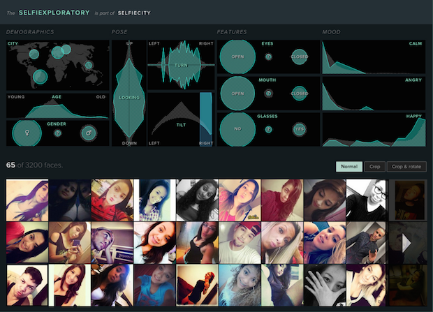
SelfieCity (2014) Investigates the style of self-portraits (selfies) in five cities across the world, using a mix of theoretic, artistic and quantitative methods.
Lev Manovich, Moritz Stefaner et al’s On Broadway (2015) provides a spatialized view of New Yorkers’ Instagram photos:
If you like these big viewer projects, you might also enjoy this Public Domain movie browser.
Searching and Sieving
Selection is OK. When working with a large database of images, it is not necessary to display all of them. Perhaps your project is a kind of filter, designed to search the world for the perfect image.
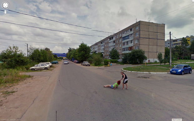
Jon Rafman performs this search himself, in his 9 Eyes of Google Streetview project, trawling the scanned world for incredible, absurd, and sometimes terrible situations. Rafman has realized that it may no longer be necessary to make new photographs. Enough interesting photographs already exist, and it is simply our job to discover them.
Or consider this new project by Benedikt Gross, Aerial Bold Typeface, which used computational techniques to assist the search. The artist’s key task was to search for these letterforms from among millions of satellite imaging tiles. [Interact here]
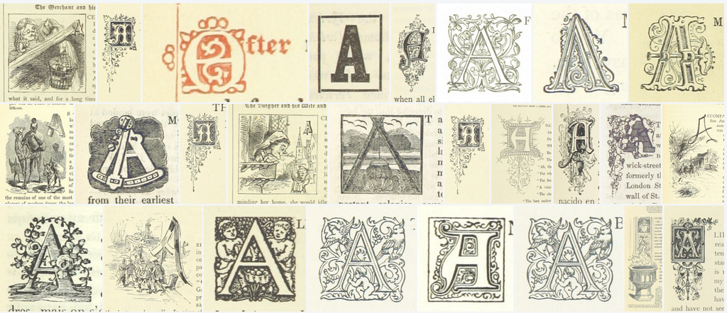
It’s fun to look for letters. Using machine-learning based searching techniques, Mario Klingemann found capital ‘A’ letters in the million-image British Library dataset.
Given the big variety of individual letterforms It was quite magical to observe how well the network was classifying pic.twitter.com/1Mgk7jTrwX
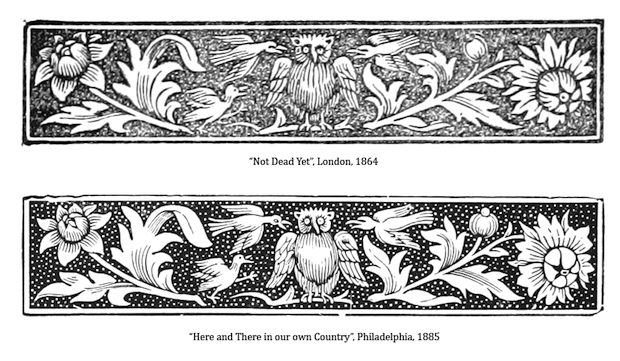
By comparing every image with every other, Mario also discovered “an interesting case of early plagiarism”, writing:
We’ve discovered these two decorative elements that come from two entirely different books during the “Archive as Instigator” workshop at the MoMA. The one at the bottom was printed 20 years after the one on top. Here are the links to the #bldigital originals:
http://www.flickr.com/photos/britishlibrary/11046907045
http://www.flickr.com/photos/britishlibrary/11095596394
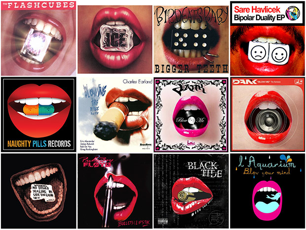
Searching through the Internet Archive’s 1 million cover collection, Klingemann also discovered, perhaps not plagiarism, but simply minds thinking alike, when he identified “12 Album Covers with objects between lips”:
The Clock (2010) by Christian Marclay is a looped, 24-hour montage that itself functions as a clock. Its scenes are carefully selected from hundreds of movies and television shows, with real-time references to the actual time of day at which The Clock (as an installation) is exhibited. Marclay assembled a team to seek out all of the footage, which he edited together over the course of three years.