World’s most likely the biggest human-centric database
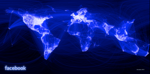
I love this map. Ever since I first saw this map, I am in love with this map. Because it represents, how easily people share information about themselves. It represents a whole new branch of psychology, and even shows political decisions, and intercultural relationships. The fact that Russia, China and Brazil being dark is also amazing. It both looks like a political map, and an internet dominance map. (ex: Russia = VKontakte)
Budget for war
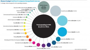
It hurts me a lot, every time I see an infographic like this. The fact that countries are spending more and more for war, and less for science, space discovery, or education is disgusting me. Coming from a not so peaceful country myself, I can clearly point why most of the countries are doomed to fail. I think this is a simple but effective infographic. It should be carved to stones for future generations to see how humanity failed.
Well crafted
Olympia looks great! The helix-alike titles, and the waveform movements are so gorgeous. The way it lists the countries, and champions are well thought and obsessively crafted. Color palette is great, and gives the whole presentation a beautiful and magical look.