FoodMood by Affect Lab, Ai Applied and Jana + Koos
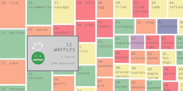
FoodMood is a data visualization that shows the relationship between food and the impact it has on the eaters’ mood. The data is collected from food related tweets in English across several countries. Each food item is represented in square blocks of different sizes, based on the number of times the food is mentioned. The range of colors of the squares represents different sentiments from positive to negative.
I find this data set very interesting because it shows the culture difference based on the food people are eating. It’s very interesting to see that, from April 22, 2012 to Feb 4, 2013, chicken was mentioned in 9188 tweets in the United States compared to 34 tweets in Thailand and 2 in Afghanistan. It can surely tell that the United States contributes to a very large consumption of chicken. Another interesting thing I find from this dataset is the fact that some countries have a lot less tweets than the other. This can illustrate one of two things – one being how influential food is to people from different countries, and the other being how accessible to the internet (twitter) are people from different countries.
Asterank by Ian Webster

With a database that contains astronomic locations, economic, and scientific information of more than 580,000 asteroids, Asterank accurately models the asteroids in our solar system. Just looking at the 3D model, I was amazed by how much information is gathered to make this data visualization. Not only that the information is so rich, but the model is also very well crafted. I like how the model is interactive, with the option to rotate and zoom in or out, making it accessible for viewers to see the asteroids in different angles.
OrgOrgChart by Justin Matejka
OrgOrgChart (Organic Organization Chart) is a data visualization that looks at the evolution of a company Autodesk’s over time. The data was taken from May 2007 to June 2011, which is a span of 1498 days. The entire organizational hierarchy is constructed as a tree with an employee as a circle connected to his or her manager. The bigger the circle, the bigger number of employees working under one manager. It is interesting to see the changes of employees being made in a big company’s structure over time. This infoviz really shows that people come and go, and that there are changes happening in an organization every single week. I think that the data is very well presented. The graphics captures the audience very well with the choice of colors and the animation. It might be difficult to see the detailed organizational difference, but it is pretty easy to grasp the big idea of how an organization evolves over time.