Category Archives: 12-datascraping

Alex Sciuto – Data Scrape

So I went through a few different ideas, and I pulled three different sources before finding a dataset that really started to provoke in me questions that I hope the data can answer. One of the unused datasets—the transcripts for every This American Life I did put on Github. I think it’s a cool dataset, and I hope someone else is inspired by it and uses it for something. See the github repo.

sketch-scrape-4

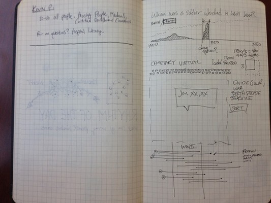
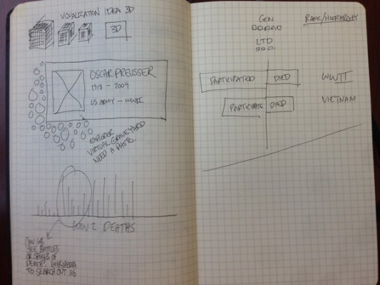
In last Thursday’s class, I was inspired by the visualization of grave stones. I was particularly inspired by Golan’s commentary on the lines of death and how they were traces of the deaths from World War II. My grandpa served in World War II, and with my grandma, I visited his gravesite a number of times since his death. He’s buried in a National Cemetery, and so there are literally thousands of lines of identical gravestones surrounding his grave. I wondered what a visualization of these mens’ gravestones would look like. Visually, it’d be monotonous, but the death-dates (and birth-dates) from all National Cemeteries would tell a story about both individuals and about the history of the United States.

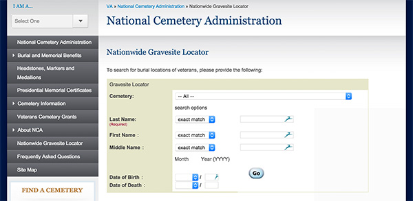
I couldn’t find any dataset for veteran’s deaths and births, and even if I did, there must be millions of lines of data. But, the VA administration has a gravesite finder. The gravesite finder is basically a form that you submit with a name. It then returns every matching name, where they are buried, their birth and death, their rank, their service, and the wars they served in. EUREKA.

I created a datascraper (no Temboo choreos, sadly), that takes the 5,000 most common surnames in the US, submits a form to the VA site, then goes through each page of results and stores them locally. I also created a parser to transform the HTML into CSV. Because the VA’s HTML is not well written, the challenge of parsing isn’t trivial, and required me to make a few assumptions and guesses to categorize data. Taking the 5,000 most popular names means this will be a large dataset. I’ve scrape some 300,000 records and am finished with the 1,500 least-common names on my list. Finding ways to pair this list down without upsetting the descriptive power of the data will be a challenge.

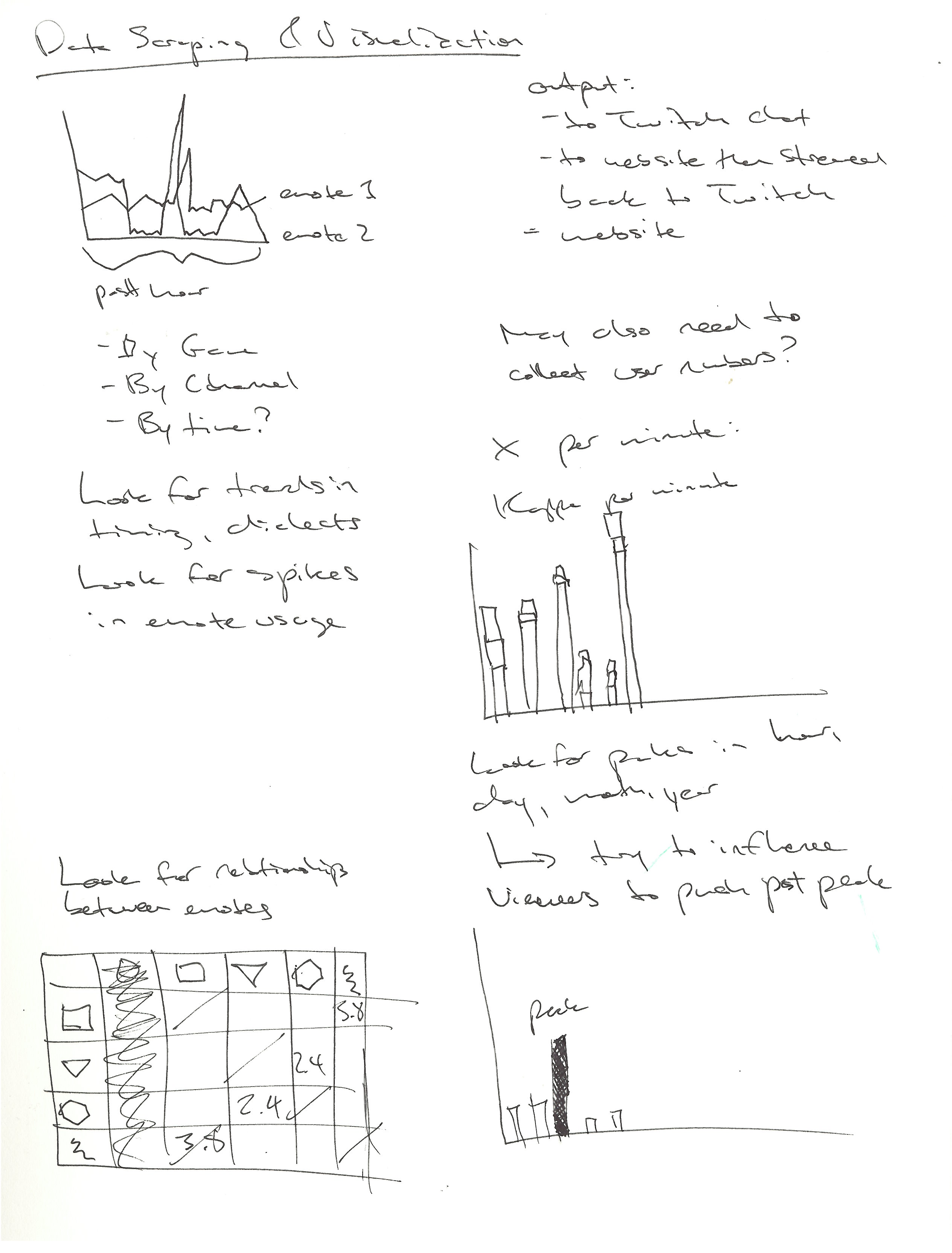
Here’s a sketch of some ideas for how to visualize this data.

sketch-scrape-1sketch-scrape-2

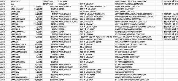
Here is some data. Click on the image to download a small csv of the data.

sketch-scrape-3

Zack Aman

24 Jan 2015

The data I chose to scrape is the chat from Twitch.tv, a website where people can stream themselves playing video games.  Specifically, I built an IRC bot to scrape the usage of emotes for a channel by minute.  The chat in some channels is notoriously rude, whereas others are mild and well-mannered.  As one viewer puts it, “this chat gives aids to cancer.”

Screen Shot 2015-01-22 at 12.01.27 PM

My end goal is visualizing, by minute, the emote usage of different channels and different games.  My hypothesis is that different games (and to a lesser extent channels within those games) will have their own emote dialect, emphasizing some more than others.  There are also spikes of specific emotes as everyone hops onto a message bandwagon, which might be interesting to visualize by number of distinct people that used that emote.

For this project, I learned how to build an IRC bot using Node.js which can look for keywords, tabulate the metrics, and write output back to the channel.  I used this approach because scraping the data from the DOM was not easy given the dynamic and ever-changing nature of chat.  In its current state I’m currently looking for five common emotes, but will expand it into the full list of twitch emotes as I move forward.

Code viewable on GitHub here.

Rough sketch of visualization options and ideas:

There are a couple of things that I think would be interesting to visualize:

  • The correlation of different emotes within a channel (or within a game)
  • Look for some sort of “chat quality index” that might be calculated based on the emote usage or the amount of bandwagoning with single emotes and then graph this against game popularity and number of channel viewers.  My guess is that chat quality decreases with more viewers.
  • A split bar graph with emote per minute.  “Kappa per minute” is a common phrase on Twitch, but it would be interesting to show an actual graph of emote usage and identify peak emote speed within different contexts.
  • A line graph of emote usage would be good for clearly showing the spikes in usage.

Here is some sample data from chat of AmazHS playing Hearthstone.  There were roughly 30,000 viewers while I collected this data.

{
 "channel": "#amazhs",
 "timestamp": 1421943255095,
 "Kappa": 12,
 "EleGiggle": 0,
 "Kreygasm": 0,
 "fourhead": 2,
 "FrankerZ": 0
}
{
 "channel": "#amazhs",
 "timestamp": 1421943315312,
 "Kappa": 22,
 "EleGiggle": 1,
 "Kreygasm": 1,
 "fourhead": 0,
 "FrankerZ": 0
}
{
 "channel": "#amazhs",
 "timestamp": 1421943375523,
 "Kappa": 5,
 "EleGiggle": 0,
 "Kreygasm": 21,
 "fourhead": 3,
 "FrankerZ": 0
}
{
 "channel": "#amazhs",
 "timestamp": 1421943435693,
 "Kappa": 79,
 "EleGiggle": 0,
 "Kreygasm": 13,
 "fourhead": 0,
 "FrankerZ": 0
}
{
 "channel": "#amazhs",
 "timestamp": 1421943495919,
 "Kappa": 20,
 "EleGiggle": 0,
 "Kreygasm": 18,
 "fourhead": 2,
 "FrankerZ": 0
}
{
 "channel": "#amazhs",
 "timestamp": 1421943556087,
 "Kappa": 12,
 "EleGiggle": 0,
 "Kreygasm": 2,
 "fourhead": 0,
 "FrankerZ": 0
}
{
 "channel": "#amazhs",
 "timestamp": 1421943616276,
 "Kappa": 5,
 "EleGiggle": 0,
 "Kreygasm": 2,
 "fourhead": 0,
 "FrankerZ": 0
}
{
 "channel": "#amazhs",
 "timestamp": 1421943676460,
 "Kappa": 2,
 "EleGiggle": 0,
 "Kreygasm": 4,
 "fourhead": 0,
 "FrankerZ": 0
}
{
 "channel": "#amazhs",
 "timestamp": 1421943736668,
 "Kappa": 10,
 "EleGiggle": 1,
 "Kreygasm": 2,
 "fourhead": 1,
 "FrankerZ": 0
}
{
 "channel": "#amazhs",
 "timestamp": 1421943796875,
 "Kappa": 16,
 "EleGiggle": 2,
 "Kreygasm": 0,
 "fourhead": 2,
 "FrankerZ": 0
}
{
 "channel": "#amazhs",
 "timestamp": 1421943857058,
 "Kappa": 16,
 "EleGiggle": 1,
 "Kreygasm": 10,
 "fourhead": 3,
 "FrankerZ": 0
}

dantasse

19 Jan 2015

I scraped some Walkscore data. Walkscore is a website that tells you how walkable a certain address is. (“Walkable” means you can get to shops, restaurants, public resources, whatever else you need reasonably well by walking.) I’m interested in how walkability correlates with other factors of a city such as schools, socioeconomic status, and crime.

The data is a 0.1 degree latitude and longitude “square” around Pittsburgh’s center (40.441667, -80), sampled at approximately 0.005 degree increments. I say “approximately” because when you submit a query to the Walkscore API, it “snaps” it to the nearest lat/lon point in their database, which are not exactly on 0.005 degree increments. They’re close, though; at 40 degrees north, 0.005 degrees latitude is about 1821 feet (longitude: 1391 ft), and they advertise that their grid is about 500 feet between points. It would be nice to sample every 500 feet (about 0.001 degrees) but that would take too many queries: .005 degree increments for a 0.2 degree range = 1600 queries, .002 degree increments = 10,000 queries, .001 degree increments = 40,000 queries. Their rate limit is 5000/day.

Anyway, here’s a slice of the data:


Screen Shot 2015-01-19 at 3.55.43 PM

Ways I might visualize it: good question. The easy thing that comes to mind is a heat map, which they’ve already done (greener = higher walkscore):

Screen Shot 2015-01-19 at 4.01.26 PM

I could also do various different heatmaps (heatmap of “walkscore minus crime”, heatmap of “walkscore + instagram posts” etc) but that’s not super exciting either. One idea: get a bunch of real estate/rent listings, show how many at each price point are how walkable.

Another thing I’m thinking is, a big geo data set might be easier to explore in slices, one point at a time. What about street view photos from the most walkable places? What about an experience like Spent – you put in how much you want to pay in rent, then you have to make a series of decisions about where you’ll get groceries, where you’ll get your car fixed (if you have one), etc. The point I’m trying to make is that walkability is, in a way, a civil rights issue. Maybe that’s too simple. Sketches of both ideas below:

IMG_20150119_162838

Code is in github here. Data’s there too, actually, because it’s pretty small.