Since this was going to be my secondary assignment, I thought I’d use it as an opportunity to collect and play around with some data I’d been interested in for a while.
Story Time
My interest stems from the tried-and-true notion that generating narrative with a computer is hard. Historically, it’s been very difficult to write programs that create comprehensible, meaningful story (spoiler alert! This does not change by the end of this post). Creating characters, leading them through plot arcs and coming up with entertaining, meaningful action are very hard for computers to get right, and while we’ve certainly been making advances, no one seems convinced that some algorithm is going to replace the screenwriter any time soon.
This makes it sound as though humans coming up with stories have it easy. While we’re probably better equipped for creative writing than NLTK, I can’t help but think of all the times I’ve been stuck in a script room for hours as we tried to figure out what could possibly come next? Does this make any sense at all? How are we going to make this profound?
In the script room, we have our own algorithms for generating narrative. On a good day, you start by getting a very detailed picture of your characters in your head, then place them in their setting and simply narrate the natural outcomes of their interaction. On a good day, this feels so obvious and organic — there’s only one way the story could possibly go. Other times, however, this just isn’t going to work: you can’t write a scene that doesn’t feel totally contrived, it’s not clear what the big picture is going to be, nothing you say feels clever, authentic, original. In other words, you get stuck.
Fortunately, the script room also had a lot of algorithms for getting unstuck. Lots of writers across genres like to use the cutup technique, where you cut out words from the newspaper, stick them together at random, and try to make sense of the sentences it creates. With theatre in particular, we liked putting iPods on shuffle, and using the sequence of songs to inspire some sort of story.
This works really well for drama. Songs are sort of like micro-expressions that quickly establish a set of characters, along with their relationships, motivations and actions. Stringing these together, combined with some amount of assistance and optimism, does help come up with characters, find a trajectory and eventually do something clever.
Data Collection
While the general processes for crafting narrative are creative, intuition-heavy and hard to model, it’s worth pointing out that, even in the human case, we sometimes turn to procedure and randomness when we want something new. I was interested in collecting a dataset that might leverage this fact, making use of what computers do best to create, at the very least, a starting point for original narrative.
With the song cutout technique in mind, I scraped the information for the 2000 most recent songs from http://billboardtop100of.com/ (inspired by Jon Mars’ data scraping plans), as well as the songs from a list of albums for top Broadway musicals . From there, I used a Youtube python library to find a YouTube video that played the music for each of these songs. At the end of the day, I had a list of song titles, their artists, and YouTube videos playing each song.
I sent these entries to 250 workers via Mechanical Turk, asking them each to listen to a sing, and write a few sentences describing the story the song seems to tell. For instance, a description for Baby Got Back might be “Man rebutes one woman’s claims that large butts are unattractive, citing his own preference for curvy women”. I considered this to be a test run: I didn’t give the task a lot of restriction, because I wanted to see what folks would come up with.
5 hours and $30 later, I had my 250 entries. Responses ranged from the literal:
A girl goes to Los Angeles for the first time. She goes to a club and gains attention because she doesn’t look like someone who lives there. Every time she gets uneasy she hears a song on the radio/stereo/etc. that makes her feel reassured and then she continues to party. The time comes close for her to go back home so she makes one last hurrah.
To the figurative:
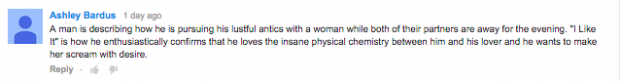
The protagonist/singer is describing a difficult, tenuous, challenging and ultimately obsessive relationship, one that affords him both pride and shame. Despite the problems, including the fact that there are issues neither party is willing to address aloud, the singer does not want it to end. In fact, he is begging his partner to keep it alive, reminding that person that they have pulled through before, again and again, and that he, (the singer/protagonist,) is willing to be subservient, put his partner in the limelight, be the quiet ‘wind beneath the wings,’ as it were, fly under the radar, do whatever it takes, experience whatever he must, of shame and denial, to keep the relationship going.
On the whole, most of the responses had at least some trace of analysis, and generally tried to get to the core of the song — “this song is about”. It was really interesting data, and it seemed like it might be a good set of building blocks for creating narrative.
Methods of Interpretation
At first, I was interested in writing a script to cluster songs that had similar ideas: for instance, I had several songs about cheating (which basic IDF was generally able to pick up on): one where a man is upset about his girlfriend’s flirtation, one where a girl is feeling tempted to cheat, one where a man tempts a woman to cheat, one where a man is upset about a breakup in which his girlfriend cheated, one where a woman is relishing her new single life, one where a man moves on with a better partner, cursing the old one, one where a woman recoils at the sight of her ex with a new girl: if a computer was able to order that kind of progression from these word descriptions, we’d be in business. But it’s not clear we have any good tools for doing such a thing, or if the sample size is big enough to do some clever analysis. I also considered randomly assembling the descriptions into a series of paragraphs to tell a story but course staff decided that this wasn’t a very interesting visualization.
If I had a ton of resources, I’d love to take a set of these song descriptions, ordered either at random or by turkers, and send them to paid writers to write a short script. I think it would be very interesting to see if something particularly creative and plausible is able to come out of this sort of treatment. Without resources, however, it’s hard to add creative intervention to this sort of thing.
It was noted that, in their original form, many of them strung together sound like an art review:
The singer is describing an infatuation, or maybe a lover, who is a recurring image in her dreams. Though the dreams are often pleasant she describes him as also being a nightmare – perhaps reflecting the confused feelings. Even still, she wants to see him every night when she drifts off to sleep.
There’s an interplay here between a man and woman outlining their abusive relationship which each other. The man is in love with the woman but can’t resist his violent and hateful impulses. The woman knows that she should leave, but is continually lured in by the promise of his love (which is a lie)
This song is about how a person should treat his significant other like they will never see them again. This is because like it says in the song, “every day is not guaranteed”. Anyone can die tomorrow.
However, without a visualization or some kind of interaction, this wasn’t going to be interesting.
As a last attempt at using my data to engage with the world around me, I turned to one of the final techniques in my memory of script room meetings, the kind that never results in anything good, for when you know you’ve lost and yet, have somehow deluded yourself into believing that your action is going to result in something positive and productive.
You start a fight.
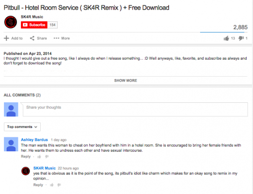
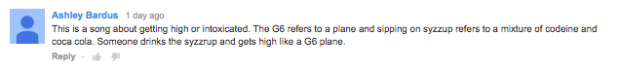
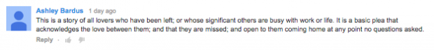
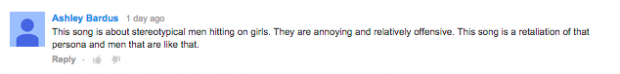
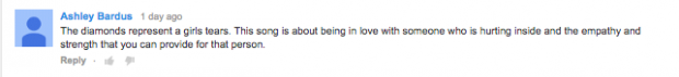
I created a gmail account under the name songpoet1996, along with a YouTube account. I then wrote a script to find 50 YouTube videos that played each song, and for each, posting its “description” as a comment on the video. At face value, the descriptions are innocent attempts at summary and analysis. As a YouTube comment, however, they tended to take on a certain amount of pretension and obtuseness. It looked like the kind of thing that might invite some strong words on the internet.
As for my other plans, I’m still interested in working with this kind of dataset, and would like to see what kind of potential songs-as-narrative-blocks has for creating new stories. Until then, I’m going to resort to the traditional pastime of theatre artists who have no more good ideas — fucking with people and calling their backlash “art”
Combined with the random montage bot, this is working out to be an interesting YouTube account. I’m interested in seeing what happens next.

 I am now officially a tool-assisted asshole
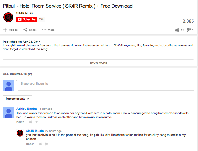


