Part I. Two Addons in OF
For this part of the assignment, I only had time to do the base requirements, i.e. getting two addons to compile in the same project (as you can see if my beautiful output screenshot below). As I have experience with openFrameworks and the type of work I am interested in doing does not usually require the use of c++, I decided to make this the last priority of the assignment. The addons I chose to use were ofxBlur and ofxCameraFilter, simply because they were both built by Kyle McDonald and came highly rated, so I figured they were likely to compile without issues. My very intricate code can be found here.
Part II. Map Visualizations
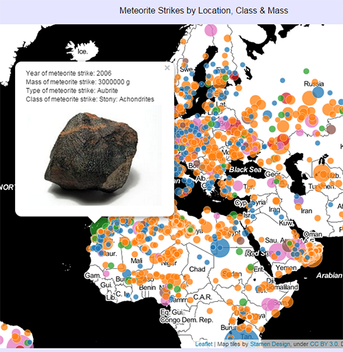
For this part of the assignment, I chose to work with the meteorite strikes dataset because the data was already pretty clean and seemed interesting to me. For both visualizations, I was interested in understanding trends within different classes of meteorites, in terms of where and when they were found and how big they were. Based on information I found on Wikipedia, I put each meteorite into one of seven classes, determined by the meteorite’s type. My map visualization was created using Leaflet, based on Ingrid’s examples, and can be viewed here. The code for it can be found here. This visualization geoplots where each meteorite was found with a circle. The radius of the circle is proportionate to the mass of the meteorite and the color refers to the meteorite’s class. Each point can be clicked to reveal a popup with more information about the meteorite, including the year of its strike, its mass, its type, and its class, along with a picture of an example meteorite from that class.
For my non-map visualization, I decided to plot the same data on parallel sets using D3. I based the code on one of the D3 examples. The visualization can be viewed here and the code is located here. A parallel set visualization lays out different data categories or ranges on axes and plots a line sequence across these axes for each data point. I decided to create an axis for meteorite class, mass and year of strike. The screenshots below show how the different meteorites get plotted and how a user can filter down to subsets of the data that interest them.
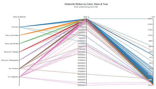
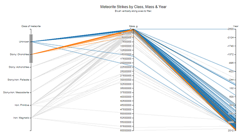
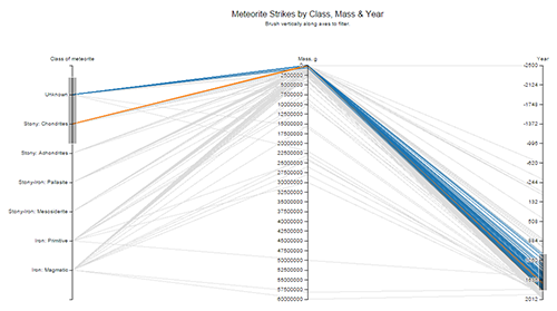
I think that the parallel sets visualization is more informative about the relationships between class and year and class and mass, and the map visualization is more useful for understanding the relationship between class and geolocation and the proportion of meteorites within the different classes. From the map, for instance, it is clear that there are a lot of Stony Chlorite meteorites in comparison to other classes, but you would not be able to understand this from the parallel sets visualization as they all have similar masses and thus have lines plotted atop one another. However, from the parallel sets visualization, it is obvious that most of the meteorites are on the smaller side and have been found in recent years.
Part III. Image Bot
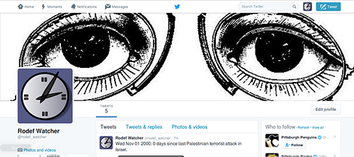
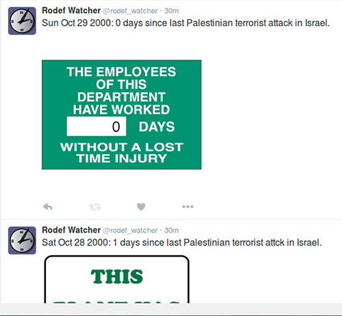
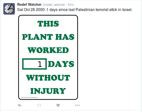
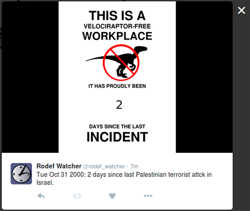
My image bot is @rodef_watcher. The code for it can be found here. Rodef Watcher reports Palestinian terrorist attacks in Israel and counts the days between attacks (‘rodef’ is the Hebrew word for a pursuer, i.e. one intending to do harm to someone else). The bot also posts an image of a “random” (within a group of seven) days-without-incident sign with the number filled in as the number of days since the last terrorist attack.
When pondering the prompt for this assignment, I knew I wanted to make a bot that would address some sort of social issue that I was passionate about. I don’t use Twitter very much myself, so I wanted the bot to have a real purpose to use Twitter as a platform. I got the specific idea for reporting on terrorist attacks in Israel while reading Mark Sample’s Bots of Conviction. In particular I was inspired to this idea by Sample’s description of “oppositional” and “uncanny” bots, though I think Rodef Watcher does a good job at hitting on all of the characteristics Sample describes. Many (educated) people know, or think they know, generally what is going on in the Middle East, but the whole picture is not really seen. The general consensus I find is that Israelis and the Israeli government are being oppressive to the Palestinians and are at fault for the continuation of the conflict. However, what seems to be overlooked is the constant threat of terror attack that Israelis live with on a daily basis. Rodef Watcher’s sole ambition is bring awareness and attention to this often disregarded piece of the conflict.
Below are some examples of the tweets. On their own, the tweets are not so impactful; they display a date and a number of days that will be forgotten upon looking away from the tweet. The power is really in the list of tweets, where you can consistently see the small number of days between attacks and understand how imminent the threat of attack is on a daily basis.
I created the bot initially by following Dan Shiftman’s Image Bot tutorial using Processing. After getting it to run locally, I looked for a way to put the bot on the shared server I rent. However, I found that I would not be able run Processing in headless mode of the server, so I converted my bot’s code to work with node canvas instead. Then, I discovered I wouldn’t be able to get it to run off the server so I learned about heroku and put it up on a heroku server. When running locally, I was using text files to keep track of dates I had already tweeted. However, these would not persist on heroku so I learned how to set up and use redis for my basic purposes. Currently, the bot posts once every 2-5 hours or so going through a list of previously recorded terrorist attacks starting in September 2000. Once it finishes, it will begin posting once a day.