- Plotting on a map.
I used the data from “The counted” database. I think that the year of 2015 was when police violence became especially prevalent in social media, and wanted to explore it.
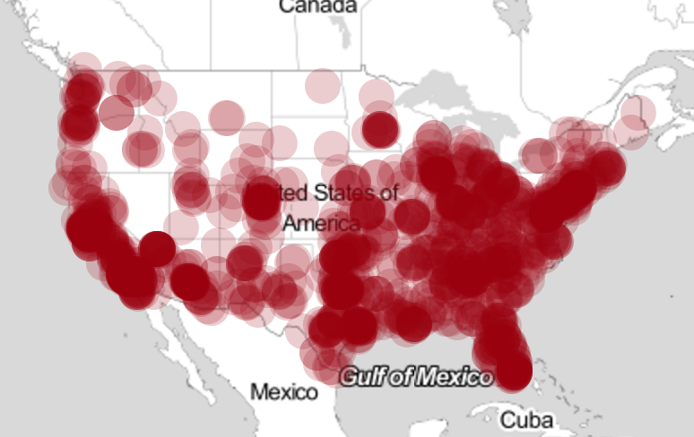
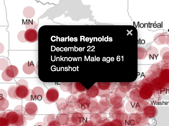
For this first map, I used leaflet to generate a map – much like in Ingrid Burrington’s lecture. I wanted to capture how dense the data was so I used opacity to show where it was most dense. Each of the popups gives more information about the specific dots. Along with capturing how much data there is, clicking on a dot gives individual information. To me — it reveals how even in data with such density, it is still made up of individuals.
link: http://jshen12815.github.io/basic_map/map.html
2. A non-map
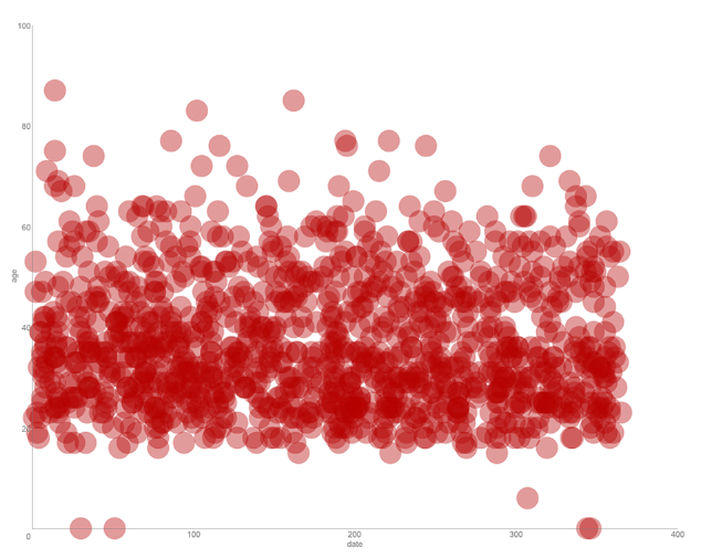
My non map is not what I wanted it to be. I originally tried creating a bar graph in D3 that was separated by race and age, but was unable to do so within the time restraints. As a result I plotted a scatterplot of ages and dates. (the rogue circles on the x axis are those with unknown ages).
Both maps reveal a lot about the information. Some are pretty expected, for example, the higher density of deaths in higher density cities on the map. Other things were less expected, for example the sharp cutoff in deaths at around age 20 in the non map (though this may be because of lack of data for minors). Both maps do what I think they were expected to do: 1. show the locations of situations, and 2. display the age densities of this information. However, I had expected to learn more from mapping this data. I think I need to work more on my previous idea for mapping out based on race, gender, and age. These bits of information, I think will be more telling.
repo: https://github.com/jshen12815/IACDS16/tree/master/Gauntlet1:28/Maps