Map Visualizations: Predators of the Sky
Visualization: http://shouvikmani.github.io/IACD/Map_Visualizations/index.html
Initially, I was apprehensive about working with the drone strike dataset. I feared that a simple map or non-map visualization wouldn’t be able to convey the gravity of the subject. When you represent drone strikes as markers on a map, you abstract away the issue, since colored dots don’t do justice to the thousands of innocent civilians who have been killed or injured by these drone strikes. So, I made a conscious effort to honor the solemnity of the topic when developing these visualizations.
My goal with these visualizations was to uncover some truths about this secretive antiterrorism program of the U.S. government. Personally, I’ve been impartial about the drone issue, and I wanted more data and insights so that I could take a stance.
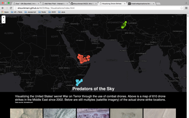
In my map visualization, I plotted the drone strikes as markers. I color coded these markers by the color of the victim country’s flag so that users could see that the strikes were concentrated in just three countries. I also added a text pop-up to each marker that displays the details of the strike, including location, date, narrative, and casualties. The pop-ups with information allowed me to convey these strikes as individual attacks, rather than just a part of a whole in the campaign against terrorism.
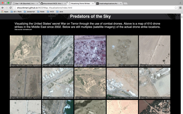
For my non-map visualization, I used the technique of still multiples to show a grid of satellite images of the actual drone strike locations. As you scroll through the page, you can make out small houses, roads, mountains, and even beaches (along the Somalia and Yemen coasts). These pictures transport you to a different world and you can almost imagine what it might be like to live there. By seeing the individual images of the drone strike locations, you start empathizing with the communities and people effected. The visualization evokes a horrific feeling, which is what I was aiming for.
The two visualizations offer very different insights on the same data. While the map visualizations offers an overall look at the scale and location of drone strikes, the non-map visualizations offers a more refined view that lets users find the similarities and differences between drone strike locations.
I made a surprising discovery from the non-map still multiples visualization. I had always thought that drone strikes would be carried out in rural, uninhabited areas to minimize casualties. But clearly, some of the satellite images show densely populated areas. With a blast radius of 20-30 meters, a drone strike could wipe out anyone in the near vicinity. I think this is a hidden secret by our government, and it’s disturbing that we’re killing innocent civilians in densely populated areas in the name of antiterrorism.
GitHub: https://github.com/shouvikmani/IACD/tree/master/Map_Visualizations