Tweetable: “How does the wearable technology market split up by sensor?”
I began with hand coding the data from Vandico Inc Wearable Tech Insight Database. For my thesis I am trying to figure out what I want to focus upon, and utilizing this data is a manner for me to figure out part of the space in the current market. On the Vandico website I wast able to manipulate the data and see how it interacted with one another. I utilized hierarchical agglomerative clustering to determine distance of similarity between the different wearables based on the sensors in common. I used tutorials from here and here, to help me manipulate the data. I tried to create a co-occurence matrix but found myself stuck with information I was unsure of how to overlap outside of python and utilize it in d3.js. I learned that the data clustered differently than I imagined it to. I didnt expect it to have the amount of space it did in the accelerometer section and was surprised that it appears in only 60% of the wearables, when I imagined it to be more.
I created the heatmap below to show the matrix of sensors to wearables.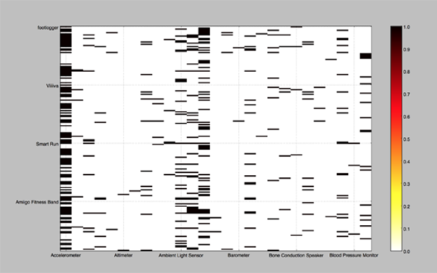
I then clustered the data based on linkage and simulated its similarities in the heat map matrix chart below.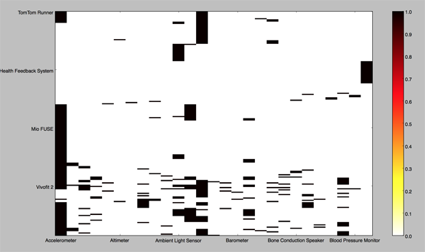
I also created a dendogram of the current market to understand how the market is clustered together based on which sensor.
I want to make this visualization multi-variant as the the experience, and plan to still accomplish this but had trouble with using the data to compare itself into a co-occurence matrix. I would also like to create a chart that is similar to this one, and show how different sensors divide to incorporate other sensors in the market. I think that one chart of clustering doesnt do the information justice and there is more to be garnered and explored, I just got caught and stuck on trying to solve one problem rather than exploring other options.