Category Archives: 24-infovizsketch

Zach Rispoli

10 Feb 2015

My info visualization will explore the awkward world of crossover fanfiction (a genre of fanfiction that combines characters/words from many different series). I want to be able to see what series are the most popular to combine, but also to discover the most strange and obscure crossovers (for example, this is a crossover between Scooby Doo and Lord of the Rings) with an interactive visualization.

This website has easily scrape-able data for about 30,000 works of crossover fanfiction.

I want to visualize this data as either a scatterplot where each dot represents a series, and the closer together a series is, the more fanctions that combine them exist…

Screen Shot 2015-02-10 at 7.48.50 AM

…or as a circular relationship graph where each connection represents one story.

screenshot

Yeliz Karadayi

10 Feb 2015

WARNING: really bad sketch.dv1 dv2

So I was going to do a basic thing with the visualization for torrenting websites, but after collecting for the past couple weeks I saw that the data is 1) not changing much at all 2) not as interesting as I thought it would be and 3) not the cleanest data for how much I’m collecting. I’d have no idea how to parse. I decided to simplify to a better database.

I was watching John Oliver and he talked about how doctors basically get paid by medicine providers to push their product. There is a website that logs all this information. I’m pretty interested in this. I want to compare this database to data that I’m still looking for that shows the quantity of sick people in each city and what their ailments are. There must be some kind of connection, right? I’m so curious. And what are the connections? If there are, does correlation imply causation?

I think this will raise some more interesting questions than my last idea so I’m running with it. In the mean time I have some awesome- I mean awful- sketches of some visuals that to me seem pretty boring and basic. What are more interesting or revealing ways to visualize this though?


As to other works that inspired me, I really liked the name visualization. I also really find cartography interesting which I guess is why I put the graph down imagining it to be similar to the name, and the map. Cartography is particularly interesting because of the geographical overlaying opportunities. I don’t know how to do that kind of thing quite yet, though. I saw a couple projects dealing with manipulating the size of the land based on population or tree growth rates.  Maybe something like that?

Sylvia Kosowski

10 Feb 2015

I came up with a new idea for my InfoVis project, unrelated to my previous idea.

This idea is to create a form of Twitter-Scrabble. The way the data is collected is as follows: 1. Start with a random Tweet. Choose a random word in that Tweet and find another random Tweet with that word in it. Continue this process until a large amount of Tweets have been gathered.

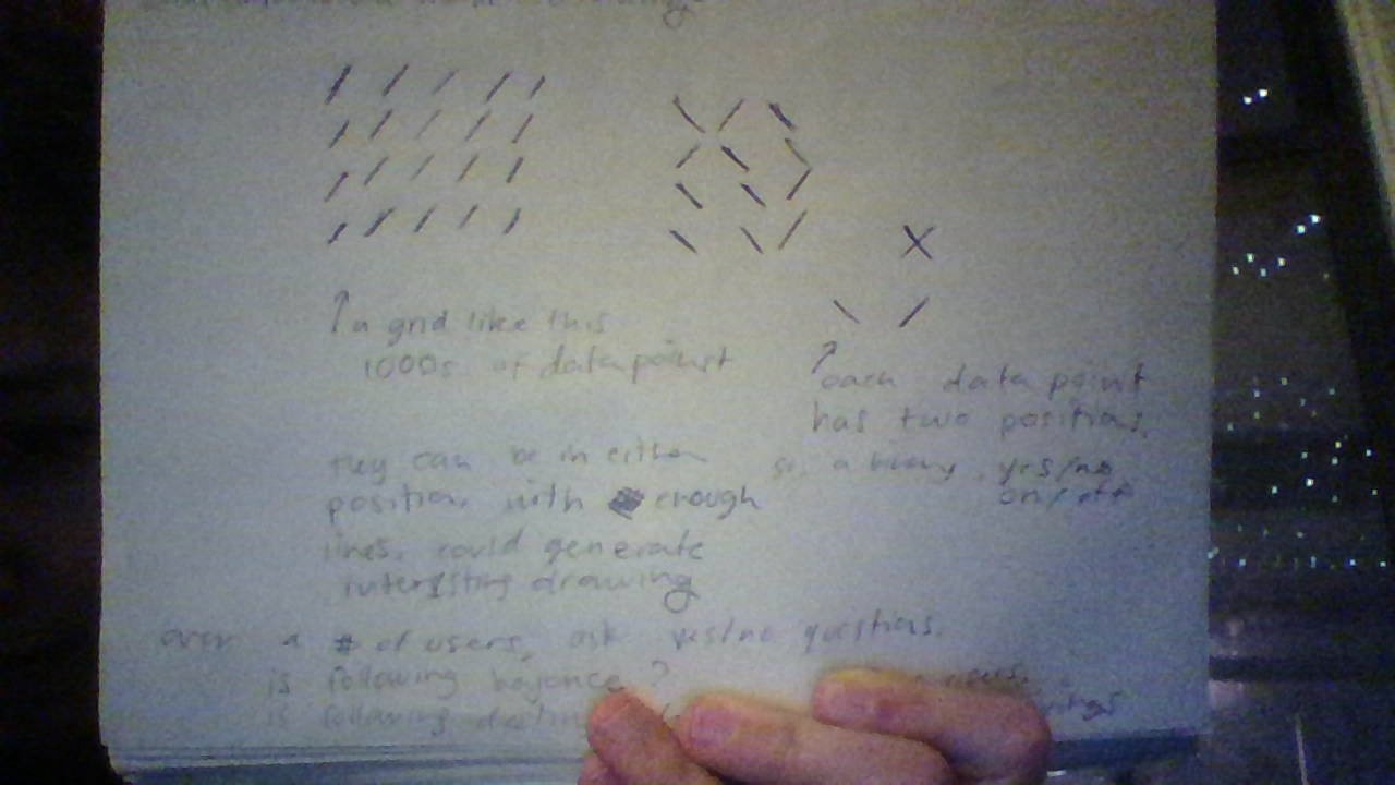
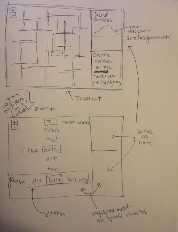
The visualization will be arranged in a somewhat Scrabble-like nature, wherein Tweets which share a word will be arranged perpendicularly so that they cross where the shared word occurs. You will be able to zoom very far out so that the Tweets are abstracted beyond recognition into criss-crosssing patterns, and also be able to zoom in close enough to read each individual Tweet. In addition, each Tweet will have a calculated “Scrabble score” using the scores that each letter receives in a traditional game of Scrabble. Additionally, there will be a side panel which will show overall statistics about the board (such as the distribution of scores,  etc.)

The reason I decided to connect Twitter to Scrabble was because of the nature of Twitter posts as being only 150 characters long. The idea of people having to cram everything they might want to say into such a small space is a curious and interesting phenomenon. Tweets are already by their nature quantifying words and condensing the meaning of those words. I wanted to further quantify these already quantified entities and further abstract away from their original meaning by assigning Scrabble scores to them, treating them as scores and game pieces rather than content.

A basic sketch of how the visualization might look is below:

IMG_0969

I was also debating whether or not I should create some sort of Bot which will Tweet the people it gets the Tweets from with the Scrabble score it assigned to their Tweet.


ST

10 Feb 2015

WIN_20150210_065004


I am going in a different direction than my current data scrape.

I plan to use a grid of diagonal unit lines, either / or \ indicating yes/no for a particular question.

For example, using 100000 instagram users, I could have a  1000×1000 grid which will display a different drawing for the following questions:

Does this user follow Beyonce?
Does this user follow Destiny’s Child?

By using these diagonal marks, we will be able to see those users who are going ‘against the grain’.

John Choi

10 Feb 2015

Mountain View

Essentially, this is the same idea I’ve had for the data I’ve collected so far, which are 10 second audio samples of YouTube sounds garnered from results of robotically searching abstract terms on the YouTube search bar.

The idea for this visualization is to have a bunch of buttons that play averaged sounds from hundreds of videos collected from YouTube.  While the text terms listed on the paper are only temporary, it clearly demonstrates the idea.  Suppose I press the “Hamburger” button.  The visualization will then proceed to play an averaged sound of several hundred YouTube videos tagged “Hamburger.”  Now, instead of hamburgers, I intend to collect and display sounds from abstract terms, which are words without any physical sound qualities.