Category Archives: looking-outwards

Yeliz Karadayi

18 Mar 2015

“D-Coil” by Huaishu Peng. 2015

D-Coil is a pretty perfect example of what it means to have human-interactive control over machine fabrication. I’m not positive as to how this is being implemented but it appears as though the machine moves along while the hand chooses exactly where to go within the limits. I hope to have my project have more freedom in terms of the fabrication process, however, as this project is limited to the layer by layer coiling as the name implies. That being said, I think this project is incredibly close to what I plan on doing.

More

“WirePrint” by Stephanie Mueller. 2014

Stephanie takes an innovative look into the capabilities of a 3d printer by 3d printing prototypes using a wireframe instead of the typical stacking. I find this to be a benefit that my project will have as well. I think this can be expanded upon regarding patterns to be made. Stephanie’s work is purely about the function and efficiency of the fabrication and less about the design and beauty of it.

More

Alex Sciuto

17 Mar 2015

propublica-538

Two recent projects that have come across my Twitter feed are 538’s airport visualization and Propublica’s Health Data Breach visualization. I like them because they are both very competently executed, but they approach user interaction in different ways. During the previous critique, Chris Harrison mentioned about my project that it had “a patina of interactivity” as opposed to rich interactivity. The Propublica graph could have the same the critique leveled at it, while the Airport visualization is much richer. There are strengths to both strategies.

Which Flight Will Get You There Fastest?

538 presents a map with US airports as nodes. The map initially contains no data beyond the airport locations. The user can hover over an airport and see which other airports have more efficient routes. Clicking on a second airport isolates the connection and displays additional information. As the user clicks through the progression, cards stack next to the map showing the user’s state.

The primary pleasure of the experience is hovering over different airports, seeing the routes light up and seeing which airports contain mostly green or mostly red airports. The least successful parts are the zoom-in information screens. The detailed information graph is difficult to read, and requires moving your eyes away from the screen.

Going back to the quality of the interactivity, The 538 map offers no information unless interacted with. That’s great for people like me who are looking at this data and curious about the vis’s construction, but to someone on smart phone or someone without much interest, the amount of work to get to insight is too high.

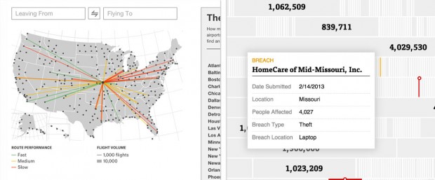
Over 1,100 Health Data Breaches, but Few Fines

I like ProPublica’s visualization of health data breaches because it works well without any interactivity at all. In addition, the non-interactive initial layout entices the viewer to interact and learn more information highlighting outliers with actual numbers. The filter and zoom interactivity that is front and center for 538 is secondary for Propublica. The user most likely only filters by state and company if they have a specific question about the data.

Deeper interactivity is non-existent. Deeper meaning more than filter and hover.

I think both strategies for interactivity are needed for a successful data visualization. The vis needs to entice the user for interaction, then deliver on that enticement.


ST

17 Mar 2015

I am still thinking about work that exists in the browser (not as documentation). I found two similar projects this week on rhizome. Both use html elements to allow interaction from the viewer. I do enjoy browser based works encourage interaction, because viewers are so familiar with the interface.

Form Art (1997)
By Alexei Shulgin
This piece reads like interactive fiction. There are pages after pages of forms, buttons/text input/scrollbars, and with each click, you are whisked away to another page or external window. Some lead to fields of radio buttons, others lead to similar pages staged as ‘games’.

LO9-2

Overall, the work is a formal study of browser aesthetics.  Some of the pages seem to be computationally generated and many of the pages are animated. I especially enjoy the grids of animated radio buttons.  I’m interested in the barrage of formal studies within the browser.


Chill Space (2010)
by Daniel Leyva
In this work, viewers are prompted to ‘click around for [their] room’. A large field of html elements is displayed on the static home page. Clicking these buttons will not lead you to another page. I began to realize that by clicking these buttons, I was customizing my own ‘chill space’. At the end of the clicking adventure, you can submit your response and receive an image, your own chill space.
I think this work is really exciting: it is quick and digestible, and makes sense on the web. It also parodies the amount of internet quizzes that promise accurate readings of personality based off of a limited number of answers to arbitrary questions. However, the outcome of this ‘quiz’ is much more interesting to me. 1) It is visual 2) The options aren’t clear, I can’t determine the precise relationships between the radio buttons and the image.

LO9-1 LO9

Matthew Kellogg-Looking Outwards 8

Snake on the Fountains of London

In this project snake can be played on an array of fountains at Granary Square, in King’s Cross.

I like that the game is interactive and public, but even more than this I like the scale. I only have ever considered snake on a small scale because of the resolution and its correlation with with Nokia phones from the 90’s. I had also not considered it as a multiplayer game.

I feel that this project is great in concept and that it looks great in action, but its interactive nature is broken in a few ways. The first is that the snake jumps from one rectangle of fountains to the other. I feel that they should have made two separate games or found some way to avoid this as it breaks the idea of continuity in the playing field and doesn’t make it clear that the edges are barriers. The control method also seems roughly done. I would prefer buttons on the screen to needing to swing the phone 90 degrees in any direction, but perhaps the interaction shown in the video is exaggerated.

I feel that they may have chosen the wrong game for the situation and maybe it would have made more sense to chose a game which works well in the rectangles given. The first thing that comes to mind is Tetris.

Obake

In 2013 Dhairya Dand and Robert Hemsley created a project that sought to develop gestures for an interactive 2.5D surface display.

I like this because it created new opportunities for interaction. This project reminds me of another that created a surface using moving pins. I appreciate this project because the display is much smoother.

I feel that they could have created more appealing interactions with the project. I understand that the project was a demonstration of the gestures, but it would have been interesting to see an interactive game or another use case where the display moves the surface and requires the user to interact with this dynamic.

obake24

Amy Friedman

16 Mar 2015

Psychogeographies

An installation created by Dustin Yellin and commissioned by the New York City Ballet to create 3d-esque figures of dancers using glass layers and cut out pieces of books, magazines, trash, etc.. Its about the weather and the way it impacts the human body, our blood and bones are affected by the surrounding environment. He jokes and claims that he makes “window pane sandwiches”, they are made of 3000 pound microscope slides. He also says that bone marrow can tell a story and this is the way of visualizing that experience. I feel this piece is an interesting visualization, and very calculated as they need to design each layer of glass, but you cant determine exactly how it will come out due to the random assortment of media they use to create color. I wonder how it looks from the back side of the sculptures and if they consider the mood looking from the opposite perspective (in the video only the front seems to be highlighted). This may not be programed, but the visualization tells a powerful story I wish his process of how he chose each one was explained better. I appreciate the reinterpretation of the memory of a body frozen in glass. It is emotional, but also has a view think about how their body feels throughout the day based on weather and changes.

A million digits of pi visualized

Screen Shot 2015-03-16 at 11.48.01 PM

This is a data visualization of 1 millions digits of pi. The colors scale from the first number of pi until the 1 millionth number, below is the color key to understand beginning and end of the sequence. This visualization was created by an astronomer named Nadieh Bremer.

Screen Shot 2015-03-16 at 11.49.54 PMThe direction of the line indicates the current number of pi, and steps to then create the next line determined by the number in pi.  See below.

Screen Shot 2015-03-16 at 11.50.01 PM

This visualization isnt an original idea, but inspired by the 1888 book “The Logic of Chance” by John Venn a mathematician. In this book his suggested the first “walk” of pi as the numbers 0-7 represent the 8 different directions on the compass. Other works which integrate pi include those by Martin Krywinski and Cristian Vasile. Visualizations are meant to show information in a new means, or medium. I feel that this is an interesting way to see what pi represents and how much 1 million digits represents outside a list of numbers. Its hard to tell what each number is and itd be nice if you could zoom in, or highlight each piece to what they are. Even allowing a video of the image as it forms a tree like formation. The description doesn’t make it clear of how the program truly jumps from one the the next number and how they could cluster the way they do.