Projects – State of the Union
The 2007 State of the Union Address, NYTimes 2007
Patterns of Speech: 75 Years of the State of the Union Addresses, NYTimes 2011
The State of Our Union, Tweeted, NYTimes 2015 (not a graphic, but interesting data source)
Graphic: Shortest to longest State of the Union addresses, USA Today 2015
The Language of the State of the Union, the Atlantic 2015
#SOTU2014: See the State of The Union address minute by minute on Twitter, Twitter 2014
The state of our union is … dumber, The Guardian 2013
Hindsight is 20/20, Luke Dubois
Projects – Text Visualization
Visualizing Repetition in Text, Univ. Toronto 2007
On the Origin of Species: The Preservation of Favoured Traces, Ben Fry 2009
Text Visualization, Lionel Michel 2009
Visualizing the text of (children’s) book series: Visualizations, Microsoft Research
State of the Unions, Jer Thorp for the NYTimes, 2011
WE ARE BEGINNING TO SEE POSITIVE SIGNS FOR OUR INDUSTRY — BEAR STEARNS, LEHMAN BROTHERS, FREDDIE MAC & FANNY MAE: 1984-2009, Jer Thorp 2009
Software Evolution Storylines, Ogawa and Mu 2010
Tweetable Summary
Explore 200 years of American history through the words of American president’s State of the Union Address.
Analysis
There is an opportunity to do a text visualization of the State of the Union speeches and letters that closely connects and displays presidents’ individual words with measurements of the uniqueness of those words. Most mainstream visualizations of State of the Union text, focus on providing summary statistics of interesting words and their locations. Most of these visualizations miss higher level sentence and paragraph analysis as well as hide the president’s actual words.
Showing summary data removes the immediacy of the speeches as well a removes the context that the presidents were writing in.
Preliminary Code
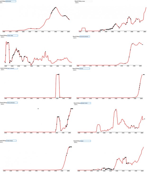
Below are screenshots of an exploratory visualization that plots Google n-gram data and notes when the same n-gram appears in a State of the Union speech. I would like to use n-gram data, but random n-grams pulled from State of the Union speeches are not interesting to view. Only carefully selected phrases yield an interesting picture.
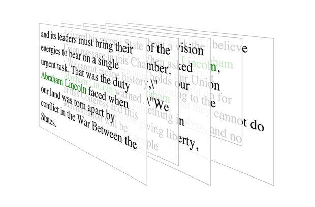
Below is another code exploration that uses layers of text to explore how phrases have been used used over time. I like this concept a lot because it brings the actual sentences to the forefront. The layered visualization is a bit over-the-top but it would work effectively to transition between speeches.