I visualized all the earthquakes that happened in the past month using Leaflet. I initially thought about visualizing names of the people killed by the police or from gun deaths and compare them with the names popular in 2015. That way I wanted to visualize the names that were gone and the names that were born. However I wanted to learn d3, spent a lot of trying to learn it and working on other Gauntlets so I unfortunately don’t have a legitimate second visualization of the data.
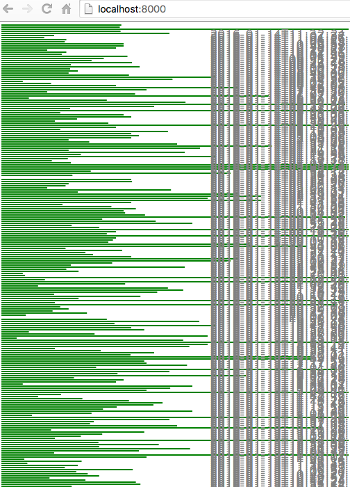
the following is how far I’ve reached on using d3, visualizing the earthquake data (the x axis represents the mag and the y axis represents the time from the past month from top to bottom)