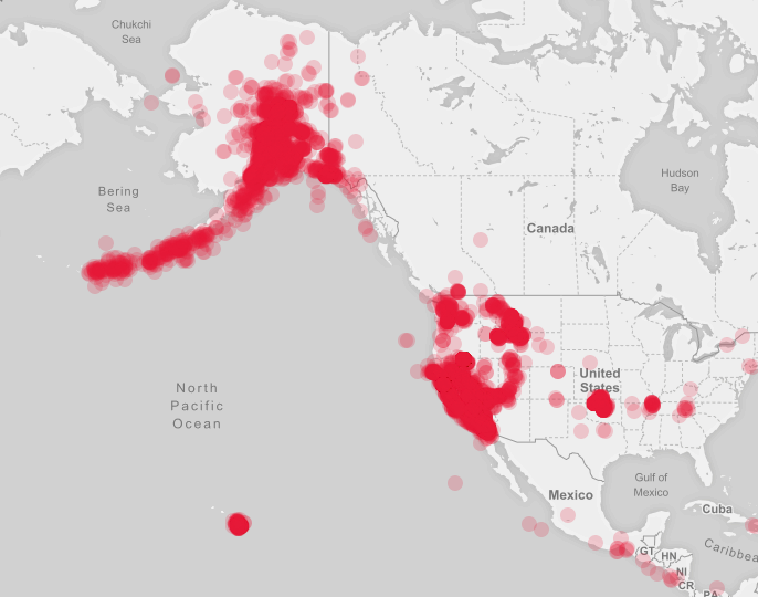
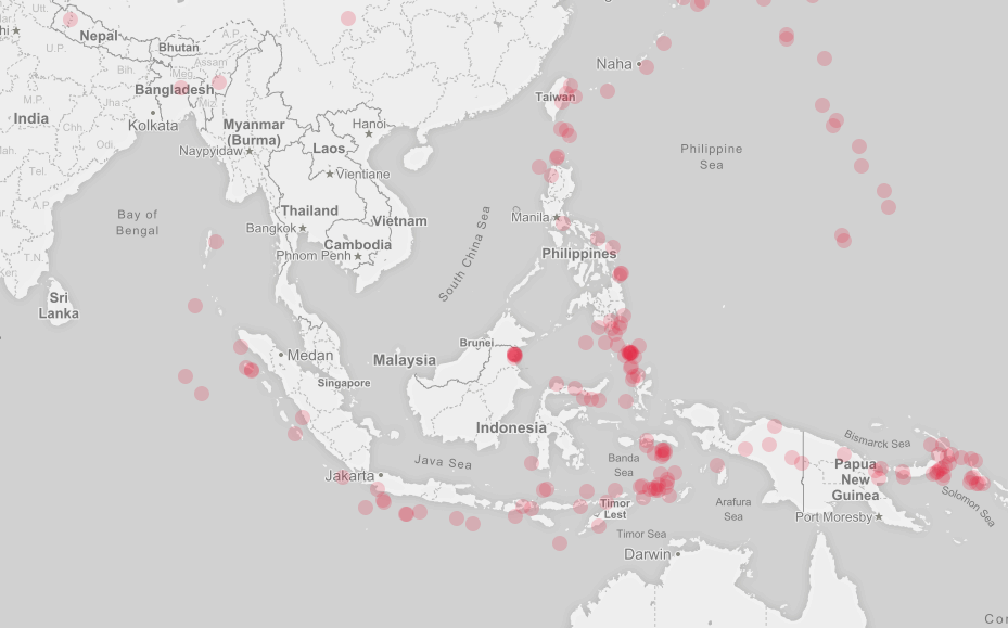
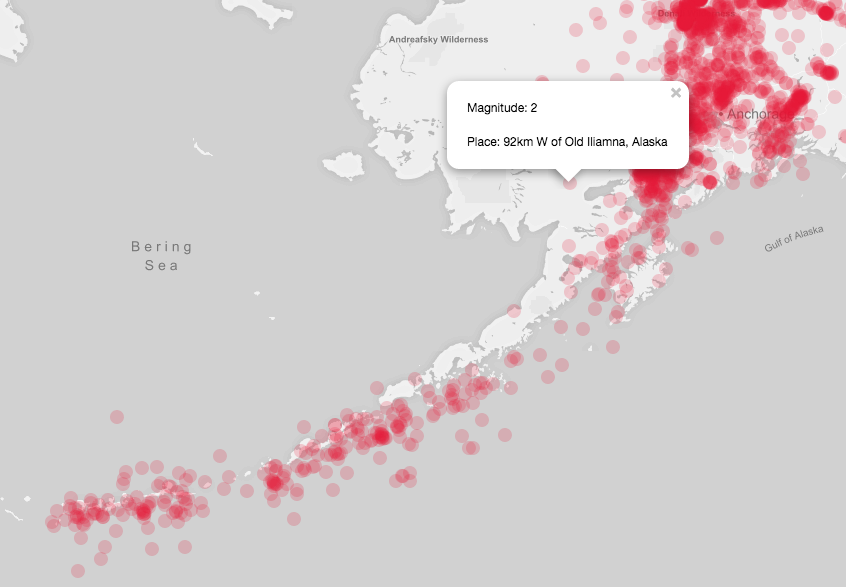
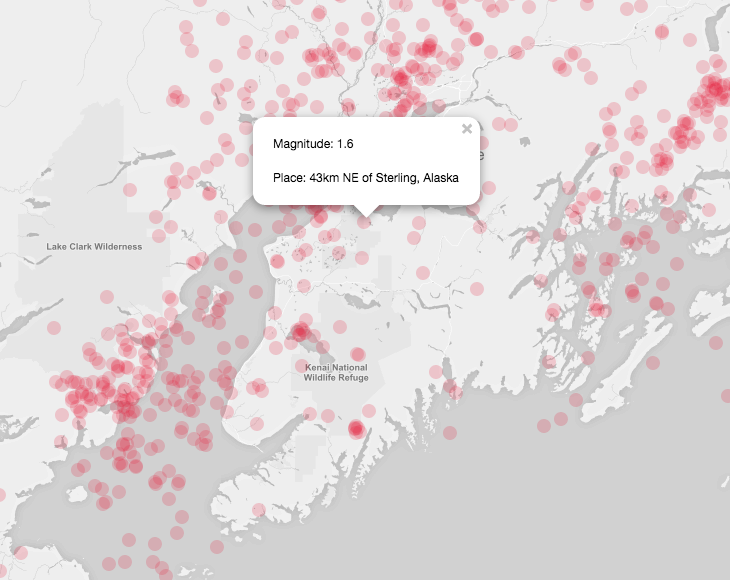
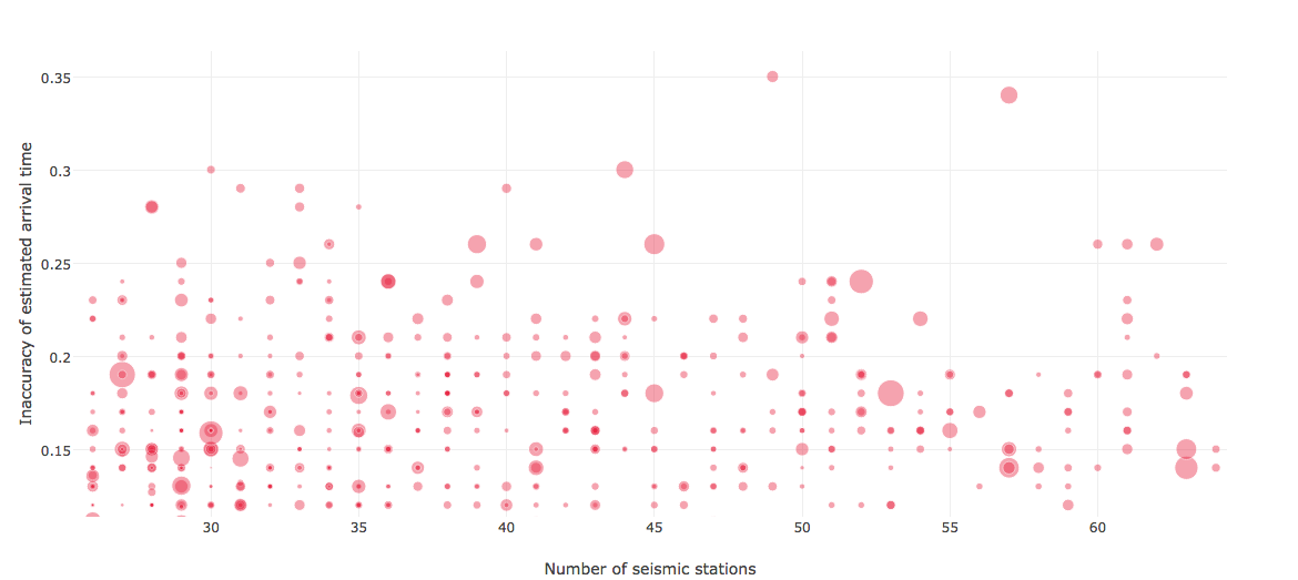
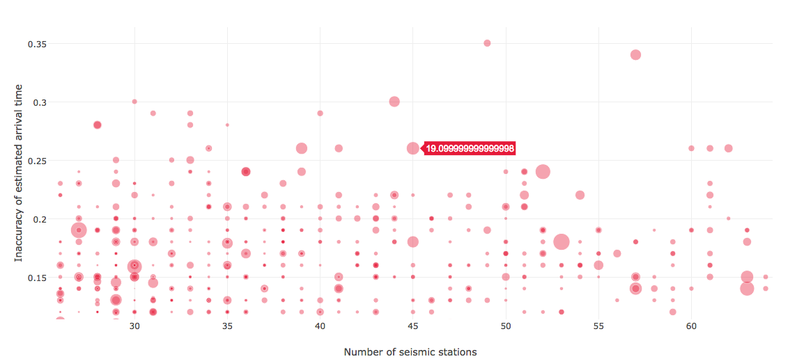
 I used the earthquake data for this part of the assignment. For part 1 I simply plotted it on a geographical map; for part 2 I had 3 dimensions of measurement: number of seismic station, the earthquake prediction accuracy, and the magnitude. I thought it’d be interesting to visualize this data because what if an earthquake has a large magnitude but was inaccurate in its predictions? Was it inaccurate because there were a lack of seismic stations around it? So by association, does having more seismic stations near the epicenter of an earthquake allow more extensive and time for preventative measures for the area’s inhabitants?
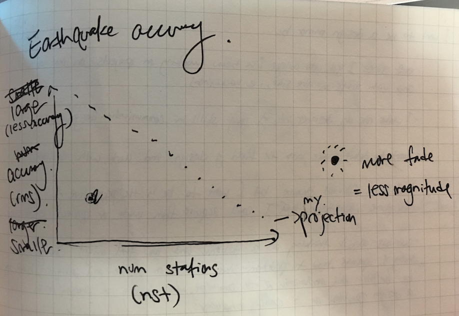
Projection of what accuracy/magnitude graph would look like
The two visualizations differ in that one provides one-dimensional information of where earthquakes happening, and the other provides multidimensional data that could be used to draw conclusions, and potentially give insight into how to improve earthquake emergency practices.