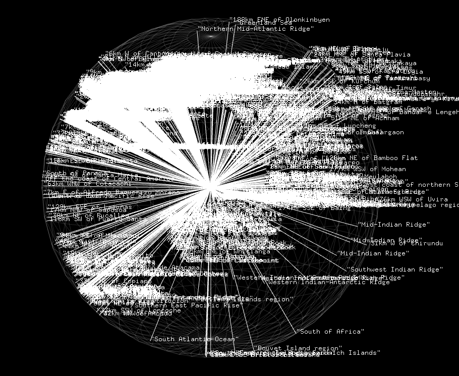
For my Maps assignment I created visualizations of the recorded earthquakes between December 15, 2015 – January 14, 2016.
“Map” Visualization
https://github.com/kevinmkarol/earthquake_lat_lon

Although this portion was more of a technical extension of work completed in class, I decided to use the quaternionLatLon example as the basis for my visualization because I thought it did a nice job of displaying density information in an interesting way without the user having to interact with the visualization. With a Leaflet app, for example, the viewer must move around the map to see relative densities. With the quaternion rendering, the whole globe is visible at all times, though certain areas are highlighted as the sphere rotates. I also think the lines emanating from the center of the earth has an aesthetic relevance to earthquakes.
Used: ofxCsv and quaternionLatLon
“Not a Map”: Earthquake Tiles
https://github.com/kevinmkarol/earthquake_tiles
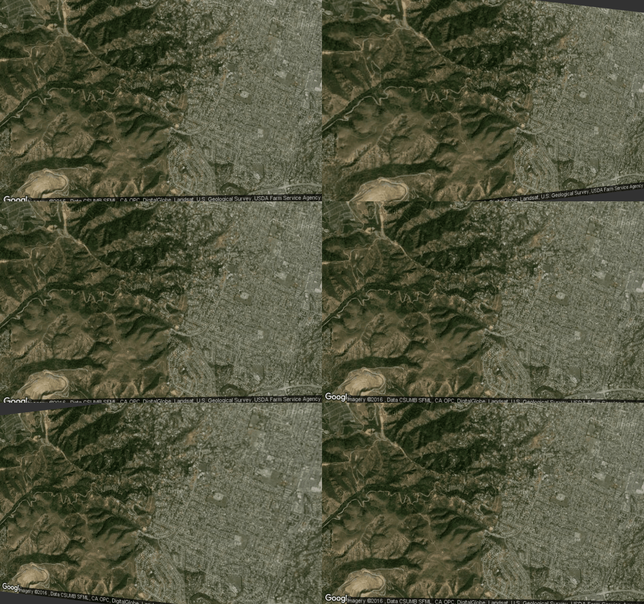
For my visualization that wasn’t a map I created a series of ~8,000 gifs which show a satellite image of the location in which an earthquake occurred, which is infinitely warped proportionally to the magnitude of the earthquake. When viewed together in a gallery, this allows the viewer to observe the relative size of earthquakes in different types of locals (oceans, cities, mountains).

I think this visualization reveals a lot about the factors that make an individual care about an earthquake. As I look through the array of images, my eyes gloss over the portions of ocean or deserts and mountains unless the earthquake is especially huge. Otherwise, it’s the combination of a civilian looking image combined with large undulations that makes me interested in imaging how that earthquake effected the people of that town.
Used: ofxCsv, ofxGifEncoder, ofxOpenCv, ofxQuadWarp
Tile Image Galleries: