Visualizing the World Cup 2014 Twitter Sphere
Visualization Link: shouvikmani.github.io/IACD/World_Cup_Visualization/index.html
The FIFA World Cup 2014 was the most tweeted event in history, totaling 672 million tweets over the 32-day tournament. I decided to visualize a small segment of World Cup Twitter traffic, around 400,000 geo-tagged tweets, to understand the influence that teams had around the world.
I devised a completely new visualization technique, which I like to call the Sphere of Influence. A “Sphere of Influence” represents the international brand value of a team, showing how popular a country’s team is worldwide. More precisely, a x% Sphere of Influence shows the area around the center of a country where x% of tweets about that country originate. In my visualization, I showed three Spheres of Influence for each country, corresponding to 25%, 50%, and 75% of tweets about each country.
For instance, here is the Sphere of Influence for the United States team:
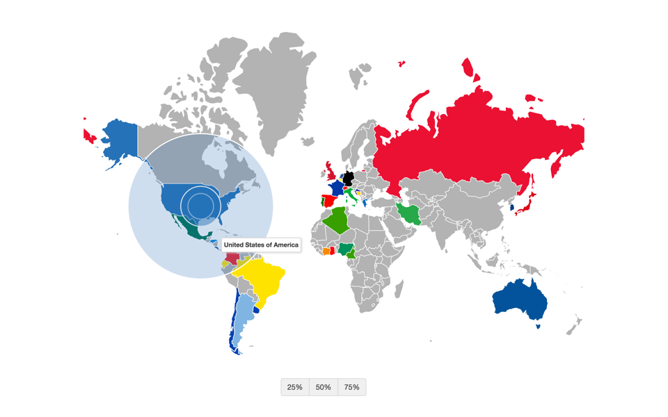
Sphere of Influence for USA
As you can see, the two inner circles represent the 25% and 50% Spheres of Influence, representing the area where 25% and 50% of tweets about the US national team were tweeted from. The larger, outer circle represents the area where 75% of tweets about the US team originated from.
Notice how the 25% and 50% Spheres for the US are contained within the US mainland whereas the 75% Sphere is larger and skewed towards the rest of the world. This is markedly different from countries like Germany and Brazil, which have a stronger international brand. For Germany, the country that won the World Cup, both the 50% and 75% Spheres are larger than the German mainland, showing a skew towards the rest of the world. Brazil has a similar Sphere of Influence as well:
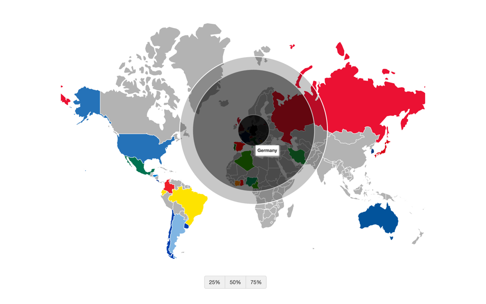
Sphere of Influence for Germany
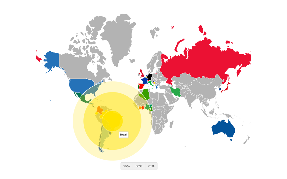
Sphere of Influence for Brazil
Obtaining the Data
The most challenging part of this assignment was pulling the data from Twitter. Given just a dataset of 32 million tweet IDs (about the World Cup), I pulled a random sample of 12 million complete tweets using the Twitter API. 400,000 of these tweets were geotagged and used in my visualization. Because the Twitter API’s rate limits only allowed me to pull 6000 tweets per 15 minutes, I ran 25 programs in parallel using 25 different API keys to pull the data over a period of 1.5 days.
Running a program for such an extended period of time made it prone to many errors (API rate limit errors, HTTP connection errors, etc.). So, I had to be very careful in handling these errors so that my programs wouldn’t crash every few hours. Handling errors gracefully was the key technique that made this mass-data scraping possible.
Github: github.com/shouvikmani/IACD/tree/master/World_Cup_Visualization