Yay!
1. A data set that I find interesting: XKCD’s Movie Timeline visualization (http://xkcd.com/657/large/). Here’s a screenshot, but you really need to go to the site and play around with it to appreciate it. 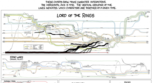
The work is a really nice way to academically approach something totally fantastic and pop-cultural. I also appreciated the bit of humor there with the last couple graphs on the bottom.
2. Something I find provocative: Internet Explorer Market Share vs US Murder Rate. 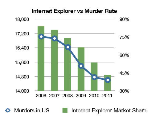 . I think the piece tells a comedic story on the surface about a piece of technology which I abhor, but also tells a story about the cultural relevance and authorial intent behind data visualizations. This piece is just absurd enough that only conspiracy-theorists would actually think that the data is related, but it certainly serves as a satirical warning to viewers that they really look at what is being visualized and not just accept conclusions because pictures are pretty.
3. Something I find very well crafted: The Psychology of Music (LINK). Growing up as a cellist, I’m already a fan of music education and all the positive benefits which come from it, but the presentation of this data visualization is just so flawless. The design is great – graphics which can explain the content to small children, but with data that could persuade a fully capable adult. The colors are good, the spacing is good, and as a scrolling piece it works very well in the web browser. I haven’t tested on a mobile web browser, but if it also looks this good on my phone then this piece really hits it out of the park for me