Sorting Visualization
by Carlo Zapponi
Weblink: http://www.visualizing.org/full-screen/324949
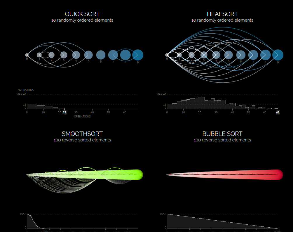
This project is near and dear to my heart. As a algorithmophile I am always searching for new ways to communicate information about abstract concepts in the hope of increasing the number of algorithm lovers in this world.
This project visualizes the operation of sorting algorithms by visualizing the location swaps that take place when a given algorithm needs to sort a list of integers.
I think that the author did a good job of conveying the procedure over time with the use of arcs. I think that the author missed the opportunity to allow the user to seed a specific initial condition. The user may want to see how a particular set of data reacts to a given sorting algorithm. It would also be nice if there were some sort of feedback that tells the user what the algorithm is doing. There will likely be countless users who can admire the beauty of the visualization but will not understand the logic of what the algorithms are doing, due to the lack of explanation. On the other hand it is nice that the creator, Carlo Zapponi, embedded links to Wikipedia pages about the algorithm within the project. The acknowledgements section at the bottom of the webpage lists the creators inspirations for the project. I would also say that the inspiration for almost all projects of this nature probably eventually can be traced back to the computer science educational experience.
Abundance of Elements
by Jonathan Hull
http://www.visualizing.org/full-screen/56819
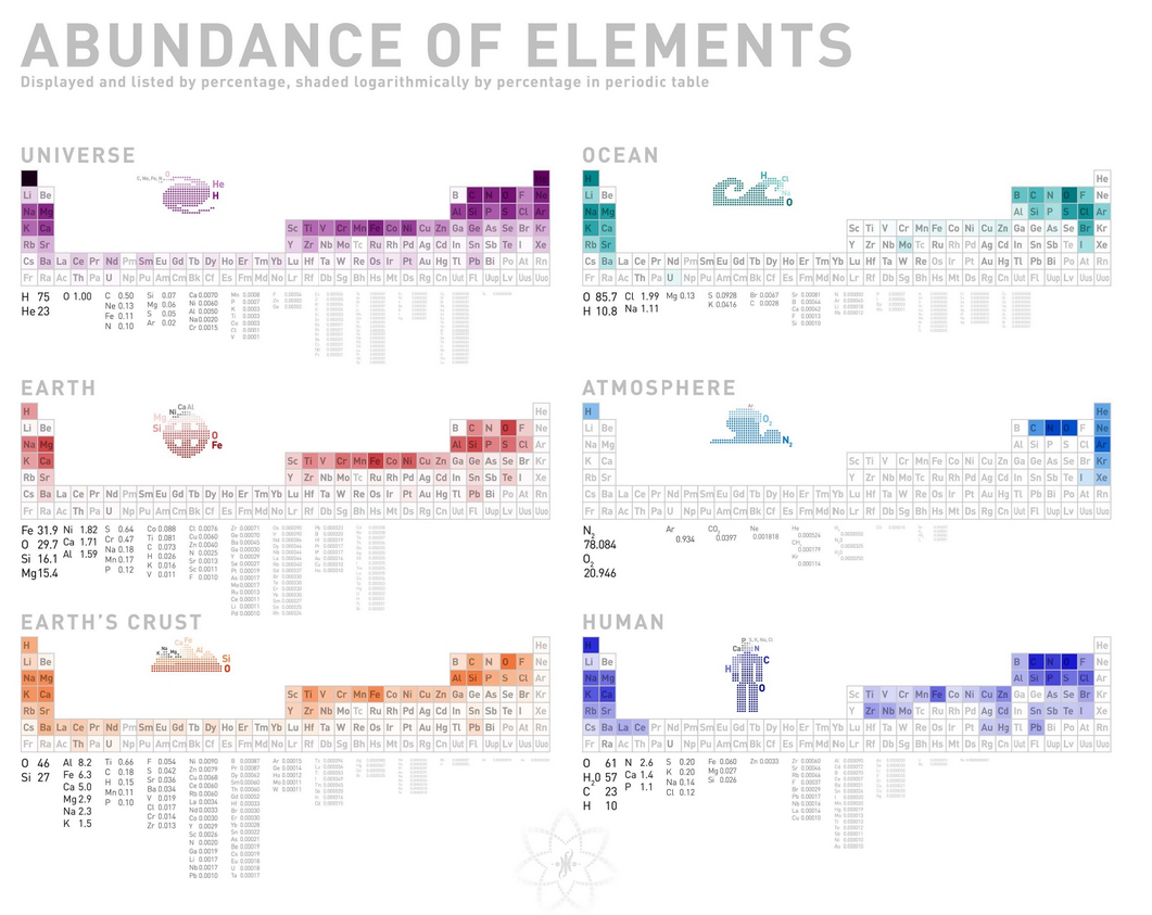
This project seeks to communicate the relative abundances of the elements of the periodic table within different contained domains. The abundances are displayed via a logarithmic scale based coloring on the respective elements boxes on the standard periodic table. I find this project to pretty cool, because I have done a project recently that tried to demonstrate a sense of scale. I also like projects that try to communicate relative quantities because they remind me of my High School Intro to programming teacher who tried very hard to communicate the relative lengths of program execution (There is a large difference between a program running in a second or a lifetime!) I also like it because it is organized and logically segmented into boxes, which appeal to me.
I think that the project does a good job of communicating the abundances of the most abundant elements in each domain, but most of the charts have a large amount of white space that is boring to look at and does not interest me. Although these non abundant elements are treated as such, it might be nice to know the relative abundances of the less abundant chemicals in a nicer way than raw numbers. I also wish that I could zoom into the pictorial graphs to see the less abundant elements.