Category Archives: Capstone

Capstone Projects from IACD-2015

Alex Sciuto

12 May 2015

A phone-based, slow-computing experience to explore words and concepts. Call 1 314 222 0893 or visit www.letsconsider.us.

GITHUB

There are tens of thousands of words and phrases in the English language that describe the physical, psychological, and social world around us. Even simple concepts like “cheese” have hundreds of words that further subdivide the concept. Let’s Consider takes these hierarchical concpets and uses them to populate a series of phone menus.

Call Let’s Consider’s phone number and you could potentially spend hours going through lists of similar words until you find one that you like. Using phone menus are usually dull and involve a lot of waiting to get ahold of a customer representative. Let’s Consider uses this unavoidable boredom and slowness to get the user to think about their thoughts and the words they use—and hopefully enjoy hearing a computer-generated voice say lots of silly words.

lets-consider

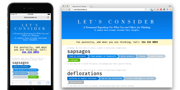
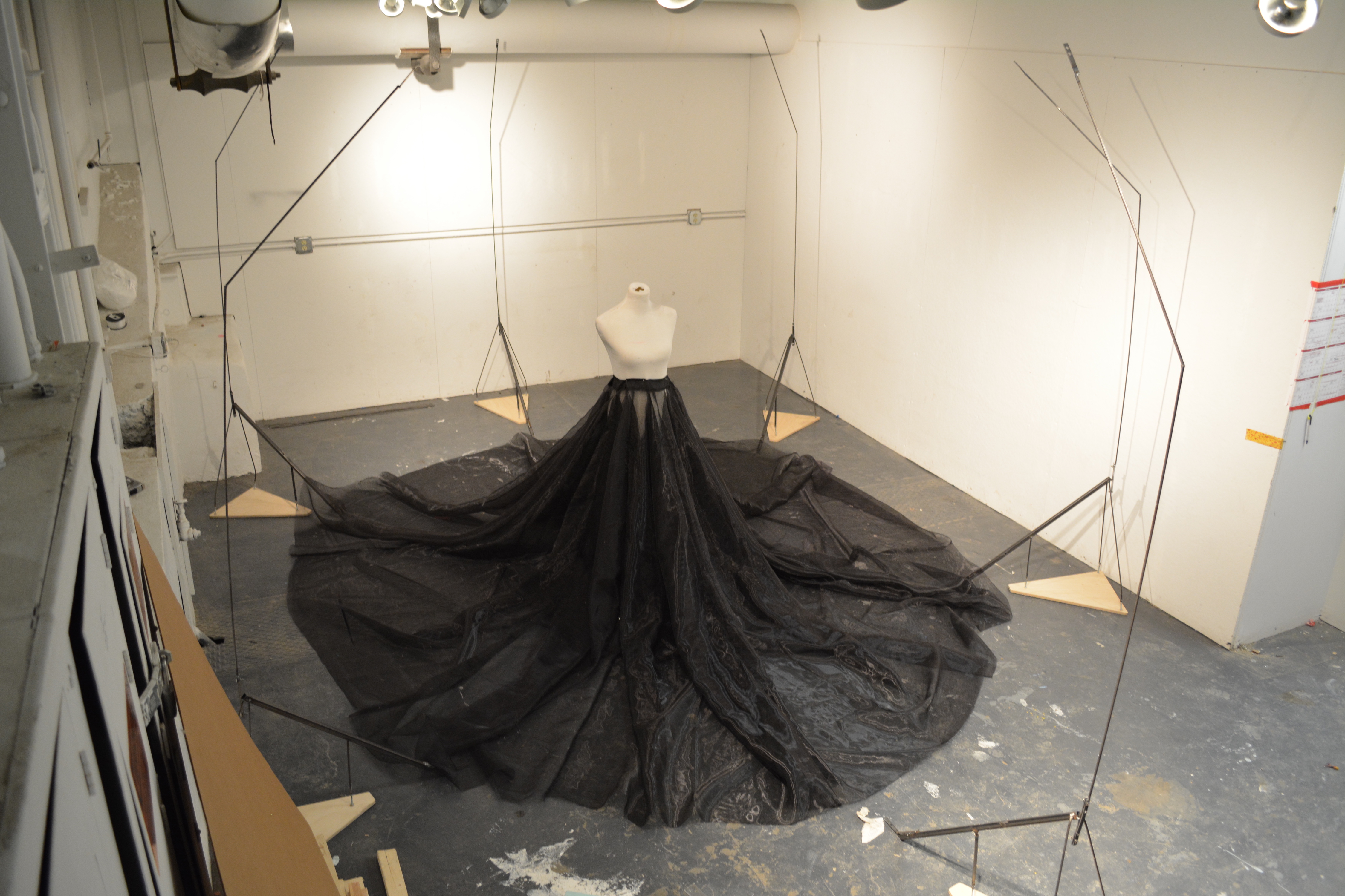
Screenshots of letsconsider.us. The companion website visualizes all the calls that have been made to Let’s Consider.

Additional Reflection

I was inspired by a number of computer art pieces and by personal experiences on the phone. A number of projects have been created using WordNet data. I was inspired by Martin Wattenberg’s Color Code and Fei-Fei Li’s ImageNet. Both of these projects use WordNet data and combine it with other data (colors and images) to make the hierarchical data more concrete. The phone-based menus were inspired by old text-to-speech voices, “intelligent” helper agents such as MS Word’s Clippy office assistant, and the common experience of being on the phone with a computer system not quite smart enough to pass as human. Inspiration for the meditation/centeredness aspect of the project came from Call in the Night, advice columns like Dan Savage and Dear Prudence, and inspired by the randomness of Chat Roulette.

This project taught me a lot about how to use audio and speech as an interface element. The details are very important for creating the menus, and much thought went into them. Dashes, commas, spaces, and periods each give different lengths of verbal pauses. To give users a hint of each category, I added dynamic examples of each category. These examples are calculated to not sound too similar to any other example.

There is still some work to be done. I am still not happy that some categories can have dozens of sub options. Finding a way to either eliminate or combine categories would be useful, but I’m not sure how to do that. Currently I am ordering the menu options based on the number of sub-options each menu item has. I tried ordering based on Bing queries. That did radically change the order, but it also brought up shallow tree-branches to the top ending the user’s experience too soon. I would like to look at another way of ordering the options.

Final Reflection: This project didn’t break new ground for me technically, but it did break new ground for me conceptually. I like how I took tools that are designed for efficiency, consumption, and corporate communications and turned them into something inefficient, vexing, time-consuming, and weird.


LValley

12 May 2015

bd1

The Breathe Dress is a device monitors breathing and visually augments it with the help of a motorized skirt.

The breath sensor was made using a conductive rubber belt that was wrapped around the wearer’s waist. Based on the amount the rubber is stretched during breathing, the motors in the dress move accordingly.

Short shallow breaths are responded to with choppy motor motions while longer, fuller breaths see longer, more fluid movement.

I initially approached this project from a sculptural perspective. I liked the idea of contrasting a person with a giant cage-like machine, and the thought of focusing on breath was even more intriguing to me. An innate, simple action would be at the center of everything.

This project was completed using Maxuino and the program, StandardFirmata, on Arduino. And while most of the software ran smoothly, the majority of the problems came in with the physical components, more specifically, figuring out the range of the motors before the spool either wound too tight and broke itself or loosened itself beyond the point of rewinding.

DSC_0357

Breathe1 (1)

Zack Aman

12 May 2015

Metonymy – Zachary Aman from Zachary Aman on Vimeo.

The goal of Metonymy is to create a user-centered graph exploration tool for Wikipedia. In my mind, Wikipedia is a modern world wonder; there is a vast quantity of information spread throughout Wikipedia, but it can be hard to find interesting articles without prior knowledge of the term you are looking for. The current method of finding new articles within Wikipedia often involves going to a page you know and then hopping around aimlessly, looking for something else that is interesting. This puts everything on a flat level, with no clear sense of hierarchy from the user perspective. In this project I built a Chrome extension that gives users the power of graph exploration, allowing them to use their own key articles as a sort of information triangulation tool.

The user can select multiple links from their saved list to use for recommendation generation. If none are selected, it defaults to the current page.

The Neo4j graph database I used to query the connections between articles. Credit to mirkonosato for his Graphipedia project that allowed me to build the database from the Wikipedia XML dump.


The main inspirations for this project were ‘Search, Show Context, Expand on Demand’: Supporting Large Graph Exploration with Degree-of-Interest by Ham and Perer (2009) and Apolo: Making Sense of Large Network Data by Combining Rich User Interaction and Machine Learning by Chau, Kittur, Hong, and Faloutsos (2011). The first paper uses graph analysis (article references as links) to surface relevant legal articles in a range from locally connected to current nodes to articles that are generally interesting. My initial conception of Metonymy was to do something very similar: provide a list of five articles a day that range from local gaps in your knowledge graph to articles that are highly connected and of general interest. The Apolo paper I found inspirational for the way they approach the graph interface; the authors allow users to set “archetypal” articles as a way of defining clusters.

I was pleased by how relevant the recommendations could be and simply being able to keep track of what I have looked at is immensely helpful; if by no other metric, I would call this project a success by the fact that it is something I will actually use. Beyond that, I learned how to  build a chrome extension (something I’ve been interested in for a while now) and got to focus on algorithms and architecture, two areas that I think I need the most work in as a programmer.  I’ve always been somewhat scared of algorithms — it’s not that I can’t hack something together, but being in a computer science program really puts the fear of scale into you. The recommendation engine certainly isn’t fast, but getting to work on an algorithm with multiple threads and filtering mechanisms was a lot of fun.

The main thing I would like to continue working on is the interface, specifically allowing a way to cluster saved items (probably sharing control with an algorithm). The existing form is serviceable, but not great, though I do want to keep it in a sidebar form which limits how much interactive space you have at a time. Under the hood, the speed could be improved and the code definitely needs refactoring — I now have three different “get recommendations” functions that are all slightly different but mostly the same. The algorithm could also be tweaked endlessly; it works pretty well for a single article but I think it needs to weight articles based on higher connectivity to multiple in-group articles to be more effective for clusters.

Code viewable on GitHub.

mmontenegro

12 May 2015

Palmistry Ball

Palmistry Ball is a maze palm reader that lives in your hand through projection mapping. In every level you will need to roll the ball into the white finger. Only one finger will be white every turn, while the others will control your four main hand lines: “heart”, “head”, “life”, and “fate”. These lines will act as walls in your quest to take the ball to the white finger. Succeed in taking it and proceed to the next level of your Palmistry reading. You need to be careful with your hand movements. If the ball falls off your hand, you will have to re start that level.

palmistryBall

After the show I also did a second way of visualizing the game by removing the hand and just showing the white finger, the ball and the lines. After play-testing both types of visualization i learned that both are very interesting to play with and create a different experience.


clear_hand

I got inspired to do this project by Golan. He initially pitched me the idea of doing a game on the hand. After seen how cool projection mapping in the hand looked, I designed 3 different games and chose the best suitable for the project.  I learned a lot about mapping. I have always wanted to do something with projection mapping but never had the chance. This project was perfect to get my hands into mapping and I realize how fun and the amount of possibilities it has in entertainment.

Link to final video:

pedro

12 May 2015

Remap is an interactive environment to explore the characteristics of buildings and redefine their relation with the territory. The project avoids the conventional idea of a map in which each building has its unique place in the urban tissue. In this sense, the basic strategy is to negate fixed positions and define a new territory based on the shape and social content of each building. Thousands of outlines and tags were extracted from OpenStreetMap and analyzed in order to treat buildings as autonomous objects with the capacity redefine the representation of city based only on its own specific attributes. A new territory can be organized according criteria such as rectangularity, dispersion, area perimeter, income, etc., revealing relationships that are hidden in the conventions of the traditional map. In the end, the project is a disturbing crossover between a tool for urban analysis/visualization and a dispute of micro-organisms under microscope lens.

[gview file=”http://golancourses.net/2015/wp-content/uploads/2015/05/finalParisframe-0315.pdf”]

[gview file=”http://golancourses.net/2015/wp-content/uploads/2015/05/finalNYframe-2785.pdf”]

[gview file=”http://golancourses.net/2015/wp-content/uploads/2015/05/finalBrasiliaframe-7280.pdf”]

[gview file=”http://golancourses.net/2015/wp-content/uploads/2015/05/finalBrasiliaframe-4166.pdf”]

[gview file=”http://golancourses.net/2015/wp-content/uploads/2015/05/finalVienaframe-2035.pdf”]

Firstly, this project shows my architectural obsession with diagramming and building form. How changes in the outline of the building reveal a complete different attitude towards space and the interaction of people in space. Besides, there are external references that were very important to me in two fields: urban fragmentation and micro-organisms.

In terms of fragmentation, I have to cite:
– David Griffin and Hans Kolhoff’s City of composite presence (1978)
– Armelle Caron’s Anagrammes graphiques de plans de villes or Les Villes Rangees (2005-2008)

In terms of micro-organisms, not only  I kept thinking about the buildings as micro-organisms but also I found interesting works such as Andreas Gysin;s The Abyss (2011-2012)

I had to learn many new things such as geodata, data scraping and physical simulation. I am a researcher in Computational Design and usually I try not to use libraries. However, in the project I needed box2d to deal with interaction of the buildings and also control p5 to define the interface. The project ended up very much as what I expected, but as I had to learn at the same time that I was doing, the code is still chaotic. Besides, when I deactivate collisions I still use the solver of box2d to move the buildings, so it keeps calculating a lot of overlapping of masses that it is not going to be applied  – I need to implement a specific non-physical solver for movements without collision in the future.

Finally, the project can be understood as pure art or as a data visualization tool. Depending on the user, the criticisms and suggestions always point to develop it towards one end. However, I think this ambiguity and deviation are what make the project so interesting.

See the code on github.