The Quest for a usable, yet interesting program
BEGINNING of STORY
For my capstone project, I wanted to make a program that was somewhat user friendly. I was originally planning to make a game about elevators, but I got distracted yet again by the seductive allure of train tracks.
I set out to invent a computer game about solving puzzles by placing tracks, building logic circuits, and routing train cars.
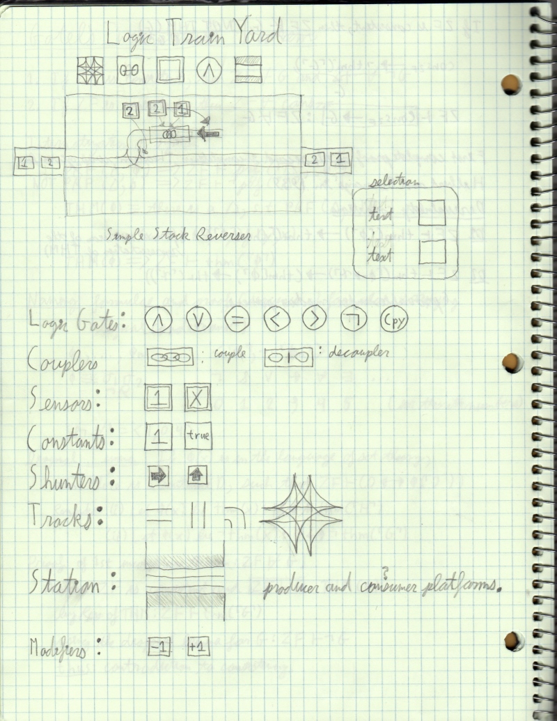
Initial Concept Sketch
I spent some time implement the representation of the train track connection network and implementing track following logic for the train cars, but I found that I had strayed off the path of crafting a program with a better user experience. I had stuck to the Bryce path and focused only on the capabilities of the program without putting some though into how they would be revealed in a pleasant manner to the user. On the technical end, I was pretty happy that I had completely refactored my old game engine and GUI and dramatically simplified it.
Bare Bones Program
But at this point Bryce either did not realize that he was deviating from his path or he was stubbornly clinging to those technical aspects that he enjoys so much. He went even further down the technical and mechanics focused whole he was digging and introduced the complicated mapping logic that was necessary for his grand vision.
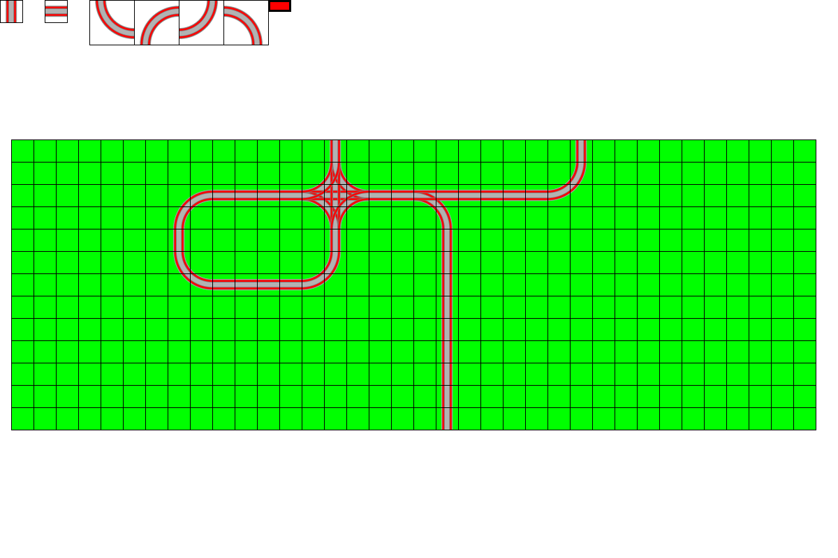
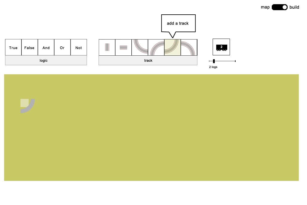
Fiercely Utilitarian and utterly confusing GUI layout
At this point, nobody but Bryce could use the program, because no thought had been put into the design. The theoretically capable of very complex routing logic, but nobody in their right mind would ever enjoy the experience of finding out how.
It was clearly time for a paradigm shift. Bryce decided that to enlist some outside help to try to pull himself back to the reality of programs written to be used by the common man. The guided Bryce back in the direction of common decency.
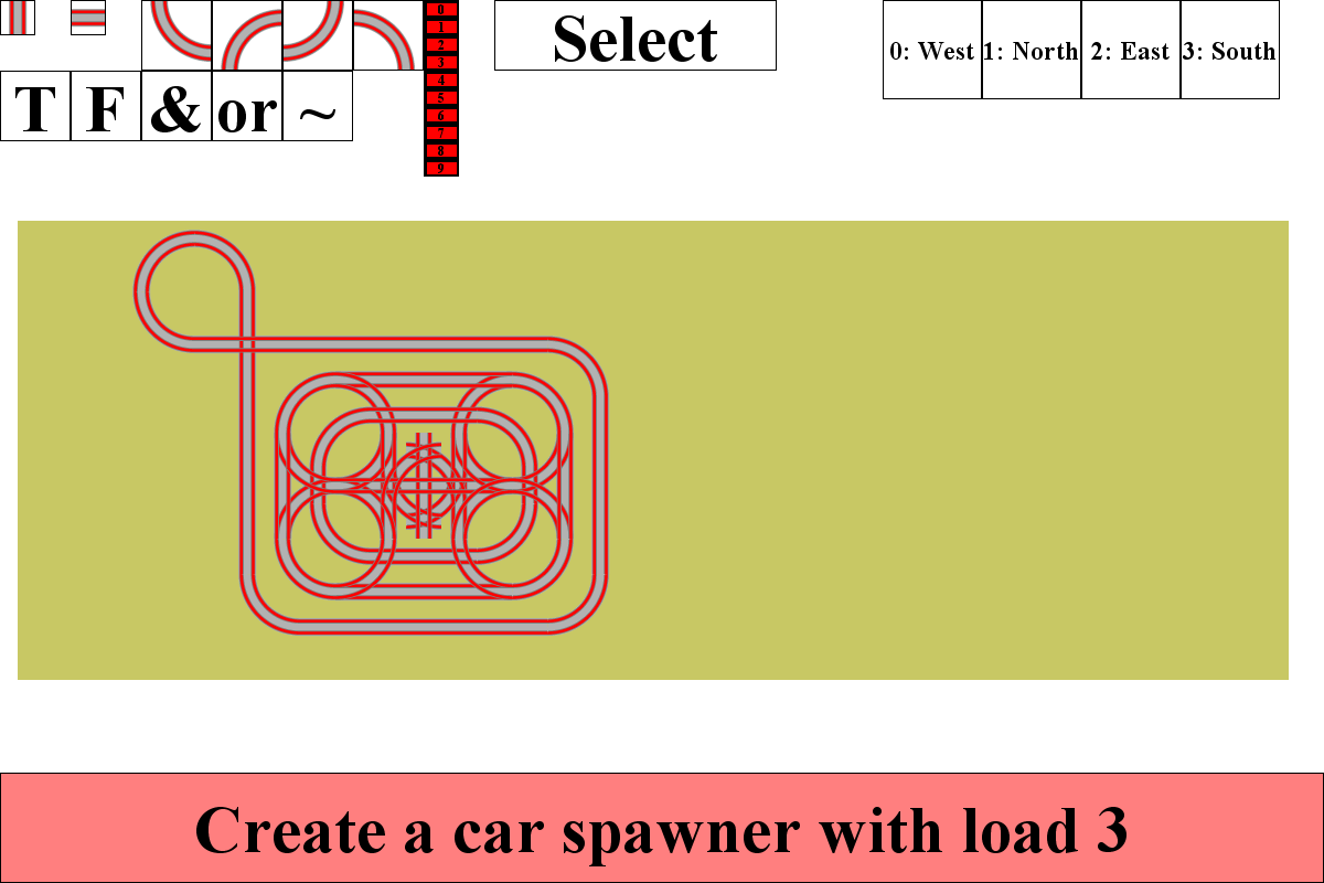
Enlightening Mockup
Bryce then set out converting his program into a more workable form.
As the deadlines loomed near and conflicting other obligations threatened to obscure the chances of the full game being realized, Bryce decided to convert the game into a Toy Train Simulator that merely allows the user to route cars.
So, thus inclined, Bryce set out to trim all of the excessive buttons and functionality and he distilled the car routing down to a more intuitive form.
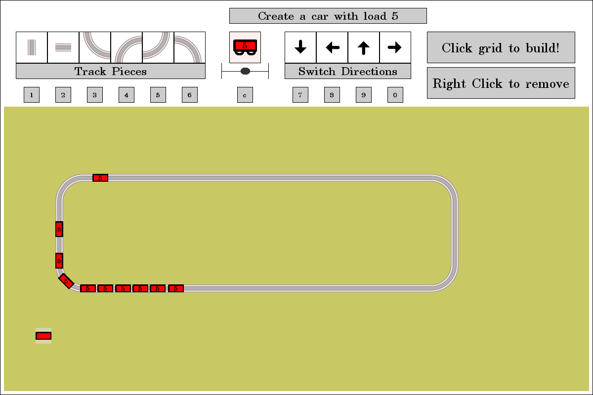
Final Iteration for IACD
Looking towards the future beyond the end of IACD, this program still has much room for improvement from a purely design perspective.
- The numbering of the cars has no functional purpose anymore, so I should either remove that slider or enable some sort of purpose.
- The buttons should be closer to where the user clicks on the grids to place the tracks. It is very awkward for the user to continuously move their mouse to the top of the screen and back.
- Placing tracks should be easier, I should either implement some “snapping” functionality or come up with alternative schemes for specifying track placement. One possible scheme would be for the user to only place curves and have the straight pieces fill themselves in automatically.
- It is critical that a delete all button be added.
- There is a lack of surprises. If fun is the objective, surprises may be important.
END OF STORY
In the future, I think it might be time that I retire from Java graphics programming and move onto c++ or some other language that provides manual memory management and smoother performance.
Some things I enjoyed doing in this project:
- I had the opportunity to completely simplify my personal game engine and GUI
- I had the opportunity to complete a right of passage, where I implemented the logic for trains following custom tracks.
- With some help, I was able to make a pseudo user friendly program. I have seen how it is possible to make improvements in user interface design with the right perspective. I sure hope that I can discover the perspective as time goes on.
Source Code: https://github.com/Bryce-Summers/JavaCode/tree/master/game_TrainOp
Thank you for looking at my Toy Train Simulator Documentation.