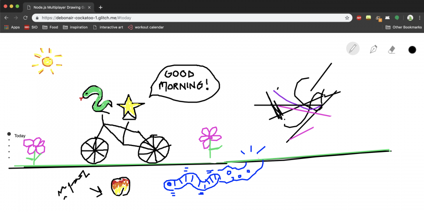
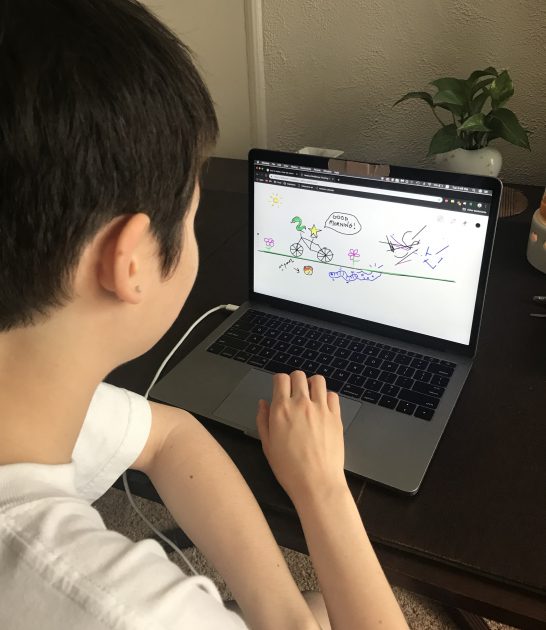
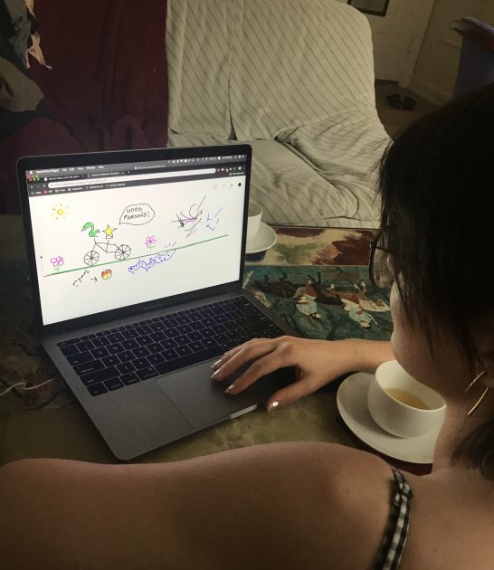
dechoes – final project documentation

Walking :  A Retraced Map of Walks Executed in Response to Grief

Stills from the 5min-long video walkthrough


For my final project, I continued work I had set down a couple months prior. Early in January, I was confronted with multiple events which caused me to grieve simultaneously. As a way to process those events, I walked roughly three hours a day over the course of a week. Because those walks felt so significant in the reclaiming of physical and mental space, I had  the foresight to record my path over the course of that week. I kept track of my routes and their timestamps, how long they took me, how long I stayed in any given place.

To create this 3D experience, I decided to use Photogrammetry to reconstruct physical spaces virtually. I specifically chose to work with footage from Google walkthroughs, because that is a theme I have been consistently going back to and interested in working with. How does digital space retain physical events? How does one make a digital landscape emotional and relatable?

Still of the keyframing of  the walks in Google Earth Studio


Recorded Path Through Photogrammetry in PhotoScan Pro


Rendering Time


I had originally planned on the video playing for a whole week synched to the real time, which unfortunately was not achieved in this time frame due to the intense rendering time. I might revisit this concept later (outside of the context of grief) and develop a more fleshed out video piece.

I’m also going to link to my website documentation for my documentary Dedications I-V, which I largely made in this class (even though I never used it as a class deliverable).

Sheep – Final Project

Title: Don’t Let Me Down

Tweetable Sentence: 

Playing Don’t Let Me Down, a double sided opposing gravity platformer on a 1920 x 480 screen.

Abstract: Don’t Let Me Down is a two player local co-op game for Windows and Mac. Two princesses must work together to escape a dangerous castle using their opposing gravities. One princess falls up, the other down. Because of this, they can use one another as platforms. The princesses must navigate through increasingly perilous situations, from upside down lava stair cases to impossible to reach ledges by using eachother and coordinating. The game was presented in class on a 1920 x 480 screen, with the players opposite one another with game controllers.

2×1 Image: 

Narrative: 

The idea initially came from a brainstorming session with Naomi Burgess and Ming Lu about ideas for a collaborative game. One idea was a version of Rapunzel where two girls hair was connected but they had separate gravities, and had to climb up each-other’s hair. Eventually the idea for two characters with opposing gravities was born and a prototype was made. I was inspired by a mix of Mario, Thomas was Alone, Gravity Guy, and for the final look of the game, but before this I went through many iterations of what the game was, what it looked like, and how difficult it was. I would let two people play through the game and get them to think out loud, which was pretty revealing about the way the human brain works. I would make appropriate gameplay adjustments. The idea of the 1920 x 480 tv came from your class in which the game could position players opposite one another, while also creating a sense of companionship, this also increased tension and let members talk more clearly to one another. It made it to the final version of the experience, and currently, for any future installs, I think it’s the best format.

Play here: 

perebite.itch.io/dont-let-me-down

Images:

Video: 


takos-FinalProject

Generative friends!

Tweetable sentance: Generative friends that you can print out and take with you! Scripted in Blender, these friends are ball-jointed creatures you can pose and play with.

My project is scripted in Blender using Python, and mainly metaballs. Running the code creates a 3d Mesh that can be printed out on a 3d printer, and strung together to create a fully mobile


This project was driven by three things: My knowledge of dollmaking, my interest in generative art, and my determination to learn blender before graduating. I developed


Previous monster generation projects:

E-Self generator (with Connie Ye and Josh Kery) – April 2019

Machine Learning Rat generator (with Connie Ye as part of Algorat.club) – Feb 2019

result | interpretation | dataset

Machine learning doodler – March 2019


result | result | dataset

Monster generator – 2018

(theres more but I wont include them all)

Also a photo of a sculpted doll for reference

I think this project arrived as a natural progression and combination of my skills. This is a way to combine my doll making practice with my computational and illustrative practices, and provides an exciting opportunity for me to integrate many of the different things I do in a natural way.

Metrics of success involve visual aesthetics resembling creatures similar to ones that I draw or otherwise create, a complete amount of parts, and being able to fit printed pieces together to actually create a functioning friend.

What is next for this project?
My main issues with this project involved blender’s three dimensional boolean operations, whats next for this project is restructuring how data for each part is stored, in order to create the metaballs in a more ordered fashion, which will in turn allow me to preform operations on them instantaneously (as opposed to after all other 3d shapes have been created), due to some quirks in blender shape/modifier hierarchies.
I’m also interested in expanding the possibilities in difference for each different body part, and for total amounts of body parts randomly, but only in rare cases, i.e. creating a figure that perhaps has 4 arms, or 1 leg, or 5 heads etc.

Credits: Shutout to blender’s stack exchange page

ya-FinalProject

looper is an immersive depth-video delay that facilitates an out-of-body third-person view of yourself.

Using a Kinect 2 and an Oculus Rift headset, participants see themselves in point cloud form in virtual reality. Delayed copies of the depth video are then overlaid, allowing participants to see and hear themselves from the past, from a third-person point of view. Delayed copies are represented using a quarter as many points as the previous iteration, allowing the past selves to disintegrate after several minutes.

I initially experimented with re-projecting color and depth data taken from a Kinect sensor in point cloud form, so that I could see my own body in virtual reality. I repurposed this excellent tool by Roel Kok to convert the video data into a point cloud-ready format.

While it was compelling to see myself in VR, I couldn’t see my own self from a third person point of view. So I made a virtual mirror.

The virtual mirror was interesting because unlike in a real mirror, I could cross the boundary to enter the mirror dimension, at which point I would see myself on the other side, flipped because of the half-shell rendering of the Kinect point cloud capture.

However, the mirror was limiting in the same ways as a regular mirror: any action I made was duplicated on the mirror side, limiting the perspectives that I could have on viewing myself.

I then started experimenting with video delay.

An immediate discovery was that in the VR headset, the experience of viewing yourself from a third person point of view was a striking one. The one minute delay meant that the past self was removed enough from the current self to feel like another, separate presence in the space.

I also experimented with shorter delay times; these resulted in more dance-like, echoed choreography — this felt compelling on video but I felt it did not work as well in the headset.

I then added sound captured from the microphone on the headset. The sound is spatialized from where the headset was when it was captured, so that participants could hear their past selves from where they were.

During the class exhibition, I realized that the delay time of one minute was too long; participants often did not wait long enough to see themselves from one minute ago, and would often not recognize their other selves as being from the past. For the final piece, I lowered the delay time to 30 seconds.

The project is public on GitHub here: https://github.com/yariza/looper


ngdon – final project

doodle-place

http://doodle-place.glitch.me

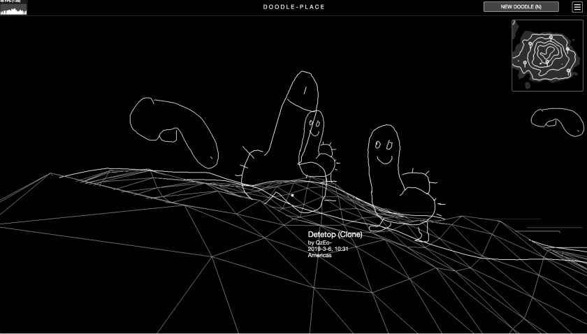
doodle-place is a virtual world inhabited by user-submitted, computationally-animated doodles.

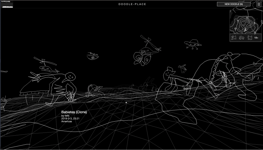
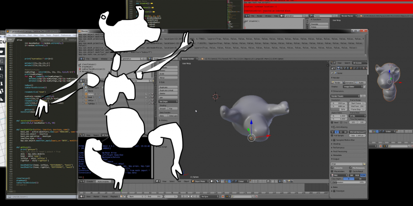
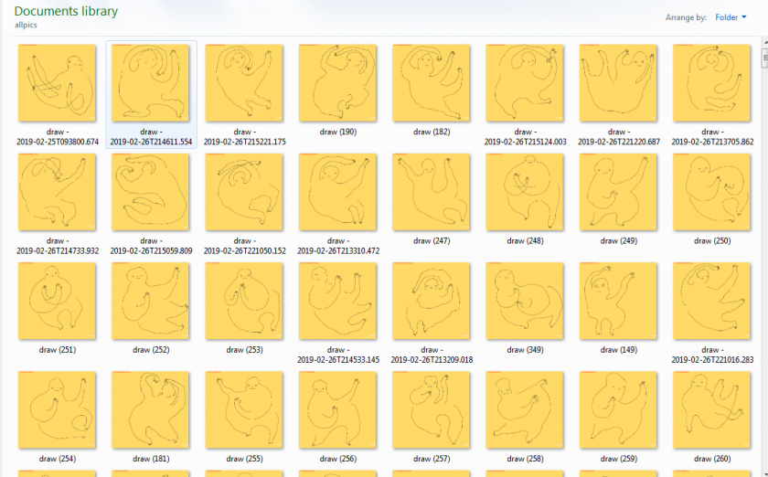
For my final project I improved on my drawing project. I added 4 new features:  a mini-map, dancing doodles, clustering/classification of doodles, and the island of inappropriate doodles (a.k.a penisland).

Doodle Recognition

I supposed with the prevalence of SketchRNN and Google Quickdraw, there would be ready-made doodle recognition model I can simply steal. But it turned out I couldn’t find one, so I trained my own.

I based my code on the tensorflow.js MNIST example using Convolutional Neural Networks. Whereas MNIST trains on pictures of 10 digits, I trained on the 345 categories of quickdraw dataset.

I was dealing with several problems:

  • The Quick, draw! game is designed to have very similar categories to supposedly make the gameplay more interesting. For example, there’re duck, swan, flamingo, and bird. Another example is tornado and hurricane. For many crappy drawings in the dataset, even a non-artificial intelligence like me cannot tell which category they belong to.
  • There are also categories like “animal migration” or “beach”, which I think are too abstract to be useful.
  • Quick, draw! interrupts the user once it figures out what something is, disallowing them to finish their drawing, so I get a lot of doodles with just 1 stroke or 2. Again as a non-artificial intelligence I have no idea what they represent.
  • There are many categories related to the human body, but there is no “human” category itself. This is a pity, because I think the human form is one of the things people tend to draw when they’re asked to doodle. I feel there’s a good reason for Google to not include this category, but I wonder what it is.

Therefore, I manually re-categorized the dataset into 17 classes, namely architecture, bird, container, fish, food, fruit, furniture, garment, humanoid, insect, instrument, plant, quadruped, ship, technology, tool and vehicle. Each class would include several of the original categories, while maintaining the same number of doodles in total in each class. 176 out of the 345 original categories are covered using my method. Interestingly, I find the process of manually putting things into categories very enjoyable.

Some misnomers (not directly related to machine learning/this project):

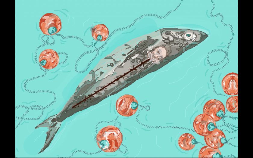
  • I included shark and whale and dolphin in the fish category, because when drawn by people, they look very similar. But I think biology people will be very mad at me. But I also think there’s no English word that I know of for “fish-shaped animals”? The phrase “aquatic animals” would include animals living in water that are not fish-shaped.
  • I put worm, spider, snake, etc. in the “insect” category, though they are not insects. There also seems to be no neutral English word that I know of for these small animals. I think “pest/vermin” focuses on a negative connotation. In where I come from, people would call them “蛇虫百脚”.
  • Since there’s no “human” category in quickdraw, I combined “angel”, “face”, “teddy bear”, and “yoga” into a “humanoid” category. So my recognizer works not that well with really regular-looking humans, but if you add some ears, or a circle on top of their head, or have them do a strange yoga move, my network has a much larger chance of recognition.

I initially tested my code in the browser, and it seemed that WebGL can train these simple ConvNets really fast so I sticked with it instead of switching to more beefy platforms like Colab / AWS. I rasterized 132600 doodles from quickdraw, downscaled them to 32×32, and fed into the following ConvNet:

model.add(tf.layers.conv2d({
  inputShape: [NN.IMAGE_H, NN.IMAGE_W, 1],
  kernelSize: 5,
  filters: 32,
  activation: 'relu'
}));

model.add(tf.layers.maxPooling2d({poolSize: 2, strides: 2}));
model.add(tf.layers.conv2d({kernelSize: 5, filters: 64, activation: 'relu'}));
model.add(tf.layers.maxPooling2d({poolSize: 2, strides: 2}));
model.add(tf.layers.conv2d({kernelSize: 3, filters: 64, activation: 'relu'}));
model.add(tf.layers.flatten({}));
model.add(tf.layers.dense({units: 512, activation: 'relu'}));
model.add(tf.layers.dropout({rate:0.5}));
model.add(tf.layers.dense({units: NUM_CLASSES, activation: 'softmax'}));

This is probably really kindergarten stuff for machine learning people, but since it’s my first time playing with the build up of a ConvNet myself, so I found it pretty cool.

Here is an online demonstration of the doodle classifier on glitch.com:

https://doodle-guess.glitch.me/play.html

It is like a Quick Draw clone, but better! It actually lets you finish your drawings! And it doesn’t force you to draw anything, but only give you some recommendations on the things you can draw!

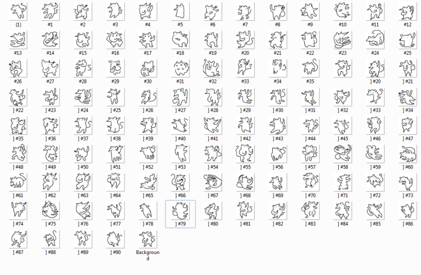
Here is a screenshot of it working on the 24 quadrupeds:

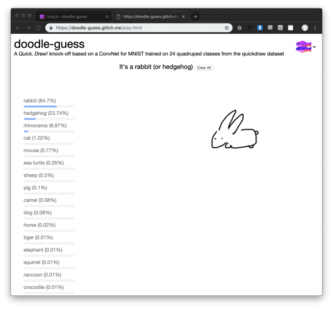
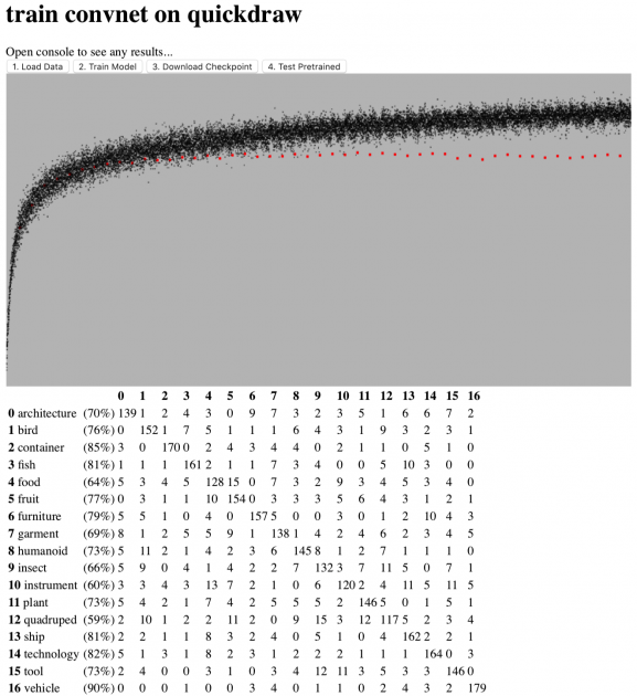
I also made a training webapp at https://doodle-guess.glitch.me/train.html. It also gives nice visualizations on the training results. I might polish it and release it as a tool. The source code and the model itself are also hosted on glitch: https://glitch.com/edit/#!/doodle-guess

Some interesting discoveries about the dataset:

  • People have very different opinions on what a bear looks like.
  • Face-only animals prevails over full-body animals.
  • Vehicles are so easy to distinguish from the rest because of the iconic wheels.
  • if you draw something completely weird, my network will think it is a “tool”.

Check out the confusion matrix:

Doodle Clustering

The idea is that doodles that have things in common would be grouped together in the virtual world, so the world would be more organized and therefore more pleasant to navigate.

I thought a lot about how I go from the ConvNet to this. A simple solution would be to have 17 clusters, with each cluster representing one of the 17 categories recognized by the doodle classifier. However, I feel that that the division of the 17 categories is somewhat artificial. I don’t want to impose this classification on my users. I would like my users to draw all sorts of weird stuff that don’t fall into these 17 categories. Eventually I decided to do an embedding of all the doodles in the database, and use k-means to computationally cluster the doodles. This way I am not imposing anything, it is more like the computer saying: “I don’t know what the heck your doodle is, but I think it looks nice along side these bunch of doodles!”

I chopped off the last layer of my neural net, so for each doodle I pass through, I instead get a 512 dimensional vector representation from the second to last layer. This vector supposedly represent the “features” of the doodle. It encodes what’s so unique about that particular doodle, and in what ways it can be similar to another doodle.

I sent the 512D vectors to a javascript implementation of t-SNE to compress the dimension to 2D, and wrote a k-means algorithm for the clustering. This is what the result looks like:

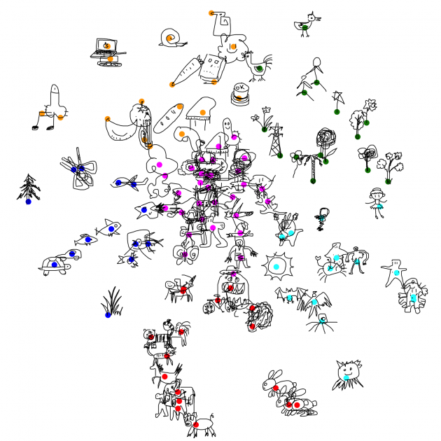
  • The pigs, tigers, horses, cats all got together, nice!
  • The bunnies got their own little place
  • The trees are near each other, except for the pine tree, which seems very unlike a tree from the AI’s perspective.
  • Humanoids are all over the place, blame quickdraw for not having a proper “human” category.

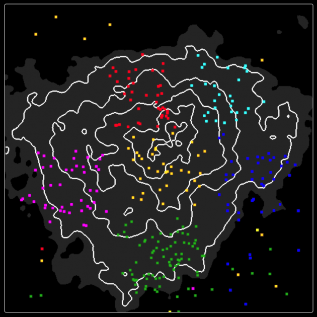
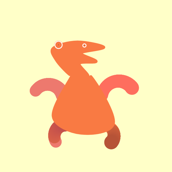
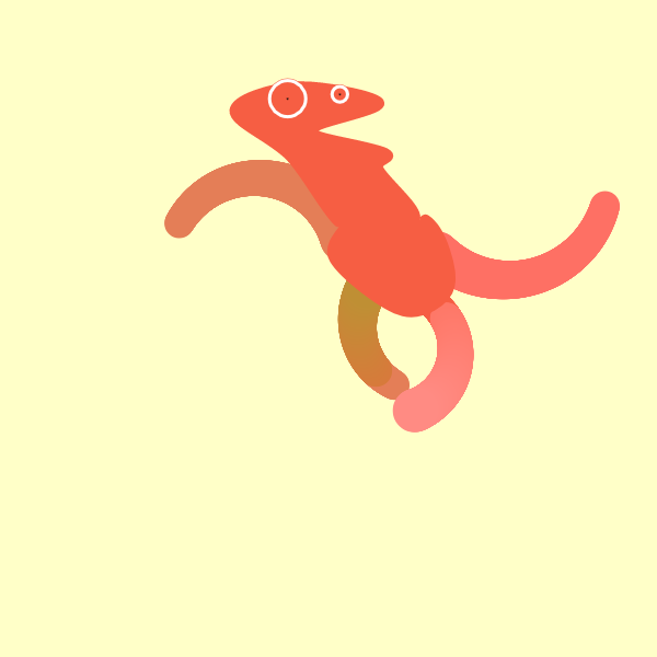
In the virtual world, the doodles will roam around their respective cluster center, but not too far from it, with the exception of fishoids, which will swim in the nearest body of water. You can see the above view at https://doodle-place.glitch.me/overview.html

Doodle Recognition as a hint for animation

So originally I have 4 categories for applying animation to a doodle: mammaloid, humanoid, fishoid, birdoid, and plantoid. The user would click on a button to choose how they animate a doodle. Now that I have this cool neural net, I can automatically choose the most likely category for the user. For those doodles that looks like nothing (i.e. low confidence in all categories from ConvNet’s perspective), my program still defaults to the first category.
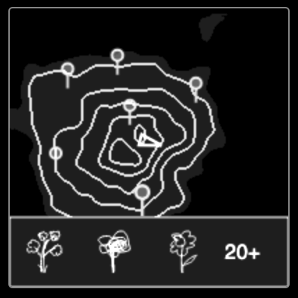
Minimap

I received comments from many people that the place is hard to navigate as one feels like they’re in a dark chaotic environment in the middle of nowhere. I added a minimap to address the issue.

I chose the visuals of isopleths to conform with the line-drawing look of the project.

I also considered how I could incorporate information about the clustering. One method would be to plot every doodle on the map, but I didn’t like the mess. Eventually I decided to plot the cluster centers, using the visual symbol of map pins, and when user hovers over the pin, a small panel shows up at the bottom of the minimap, letting you know just what kinds of doodles to expect (by giving some typical examples), and how many doodles there are in the cluster. This GUI is loosely inspired by Google Map.

Golan suggested that if the user clicks on the pins, there should be an animated teleportation to that location. I am yet to implement this nice feature.

Dancing Doodles

Golan proposed the idea that the doodles could dance to the rhythm of some music, so the whole experience can potentially be turned into a music video.

I eventually decided to implement this as a semi-hidden feature: When user is near a certain doodle, e.g. doodle of a gramophone or piano, the music starts playing and every doodle would start dancing to it.

At first I wanted to try to procedurally generate music. I haven’t done this before and know very little about music theory, so I started with this silly model, in the hope of improving it iteratively:

  • The main melody is a random walk of the piano keyboard. It starts with a given key, and at each step can go up a bit or down a bit, but not too much. The idea is that if it jumps too much, it sounds less melodic.
  • The accompaniment is repeated arpeggios consisting of the major chord depending on the key signature.
  • Then I added a part that simply plays the tonic at the beat, to increase the strength of the rhythm
  • Finally a melody similar to the main melody but higher in pitch, just to make the music sound richer.

The resultant “music” sounds OK at the beginning, but gets boring after a few minutes. I think an improvement would be to add variations. But then I ran out of time (plus my music doesn’t sound very promising after all) and decided to go in another direction.

I took a MIDI format parser (tonejs/midi) and built a MIDI player into doodle-place. It plays the tune of Edvard Grieg’s In the Hall of the Mountain King by default, but can also play any .midi file the user drags on top of it. (Sounds much better than my procedurally generated crap, obviously, but I’m still interested in redoing the procedural method later, maybe after I properly learn music theory)

My program automatically finds the beat of the midi music using information returned by the parser, and synchronize the jerking of all the doodles to it. I tried several very different midi songs, and was happy that the doodles do seem to “understand” the music.

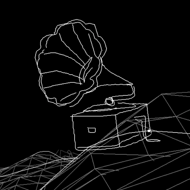
^ You can find the crazy dancing gramophone by walking a few steps east from the spawn point.

One further improvement would be having the doodles jerk in one direction while the melody is going upwards in pitch, and in the other direction when it is going down.

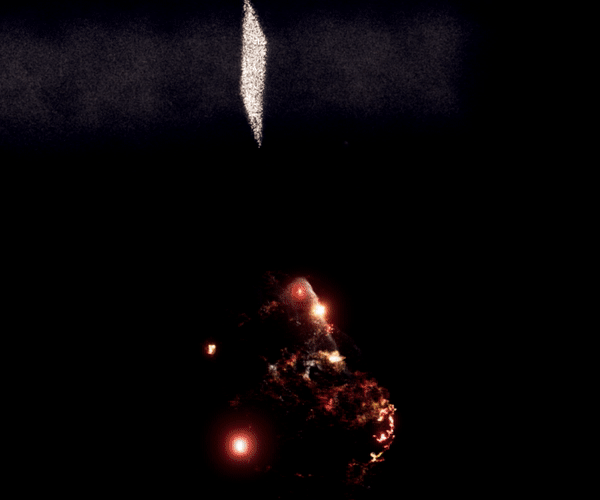
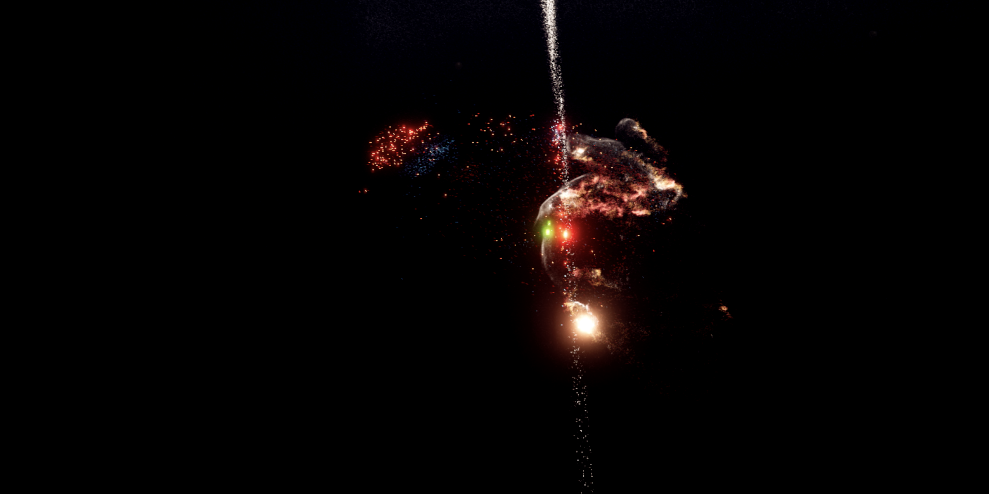
Island of Inappropriate Doodles (IID)

Most people I talk to seems to be most interested in seeing me implementing this part. They are all nonchalant when I describe all the other cool features I want to add, but only become very excited when I mentioned this legendary island.

So there it is, if you keep going south and continue to do so even when you’re off the minimap, you will eventually arrive at Island of Inappropriate Doodles, situated on the opposite side of the strait, where all the penises and vaginas and swastikas live happily in one place.

I thought about how I should implement the terrain. The mainland is a 256×256 matrix containing the height map, where intermediate values are interpolated. If I include the IID in the main height map, the height map needs to be much much larger than the combined area of the two lands because I want to have decent distance between them. Therefore I made two height maps one for each land, and instead have my sampler take in both as arguments and output the coordinates of a virtual combined geometry.

aahdee – Final Project

Simulated Weather I is a mesmerizing interactive display where you can playfully interact with a storm.

Overview

Part of a small series, Simulated Weather I is a mesmerizing interactive display that represents hail. It is displayed on a touchscreen monitor with multi-touch functionality, so many people can approach the screen and experience it. The entire series revolves around representing the many personas that the force weather wears all around the globe.

Narrative

Weather is a powerful natural force that comes in many forms. I find that it has a unique beauty: it can be harsh or gentle, cold or warm, and jarring and soothing. I have many memories that are strongly connected to weather, so I find that I have applied specific moods and thoughts to different types of weather events. I then considered how would I represent it in geometric shapes. At first glance, geometry may seem cold and inorganic, but there are multiple instances of many types of geometry and repetition in nature, so I found it to be a clean choice. For the first piece, I chose to represent a hailstorm.

Wanting to represent that, I started a series of different animations that represents the natural events. I initially used Processing, a visual arts coding developer, and TUIO, an API for multitouch surfaces. I created an experience that represents hail that many people can interact with at the same time.

The main difficulty that I ran into was the touchscreen monitor that I was going to use came very late: it arrived the day before the exhibition. Thus I didn’t have a lot of time to debug the inevitable problems that I would run into and implement multitouch functionality to my second program that represents wind. At the exhibition, it couldn’t handle a lot of stress and the Java VM stopped working with too many or too rapid inputs. I wish I had more time to work on it, but one is at the mercy of UPS and FedEx. That being said, I do plan on working on it more and this series this summer.


lumar – FinalProject


iLids from Marisa Lu on Vimeo.


A phone powered sleeping mask with a set of cyborg eyes and an automatic answering machine to stand in for you while you tumble through REM cycles.

Put it on and konk out as needed. When you wake up, your digital self will give you a run down of what happened.

The project was originally inspired by the transparent eye lids pigeon’s have that enable them to appear awake while sleeping. This particular quirk has interesting interaction implications in the context of chatbots, artificial voices, computer vision, and the idea of a ‘digital’ self embodied by our personal electronics. We hand off a lot of cognitive load to our devices. So how about turning on a digital self when you’re ready to turn off? The project is a speculative satire that highlights the ever increasingly entwined function and upkeep of self and algorithm. The prototype works as an interactive prop for the concept delivered originally at the show as a live-sleep performance.

  • Narrative: In text of approximately 200-300 words, write a narrative which discusses your project in detail. What inspired you? How did you develop it? What problems did you have to solve? By what metrics should your project be evaluated (how would you know if you were successful)? In what ways was your project successful, and in what ways did it not meet your expectations? (If applicable) what’s next for this project? Be sure to include credits to any peers or collaborators who helped you, and acknowledgements for any open-source code or other resources you used.

Butterflies, caterpillars, and beetles have all developed patterns to look like big eyes. Pigeon’s appear constantly vigilant with their transparent eyelids and in the mangrove forests of India, fishermen wear face masks on the back of their heads to ward off attacks from Bengal tigers stalking from behind. These fun facts fascinated me as a child. In Chinese paintings, the eyes of imperial dragons are left blank – because to fill them in, would be to bring the creature to life. In both nature and culture, eyes carry more gravitas than other body parts because they are most visibly affected by and reflective of an internal state. And if we were to go out on a limb and extrapolate that further – making and changing eyes could be likened to creating and manipulating self / identity.

Ok, so eyes are clearly a great leverage point. But what did I want to manipulate them for? I knew that there was something viscerally appealing to having and wearing eyes that on a twist, weren’t reflective of my true internal state (which would be sleeping). There was something just plain exciting about the little act of duplicity.

The choice to use a phone is significant beyond its convenient form factor match with the sleeping mask. If anything in the world was supposed to ‘know’ me best, it’d probably be my iPhone. For better or for worse, its content fills my free time, and what’s on my mind is on my phone — and somehow that is an uncomfortable admission to make.

And so, part of what I wanted to achieve with this experience, was a degree of speculative discomfort. People should feel somewhat uncomfortable watching someone sleep with their phone eyes on, because it speaks to an underlying idea that one might offload living part of (or more of) their life to an AI to handle.

Of course however uncomfortable it might be, I do still hope people find a spark of joy from it, because there is something exciting about technology advancing to this implied degree of computer as extension of self.

In more practical terms of assessing my project, I think it hit uncanny and works well enough to get parts of a point across, but I struggle with what tone to use for framing or ‘marketing’ it. And I would additionally love to hear more on how to figure out how to make more considered metrics for evaluating this. On the technical side, the eye gaze tracking could still be finessed. The technical nuancing of how to map eye gaze to ensure the phone always looks like its staring straight at any visitors/viewers is an exciting challenge. For now, the system is very much based off of how a different artist achieved it in a large scale installation of his — insert citation — but could be done more robustly by calculating backwards from depth data the geometry and angle the eye would need to be. Part of that begins with adjusting the mapping to account for the front view camera on the iPhone being off center from the screen which most people are making ‘eye contact’ with.

In my brainstorms, I had imagined many more features to support the theme of the phone taking on the digital self. This included different emotion states as computational filters, of microphone input to run NLP off of and automating responses for the the phone to converse with people trying to talk to the sleeping user.

The next iteration of this would be to clean this up to work for users wanting their own custom eyes.

But for now — some other technical demos

Credits:

Thank you Peter Shehan for the concise name! Thank you Connie Ye, Anna Gusman, and Tatyana for joining in to a rich brainstorm session on names, and marketing material. Thank you Aman Tiwari, Yujin Ariza and Gray Crawford for that technical/ux brainstorm at 1 in the morning on how I might calibrate a user’s custom eye uploads. I will make sure to polish up the app with those amazing suggestions later on in life.

  • Repo Link. 

Disclaimer: Code could do with a thorough clean. Only tested as an iOS 12 app built on iPhone X.

dorsek – FinalProject

Tweetable Sentence: 

“Butter Please: A gaze-based interactive compilation of nightmares which aims to mimic the sensation of dreaming through playing with your perception of control.  ”


Overview

Butter Please is an interactive sequence of nightmares transcribed during a 3-month period of insomnia, and the result of an exacerbated depression. The work is an exploration of the phenomenological properties of dreaming and their evolutionary physiology, in addition to being a direct aim at marrying my own practices in fine art and human-computer interactions. The work finds parallels with mythology and folklore; the way people seem to ascribe a sense of sentimentality to such fantastical narratives. 

 Butter Please mimics the sensation of dreaming, through playing with your perception of control. Your gaze (picked up via the Tobii Eyetracker 4c) is what controls how you move through the piece, it is how the work engages with, and responds to you. 


Narrative

Butter Please, as mentioned above, was inspired by a 3-month period of insomnia I experience in the midst of a period of emotional turmoil; the nightmares resulted from an overwhelming external anxiety brought on by a series of unfortunate events and served to only exacerbate the difficulty of the time. The dreams themselves became so bad for me that I would do everything in my power to avoid falling asleep, which in turn birthed a vicious cycle. My inspiration for pursuing this was as follows; to try to dissect the experience a bit through replicating the dreams themselves (all of which I vividly transcribed during the time that this happened, as I thought it would be useful to me later on).

This project was something I felt strongly enough about to want to pursue to the end, so I decided to work on it with the hopes of displaying it in the senior exhibition (where it presently resides).  In addition to being a mode for me to process such an odd time in my life, it also became a way to experiment with combining my practice in Human-Computer Interaction and Fine Art; creating a piece of new media art that people could engage and interact with in a meaningful way.  It was a long process  – from drawing each animation and aspect of the piece on my trackpad with a one-pixel brush in photoshop (because I am a bit of a control-freak) to actually deciding on the interactive portion of the piece (a.k.a. using the eye tracker and specifically gaze as the sole mode for transition through images)… and beyond that, even deciding on how to present it in a show.  I think that I had the most difficulty with getting things to run quickly, simply because there was so much pixel data being drawn and re-drawn from scene to scene. It was a bit difficult to glean the eyetracker data at first from the Tobii 4c, but as soon as I managed to do that the process of coding became much smoother. In this way the project did not meet my original expectation for fluidity and smoothness… On the other hand; it exceeded my original expectations on so many levels: I never would have expected to have coded a program which utilized an eye-tracker even just 4 months ago when I was searching for the best mode of interaction with this piece… I think that being in this class really developed my ability to source information for learning how to operate and control unusual technology, and for that I am actually pretty proud of myself (especially knowing how unconfident and how little I felt I knew at the beginning of the semester…)

In all honesty, I’m elated to have gotten the project to a finished looking state; there were a few points were I wasn’t sure that I would be able to create it in time for the senior show.

That being said I am extremely indebted to Ari (acdaly) for all of the help she provided to me in working out the kinks of the code (not to mention the tremendous moral support she provided to me…); I really can’t thank her enough for her kindness, and patience to work through things with me; and I couldn’t have finished it on time in the level of polish it exists without her help.

Beyond that I really owe it to all of my peers for the amazing feedback that they provided throughout the year (both fellow art majors in senior critique seminar from Fall/Spring semester in addition to the folks from this Interactive Art course). It’s because of them that I was able to refine things to the point they are at.

Golan is also to thank (that goes without saying) for being such an invaluable resource and allowing me to borrow the tech I needed in order to make this project come to fruition.

Aaaaaaand finally I just want to give a shoutout to Augusto Esteves for creating an application to transmit data from the Tobii into processing (that saved me a vast amount of time in the end.)


________________________

Extra Documentation

Butter Please in action!


Shots from the piece:

________________________

arialy – FinalProject

Our Tab creates a way to reintegrate your closest relationships into our modern daily life through messages and drawings shared on a collaborative new tab screen.

As we spend an increasing amount of time online, we need to find new ways to connect in our digital spaces. This new tab screen can sync with two or more people, creating a shared space for close friends, lovers, or family to leave messages and drawings. You can choose just one person or group of people to share with; even without notifications, you’ll always see the messages the special person or people in your life leave for you.

As time goes on, the drawings will slowly move down the page. They are completely out of view after 24 hours, leaving a new blank canvas for new creations. The old drawings are still just a scroll down memory lane, and those more than one week old are archived.

It’s common knowledge that our society is both the most connected and loneliest it’s ever been. For example, half of Facebook users have at least 200 Facebook friends, and yet there’s typically only a handful or less friends a person feels comfortable reaching out to in dire times. While social media invests in sharing with large groups of people, I believe there’s great opportunity for connection in the space of direct communication. Video calling my family, emailing an alumni, messaging my friends while abroad, watching shows with my sister… these are all experiences I’m grateful for. How can we create one on one communication tools to foster our closest relationships?

I started to think about places online we look at on the daily, and specifically a screen that actually reinforces our habits. I quickly thought about our browser new tab screen, which often shows our most frequently viewed websites.  There’s plenty of chrome extensions for customizing this page, typically to change it into a task manager, clock, and/or aesthetic image. But what if this space was changed into a communication tool?


I created Our Tab to make a digital intersection where we can reintegrate our closest relationships into our daily life. People can use it for whatever purpose they see fit– stay accountable with friends through a bulleted list of tasks, create dots at the top of the screen whenever you’re online to monitor your use of technology, send gushy messages to your significant other, remind roommates to take out the trash… The time component of this space– the scrolling of the drawings– encourages daily interaction your special person/people through it, and uniquely reminds you of those that are thinking of you every day, with every new tab.

I definitely want to make this into a chrome extension that’s user ready + a legit video over the summer, so will let y’all know when this launching!

gray – FinalProject

Bow Shock

Bow Shock is a musical VR experience where the motion of your hand reveals a hidden song in the action of millions of fiery particles.

In Bow Shock, your hands control the granulation of a song embedded in space, revealing the invisible music with your movement. You and the environment are composed of fiery particles, flung by your motions and modulated by the frequencies you illuminate, instilling a peculiar agency and identification as a shimmering form.

Bow Shock is a spatially interactive experience of Optia‘s new song of the same name. Part song, part instrument, Bow Shock rewards exploration by becoming performable as an audiovisual instrument.

Bow Shock is an experiment with embodying novel materials, and how nonlocal agency is perceived.

Two particle systems make up the hand, responding to the frequencies created by your hand position. Pinching mutes the sounds created.


I wanted to create another performable musical VR experience after having made Strata . Initially stemming from a previous assignment for a drawing tool, I wanted to give the user a direct engagement with the creation of spatial, musical structures.

I envisioned a space where the user’s hand would instantiate sound depending on its location and motion, and I knew that granulation was a method that could allow a spatial “addressing” of a position within a sound file.

I created an ambient song, Bow Shock, to be the source sound file. I imported the AIFF into Manuel Eisl’s Unity granulation script and wrote a script that took my hand’s percent distance between two points on the x-axis and mapped that to the position within the AIFF that the granulator played at. Thus, when I moved my hand left and right, it was as if my hand was a vinyl record needle “playing” that position in the song. However, the sound was playing constantly, with few dynamics. I wrote a script mapping the distance between my index fingertip and thumbtip to the volume of the granulator, such that pinching completely pinched the sound off. This immediately provided much nuance in being able to “perform” the “instrument” of the song and allow choice of when to have sound and with what harmonic qualities.

Strata was made using cloth physics, and in an attempt to move away from polygonal structures, my work with the particles in Unity’s VFX Graph made them a great candidate for this. Much of the work centered around the representation of the hand in space. Rather than using the Leap-Motion-tracked hand as a physical collider, I used Aman Tiwari’s MeshToSDF Generator to have my hand be a field influencing the motion of the particles.

I have two particle systems associated with the hand. The soft white particle system is constantly attempting to conform to the hand SDF, and I have the parameters set such that they can easily be flung off and take time to be dragged out of their orbit back onto the surface of my hand. The other, more chaotic particle system uses the hand SDF as boolean confinement, trapped inside the spatial volume. Earlier in the particle physics stack, I apply an intense and dragful turbulence to the particles, such that floating-point imprecision at those forces glitches the particle motions in a hovering way that mirrors the granulated sound. These structures are slight, and occupy a fraction of the space, such that when confined to within the hand only, predominantly fail to visually suggest the shape of the hand. However, in combination, the flowy, flung particles plus the erratic, confined particles reinforce each other to mesh sufficiently with proprioception to be quite a robust representation of the hand that doesn’t occlude the environmental effects.

What initially was a plan to have the user draw out the shape of the particle instantiation/emission in space evolved into a static spawning volume matching in width the x-extent of the granulated song. In the VFX graph I worked to have the particles inherit the velocity of the finger, which I accomplished by lerping their velocities to my fingertip’s velocity along an exponential curve mapped to their distance from my fingertip, such that only the most near particles inherited the fingertip velocity, with a sharp falloff to zero outside of ~5cm radius away from my fingertip.

The particles initially had infinite lifetime, and with no drag open velocity, after flicking them away from their spawning position they often quickly became out of reach, so I instantiated subtle drag and gave the particles a random lifetime between 30 and 60 seconds such that the flung filamentary particle sheets would remain in the user-created shape for a while before randomly dying off and respawning in the spawn volume. The temporal continuity of the spawn volume provides a consistent visual structure correlated with the granulation bounds.

Critically, I wanted the audio experience to not be exclusively sonic. I wanted some way that the audio affected the visuals, so I used Keijiro’s LASP Loopback Unity plugin to extract the separate amplitudes for low, medium, and high chunks of the realtime frequency range, and mapped their values to parameters available in the VFX Graph. From there, I mapped the frequency chunk amplitudes to particle length, the turbulence on the particles, and the secondary, smaller turbulence on my hand’s particles. Thus, at different parts of the song, for examples, the predominating low frequencies will cause the environmental particles to additively superimpose more versus areas in space where high frequencies dominate and the particle turbulence is increased.

My aspiration for this effect is that the particle behaviors, driven by audio, visually and qualitatively communicate aspects of the song, as if seeing some hyper-dimensional spectrogram of sorts, where the motion of your hands through space draws out or illuminates spots within the spectrogram. Memory of a certain sound being attached to the proprioceptive sensation of the hand’s location at that moment, in combination with the visual structure at that location being correlated with the past (or present) sound associated with that location, would reinforce the unity of the sound and the structure, making the system more coherent and useful as a performance tool.

In order to make it more apparent that movement along the x axis controls the audio state, I multiply up the color of the particles sharing the same x-position as the hand such that a slice of brighter particles tracks the hand. This simultaneously visually shows that something special is associated with x-movement, but also provides a secondary or tertiary visual curiosity allowing a sort of CAT-scan-like appraisal of the 3D structures produced.

Ideally this experience would be a bimanual affair, but I ran into difficulties of multiple fronts. Firstly, if each hand granulates simultaneously, it is likely to be too sonically muddy. Secondly, the math required to use two points (like the fingertips of both hands simultaneously) to influence the velocity of the particles, each in their own localities, proved to be insurmountable in the timeframe. This is likely a solvable problem. What is less solvable, however, is my desire to have two hand SDFs simultaneously affect the same particle system. This might be an insurmountable limitation of VFX Graph’s ‘Conform To SDF’ operation.

Functional prototypes were built to send haptic moments from Unity over OSC to an Apple Watch’s Taptic Engine. These interactions were eventually shifted to an alternate project. Further, functional prototypes of a bezier-curve based wire-and-node system made out of particles were built for future functionality, and not incorporated into the delivered project.

future directions:

  • multiple hands
  • multiple songs (modulated by aforementioned bezier-wire node system)
  • multiple stems of each song
  • different particle effects per song section
  • distinct particle movements and persistences based on audio
  • a beginning and an end
  • granulation volume surge only when close to particles (requires future VFX Graph features for CPU to access live GPU particle locations)

Special thanks to
Aman Tiwari for creating MeshToSDF Converter
Manuel Eisl for creating a Unity granulator
Keijiro Takahashi for creating the Low-latency Audio Signal Processing (LASP) plugin for Unity


points along the process