ngdon – final project

doodle-place

http://doodle-place.glitch.me

doodle-place is a virtual world inhabited by user-submitted, computationally-animated doodles.
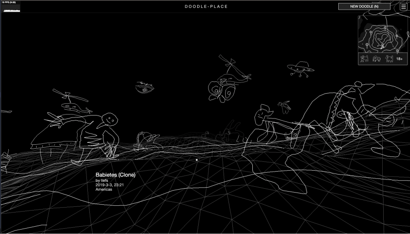
For my final project I improved on my drawing project. I added 4 new features:  a mini-map, dancing doodles, clustering/classification of doodles, and the island of inappropriate doodles (a.k.a penisland).

Doodle Recognition

I supposed with the prevalence of SketchRNN and Google Quickdraw, there would be ready-made doodle recognition model I can simply steal. But it turned out I couldn’t find one, so I trained my own.

I based my code on the tensorflow.js MNIST example using Convolutional Neural Networks. Whereas MNIST trains on pictures of 10 digits, I trained on the 345 categories of quickdraw dataset.

I was dealing with several problems:

  • The Quick, draw! game is designed to have very similar categories to supposedly make the gameplay more interesting. For example, there’re duck, swan, flamingo, and bird. Another example is tornado and hurricane. For many crappy drawings in the dataset, even a non-artificial intelligence like me cannot tell which category they belong to.
  • There are also categories like “animal migration” or “beach”, which I think are too abstract to be useful.
  • Quick, draw! interrupts the user once it figures out what something is, disallowing them to finish their drawing, so I get a lot of doodles with just 1 stroke or 2. Again as a non-artificial intelligence I have no idea what they represent.
  • There are many categories related to the human body, but there is no “human” category itself. This is a pity, because I think the human form is one of the things people tend to draw when they’re asked to doodle. I feel there’s a good reason for Google to not include this category, but I wonder what it is.

Therefore, I manually re-categorized the dataset into 17 classes, namely architecture, bird, container, fish, food, fruit, furniture, garment, humanoid, insect, instrument, plant, quadruped, ship, technology, tool and vehicle. Each class would include several of the original categories, while maintaining the same number of doodles in total in each class. 176 out of the 345 original categories are covered using my method. Interestingly, I find the process of manually putting things into categories very enjoyable.

Some misnomers (not directly related to machine learning/this project):

  • I included shark and whale and dolphin in the fish category, because when drawn by people, they look very similar. But I think biology people will be very mad at me. But I also think there’s no English word that I know of for “fish-shaped animals”? The phrase “aquatic animals” would include animals living in water that are not fish-shaped.
  • I put worm, spider, snake, etc. in the “insect” category, though they are not insects. There also seems to be no neutral English word that I know of for these small animals. I think “pest/vermin” focuses on a negative connotation. In where I come from, people would call them “蛇虫百脚”.
  • Since there’s no “human” category in quickdraw, I combined “angel”, “face”, “teddy bear”, and “yoga” into a “humanoid” category. So my recognizer works not that well with really regular-looking humans, but if you add some ears, or a circle on top of their head, or have them do a strange yoga move, my network has a much larger chance of recognition.

I initially tested my code in the browser, and it seemed that WebGL can train these simple ConvNets really fast so I sticked with it instead of switching to more beefy platforms like Colab / AWS. I rasterized 132600 doodles from quickdraw, downscaled them to 32×32, and fed into the following ConvNet:

model.add(tf.layers.conv2d({
  inputShape: [NN.IMAGE_H, NN.IMAGE_W, 1],
  kernelSize: 5,
  filters: 32,
  activation: 'relu'
}));

model.add(tf.layers.maxPooling2d({poolSize: 2, strides: 2}));
model.add(tf.layers.conv2d({kernelSize: 5, filters: 64, activation: 'relu'}));
model.add(tf.layers.maxPooling2d({poolSize: 2, strides: 2}));
model.add(tf.layers.conv2d({kernelSize: 3, filters: 64, activation: 'relu'}));
model.add(tf.layers.flatten({}));
model.add(tf.layers.dense({units: 512, activation: 'relu'}));
model.add(tf.layers.dropout({rate:0.5}));
model.add(tf.layers.dense({units: NUM_CLASSES, activation: 'softmax'}));

This is probably really kindergarten stuff for machine learning people, but since it’s my first time playing with the build up of a ConvNet myself, so I found it pretty cool.

Here is an online demonstration of the doodle classifier on glitch.com:

https://doodle-guess.glitch.me/play.html

It is like a Quick Draw clone, but better! It actually lets you finish your drawings! And it doesn’t force you to draw anything, but only give you some recommendations on the things you can draw!

Here is a screenshot of it working on the 24 quadrupeds:
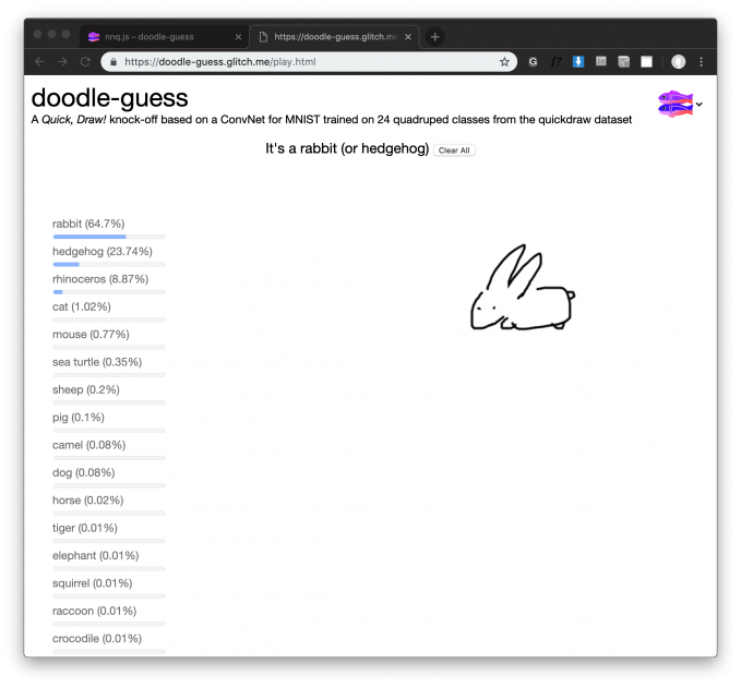
I also made a training webapp at https://doodle-guess.glitch.me/train.html. It also gives nice visualizations on the training results. I might polish it and release it as a tool. The source code and the model itself are also hosted on glitch: https://glitch.com/edit/#!/doodle-guess

Some interesting discoveries about the dataset:

  • People have very different opinions on what a bear looks like.
  • Face-only animals prevails over full-body animals.
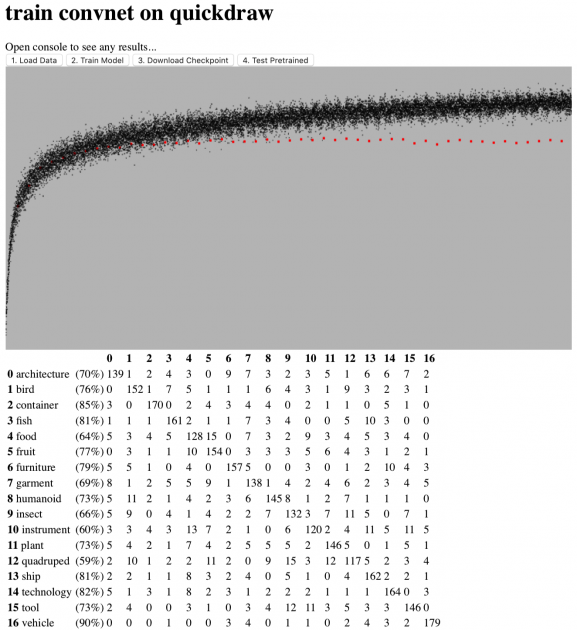
  • Vehicles are so easy to distinguish from the rest because of the iconic wheels.
  • if you draw something completely weird, my network will think it is a “tool”.

Check out the confusion matrix:
Doodle Clustering

The idea is that doodles that have things in common would be grouped together in the virtual world, so the world would be more organized and therefore more pleasant to navigate.

I thought a lot about how I go from the ConvNet to this. A simple solution would be to have 17 clusters, with each cluster representing one of the 17 categories recognized by the doodle classifier. However, I feel that that the division of the 17 categories is somewhat artificial. I don’t want to impose this classification on my users. I would like my users to draw all sorts of weird stuff that don’t fall into these 17 categories. Eventually I decided to do an embedding of all the doodles in the database, and use k-means to computationally cluster the doodles. This way I am not imposing anything, it is more like the computer saying: “I don’t know what the heck your doodle is, but I think it looks nice along side these bunch of doodles!”

I chopped off the last layer of my neural net, so for each doodle I pass through, I instead get a 512 dimensional vector representation from the second to last layer. This vector supposedly represent the “features” of the doodle. It encodes what’s so unique about that particular doodle, and in what ways it can be similar to another doodle.

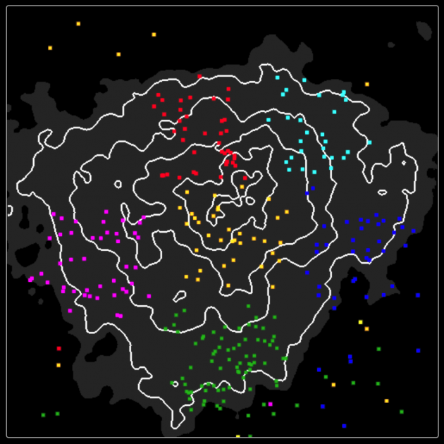
I sent the 512D vectors to a javascript implementation of t-SNE to compress the dimension to 2D, and wrote a k-means algorithm for the clustering. This is what the result looks like:
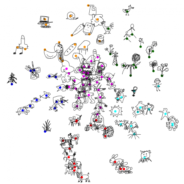
  • The pigs, tigers, horses, cats all got together, nice!
  • The bunnies got their own little place
  • The trees are near each other, except for the pine tree, which seems very unlike a tree from the AI’s perspective.
  • Humanoids are all over the place, blame quickdraw for not having a proper “human” category.

In the virtual world, the doodles will roam around their respective cluster center, but not too far from it, with the exception of fishoids, which will swim in the nearest body of water. You can see the above view at https://doodle-place.glitch.me/overview.html

Doodle Recognition as a hint for animation

So originally I have 4 categories for applying animation to a doodle: mammaloid, humanoid, fishoid, birdoid, and plantoid. The user would click on a button to choose how they animate a doodle. Now that I have this cool neural net, I can automatically choose the most likely category for the user. For those doodles that looks like nothing (i.e. low confidence in all categories from ConvNet’s perspective), my program still defaults to the first category.

Minimap

I received comments from many people that the place is hard to navigate as one feels like they’re in a dark chaotic environment in the middle of nowhere. I added a minimap to address the issue.

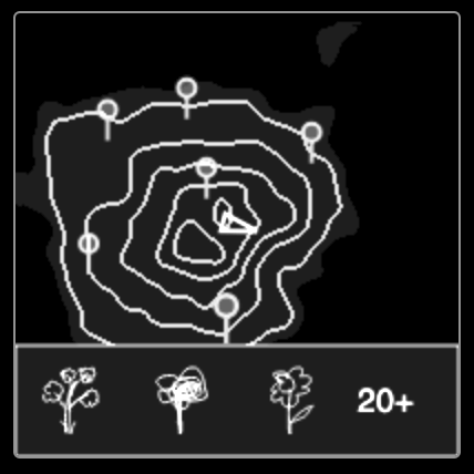
I chose the visuals of isopleths to conform with the line-drawing look of the project.

I also considered how I could incorporate information about the clustering. One method would be to plot every doodle on the map, but I didn’t like the mess. Eventually I decided to plot the cluster centers, using the visual symbol of map pins, and when user hovers over the pin, a small panel shows up at the bottom of the minimap, letting you know just what kinds of doodles to expect (by giving some typical examples), and how many doodles there are in the cluster. This GUI is loosely inspired by Google Map.

Golan suggested that if the user clicks on the pins, there should be an animated teleportation to that location. I am yet to implement this nice feature.
Dancing Doodles

Golan proposed the idea that the doodles could dance to the rhythm of some music, so the whole experience can potentially be turned into a music video.

I eventually decided to implement this as a semi-hidden feature: When user is near a certain doodle, e.g. doodle of a gramophone or piano, the music starts playing and every doodle would start dancing to it.

At first I wanted to try to procedurally generate music. I haven’t done this before and know very little about music theory, so I started with this silly model, in the hope of improving it iteratively:

  • The main melody is a random walk of the piano keyboard. It starts with a given key, and at each step can go up a bit or down a bit, but not too much. The idea is that if it jumps too much, it sounds less melodic.
  • The accompaniment is repeated arpeggios consisting of the major chord depending on the key signature.
  • Then I added a part that simply plays the tonic at the beat, to increase the strength of the rhythm
  • Finally a melody similar to the main melody but higher in pitch, just to make the music sound richer.

The resultant “music” sounds OK at the beginning, but gets boring after a few minutes. I think an improvement would be to add variations. But then I ran out of time (plus my music doesn’t sound very promising after all) and decided to go in another direction.

I took a MIDI format parser (tonejs/midi) and built a MIDI player into doodle-place. It plays the tune of Edvard Grieg’s In the Hall of the Mountain King by default, but can also play any .midi file the user drags on top of it. (Sounds much better than my procedurally generated crap, obviously, but I’m still interested in redoing the procedural method later, maybe after I properly learn music theory)

My program automatically finds the beat of the midi music using information returned by the parser, and synchronize the jerking of all the doodles to it. I tried several very different midi songs, and was happy that the doodles do seem to “understand” the music.
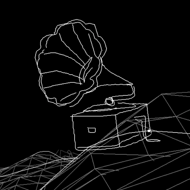
^ You can find the crazy dancing gramophone by walking a few steps east from the spawn point.

One further improvement would be having the doodles jerk in one direction while the melody is going upwards in pitch, and in the other direction when it is going down.

Island of Inappropriate Doodles (IID)

Most people I talk to seems to be most interested in seeing me implementing this part. They are all nonchalant when I describe all the other cool features I want to add, but only become very excited when I mentioned this legendary island.

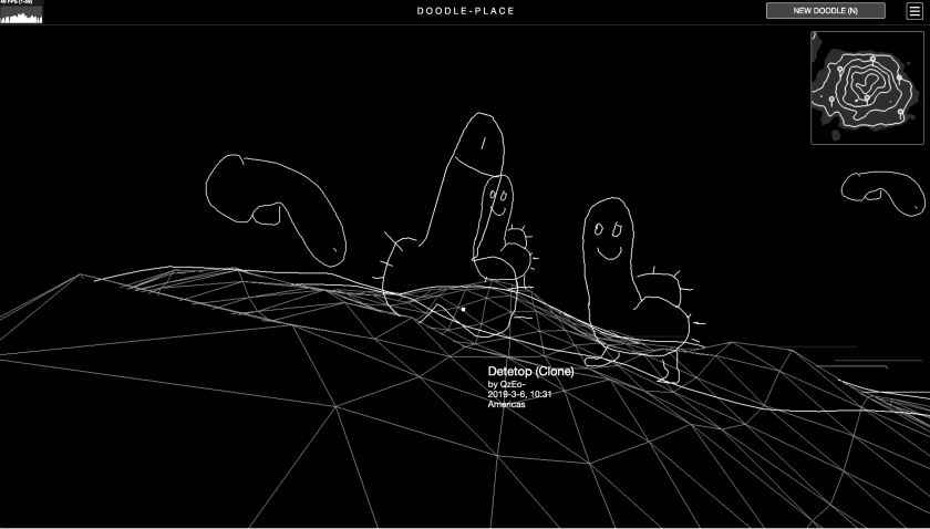
So there it is, if you keep going south and continue to do so even when you’re off the minimap, you will eventually arrive at Island of Inappropriate Doodles, situated on the opposite side of the strait, where all the penises and vaginas and swastikas live happily in one place.

I thought about how I should implement the terrain. The mainland is a 256×256 matrix containing the height map, where intermediate values are interpolated. If I include the IID in the main height map, the height map needs to be much much larger than the combined area of the two lands because I want to have decent distance between them. Therefore I made two height maps one for each land, and instead have my sampler take in both as arguments and output the coordinates of a virtual combined geometry.
ngdon – final proposal

I’ll be polishing and finishing 3 of my earlier projects for the final.

The first is pose estimation playrooms (playrooms.glitch.me). I have plans for many new “rooms”, and some other improvements. This is the complete list: https://glitch.com/edit/#!/playrooms?path=TODO.md

The second is doodle-place (doodle-place.glitch.me). I’ll be adding some grouping to the creatures so the world is more organized and interesting to navigate. I might also try Golan’s suggestion which is synchronize the creatures’ movement to some music.

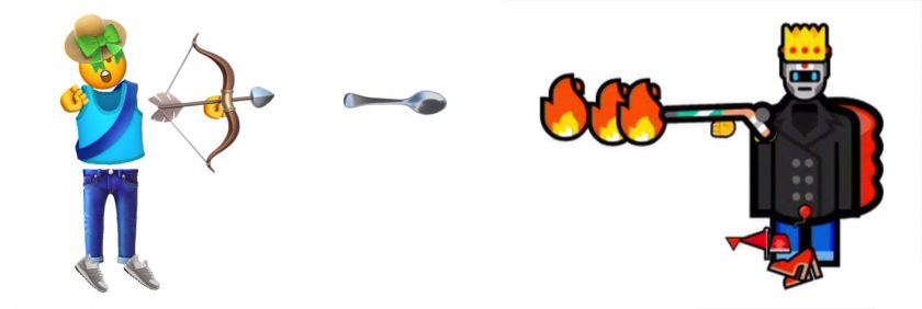
Finally I want to add a simple entry screen for the emoji game (emojia.glitch.me). On it you’ll be able to customize to some extent your outfit, or maybe see some hints about gameplay. I’m not sure if this will be an improvement, but I think it can be quickly implemented and figured out. I also want to put the game on an emoji domain I bought last year: http://🤯🤮.ws (and finally prove it’s not a waste of my $5)

ngdon – telematic feedback

My online multiplayer world made of emojis received a lot of feedback. I’m most happy to learn about related things and people such as Battle Royal, Everything game, and Yung Jake.

I noticed that the two most frequent keywords used to describe the game are “humorous” and “violent”, which I find accurate.

I received comments about gameplay, such as accommodating more players, more explanation of what is going on, having ability to change clothes etc. I’m considering implementing many of the suggestions.

During the critique, people seem to enjoy playing it. I also found out that people could not distinguish which players were controlled by AI, until I pointed out that the AI’s have the robot face emoji as their heads. I wonder if this means that my program passed the Turing test.

ngdon – telematic

emojia.glitch.me

An online multiplayer world made entirely of emojis. check it out on https://emojia.glitch.me

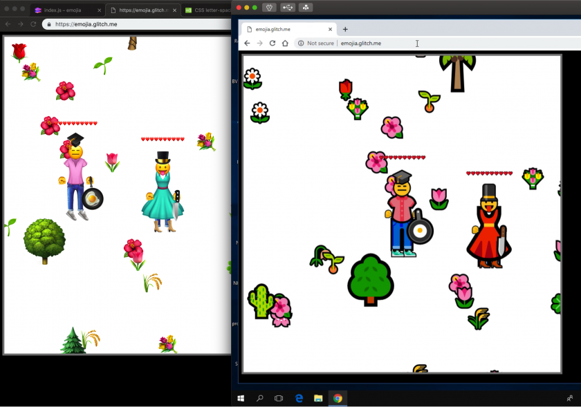
^ Gameplay on Windows 10

^ Left: Apple Color Emoji, Right: ASCII

^ Comparison of 4 OS.

Process

Emojis

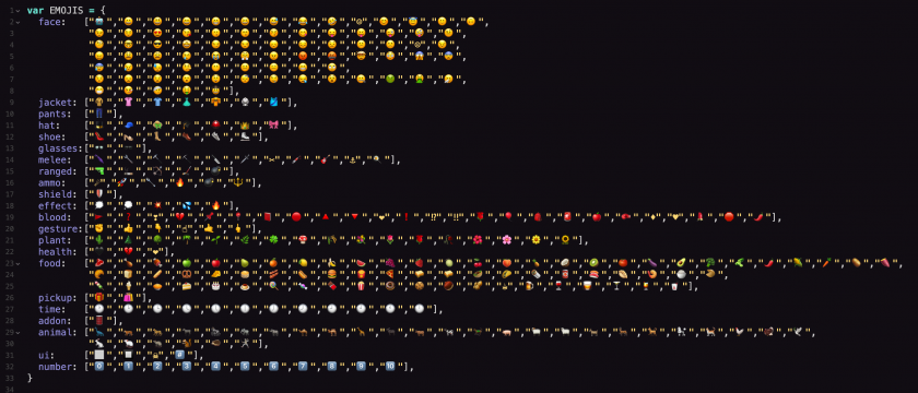
I collected the useful emojis in a dictionary and built a system to find and draw them. Since the center and rotation of individual emoji graphics are arbitrary and different on different OS’s, I built a mapping for different OS’s  to rectify them.

Rendering

Emojis are rendered as text in HTML divs. It turns out that mac Chrome and Safari are bugged in displaying emojis. Emojis cannot be rotated to axis-aligned angles (90°, 180°, 270°, etc), otherwise it will glitch crazily, being scaled to random sizes at frame. Also emojis cannot be scaled above 130 pixels in height, otherwise the emojis will not show up. I made some tricks and hacks so these problems are not visible.

Another problem is that mac Chrome and Safari cannot render emojis very efficiently. If there are many bunches of emojis flying all over the screen, the render loop is going to get very slow. Current solution is to not generate too many items, and delete them as soon as they’re no longer in sight.

Server

I used node.js on glitch.com to make the server. In my previous networked projects, precise sync was not very crucial, and “fairness” for all the players didn’t have to be enforced. However with this project I had to redesign my data structures multiple times to find the ones that optimizes both speed and fairness.

glitch.com seems to be limiting my resources, so from time to time there can be an outrageous lag (5 sec) in communicating between the server and client. I also tried to setup a server on my MacBook using serveo/ngrok, and the lag is much more consistent.

I also found another solution, which is to get a good noise filter. This time I’m using the One Euro Filter. I knew this filter for a while, but for my previous projects a Lerp is suffice. But for this project, Lerp means that everything will be always behind their actual position, which is quite unacceptable for a game. One Euro Filter turns out to be very magical, and the game no longer look laggy even on glitch.

Game Mechanism

Once you connect to the server, the server will put you into the most populated, yet not-full room. The capacity of a room is currently 4. I was hoping to have infinitely many players in a room, so it will look really cool if there’re many people online. However testing this made the network communication infinitely laggy.

When there’re less than 4 human players in a room, bots, which look almost human but can be easily distinguished with their bot “🤖” faces, will join the game to make things more interesting. Once another user want to connect, the bots will self-destruct to make space for human.

The bots have an average IQ, but it is already fun to observe them kill each other while my human character hide in the corner. Watching them I feel that the bots are also having a lot of fun themselves.

Currently players can pickup food and other items on the floor, or hunt small animals passing by for more food. But I have many more ideas that I haven’t got the time to implement.

Platform Specific Looks

Since for different OS’s and browsers the emojis look different, I made a small utility so that I can render the same gameplay video on different devices for comparison. How it works is that I first play it on my mac, and my code writes down the position and so on of all the stuff on the screen for each and every frame. I download the said file, can upload it again to different browsers on different OS’s to render the same play through, but rendered with platform specific emojis.

Currently I’ve rendered on 4 platforms: macOS mojave, windows 10, ubuntu 18, and android. I got access to windows 10 via connecting to virtual andrews in vmware. I have a USB-bootable linux which I plugged into my mac to get the linux recording. Golan lend me a Pixel phone which I used to make the android recording.

Though I’ve made a timer in my code so all the playbacks should be played at exact same speed, each browser seems to have a mind of its own and the resultant 4 videos are still a bit out of sync. Also took me all night to put them together.

You can find the recordings in a 2×2 grid view at the top of this post.

Todo

  • Mobile/touch support
  • More type of interactions: drawing stuff with emojis, leaving marks to the landscape, change facial expressions, etc.
  • Tutorial, instructions and other GUI

ngdon – telematic check-in

https://emojia.glitch.me

I’m making a multiplayer online game where everything is made of emojis.

I think there are enough emojis in unicode now so I can craft an entire world out of them.

See in-progress videos for details:


Another interesting aspect is that the game will look very different on different OS. For example, left is mac, right is windows:

ngdon-lookingoutwards-3

1. Your Line or Mine – Crowd sourced animation installation

https://yourlineormine.com

  • Explain the project in a sentence or two (what it is, how it operates, etc.);

Each visitor can draw on a piece of paper and their drawings are combined into an animation. There are both visual and textual hints on the paper telling visitors what to draw, but visitors can also ignore them.

  • Explain what inspires you about the project (i.e. what you find interesting or admirable);

I think the most interesting part is the dots on the image. Even though the visitors often improvise, they almost always incorporate the dots in their drawings in some way. Therefore the resultant animation still looks continuous, since the path of the dots are predetermined. I think this is a smart choice.

  • Critique the project: describe how it might have been more effective; discuss some of the intriguing possibilities that it suggests, or opportunities that it missed; explain what you think the creator(s) got right, and how they got it right.

I think dots are enough, so maybe the textual hint can be removed since users don’t follow it anyways. I’m curious to see how this effects users’ creativity.

  • Research the project’s chain of influences. Dig up the ‘deep background’, and compare the project with related work or prior art, if appropriate. What sources inspired the creator this project? What was “their” Looking Outwards?

I think it is closely related to the project where everyone tries to trace the previous line, but looks at the “crowd-sourced drawing” idea from a different perspective.


2. fridgemoji

https://glitch.com/~fridgemoji


  • Explain the project in a sentence or two (what it is, how it operates, etc.);

This is an online interactive fridge where users can place food (emojis).

  • Explain what inspires you about the project (i.e. what you find interesting or admirable);

This project showed up on glitch.com’s front page one day. It seems to be like a demo, but I like the simplicity. I also admire the fact that there’s no apparent goal, and users just add and rearrange items, which is very much like the communal fridges at CMU Gates.

  • Critique the project: describe how it might have been more effective; discuss some of the intriguing possibilities that it suggests, or opportunities that it missed; explain what you think the creator(s) got right, and how they got it right.

The food I placed there a couple of weeks ago disappeared. Maybe it is because the app doesn’t have persistent storage.

  • Research the project’s chain of influences. Dig up the ‘deep background’, and compare the project with related work or prior art, if appropriate. What sources inspired the creator this project? What was “their” Looking Outwards?

I think real fridges as well as the internet’s use of emojis inspired the artist.


ngdon-DrawingSoftware

doodle-place

Check it out at https://doodle-place.glitch.me

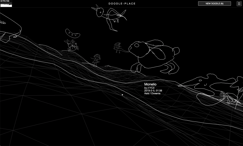
doodle-place is an online world inhabited by user-submitted, computationally-animated doodles. You can wander around and view doodles created by users around the globe, or contribute your own.

Process

To make this project, I first made a software that automatically rigs and animates any doodle made by users. It does so using some computer vision. Then I wrote server-side and client-side software to make the world and the database behind it running. The process is explained below.

doodle-rig

Skeletonization

To rig/animate a doodle, I first need to guess the skeleton of it. Luckily, there’s something called “skeletonization” that does just that. Thanks to Kyle McDonald for telling me about it one day.

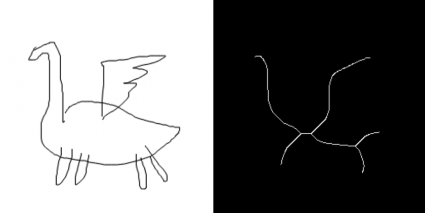
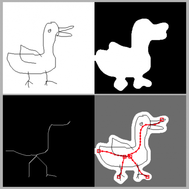
The idea of skeletonization is to make the foreground thinner and thinner until it’s 1px thick.

At first I found a OpenCV implementation, but it was quite bad because the lines are broken at places. Then I found a good implementation in C++. I ported it to javascript. However it runs very slow in the browser, because it iterates through every pixel in the image multiple times and modifies them. However, I discovered gpu.js, which can compile kernels written using a subset of javascript into WebGL shaders. So I rewrote the skeletonization algorithm with gpu.js

The source code and demo can be found at:

https://skeletonization-js.glitch.me

You can also import it as a javascript library to use in whatever js project, which is what I’m doing for this project.

Inferring rigs

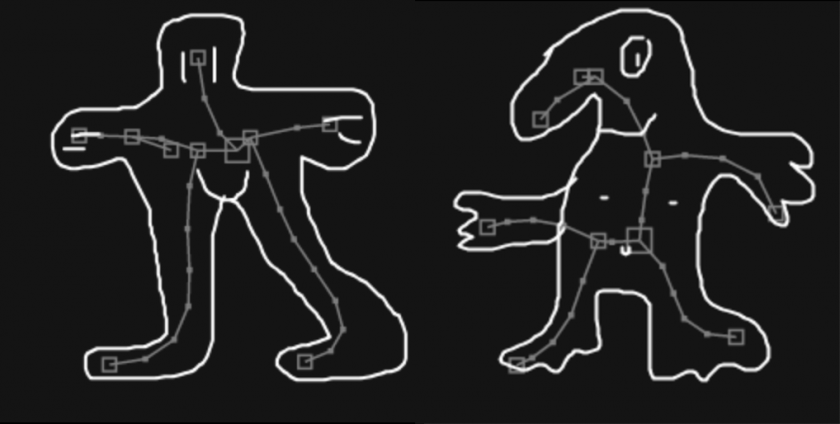
Since the skeletonization is a raster operation, there is still the problem on how to make sense of the result. We humans can obviously see the skeleton meant by a resultant image, but for computers to understand I wrote something that extracts it.

The basic idea is that I scan the whole image with a 8×8 window for non-empty patches, and I mark the first one I found as root.

I check all 4 edges of the root patch, and see which of the 8 directions have outgoing lines. I’ll follow these lines and mark the patches they point to as children. Then I do this recursively to extract the whole tree.

Afterwards, an aggressive median-blur filter is applied to remove all the noise.

The source code and demo can be found at:

https://doodle-rig.glitch.me

Again, this can be used as a library, which is what I did for this project.

Inferring limbs & Animation

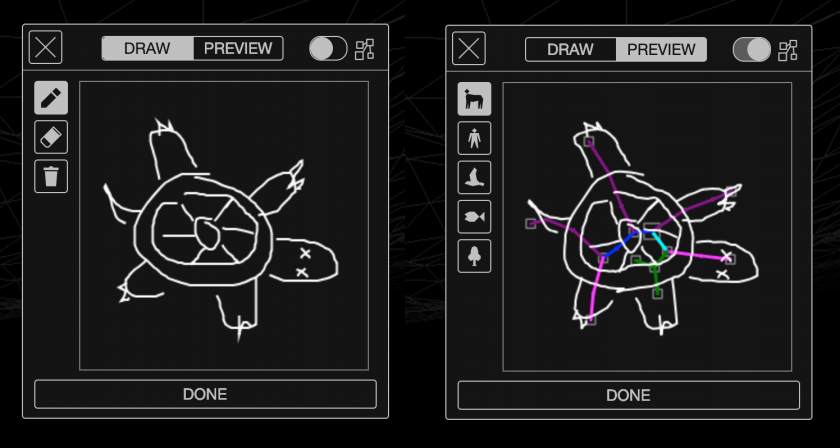
I made 5 categories for doodles: mammal-oid, humanoid, bird-oid, fish-oid, and plant-oid. For each of them, I have a heuristic that looks at the shape of skeleton and decide which parts are legs, arms, heads, wings, etc. Though it works reasonably well on most doodles, the method is of course not perfect (because it doesn’t use machine learning). But since the doodle can be anything (the user might submit say a banana as a humanoid, in which case no method will be correct in telling which parts are legs), I embraced the errors as something playful.

Then I deduced separate animation for different limbs.  For example a leg should move rapidly and violently when walking, but a head might just bob around a little bit. I also tried just totally random animation, and I almost liked insane randomness better. I’m still working on the sane version.


Database & Storage

Structure

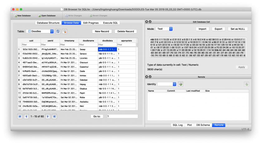
I use SQLite to store the doodles. This is my first time using SQL. I find learning it interesting. Here is a sqlite sandbox I made to teach myself:

https://ld-sql-lab.glitch.me

Anything you post there will be there forever for everyone to see…

But back to this project, I encode the strokes and structure of each submitted doodle into a string, and insert it as a row along with other meta data:

  • uuid: Generated by the server, universally unique identifier to identify the doodle.
  • userid: The name/signature of a certain user to put on their doodles, doesn’t need to be unique
  • timestamp: time at which the doodle is created, also contains the time zone information, which is used to estimate the continent where the user is on without tracking them.
  • doodlename: The name of the doodle given by user
  • doodledata: strokes and structural data of the doodle.
  • appropriate: whether the doodle contains inappropriate imagery. All doodles are born as appropriate, and I’ll check the database periodically to mark inappropriate ones.

Management

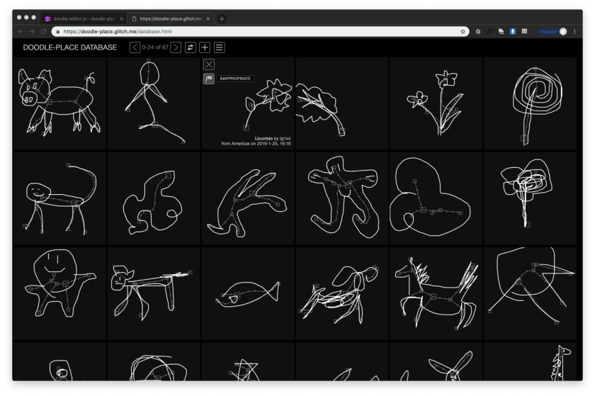
I made a separate page (https://doodle-place.glitch.me/database.html) to view and moderate the database. Regular users can also browse that page and see all doodles aligned in a big table, but they won’t have the password to flag or delete doodles.

Golan warned me that the database is going to be full of penises and swastikas. I decided that instead of deleting them, I’ll keep them but also flag them as inappropriate so they will not spawn. When I’ve collected enough of these inappropriate doodles, I’ll create a separate world so all these condemned doodles can live together in a new home, while the current world will be very appropriate all the time.

Engine

GUI

The default HTML buttons and widgets looks very generic, so I wrote my own “skin” for the GUI using JS and CSS.

Turns out that modern CSS support variables which can be programmatically set with JS. This recent discovery made my life a lot easier.

I created an entire set of SVG icons for the project. I used to use Google’s Material Icon font, but it turns out that what I need this time is too exotic.

Making the doodle editor GUI was more time-consuming than writing actual logic / developing algorithms.

3D

At first I thought I could get away with P5.js 3D rendering. Turns out to be slow as crawl. After switching to three.js, everything is fast. I wonder why, since they both use WebGL.

The lines are all 1px thick because of Chrome/Firefox WebGL implementation doesn’t support line width. I would be happier if they can be 2px so things look more visible, but I thick currently it’s fine. Workaround such as to render lines as “strip of triangles” is way too slow.

Terrain

I’ve generated a lot of terrains in my life so generating this one isn’t particularly hard. But in the future I might give it more care to make it look even better. Currently it is a 2D gaussian function multiplied with a perlin noise. This way the middle part of the terrain will be relatively high, with all the far-away parts having 0 height. The idea is that the terrain is an island surrounded by waters, so the players can’t just wander off the edge of the world.

The plant-oids will have a fixed place on land, the humanoids and mammal-oids will be running around on land, the bird-oids will be flying around everywhere, and the fish will be swimming in the waters around the island.

The terrain is generated by the server as a height map. The height map is a fixed-size array, with the size being its resolution. The y coordinate of anything on top of the terrain is calculated from its x and z coordinates, and non-integer positions are calculated using bilinear-interpolation. This way mesh collision and physics stuff are avoided.

Initially I planned to have the terrain look just like a wireframe mesh. Golan urged me to think more about it, such as outlining the hills instead so the look will be more consistent with doodles. I implemented this by sampling several parallel lines on the height map normal to the camera’s direction. It’s quick, but it sometimes misses out the top of the hills. So I still kept the wireframe as a hint. In the future I might figure out a fast way, perhaps with some modified toon shader to draw exactly the outline.

Control

The user can control the camera’s rotation on y axis. The other two rotations are inferred  by the terrain beneath the user’s feet, with some heuristics. There’s also a ray-caster that acts like a cursor, which determines where new user-created doodles will be placed. The three.js built-in ray caster on meshes is very slow, since I have really really big mesh that is the terrain. However since terrains are not just any mesh and have very special geometric qualities, I wrote my own simple ray caster based on these qualities.

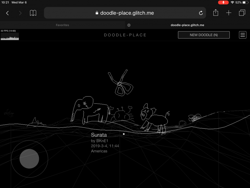
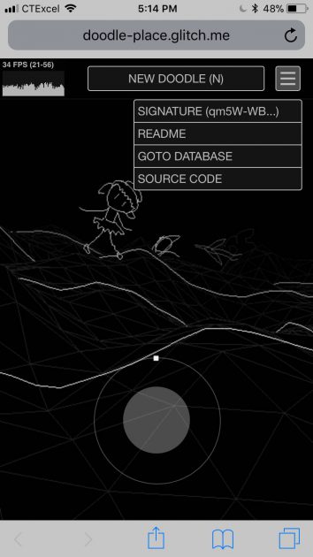
I want the experience to be playable on desktop and mobile devices. So I also made a touch-input gamepad and drag-the-screen-with-finger-to-rotate-camera.

^ On iPad

^ On iPhone

Libraries:

  • three.js
  • OpenCV.js
  • gpu.js
  • node.js
  • sqlite
  • socket.io
  • express

Evaluation

I like the result. However I think there are still bugs to fix and features to add. Currently there are ~70 doodles in the database, which is very few, and I’ll need to see how well my app will perform when there are many more.

Some more doodles in the database, possibly by Golan:

ngdon-LookingOutwards-2

NORAA (Machinic Doodles)

A human/machine collaborative drawing on Creative Applications:

https://www.creativeapplications.net/processing/noraa-machinic-doodles-a-human-machine-collaborative-drawing/

  • Explain the project in a sentence or two (what it is, how it operates, etc.);

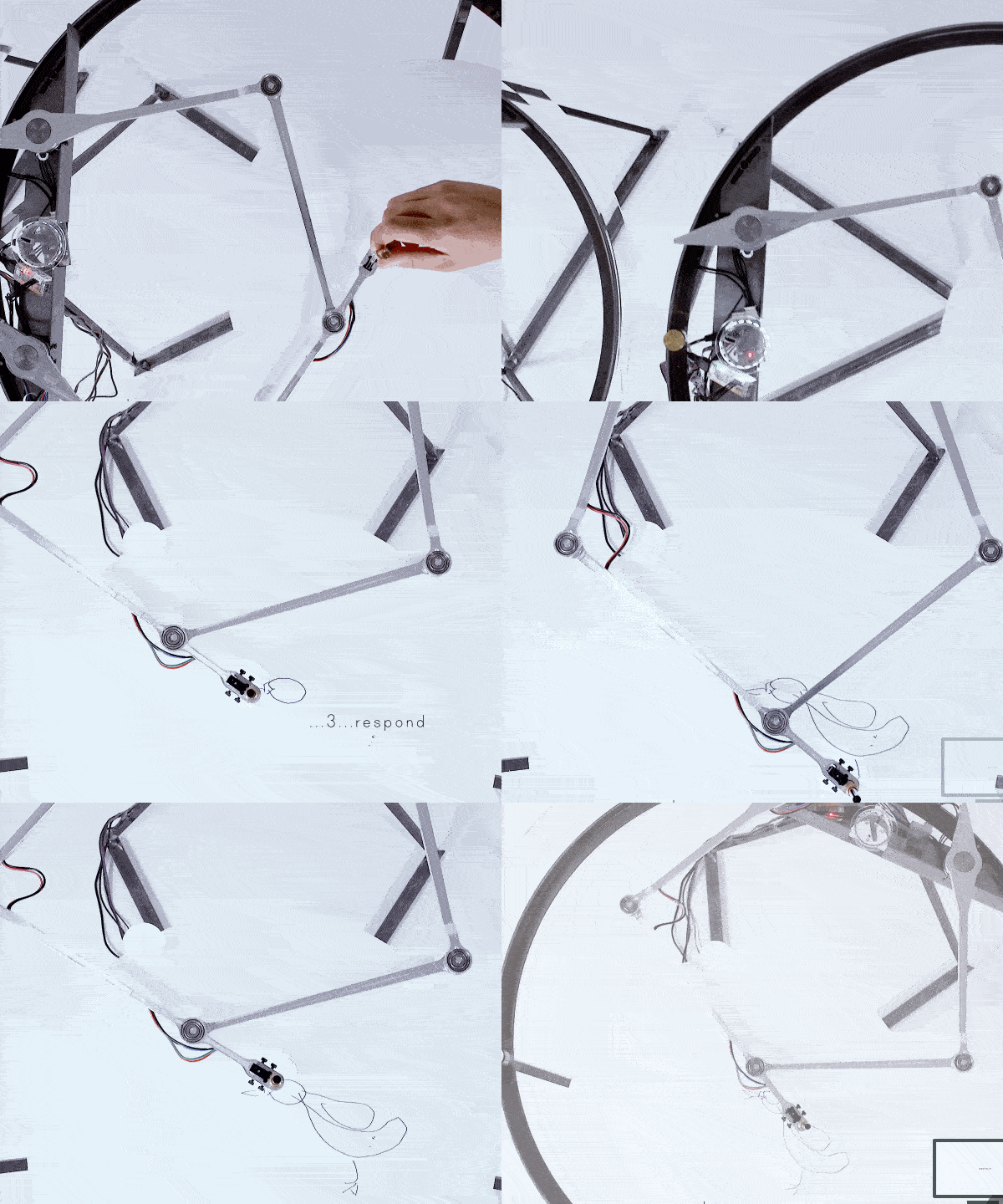
NORAA (Machinic Doodles) is a plotter that first duplicates the user’s doodle and then based on its understanding of what it is, finish the drawing.

  • Explain what inspires you about the project (i.e. what you find interesting or admirable);

I find the doodles, which are from Google’s QuickDraw dataset, very interesting and expressive. They also reveal how ordinary people think about and draw common objects. They’re very refreshing to look at, especially after spending too much time with fine art. However I always wondered if they’ll look even better if they’re physically drawn instead of being stored digitally.

I think this project brings out these qualities very well with pen and paper drawings.

I’m also drawn to the machinery, which is elegant visually, and well documented in their video.

  • Critique the project: describe how it might have been more effective; discuss some of the intriguing possibilities that it suggests, or opportunities that it missed; explain what you think the creator(s) got right, and how they got it right.

I think the interaction can be more complicated. I think the current idea of how it collaborates with the users is too easy to come up with, and is basically just like a SketchRNN demo. I wonder if other kinds of fun experiences that can be achieved, given that they already have excellent software and hardware. Especially since the installation is shown in September 2018, at which point I think SketchRNN and QuickDraw have already been there for a while.

  • Research the project’s chain of influences. Dig up the ‘deep background’, and compare the project with related work or prior art, if appropriate. What sources inspired the creator this project? What was “their” Looking Outwards?

I think they’re mainly inspired by SketchRNN, which is a sequential model trained on line drawings that also have temporal information.

I think creative collaboration with machines has been explored a lot recently. Google’s Magenta creates music collaboratively with users, and there’s also all those pix2pix stuff that turns your doodles into complex-looking art.

  • Embedding a YouTube or Vimeo video is great, but you should also

  • Prepare and upload an animated GIF to this WordPress.

ngdon-mask

age2death

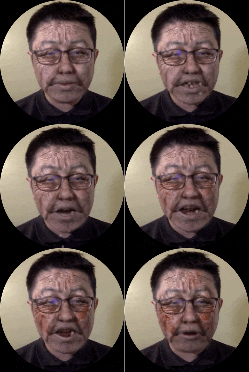
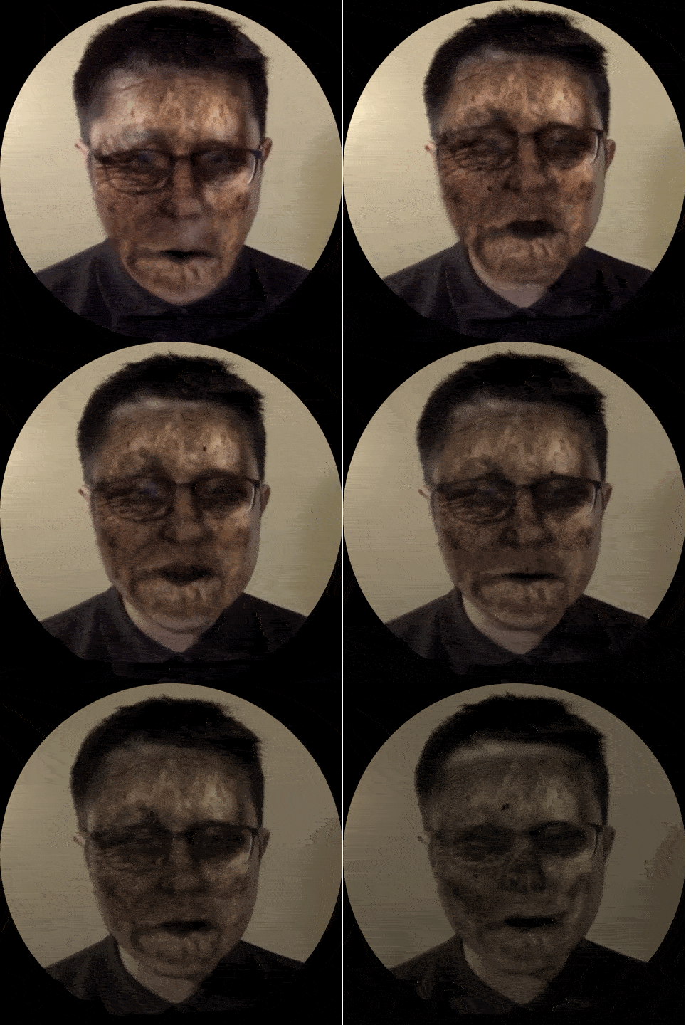
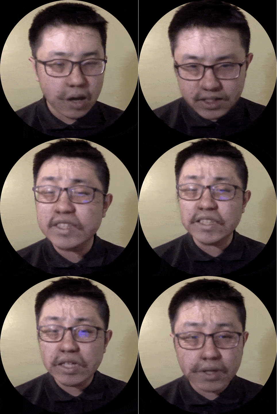
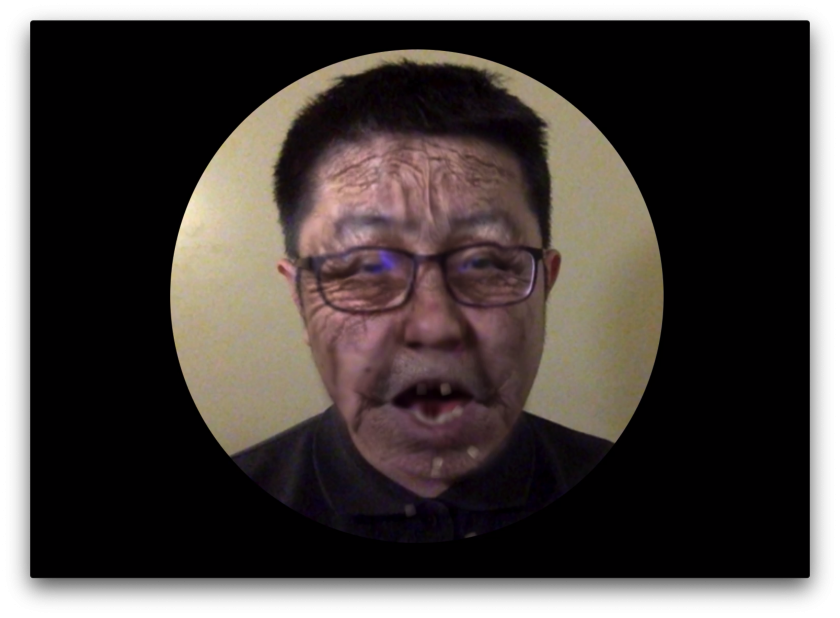
age2death is a mirror with which you can watch yourself aging to death online. Try it out: https://age2death.glitch.me

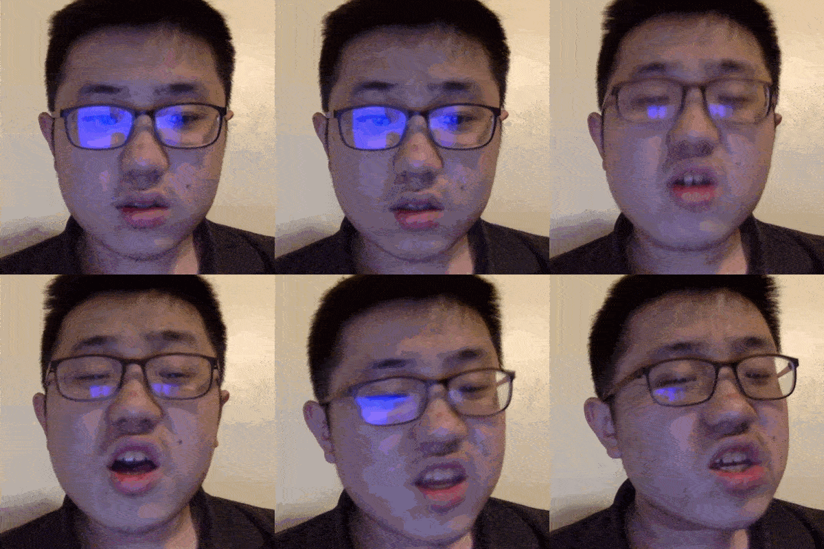
GIFs

^ timelapse

^ teeth falling

^ decaying

^ subtle wrinkles

Process

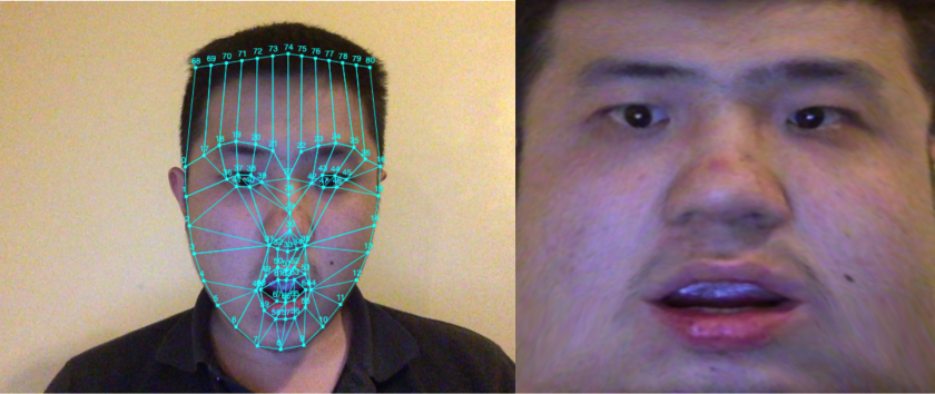
Step 1: Facial Landmark Detection + Texture Mapping

I used brfv4 through handsfree.js to retrieve facial landmarks, and three.js to produce the 3D meshes.

I wanted to get the forehead too, which is not in the original 68 key points. However, a person’s forehead’s size and orientation is somewhat predictable based on the rest of their face. Thus I calculated 13 new  points for the forehead.

To achieve the effect I wanted, I have two possible approaches in mind: The first is to duplicate the captured face mesh and texture them with “filters” I want to apply, and composite the 3D rendering with the video feed.

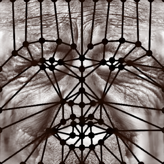
The second is to “peel” the skin off the captured face, and stretch it onto a standard set of key points. Then the filters are applied onto the 2D texture, which is then used to texture the mesh.

I went with the second approach because I my intuition is that it would give me more control over the imagery. I never tried the other approach, but I liked my current approach.

Step 2: Photoshopping Filters

My next step was to augment the texture of the captured face so it looks as if it is aging.

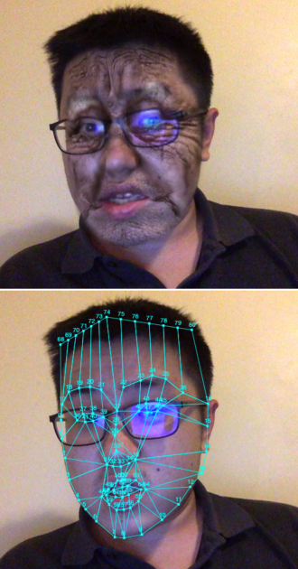
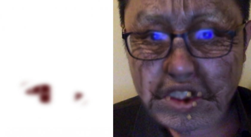
I made some translucent images in Photoshop, featuring some wrinkles (of different severity), blotches, white eyebrows, an almost-dead-pale-blotchy face, a decaying corpse face, and a skull according to the standard set of key points I fixed.

I tired to make them contain as little information about gender, skin color, etc. as possible so these filters will ideally be applicable to everyone when blended using “multiply” blend mode.

Moreover, I made the textures rather “modular”. For example, the white brow image contains only the brow, the blotch image contains only the blotch, so I can mix and match different effects in my code.

Most of the textures were synthesized by stretching, warping, compositing, and applying other Photoshop magic to found images.

Currently I’m loading the textures directly in my code, but in the future maybe procedurally generating the textures fits more to my taste.

^ Some early tests. Problem is that the skin and lips are too saturated for an old person.

After spending a lot of time testing the software, I feel so handsome IRL.

Step 3: Skewing the Geometry

Besides the change in skin condition, I also notice that the shape of old people’s face & facial features also changes in real life. Therefore, I made the chin sag a bit and corners of the eyes move down a bit over time, among other subtle adjustments.

Step 4: Transitions

After I have a couple of filters ready, I tested out the effect by linearly interpolating them with code. It worked pretty well, but I thought that the simple fade in / fade out effect looks a bit cheap. I want it to be more than just face-swapping .

One of the improvements I made is what I call “bunch of blurry growing circles” transition. The idea is that some part of the skin get blotchy/rotten  before other parts, and the effects sort of expand/grow from some areas of the face to the whole face.

I achieved the effect with a mask containing a bunch of blurry growing circles (hence the name). As the circles grow, the new image (represented by black areas on the mask) reveals.

My first thought on how to achieve this kind of effect is to sample a perlin noise, but I then thought that it would be less performant unless I write a shader for it. The circles turned out to be pretty good (and fast).

Another problem I found was that the “post-mortem” effects (ie. corpse skin, skull, etc) are somewhat awkward. Since only the face is gross while other parts of the body are intact, I think the viewer tends to feel the effects are “just a mask”. I also don’t want to the effects to be scary in the sense of scary monsters in scary movies. Therefore my solution was to darken the screen gradually after death, and when the face finally turns into a skull, the screen is all black. I think of it as hiding my incompetence by making it harder to see.

I also made heavy use of HTML canvas blend modes such as multiply, screen, source-in, etc. I desaturate and darken parts of the skin.

^ Some blending tests

Step 5: Movable Parts

After I implemented the “baseline”, I thought I could make the experience more fun and enjoyable by adding little moving things such as bugs eating your corpse and teeth falling down when you’re too old.

The bugs are pretty straightforward. I added a bunch of little black dots whose movements are driven by Perlin noise. However I think I need to improve it in the future. Because when you look closely, you’ll find out these bugs are nothing more than little black dots. Maybe some (animated?) images of bugs will work better.

I did the falling teeth with two parts: the first is the particle effects of the individual tooth falling, and the second is to mask out the teeth that have already fallen.

I liked the visual effect of teeth coming off one by one, but sometimes the facial landmark detection is inaccurate around the mouth, and you can sort of see your real teeth behind the misaligned mask. I probably need to think of some more sophisticated algorithms.

^ left: teeth mask, right: teeth falling. Another thing I need to improve is the color of the teeth. Currently I assume some yellowish color, but probably better way is sample user’s real teeth color, or easier, filter all other teeth into this yellowish color.

Step 6: Timing & Framing

I adjusted the speed and pace of the aging process, so at first, the viewers are almost looking into a mirror, with nothing strange happening. Only slowly and gradually they’ll realize the problem. And finally, when they’re dead, their corpse decay quickly and everything fades into darkness.

I also wanted something more special than the default 640x480px window. I thought maybe a round canvas will remind people of a mirror.

I made the camera follow the head, because it is what really matters and what I would like people to focus on. It also looks nicer as a picture, when there isn’t a busy background.

Step 7: Performance

I decided to read a poem for my performance. I thought my piece woldn’t need too many performative kind of motions, and some quiet poem-reading best brings out the atmosphere.

I had several candidates, but the poem I finally picked is called “Dew on the Scallion (薤露)”. It was a mourning song written in 202 BC in ancient China.

薤上露,何易晞。

露晞明朝更复落,

人死一去何时归!


蒿里谁家地,

聚敛魂魄无贤愚。

鬼伯一何相催促,

人命不得少踟蹰。

I don’t think anyone has translated it to English yet, so here’s my own attempt:

The morning dew on the scallion,

how fast it dries!

it dries only to form agian tomorrow,

but when will he come back, when a person dies?


Whose place is it, this mountain burial ground?

yet every soul, foolish or wise, rest there.

And with what haste Death drives us on,

with no chance of lingering anywhere.

Byproduct: face-paint

Try it out: https://face-paint.glitch.me

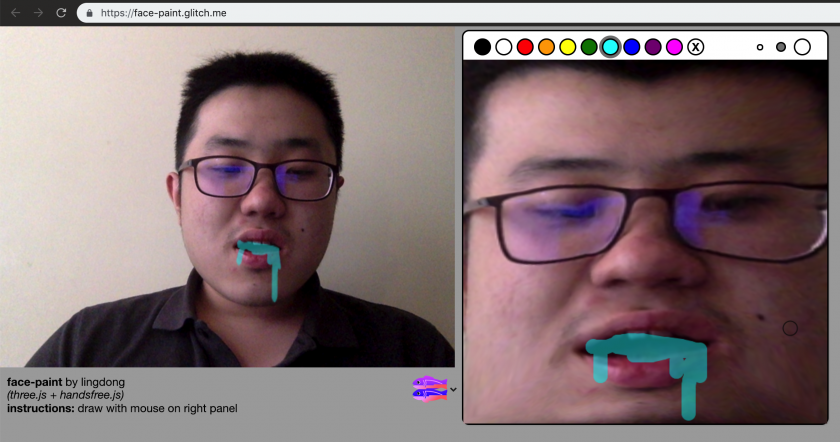
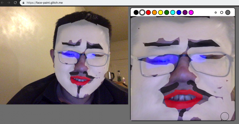
While making my project, I found that painting on top of your own face is also quite fun. So I made a little web app that lets you do that.

ngdon-lookingoutwards01

  • Please discuss the project. What do you admire about it, and why do you admire these aspects of it?

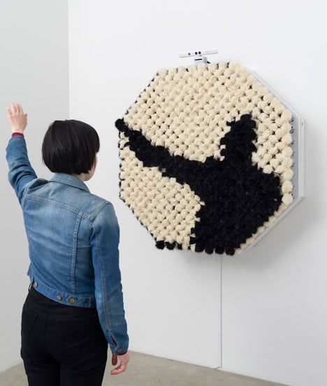
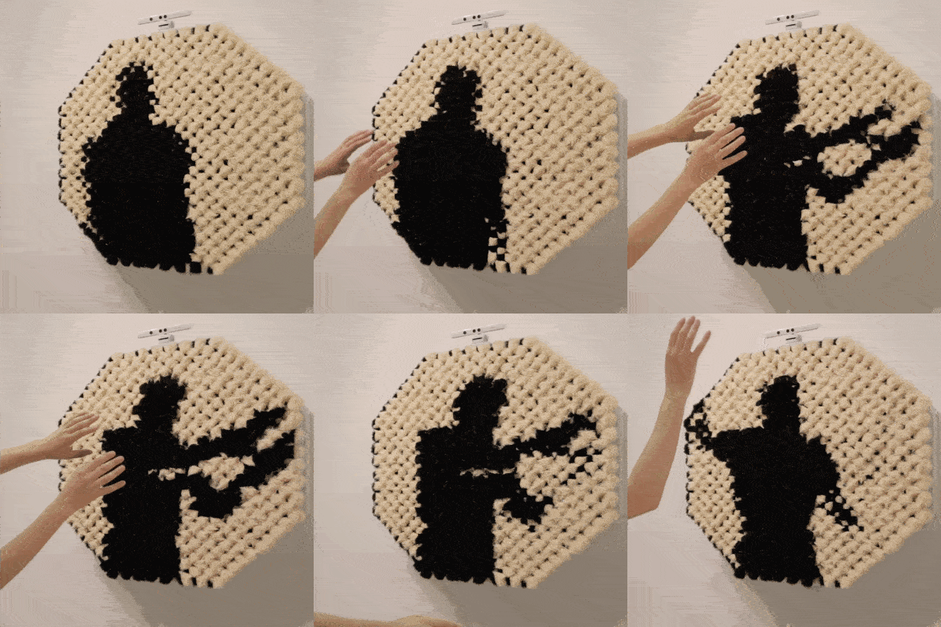
One of the interactive projects I remembered is Daniel Rozin’s PomPom Mirror. The project contains a mirror made of black and white fur, which reflects the audience’s silhouette by pushing the furs using many motors. The most fascinating aspect of the project is the material. The fur moves slowly yet smoothly, displaying interesting patterns when they’re switching between black and white. The delay creates an expectation. Furthermore, while most mirrors are hard and shiny, this mirror creates an unfamiliarity as well as a novel feeling by being organic and fluffy. Moreover it only display very rough silhouettes, giving audience space for imagination. I also enjoyed the idea of “pixels” taken out of the context of screens.

  • How many people were involved in making it, and how did they organize themselves to achieve it? (Any idea how long it took them to create it?)

1 people is credited, but I can not find information on whether the artist has helpers. I think it takes a long time to install all the motors.

  • How was the project created? What combination of custom software/scripts, or “off-the-shelf”  software, did the creators use? Did they develop the project with commercial software, or open-source tools, or some combination?

The project uses fur puffs, motors and Kinect. Kinect detects people and custom software translates the detection into motion of the motors, which then move the fur.

  • What prior works might the project’s creators have been inspired by?

I think mirrors and the idea of seeing one self has always been something fascinating to human beings, and people are writing and making things about them since ancient time. (e.g. Snow White, Perseus, etc). The artist himself also makes a lot of mirrors, and some of them are made before this one, such as Wood Mirror (1999) and Peg Mirror (2007).

  • To what opportunities or futures does the project point, if any?

Mirrors of other materials. Moving furs that interacts with audience differently.

  • Provide a link (if possible) to the artwork, and a full author and title reference.

link: http://www.smoothware.com/danny/index.html

Daniel Rozin
PomPom Mirror, 2015
928 faux fur pom poms, 464 motors, control electronics, xbox kinect motion sensor, mac-mini computer, custom software, wooden armature
48 × 48 × 18 in
121.9 × 121.9 × 45.7 cm
Edition 6/6 + 1AP
  • Embed an image and a YouTube/Vimeo video of the project (if available).

image:

video:

  • Create a brief animated GIF for the project, if a video is available. (For advice, information and resources about how to make an animated GIF, please see this page.) Keep your GIF around 640×480 pixels (absolutely no wider than 840 pixels), and under 5Mb.