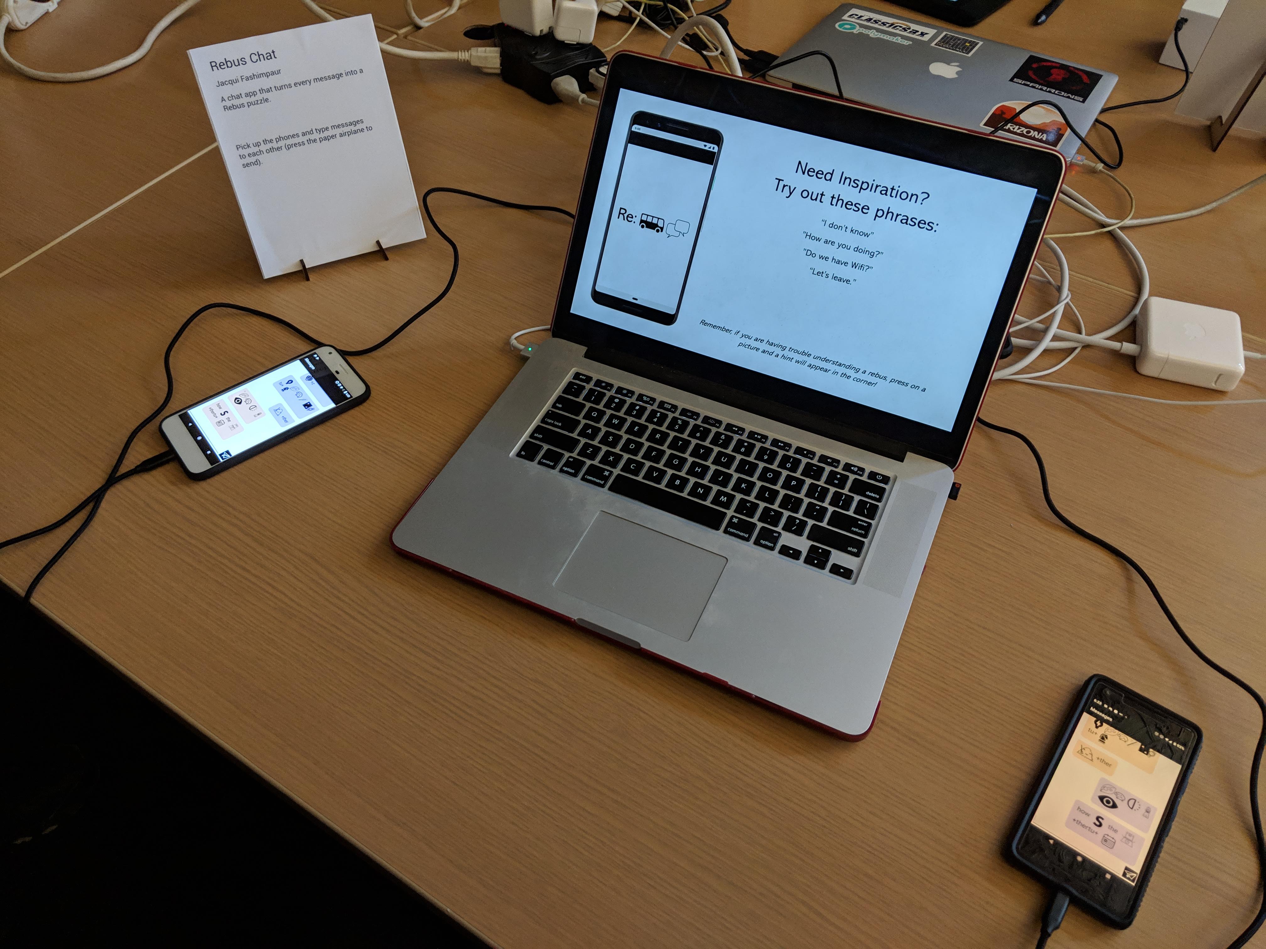
jaqaur – FinalProject

Rebus Chat

Description

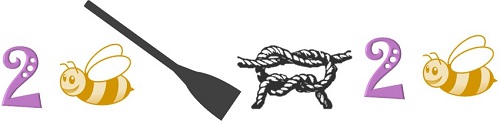
My final project is a continuation of my project for the telematic assignment. It’s an Android chat app that automatically converts every message you send into a Rebus puzzle. For those unfamiliar, a Rebus is a puzzle in which words/syllables are replaced with images that depict the pronunciation, rather than the meaning, of the message. Below is an example Rebus of the phrase “To be or not to be.”

To be or not to be…

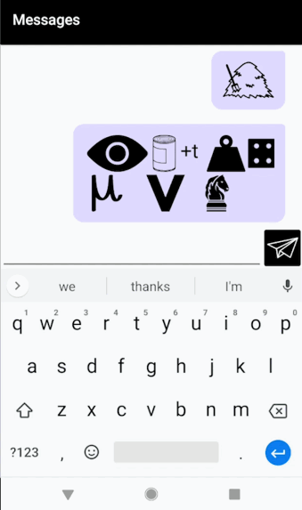
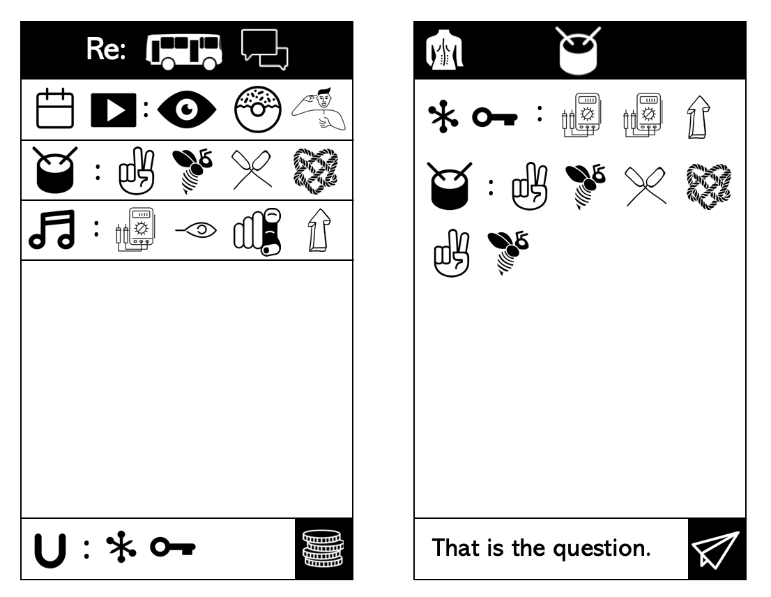
As you type, a preview of your Rebus-ified message appears above the text box. Pressing the paper airplane sends your message to the other person. Long pressing on any image generates a “hint” (a popup in the corner containing the title of that image). You can scroll back through past messages to see your chat history.

How it Works

I made Rebus Chat with Android Studio and Firebase (Quick sidenote about Firebase: it’s really amazing and I would recommend it to anyone making an Android app with things like authentication, databases, and ads. It’s very user friendly, it’s integrated with Android Studio, and it’s free!). All of the icons I used came from the Noun Project, and the pronunciations came from the CMU Pronouncing Dictionary.

The most important part of this app, and the one I am most proud of, is the Rebus-ification algorithm, which works as follows:

  • All punctuation, except commas, are stripped (I will change this in future iterations)
  • The string is split into words and those words are passed through the pronunciation dictionary, ultimately yielding a list of phonemes (words it doesn’t know are given a new “unknown” phoneme)
  • The full list of phonemes is passed into a recursive Dynamic-Programming function that tries to get the set of “pieces” (I’ll explain what a piece is in a minute) with the best total score for this message. Working from the back (so that the recursive calls are mostly unchanged as the message is added to, which improves runtime), the function asks “How many (from 1-n, the length of the list) phonemes should make up the last piece, such that the score of that piece plus the score of the rest of the message (via a recursive call) is maximized?” As part of this, each sublist of phonemes is passed into a function that finds the best piece it can become.
  • A “piece” is one of three things: Image, Word, or Syllable. The function to find the best piece for a given list of phonemes first checks every image we have to find the one with the best matching score (matching scores will be described next). If the best matching score is above a certain threshold, it’s deemed good enough and returned as an Image piece. If not, we say this list of phonemes is un-Rebusable. If the list contains exactly the phonemes from a full word in the original message–no more, no less–then it is a Word piece and returned as the word it originally was (this is the default when the pronunciation dictionary doesn’t know the word). Otherwise, the list is a Syllable piece and a string is generated to represent how those phonemes should be pronounced. I do this rather than using the letters from the original word because it is more readable in many cases (eg. if “junction” became a “Junk” image and then “ti” and then an “On” image, the “ti” would likely not read right. So in my code I turn it into “sh”).
  • To find the matching score between a word and an image, we get the phoneme list for the image. Then we do a second Dynamic Programming algorithm which tries to find the best possible score to assign these two lists. The first sounds of each list can either be matched with each other, in which case we add to our total the sound-similarity score (explained below) for these two sounds, or one of the lists’ first sound can be skipped, in which case we match it with the “empty sound” and add the sound-similarity score for that sound and nothingness. This repeats recursively until we hit the end of the list.
  • The sound similarity score is more or less a hard list of scores I made for each pair of sounds in the CMU Pronouncing Dictionary. The better the score, the better the match. In general, sounds that only kind of match (“uh” and “ah”) have slightly negative scores, as we want to avoid them, but can accept them, while sounds that really don’t match (“k” and “ee”) have very negative scores. Soft sounds like “h” have only slightly negative scores for matching with nothingness (ie. being dropped). Perfect matches have very positive scores (but not as positive as the non-matches are negative), and voiced/unvoiced consonant pairs (“s” and “z”, or “t” and “d”) are slightly positive because these actually swap out remarkably well.
  • Okay. That’s it. The bottom of the stack of function calls. After all the results of all the functions get passed up to the top, we are left with the best-scoring list of pieces. We then render these one at a time: words are simply inserted as text. Syllables are also inserted as text, with a plus sign next to them if they are part of the same word as an adjacent image piece (syllables are not allowed not to be next to image pieces–there would be no reason to do this). Images are looked up in my folder and then inserted inline as images.

While that was kind of complicated to explain, it’s mostly very simple: it just tries everything and picks the best thing. The only real “wisdom” it has comes from the sound-similarity scores that I determined, and of course the pronunciation dictionary itself.

Rebus Chat, as displayed in the final showcase.

Reflection

Before I get into my criticisms, I want to say that I love this app. I am so glad I was encouraged to finish it. I genuinely get a lot of enjoyment out of typing random sentences into it and seeing what kind of Rebus it makes. I have already wasted over an hour of my life doing this.

Rebus Chat is missing some basic features,  including the ability to log in and choose which user you want to message (in other words, it’s basically one big chat room you can enter as one of two hard-coded “users”).  In that respect, it is incomplete. However, the critical feature (the Rebus-ification tool) is pretty robust, and even just as a Rebus-generating app I think it is quite successful.

There are still some bugs with that part to be worked out too. The most important is the fact that some images in my catalog fail to render correctly, and others have too much or not enough padding, causing the messages to look messy (and, when two syllables from separate words get squished together with no space, inaccurate). But I also can and should spend a little more time fine-tuning the weights I put on each sound matching, because it’s doing some more than I would like (eg. it turns “Good” into “Cut” because g->c and d->t and oo->u are all considered acceptable) and others less than I would like.

Still, for how little it was tested, I am really happy with the version that was used in the class showcase. People seemed to have fun, and I scrolled back through the chat history afterwards and saw a lot of really interesting results. It was cool to have gotten so many good test cases from that show! Some of my favorites are below (try to decipher them before reading the answers 😀 ).

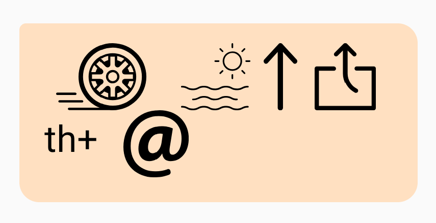
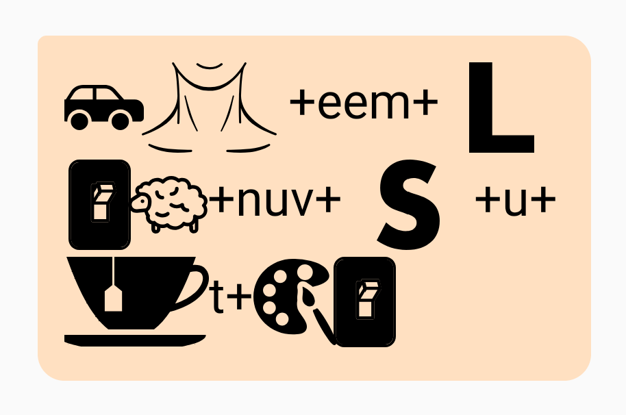
“Carnegie Mellon University Tartan” = Car+Neck+ee / / m+L+on / / Ewe+nuv+S+u+tea / / t+Art+On

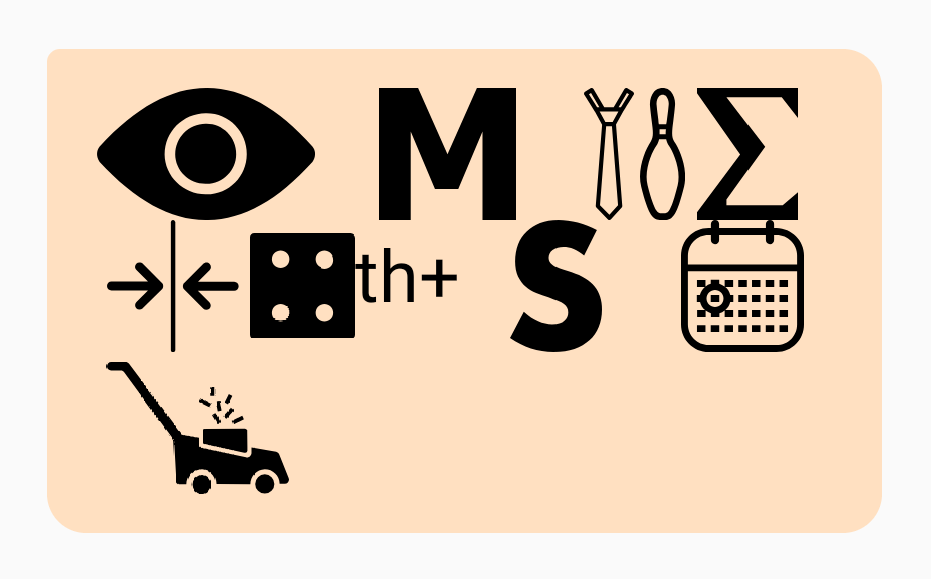
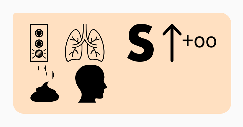
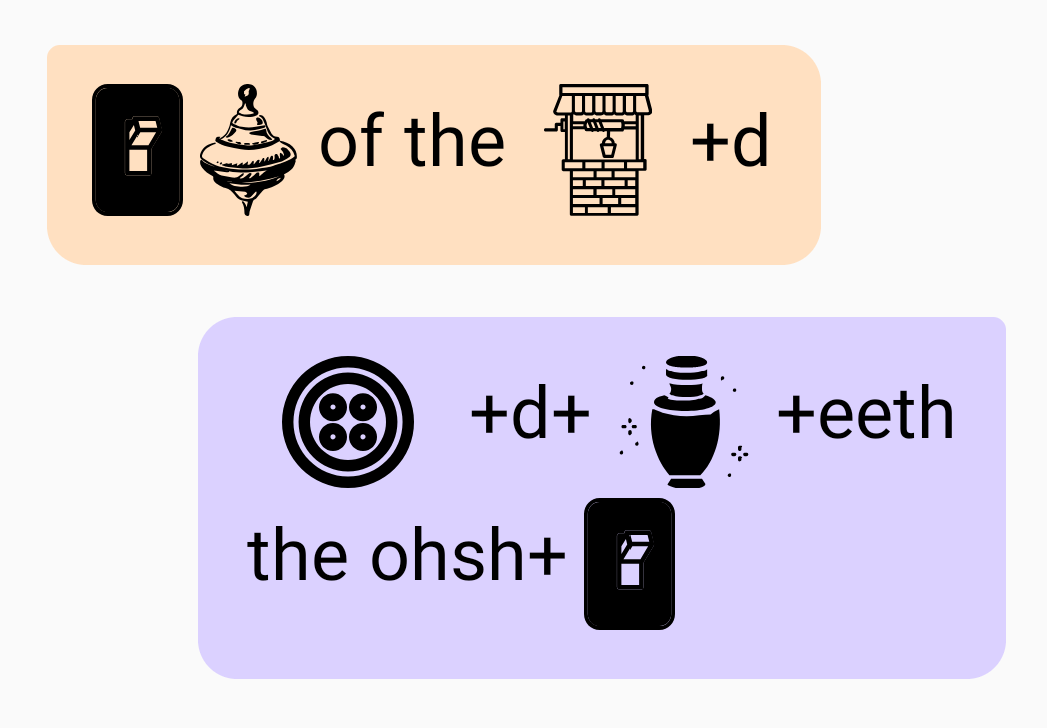
“On top of the world. But underneath the ocean.” = On // Top // of // the // Well+d. Button+d+Urn+eeth // the // ohsh+On

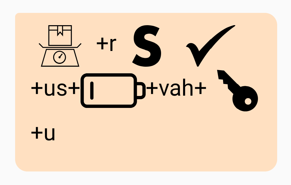
“Where is Czechoslovakia?” = Weigh+r / / S / / Check+us+Low+vah+Key+u

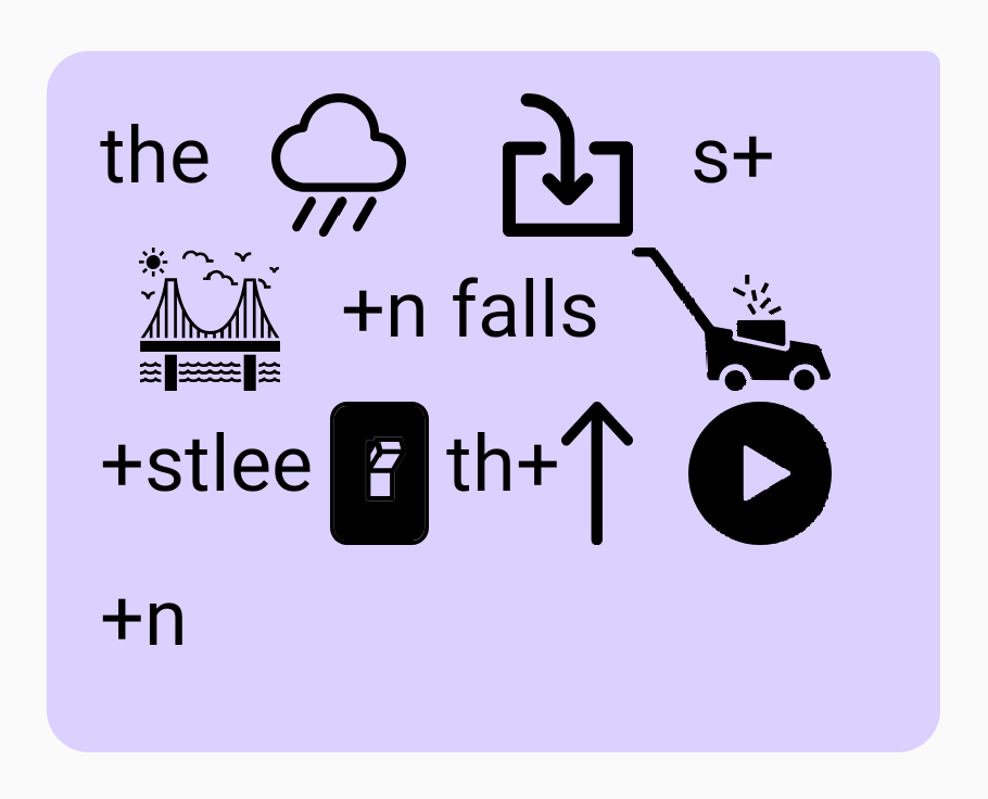
“The rain in Spain falls mostly on the plain.” = The // Rain // In // s+Bay+n // falls // Mow+stlee // On // th+Up // Play+n
(I like this one as an example of a letter sound being duplicated effectively: “the plain” into “th+up” and “play+n”)

“I am typing something for this demo” = Eye // M // Tie+Pin // Sum+Thin // Four // th+S // Day+Mow

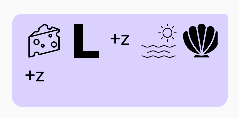
“She sells sea shells” = Cheese // L+z // Sea // Shell+z

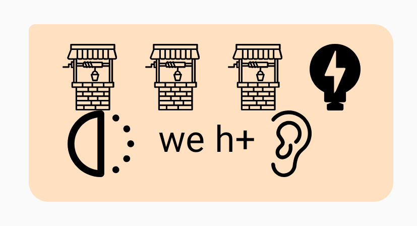
“Well well well, what have we here?” = Well // Well // Well // Watt // Half // we // h+Ear

“We’ll see about that” = Wheel // Sea // Up // Out // th+At

“What do you want to watch tonight?” = Watt // Dew // Ewe // Wand // Two // Watch // tu+Knight

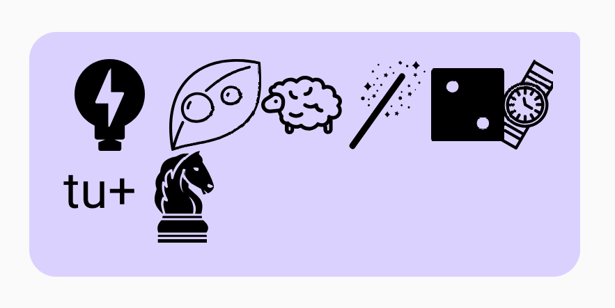
“Golan is a poo-poo head” = Go+Lung // S // Up+oo // Poo // Head
(I like this one as an example of two words merging: “a poo” into “Up+oo.” I was also pleased to find out that the pronunciation dictionary knows many first names)

Moving Forward

I would like to complete this app and release it on the app store, but the authentication parts of it are proving more painful than I thought. It may happen, but something I want to do first is make Rebus Chat into an extension for Messenger and/or email, so that I can share the joy of Rebus with everyone without having to worry about all of the architecture that comes with an actual app. This way, I can focus on polishing up the Rebus-ification tool, which in my opinion is the most interesting part of this project anyway. Whether I ultimately release the app or not, I’m really glad to have learned Android app development through Rebus Chat.

jaqaur – Project 4 Feedback

The feedback I received on Rebus Chat is very interesting, especially because I will be continuing to work on this project for the final exhibition. A few themes I heard a lot were:

  1. It turns communication into a game – This is something I am glad people said, because it was part of my goal. Rebus Chat is not for making communication of big ideas any easier, but for giving people access to fun puzzles to solve as part of their regular communication. There were mixed opinions about just how much of an explicit “game” this app should be, and I personally don’t think I want to go full-out with points, stats or other game-y elements like that. But I do want to encourage people to craft interesting puzzles!
  2. It is related to emojis and/or hieroglyphics – Both of these things were mentioned by people in McLuhan’s Tetrad. I find the connection to emojis particularly interesting, because in some ways they are very alike (both are images sent as messages), but they also are fundamentally different; emojis generally represent the thing they depict (be that happiness, money, pizza, etc) whereas rebus images represent the sound of the thing they depict. That’s part of why I am intentionally avoiding using emojis as the images in this project–I don’t want people to start using them literally.Hieroglyphics, on the other hand, are more closely related. There are many kinds of hieroglyphics, but often each pictogram does relate to a particular syllable or sound, and sometimes the images even come from depictions of one-syllable words. I guess Rebus Chat is kind of like a modernization of hieroglyphics, putting them into a messaging application.

jaqaur – Final Proposal

For my final project, I intend to complete my Rebus Chat app that I began for the telematic project (http://golancourses.net/2019/jaqaur/04/10/jaqaur-telematic/). It will be basically the same as I described in that post, but I have changed part of the Rebus-ification pipeline and also solidified my plans for implementing the rest of the app.

The new Rebus-ification pipeline will not use Rita or The Noun Project‘s API (though I will still use icons from The Noun Project). I will use The CMU Pronouncing Dictionary to get IPA pronunciation for everything users type. I will also manually create a dictionary of 1000-2000 images, along with their pronunciation (these will be short words whose pronunciation is quite common). Then, I will try to match substrings of the users’s typed syllables with syllables I have in my dictionary. I will insert the images in place of the corresponding words.

In terms of other implementation details, I am using Android Studio along with Firebase to help with authentication and data storage (which I highly recommend). I have big dreams for this project; I hope I can finish it all in time!

jaqaur – Telematic

Android App development proved harder than I thought, and I didn’t want to phone it in, so this is very unfinished. Still, since I really like my idea and plan to continue working on it, I’ll share what I have so far.

My project is a messaging app called Rebus Chat that automatically converts typed messages to Rebus puzzles like the one below, and sends them that way.

“To be or not to be…”

Even the usernames and the buttons like “back” will be images rather than text. All the images will come from The Noun Project. A mock-up of the design I was thinking is below (can you guess all the messages?)

Rebus Chat Mock-Up

I really like this idea, because it reminds me of the puzzlehunts I love to participate in, and requires a little tricky but fun thinking to decipher each message. To convert text to Rebus, here is the pipeline I had in mind (mostly unimplemented):

  • Strip out punctuation/capitalization/etc.
  • Try to correct spelling errors (I am looking for an existing tool to help me do this; if I can’t find one then any “words” that don’t parse as words jump to the last bullet)
  • Split everything into syllables (this will be done using Rita). We only care about pronunciation here, so “Where are you” could just as well be “Wear arr ewe”.
  • For each syllable, if one interpretation of it is as a (non-abstract) noun, look it up in The Noun Project and use that picture (if multiple noun interpretations, use the most common one–there are tools for ranking words based on popularity)
  • If a syllable still doesn’t have a picture, try combining it with neighboring syllables to see if it makes a two-syllable noun (if so, use that image).
  • If that doesn’t work, try near rhymes.
  • If there still isn’t anything, then I’m not sure what to do. Some words/phrases just aren’t 100% Rebus-able (eg. “Relevant Job Experience”–what should that even look like?). I have thought of a few options:
      • Option 1: Use “word math,” like R + (elephant) for “relevant” or (smile) – S for “mile.” This seems pretty hard to do programmatically, at least robustly, and there will still be words that don’t work. Like “the.”
      • Option 2: Just put those parts in as text, like “(eye) (half) the relevant job experience”. It will be as Rebus-ified as possible, and still a bit of a puzzle to decipher, but not purely images, which is too bad since I like the all-images look.
      • Option 3: Just remove those parts, keeping only what can be Rebus-ified. This might turn “I have the relevant job experience” to “(eye) (half)” and then… nothing. That’s no good, because it loses important content. However, maybe in the case of just small words (a/the/and) it’s okay. This could perhaps be fused with Option 2, then?
      • Option 4: Prompt the user before the message gets sent, marking that word as un-rebus-able and encouraging them to try something else. This is a little clunky and less smooth from a UI perspective, but might result in the best Rebuses.

I am leaning towards Option 2, but would be interested in hearing your opinions on this. I really do want to make this a reality, because I think it could be super fun and it really is time I learn Android App development.

jaqaur – telematic (check-in)

My project, working titled re:us is a chat app which automatically converts every message sent to a rebus (a series of images clueing the message, like the one below). I’ll do this using some part-of-speech/pronunciation parsing from Rita.js, and images from The Noun Project.

To be or not to be…

Though I think this idea is really fun, and I have ideas for how to do the message-to-rebus transformation, I am having a lot of trouble getting the basic software for a chat app working. I have never really used servers or databases like this before, and feel a bit overwhelmed. I haven’t been able to put the necessary time into the app so far, and might have to use a pass on this assignment, but I hope not! I’d love to see this completed.

LookingOutwards03

I’m not sure yet what my project will be about, so I have found projects related to two different directions I am considering.

1. Real World Third Person Perspective VR

This is not an art project as much as a technical experiment, but it’s similar to something I am considering involving streaming a camera feed to a VR headset. Here, the user wears a backpack with a stereoscopic camera mounted a few feet above them. They wear a VR headset that displays what the camera sees, and controls the camera with servos based on the headset’s position.

This gives them a videogame-like 3rd person perspective of themselves and the world. I find this idea very interesting, because I often see myself in videos and in my memories as different than I do in the moment, and because people behave differently when they can see themselves (like in mirrors) than when they can’t. I’d be curious as to how people feel about wearing this, and how it affects their interactions with people (besides the obvious effects of wearing a backpack and VR headset around…).

I’m not sure these people were interested in those questions (and from this video, I’m not sure they even got their idea fully working), but I love the concept and it’s a really cool technical experiment too.

2. King’s Cross Phone-In

For my second project, I wanted to go really old-school, or at least more analog than a lot of the web-based telematic artworks we’ve been looking at. “King’s Cross Phone-In” is a performance art piece (kind of a flash mob) orchestrated by Heath Bunting in 1994. He posted the numbers to the public phones in King’s Cross Station on his website with the following message:

At the specified time, the station was flooded with calls, causing an orchestra of phones ringing. Bunting spoke with several people on the phone, as did many people in the station. Others didn’t know how to react. People were interacting with strangers from different sides of the world, and (maybe I’m imagining the whole thing rather romantically) it must have been a really beautiful experience, demonstrating the power technology has to connect people before smart phones with wifi took over the world. Bunting did a lot of early internet art projects that I really like, but I especially appreciate this one’s use of a different technology–landline phones–to bring the artwork out of the net and into real life.

jaqaur – DrawingSoftware

ASTRAEA

A Constellation Drawing Tool for VR

Astraea is a virtual reality app for Daydream in which the user can draw lines to connect stars, designing their own constellations. It was named after the figure in Greek mythology Astraea, who is daughter of Astraeus and Eos (gods of dusk and dawn, respectively). Her name means “starry night” and she is depicted in the constellation Virgo.

The app puts the user in the position of stargazer, in the middle of a wide open clearing on a clear night. They draw using a green stargazing laser, and can also use the controller to rotate the stars to their desired position. All stars’s magnitude and position came from the HYG database, and hovering over a star displays its name (if the database has it).

Since constellations– and the stars in general–are so connected to myths, legends, and stories, I imagine Astraea as an invitation for people to tell their own stories. By drawing their characters and symbols in the sky, users give them a place of importance, and can identify them in the real sky later. At the very least, it’s a fun, relaxing experience.

Design Process

About half of the work time for this project was spent just coming up with the idea. I was originally going to make something using GPS and tracking multiple people, but later decided that the networking involved would be too difficult. Then I thought about ways to constrain what the user was able to draw, but in a fun way. My sisters and I like to play a game where one of us draws a pseudorandom bunch of 5-10 dots, and another has to connect them and add details to make a decent picture (though I’m sure we didn’t invent this, I don’t know where it came from. It reminds me a bit of “Retsch’s Outlines” that Jonah Warren mentioned in “The Act of Drawing in Games”).

Shortly after that, I landed on constellations. I thought about how (at least in my experience), many constellations barely resemble the thing they were supposed to be. Even with the lines in place, Ursa Major looks more like a horse than a bear to me… This made me think that constellation creation and interpretation could be a fun game, kind of like telephone. I made the following concept art for our first check-in, depicting a three-step process where someone would place stars, someone else would connect them, and a third person would interpret the final picture. This put the first person in the position of a Greek god, placing stars in the sky to symbolize something, and the other people in the position of the ancient Greeks themselves, interpreting (and hopefully comedically misinterpreting) their god’s message.

Though this was a kind of fun concept, it was definitely missing something, and my discussion group helped clarify the idea a great deal. They suggested using the positions of real stars, and putting it in VR. After that, I designed and built Astraea–not as a game but a peaceful drawing experience.

Design Decisions

I don’t have time to discuss every decision I made for this project, but I can talk about a few interesting ones.

Why Daydream?

Google Daydream is a Mobile VR for Android devices, and as such, it is significantly more limited than higher-end hardware like the Oculus Rift or HTC Vive. It has only 3 degrees of freedom, which wasn’t a big problem for the stargazing setting, but its less precise controller makes selecting small stars trickier than would be ideal. The biggest problem that came with using mobile VR is the lower resolution and the chromatic aberration that appears around the edges of one’s vision. This is especially noticeable in Astraea, as the little stars turn into little rainbow balls if you look off to the side.

All of that said, it was still important to me that Astraea was a mobile application rather than a full room-scale VR game. Platforms like Vive and Oculus are not as accessible to people as mobile VR, and I definitely don’t envision this as an installation piece somewhere. Even for people with high-tech headsets in their home, the big controller/HMD/tracker setups for them feel too intense for Astraea. No one uses a Vive while lying in bed, and I want Astraea to be cosy, easy to put on for some stargazing before you go to sleep. So mobile VR worked really well for that. Daydream just happened to be the type of mobile VR that I have, so that’s why I picked it. I’ve been meaning to learn Daydream development, and I finally did it for this project, so that’s a bonus!

Why do the stars look that way?

Way too much time went into designing the stars for Astraea. They went through many iterations, and I actually went outside for some stargazing “research.” I determined that stars (at least the three visible in Pittsburgh) look like small bright points of light, with a softer, bigger, halo of light around them depending on their brightness. Their “twinkle” looks like their halo growing, shrinking, and distorting, but their center point is fairly constant. That’s basically what I implemented. Small spheres for the stars themselves, with sprites that look like glowing circles around them. The glowing circles change their size randomly, and the stars are sized based on how bright they are from Earth. I did not include all 200,000+ stars in the dataset; instead I filtered out the ones with Magnitude higher than 6 (ie. the very dim ones) so the user wouldn’t have to deal with tiny stars getting in the way. This left me with about 8,000 stars, which works pretty well.

Why does everything else look that way?

The ground is there just to block out the stars below you. The treeline is to give it a hint of realism. But really, they are both supposed to be very simple. I want your attention directed upwards. The laser is green because that’s the actual color laser that stargazers use. My friend told me this when I was lamenting how I didn’t know what to make the laser look like. It turns out that green and blue are the only colors that are powerful enough for this sort of thing, and green is used in practice like 90% of the time. I thought that was a neat fact, so I included it in the game. I chose to have no moon because it would block stars, get in the way, and be distracting. So you can pretend it’s a new moon. However, I might put a moon back in later (or a moon on/off option), in case some people want to incorporate it into their drawings.

“Man Losing Umbrella”

Other Thoughts

I am very proud of Astraea. I genuinely enjoy using it, and I learned a lot about mobile VR development in the creation of it. There are a few more features I want to add and touch-ups I want to make, but I intend to make this app publicly available in the future, and hopefully multi-user so people can draw for each other in real time as they share their stories.

jaqaur – Mask

Chime Mask

I wasn’t super inspired for this project, but I had a few concepts I wanted to try to work in:

  • Masquerade-style masks, especially asymmetrical ones like this: 
  • Lots of shiny pieces (I really liked the glittery look of tli’s 2D Physics project, and wanted to make something that kind of looked like that)
  • Interaction, besides just the mask sticking to your face. I wanted moving parts, or something that you could do with the mask on besides just looking at yourself.

I drew up a few ideas (a little below), but what I ended up with was this: something metallic that would sparkle and could be played like an instrument.

My initial design for Windchime Mask, based on the FaceOSC raw points. Points I added are colored black, but points I moved, like the eyes and eyebrows, are not shown.

My idea was that by opening your mouth (or maybe nodding or some other gesture), you could play a note on a chime above their head. By rotating your head, you could change which note was selected. In this way, I would make a face instrument, and perform a short song on it. The fact that the chimes on top were different lengths was both accurate to how they are in real life, and reminiscent of the asymmetrical masks I love so much.

My early idea sketches:

I started by making the part around the eyes, which I did by receiving the raw FaceOSC data. To get the proper masquerade look, I needed to use different points than FaceOSC was tracking. So I made my own list of points. Some, like those on the cheeks, are the average of two other points (sometimes midpoint, sometimes 2/3 or something: I played with it). Others, like the eyes and eyebrows, are just exaggerations of the existing shapes. For example, masquerade masks generally have wider eye-holes than one’s actual eye size, so I pushed all of the eye points out from the center of their respective eye (twice as much). I did the same for the eyebrows. This results in a shape that more accurately resembles a real mask and also is more expressive when the user moves their eyes/eyebrows.

An early stage of Windchime Mask

I made the mask shape out of a bunch of triangles that shift their color based on the rotation of the user’s head. I started them with different colors so that the light and dark parts would be spread apart. I was hoping that it would look like it was made out of angled metal bits, and I think that comes across in the final product. The pieces make it look somewhat 3D even though they are all in 2D, and I’m happy about that.

When it came time to do the interactions, I found the one I had initially described somewhat challenging, because it involved extrapolating points so far above the head, and they would have to move in a realistic way whenever the head did. I also had another idea that I began to like more: dangling chimes. I thought that if I dangled metal bits below the eye-mask, they could operate like a partial veil, obscuring the mouth. They also could clang together like real wind chimes.

I used Box2D for the dangling chimes, and much like with my Puppet Bot, the physics settings had to be played with quite a bit. If I made the chimes too heavy, the string would get stretched or broken, but if I made the chimes too light, they didn’t move realistically. I ended up going with light-medium chimes, heavy strings connecting them to the mask, and very strong gravity. It isn’t perfect, and I feel like there is probably a better way to do what I’m doing, but I tried several things and couldn’t find the best one.

In any case, the interaction is still fun and satisfying, and I actually really like the metallic aesthetic I have here. I did put thought into what kind of performance I wanted to do (it would have been easier if I had made a mask you could play like an instrument), but I couldn’t think of anything too interesting. So, here I am, showing off my mask in a performative way (sound on to get the full chime effect):

Overall, I am pretty satisfied with Windchime Mask. It’s not one of my favorites. A few things I would ideally change about it are:

  • The sound of the chimes isn’t quite right. I’d like them to resonate a bit more, but I couldn’t find the right audio file. At least there are some windchimes that sound like this, so I can say I was trying to emulate them?
  • More problematically, the sound of the windchimes seriously degrades after about 45 seconds with the mask. It gets all garbled, buzzy, and demonic. I have no idea why this is. I tried searching for the problem and debugging it myself, to no avail.
  • The physics of the chimes has the same problem my PuppetBot did; it’s all a little too light and bouncy. Maybe that’s the nature of Box2D? But more likely, I’m missing something I need to change besides just the density/gravity parameters.

All of that said, I have fun playing with this mask. I like the look of it, and I especially like the idea of this mask in real life (though it probably would not turn out so well with the chimes slapping against my face). I’ll call this a success!

jaqaur – Looking Outwards 2

When looking into participatory works of art, one that really stood out to me was “Polyphonic Playground” by Studio PSK.

This piece is a “playground” for adults–complete with swings, slides, and bars to climb on. It’s covered in conductive thread, paint, and tape that generates sound when people touch it. By playing on the piece, a unique “song” of sorts is produced, comprised partially of sounds recorded by beatboxer Reeps One.

The artists behind this piece say that the idea of play was central to the design of the playground. They said that they hoped a playful approach would allow them to better connect with the audience.

One thing I really appreciate about Polyphonic Playground is the intentionality with with the sounds were designed. It feels like an actual instrument, rather than a random collection of noise. This is demonstrated by the fact that it can actually be “performed”on (shown in the video below). It works as well for a trained musician as for a casual participant–a satisfying, fun experience.

Related links:

https://www.bareconductive.com/news/qa-polyphonic-playground-by-studio-psk/

https://www.studiopsk.com/polyphonicplayground.html


jaqaur- 2D Physics

This is PuppetBot. He’s a 2D marionette controlled by LeapMotion.

I had this idea when I was brainstorming ways to make interactions with the physics engine more engaging than just clicking. Puppets like this are familiar to people, so I thought it would be nice and intuitive. The  physics engine I used is Box2D, and the code is all pretty simple; I have a set of limbs that are attached to each other by joints. I also have some ropes (really just lots of little rectangles) connecting those limbs to points whose coordinates are determined based on the coordinates of your actual fingertips. [I will put my code on GitHub soon, but I need to go back through it and make sure everyone is credited appropriately first]

A lot of the decisions I made for this project were in the interest of making the puppet easier to use. For example, I lengthened the segments in the ropes so that movements didn’t take as long to “wave” down the rope before they affected the puppet. This is also why I made the ropes fairly short, instead of having them permanently reside above the top of the window, as I had originally planned. I made the body parts as heavy as I could so they wouldn’t bounce all over the place, but if I made them too heavy they strained and broke the ropes. I played around with friction/density/restitution settings a lot to try and find the perfect ones, but to no avail. I did a few other things just for personal aesthetic reasons, like making it so that the knees never bend backwards (this happened a lot before and I didn’t think it looked good). I went with the robot design because I thought it would fit best with the jerky/unbalanced movement I was bound to get. I think it look like he’s short-circuiting whenever the physics gets broken:

Ultimately, PuppetBot is not as easy to control as I would have liked, but he’s still pretty fun to  play with. And all things considered, I’m not much better with real marionettes, either…