Recaptcha(intro here) is founded by CMU Professor Luis Von Ahn.
It touches me so profoundly because this project turns those time which used be wasted into something valuable in large scalability. Prof Von Ahn mentioned “human computing” in his paper. Recaptcha solve the problem how to digitize real-world publishment which used to be not precise and expensive. It benefits society a lot to make knowledge more available all over the world.
The Johnny Cash Project is a global collective art project for memorial of Johnny Cash.
They separate Johnny’s final studio recording Ain’t No Grave into each piece of frame. After that, they crowdsourcing these frames to public allowing people all over the world to recreate each frame with their own way.
I can’t say more words to describe how genius they are. Here’s their determination.
The Johnny Cash Project is a visual testament to how the Man in Black lives on – not just through his vast musical legacy, but in the hearts and minds of all of us around the world he has touched with his talent, his passion, and his indomitable spirit.
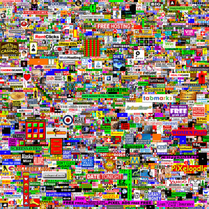
The million dollar homepage project (intro here) is an interesting project. Within a 1000 * 1000 pixels page, it was sold for $1 for each pixel on 10 * 10 blocks. Finally, the website was sold over 1 million dollars.
This is a very cool project because of its novelty. It is nothing but pure commercials, and convergence of ads itself becomes a public art. It symbols the Internet era in which each pixel can be a product. However, it was never a great project also because of its novelty. It lacks something touching, but I still think it has potential to be a great project.
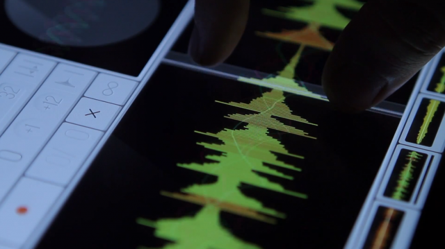
I think this is a very well-done project. It has invented a new way of controlling to adapt to a new control interface – touching screen. The controls are very intuitive and of high usability while I wish the colors were prettier….
Samplr – by Marcos Alonso
{Suprised}:
This piece is so elegant, yet the technology behind it is so simple. I like the the way the user used the magnets and created such a poetic piece. Watching the slow movement of the metal cube, I feel like time stops..
moving objects | nº 502 – 519 by: Pe Lang
Gearmotor, magnets
Size: 660 x 540 mm
Year: 2011, Galerie Mario Mazzoli – PreviewBerlin
I’ll begin with the work I was impressed by: OutRun, made in 2011 by Garnet Hertz.
Hertz essentially took an old OutRun arcade cabinet and modified it so that it became a small electric vehicle in its own right. Custom computer vision software analyzes the road lying in front of the vehicle (as recorded by front-mounted cameras) and constructs an analogous image of it using the game’s sprite set. The virtual road is displayed on the “windshield” in real time.
Mainstream video game designers strive for realism, but this effort seems to end up concentrated specifically on games’ graphics. Hertz de-simulates OutRun’s essential gameplay component – the driving, bringing the game onto the mean streets of the real world. Simultaneously, he subverts the effect by forcing the driver’s focus to a relatively small amount of visual data. The “gameified” model of the world is the driver’s sole navigational tool. With our own GPS systems, how different is our own experience driving?
It’s nice to see a project that has a sense of humor (16-bit go-karting!) that, as an experiment in augmented reality, can provide useful data for other future research in the field.
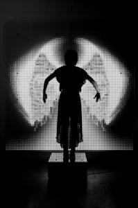
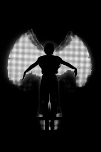
Now, the work I was surprised by: Ice Angel, by Dominic Harris and Cinimod Studio.
This work is just as much a performance as it is an installation, with one viewer at a time taking the role of actor. As a participant stands on a mirrored pedestal and moves his or her arms, an array of 6,500 LEDs behind the pedestal generates a pair of wings which match the movements in an impressively natural manner. The camera used to capture user movement data is placed diagonally above the performer, making coding the installation more complex, but ensuring no jarring disruption of the scene by the recording device.
Though I would contend that the conceptual underpinning of the work is somewhat weak, I was surprised by two aspects of the installation. For one thing, its requirement of audience participation that is performative rather than cooperative is something I don’t see enough of. Perhaps more importantly, the installation records performers’ biometric data, thereby “remembering” the wings unique to them should they mount the pedestal again. Where many generative New Media artworks focus on the ephemeral experience, this work has a sense of permanence.
Finally, a work I feel could use improvement: The Pyramid series, by Dev Harlan.
Harlan projection maps intricate and ever-changing patterns onto pyramidal surfaces.The video he projects emphasizes, complicates, and is limited by these simple geometric surfaces. Harlan’s clean aesthetic makes for some colorful, interesting monolithic installations. Despite this, I feel that he isn’t pushing his work to its full potential.
I feel Harlan’s expert manipulation of geometry in two dimensions could translate just as well into three dimensions. Imagine projection mapping on an installation that transforms and undulates. As it stands now, I find Pyramids stales rather quickly.
A new direction in the visual representation of music with 3D printed sculptures.
I like how this piece is something different than the usual data visualizations and that they focused on creating physical 3D visualizations for music data. The sculptures that came out of it have something magical and mysterious in them that captures my attention and curiosity. It is unclear what they exactly used as input for the printing. They are using an algorithm to extract certain parts of the soundwave. The website gives very little detail about its implementation other than using Processing and a Makerbot. I was wondering how the sculptures would look if they would create individual prints of e.g. only low frequencies only, or high frequencies. Perhaps isolating individual instruments. I like the usage of pure black as material. I’m not sure if it would look good if they tried to mix different colors in it.
The artists seem to have a track record in creating similar visualizations, generative art and algorithms in their previous work [link]
A futuristic interactive light sculpture series controlling 96 red/white LED arrays as well as LED-lit acrylic circuit boards respond to the viewer’s movements.
This piece reminds me of a portal or futuristic control handle to open spaceship doors. I really like the interaction of omnidirectional movement, and how this movement is reflected back with changes in color. While the installation might be visually very impressive, it’s not eliciting any other emotions other than the “Wow!”-factor. I wished it could perhaps attach meaning into the representation of the lights or perhaps connect it with something more abstract rather than direct feedback of the visitor’s interaction with the center handle.
Looking at his portfolio and previous work, the artist loves to work and fabricate with metals which gives the artworks a futuristic touch.
Smile and the robotic skeletal arms will wave at you!
I always found it interesting to use robotics to create art. I like how the skeletal arms point and follow your movement through the space, it gives a bit of a spooky feeling. Other than that I didn’t find anything else really interesting. Waving the hands when a smile is detected didn’t really seem that engaging to me. The outcome isn’t really that spectacular or thought provoking. I would have love to see tangible interaction with the hands. Perhaps giving an actual handshake or something similar.
This project is an interactive piece where users create tide pools out of sand in which generated fish and other creatures move and react to outside stimulus. This project struck me as particularly beautiful, though, in its vivid yet simple simulation of life.
Some projects attempt to simulate life by attending to every detail, trying to get as close to the original as possible. Most of these attempts are exercises in futility, though, because the closer a thing gets to life without reaching it the more uncanny it appears. In Oasis II, though, when you look at the screen it is immediately clear that the residents of the tiny tide pools are neither alive nor close enough to appear uncanny–instead, as the documentation states, “creatures look like vivid pencil sketches on a canvas.” This design choice almost makes the creatures seem more real, though, as the creatures instead seem to be drawings leaping from the page, thus creating an environment of suspended disbelief rather than an unsuccessful copy of a live animal. The interaction is simple and intuitive as it mimics the way our natural world works and creates an elegant overall experience that, while clearly based in technology, feels natural and almost grown rather than built.
http://vimeo.com/20967084 The fly blimps are a small cluster of blimps that maneuver themselves around a room based on the input of a swarm of flies contained at the base of each balloon. The movement of each blimp is calculated from data collected from the movement of the flies as they buzz around their habitats.
I was surprised by this piece in that it took its interactive input from an animal other than a human; not only that but the animals themselves were part of the piece. The piece itself does not hold much meaning for me beyond the materials used in its construction–the fact that it incorporates living animals is the thing that interests me. I would have been even more interested to see what would happen if the inputs from the flies had an effect outside of their collection of blimps: what if the flies had unknowing control over something that humans depend on like the lights or a door opening and closing? What other projects could take the instinctual actions of different animals and create a responsive and interactive piece of work? It definitely gave me some food for thought.
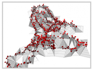
This data visualization is a cool concept–the creator took Galvanic Skin Response readings of his basic emotional state as he wandered around the Greenwich Peninsula in London, England to create this visualization.
While the idea for the project is pretty cool and the concept of having a map of human response is excellent in that it adds an element of personality that simple maps lack, there are some inherent flaws. As the artist states, the data in this particular map is partially flawed because of the way he gathered it. It also might benefit from more specific information–emotional arousal could mean anything from a breathtaking sunset to just missing being hit by a car. Including unobtrusive descriptions of the events in question, connecting the visualization to a map, or comparing two peoples’ shared experiences could be fun possible additions. The artist also talked about constructing such maps for an entire community–I would be interested to see how that possibility could be explored.
Admire Profoundly: Hans Rosling Data Visualizations
I can still remember high school history when they made us memorize a whole bunch of dates just for the sake of it. The dates never meant anything to me then it was just a whole bunch of data. When I saw this talk with Rosling using his Trendalyzer software (http://en.wikipedia.org/wiki/Trendalyzer) a few years ago my mind was blown.
In the talk above, Rosling uses data visualization to convey a tremendous amount of information to us in a digestable way. Its really remarkable. The fact that an animated circle moving across the screen accompanied with Rosling’s commentary can convey a countries evolution from third world to first world is stunning. The books will tell you history – Rosling shows you history. That makes all the difference.
Suprising: MIT Media Lab’s Robotic “Spider”
OK, so its not really a spider. What I found surprising here though was the idea of making something based on surrounding elements. Currently the norm in architecture seems to be creating rigid non-conforming bodies. MIT shows us how using tensile elements like strings to build structures that conform and rely on their surroundings.
I am not an architecture expert, but I think this is really surprising since it opens many doors towards architecture that can adapt based on my needs. A simple example might be using this robot to change the structure and patterns of a skylight based on the location of the sun.
Could have Been Great but Disappointed Me: Pinokio, The Animatronic Lamp that is Aware of its environment
Before watching the video, the notion of a moving lamp reminded me (and many of you I’m sure) of John Lasseter’s Luxo animation for Pixar. I was expecting a lamp with the same depth as Lasseter’s, and unfortunately got something less.
First thing that bothered me was the sound of the servos. When I think of a lamp, I think of smooth graceful movements – similar to the way the light can smoothly be amplified. Instead, the servos were very loud and annoying.
The lamp was a total spaz, and would jump around too much. In a way, I think it would be more human if it were a little more neglecting of the user.
Finally, the nail in the coffin was that this lamp was not a lamp at all. It had no light. Not only
did that make it less of a lamp, it also was a huge waste of an opportunity. Imagine the interaction
that would be possible by dimming or shining the light. Or maybe changing the color (say red when its angry). This bothered me a bunch, and when I scrolled to the comments I was glad it bothered someone else as well.
I was drawn to this dress the instant I saw it; I’m fascinated by spiders, and I’m also interested in biomimicry in design. Spiders have such a compelling and elegant way of moving — even if it does creep some people out — and the idea of being able to infuse our own bodies with some of that haunting grace through robotics is highly attractive. When I read the associated article and the artists (albeit brief) thoughts about “themes of ‘personal space’ […] control and privacy” I became even more intrigued. One of the most powerful aspects of art—regardless of medium—is its ability to deeply attract and repulse an audience on a purely visceral level. This piece takes that concept and physically manifests it, actually luring in people and then pushing them away again.
My biggest regret with this piece is that the video does very little to capture the functionality of the dress. It’s so focused on clichéd editing that one can’t really witness the dress luring or attacking anybody, and so it’s difficult to make a final judgment about how well the dress achieves its artistic vision. All in all, I’d have to say I deeply admire this piece purely based on aesthetics, but am also very disappointed, possibly owing purely to poor documentation.
21 Balançoires (21 Swings)
And so, we move from a piece that focuses on isolation and personal boundaries, to a piece whose primary aim is to bring together all sorts of people in the name of music. Somehow, I wasn’t expecting a whole lot from the idea of ‘musical swings’; I think I’d seen enough repetitions of the ‘musical staircase’ concept to become jaded, and, typically, I’ve found that auditory art installations seem to produce random noise more often than pleasant compositions.
The melodies and harmonies created by these swings–while repetitive–are beautiful and deeply textured. Add to that the activity of swinging. Swinging is a children’s pastime for all ages. Swing-sets have the power to draw in everybody: little kids, elderly couples looking for a place to rest, otherwise apathetic teens who need a place to loiter. People compete to see who can swing higher. People push each other on swings. People interact with swings—and with each other around swings— in a much deeper way than they do with staircases.
It’s also a clean and compelling video. Count me impressed.
Les Belles Infidèles
(http://www.turbulence.org/Works/belles/)
The concept of this last work is one that I have adored for ages: exploring what details, nuances and feelings are lost in the translation of stories from one language to another. Bear with me while I share a few anecdotes. 1) My father, who is German, didn’t take well to the (objectively amazing) rendering of Gollum in the Lord of the Rings trilogy, because when he’d read the books as a child in German, the presence of the article ‘Das’ in front of the name ‘Gollum’ was enough to make him picture an entirely different creature. 2) In high school I accidentally wound up with a British translation of Crime and Punishment while the rest of my English class read from an American translation, and the number of very significant stylistic changes more-or-less blew my mind. Same thing happened when I read ‘The Little Prince’ in French and then again in English.
As the text changes, so does the experience.
This application is deceptively simple, and aesthetically horrid. But the content it contains is amazing. By taking the same story and allowing it to be translated in and out of the same language several times over, you end up with different grammatical structures, narrative structures, and imagery. I admire this application, bare-bones as it is, for making it so easy to see the ‘translational metamorphoses’ in action.
I’ve had the pleasure of seeing/performing through this piece several times. It consists of several hand decorated leads feeding back into a max patch (I think) measuring the overall resistance created as users hold hands/release their grasps. As circuits open and close, the characteristics of the sound evolve and expand.
In the performances i’ve seen, this results in a lot of relative strangers spontaneously grasping each other to create really lovely generative musical compositions. Make a Baby is a prime example of something that’s totally technology driven, but which totally obscures that technology in the interactions it facilitates.
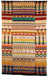
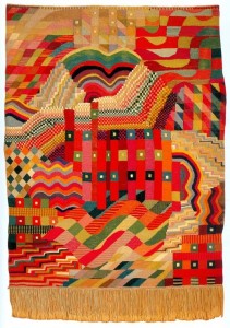
Surprised: Gunta Sotlzl’s Textiles
Stolzl produced textiles in as a master craftsperson in the Dessau Bauhaus. Her textiles were created on Juaquard looms that use punch cards to encode weaving patterns. I saw several of these at a MoMA exhibition a few years back and they surprised me because (a) they’re so obviously obscenely amazing and (b) they were largely made in the 1920s on what are essentially massive proto-computing platforms
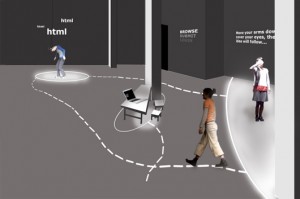
Disappointed: Website Impersonations: The Ten Most Visited #8 – www.facebook.com by Ursula Endlicher
This piece is technically impressive and, on its face, seems like a really cool idea. HTML is pulled live of a page and interpreted by dancers whose movements are subsequently interpreted, and stored into a language of movement, and then re-interpreted (again!) by a second set of dancers. Additionally, sound is generated by mapping the characters of HTML tags into sonic elements (H-E-A-D, is given as an example).
For all its real-timeyness, this performance lacked any sense of urgency or immediacy. More importantly, by using HTML as a the driving tool Endlicher conveys nothing meaningful about Facebook as a system. Sure there are some handy bodily metaphors (head, body, link, span, etc) but HTML is merely an artifact of an end-user experience and is fundamentally not what’s interesting about Facebook as a network (which is what’s interesting about Facebook). Doing an HTML based interpretive dance for any site (cuteoverload.com for example) would look just about the same.