Daily Archives: 29 Jan 2013

Patt

29 Jan 2013

I have always been fascinated by stars in general – their formation, life cycle, position relative to each other, brightness, and much more. Thanks to wikipedia, I learned that “star formation is the process by which dense regions within molecular clouds in interstellar space, commonly referred to as ‘stellar nurseries’, collapse into spheres of plasma to form stars”. This following video is a 3D animation, made by Matthew Bate, models the collapse and fragmentation of a 500 solar mass cloud that produce more than 1250 stars.

http://www.astro.ex.ac.uk/people/mbate/Cluster/cluster3d.html

I was introduced to generative art when I first learned about the company Nervous System (n-e-r-v-o-u-s.com), where they use computer simulation to generate design and to create interesting products. They use a lot of biology-based simulations, and the one I find most interesting is their computer simulation inspired by the cell cycle. I think it is very cool to see familiar patterns that you might see in everyday life being used to produce something aesthetic. I want to create something based on common patterns, that might be overlooked, to make tangible products that look beautiful.

I still remember my first flight to Pittsburgh, and the moment I looked out the window to see the city: the formation of streets, houses, cars, and the green area. I must really have been drawn to what I saw because I can still remember it until now. I love seeing the city from that angle, where you see how the city is planned – seeing the big picture of an urban life. I think it should be interesting to use city plans, from different cities and countries, to generate art. Grid planning is one city planning methods that I want to look into.

city plan

(Source: http://www.noupe.com/inspiration/generative-digital-art-tutorials-and-inspiration.html)

Marlena

29 Jan 2013

There are some pretty cool projects out there that use procedural generation to “evolve” a simulation over time. An especially interesting area of both research and artistic expression is the use of procedural generation to simulate natural phenomenon like life and nature. A cool early example is a project developed by Karl Sims in 1994 that uses Darwinian evolutionary algorithms to develop blocky creatures. These creatures are developed randomly over time to achieve a set goal such as swimming quickly, fighting over a cube, and other tasks. The good designs are kept and improved until the a creature is developed that can best accomplish the task.

Since then there have been other cool projects that use procedural generation, especially in games. A great example of this is Minecraft–while the game is incredibly blocky and closer to Legos than landscapes, the algorithms used by Notch to create them make convincing and exciting areas to explore ranging from thick jungles to frozen tundra. Below is a link posted by Notch discussing his terrain generation techniques:

http://notch.tumblr.com/post/3746989361/terrain-generation-part-1

He discusses some of the technical issues involved with generating an infinite terrain for the player–in particular having to center the world around the player and making new world for them to explore as they get farther and farther from their spawn point. He doesn’t tell us the actual algorithm unfortunately, but it definitely shows the technical limits of certain kinds of generation.

Here are some additional links to projects that I either found or heard about through other sources.

http://www.field.io/project/communion
http://freshsim.org/discussion/11/established-alife-projects/p1
http://www.spore.com/ftl
http://vterrain.org/Elevation/Artificial/

Anna

29 Jan 2013

While trying to decide whether I want my next project to focus more on InfoVis or GenArt I definitely find myself stuck somewhere in between. What I do know is that I’m fascinated with 3D forms and physical artifacts generated through code, and, in particular, would love to explore means of being able to create unique objects through making sounds (singing, talking, screaming, etc), which reflect the nature of the sound. Below are a few nifty things I stumbled upon while exploring that space.

…But Narcissus & Nemesis

http://www.new-territories.com/blog/ncertainties/col12/scenariopair/luisandriana/

Let me be totally frank: At first, I had no idea what this was, and I clicked on it mainly because I was sick of looking at post-modern architecture and saw a link with alliteration and mythology in the title. In retrospect, I still am not sure I know what this is. Things I do know: 1) there are a lot of calculations going on here, 2) there is a lot of poetry and metaphysics going on here, 3) the presentation style leaves it incredibly ambiguous as to what falls under category (1) vs. (2). 4) Design fiction or fact, I’m a little bit obsessed with it. Maybe a lot.

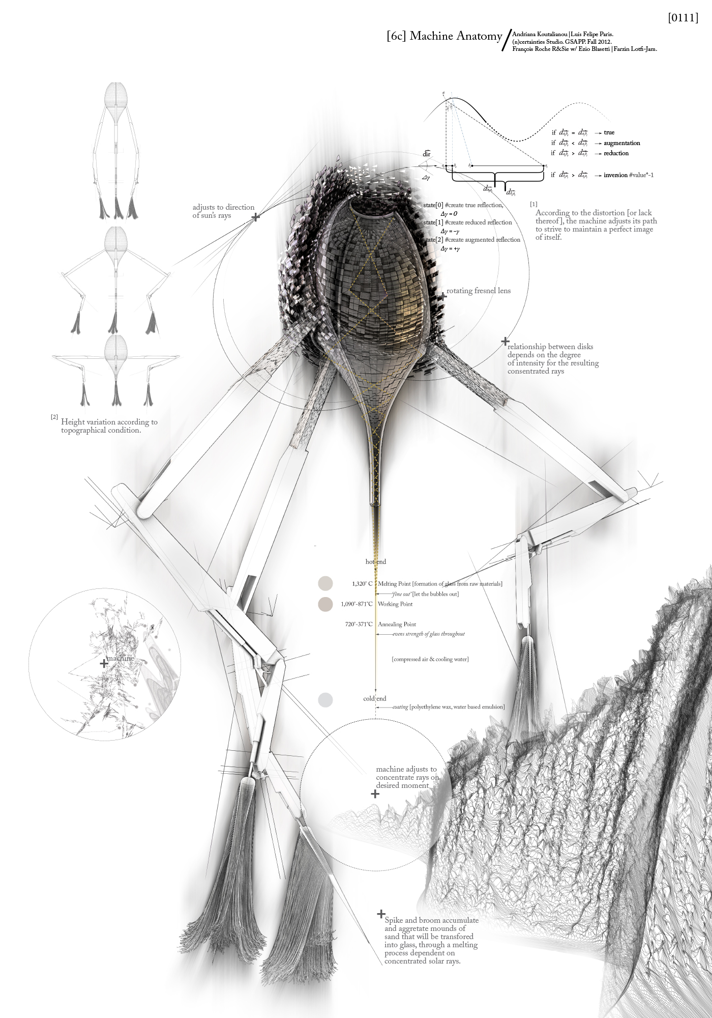
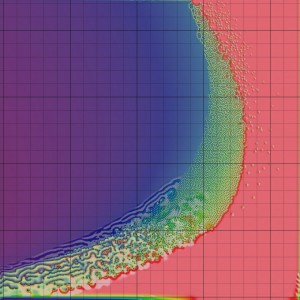
I think the most interesting idea contained in this piece is that coded generative behavior can stem from something higher and more abstract than math models, biological transport systems, cellular behavior, plant growth, or basic instincts like hunger or fear. Here, the ‘machine’ is driven by the weighty and cerebral desire to ‘maintain a perfect image of itself” as it continually moves and melts sand into glass. As the environment shifts and the glass causes distortions, the machine must move, but in doing so, creates more distortions in its environment…. it all just screams kafka novel to me.

So much of this system is entirely narrative. You could, I suppose, invent any number of stories to superimpose upon the graphs generated by the code, but the fact that the code seems to have been written in order to bring this story to life, and to address such an interesting concept of self-image and paranoia, anxiety, identity, makes this piece stand out among other examples I’ve seen. It’s also fair to say that I may have interpreted the thing entirely wrong, and it doesn’t really matter to me, because I’m still moved.
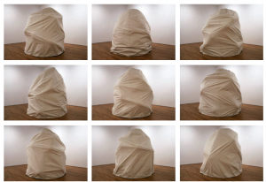
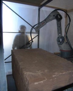
ShapeShift
http://www.caad-eap.blogspot.com/p/exhibition_15.html

I was a MatSci geek in undergrad, and did a lot of experiments trying to create piezoelectric ceramic thin films. I liked the idea that a material that looked rigid and immoveable could take on a completely different character in the presence of electricity. From what I can tell, there’s no real code in this demo, but I appreciate the potential for interacting with this material using code. Consider, for instance, talking into a microphone, and watching the material cringe away from the words you say because of the way you said them. In a way, that’s both visualizing information, and generative art, but both are embedded within the polymer itself!
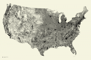
Digimorph
http://digimorph.org/

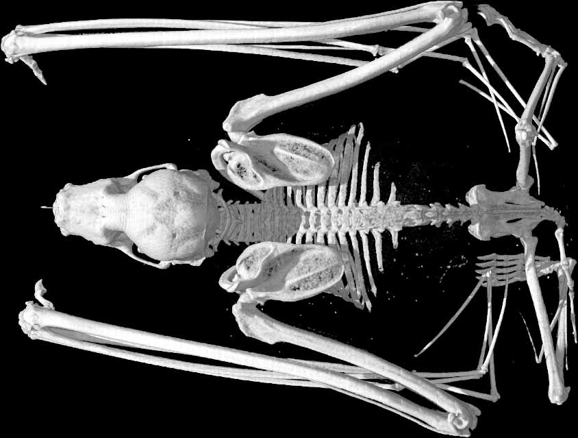
Um, no, this isn’t some odd genetic hybrid of Digimon and the Animorphs—but it does have something to do with genetics and weird animals. As the website explains (if you can suffer through its rather ugly design), this is a database of hi-res, x-ray computed tomography of a whole slew of animals, living and extinct. I’m including it both because they have a fairly interesting description of what goes into generating these scans, and how the computer constructs X-Ray tomographs from fragments and slices of images, and because it could possibly serve as an incredible database to mine for an infoVis project (there has to be a better way to display all these amazing images than that website! yikes…)

Joshua

29 Jan 2013

Coral Morphogenesis

I am really obsessed with corals, so this paper, and in general the research revolving around simulating coral morphogenesis (how corals grow) is my main focus for this class.  Corals are colonies of tiny polyps (like miniature sea-anemones).  Many corals have a photosynthesizing algae called Zooxanthellae living in their tissue.  Thus some corals “feed” in two ways: through photosynthesis and ingesting small organic matter.  Colonies of a signal species can form various morphologies depending on environmental conditions like light, flow, and nutrient availability.  Not only do corals exhibit this ‘morphological plasticity,’ it appears that the various forms they produce are adaptive.  This is pretty fascinating since there is no centralized organization: the polyps are all extraordinarily simple, yet there collective behavior is rather complex.  In this way they are similar to ant colonies and a multitude of other biological systems.

In order to understand these phenomena, a bunch of computational biologists have been modeling coral growth in massive computer simulations.  The video is the output of one of those simulations.  These guys are the main coral/sponge folks:

http://staff.science.uva.nl/~jaapk/

http://homepages.cwi.nl/~merks/Homepage/Home.html

The simulations are pretty complex (involving lattice simulation of diffusion and mesh manipulation) but the basic idea is simple: each node of the mesh represents a polyp, each edge a connection between polyps, and the polyps grow normal to their neighbors at a rate proportional to the food concentration in a small neighborhood. Edges that are to small fuse, edges that are too large grow new polyps.

I want to copy this stuff, and then tweak it. It would be interesting to take these models and fiddle with them not to model nature precisely, but to still retain some fundamental abstraction of the natural system, while exaggerating various parameters.  The effect, I hope, would be a form or process that looks vaguely organic or familiar, yet is somehow bizarre and ‘incorrect.’


A Collision Based Model of Spiral Phyllotaxis


spiralPhyllotaxis_img


There are numerous theories about why plants form such regular (and beautiful) spirals around their longer axis.  This paper presents a model/system for understainding these spiral patters.  The basic idea is that as new organs develop, whether they be seeds or stems, they collide with their predecessors and are forced into spiral patterns.  Oddly enough (or perhaps not oddly at all) the spiral patterns exhibit some mathematical consistency   The number of spirals going in one direction and the number going in the opposite direction are often two consecutive values from the fibonacci sequence.  In addition the angle change between successive units is sometimes the golden angle (the golden angle is formed from the golden ratio, but wrapped onto a circle).  I find this idea, that the dynamic nature of plant development causes these patterns, fascinating in its simplicity and exciting from a modeling perspective.  A computational model could be constructed which relies primarily on the simulation of physical interactions (collisions, deformations, etc.) to generate organic forms and processes.  I imagine a program where each organ or seed is modeled as a little balloon of springs, which can coalesce, grow, and then shrivel (the timing would probably have to be non-physical, or in the “genes” of the system).  Each balloon would exert forces on its neighbors and perhaps be constrained to lie on a surface or retain a distance from a central axis.


A Confidence of Vertices

I couldn’t find any explanation of this project, but I assume it is a spring simulation with some external forces pulling on each cube.  I find it rather humorous and alien.  These large collections of springs look like they have intention and are extraordinarily massive.  Its neat that physical simulations allow for exaggerated behaviors that would be extremely rare in the real world (ideal springs that are extremely soft, or massive or in giant arrays).

Can

29 Jan 2013

World’s most likely the biggest human-centric database

Facebook Dataset

I love this map. Ever since I first saw this map, I am in love with this map. Because it represents, how easily people share information about themselves. It represents a whole new branch of psychology, and even shows political decisions, and intercultural relationships. The fact that Russia, China and Brazil being dark is also amazing. It both looks like a political map, and an internet dominance map. (ex: Russia = VKontakte)

Budget for war

Budget

It hurts me a lot, every time I see an infographic like this. The fact that countries are spending more and more for war, and less for science, space discovery, or education is disgusting me. Coming from a not so peaceful country myself, I can clearly point why most of the countries are doomed to fail. I think this is a simple but effective infographic. It should be carved to stones for future generations to see how humanity failed.

Well crafted

Olympia looks great! The helix-alike titles, and the waveform movements are so gorgeous. The way it lists the countries, and champions are well thought and obsessively crafted. Color palette is great, and gives the whole presentation a beautiful and magical look.

Keqin

29 Jan 2013

The Internet map

The Internet map is a bi-dimensional presentation of links between websites on the Internet. Every site is a circle on the map, and its size is determined by website traffic, the larger the amount of traffic, the bigger the circle. Users’ switching between websites forms links, and the stronger the link, the closer the websites tend to arrange themselves to each other. It encompasses over 350 thousand websites from 196 countries and all domain zones. Information about more than 2 million links between the websites has joined some of them together into topical clusters.

This is very interesting because you can see every website’s traffic directly from the map or them. And the famous  website such as facebook, google and so on. They are really big circle in the map. And there are also many other small website that we may not know them at all.

You need to check out this link to see : http://www.visualizing.org/visualizations/internet-map


His And Hers Colors: Popular Color Names By Gender Preference

http://infosthetics.com/archives/2012/09/his_and_hers_colors_popular_color_names_by_gender_preference.html

His And Hers Colors by artist and scientist Stephen Von Worley is a beautifully rendered – yet HTML5-based – bubble plot of the 2,000 most commonly-used color names. The data was harvested from the huge sample results of XKCD’s color name survey.

Each color preference is sized by relative usage and positioned horizontally by average hue and vertically by gender preference (women at the top and men at the bottom). A dashed line represents the 50-50 split, or the equal usage by both sexes. Near the middle, the huge ovals correspond to the most common colors, such as green, blue, purple, and so on. The color cyan is most ‘male’, while women tend to describe colors according to warm-fuzzy descriptive names.


Comparing the World’s Richest People

http://infosthetics.com/archives/2013/01/comparing_the_worlds_richest_people.html

Bloomberg Billionaires , designed by the Bloomberg Visual Data team, is a daily-updated interactive dashboard of the world’s richest people.

Many filtering and graphing features are relatively hidden behind beautiful buttons, such as a number-only view in the ranking list, and the variable choice of the vertical and horizontal axes in the scatter plot view. Also, a dynamic timeline at the bottom allows one to explore the historical rankings of the last 10 months.

Accordingly, one can perceive how the large majority of billionaires has significantly been gaining wealth during the last year (and daily gains or losses of more than 500 million dollars in not uncommon), while very few have seen any relative losses. For those wanting to marry a billionaire without any direct heirs, the number of children can be plotted as well.

Caroline

29 Jan 2013

Phenomenon: Diffusion Limited Aggregation

This algorithm is one of a variety of reaction diffusion systems that is popular because of its ability to create a biological looking pattern.

xmorphia


Reaction diffusion in general is the mathematical study of how substances move in space as influenced by two parameters, chemical reactions and diffusion. Each cells behavior is defined by these two variables (expressed as J and K in the Processing library Toxiclibs). The image above shows the relationship between these two variables.

Method or Technique: Serial Art

Serial art is the presentation of a collection of pieces that are very similar in appearance and only gain their meaning in relation to one another.

url


Presenting a series of very similar images or objects is an established tradition in art. It was practiced by Sol Le Witt, that composer guys and Joseph Albers. My favorite definition of it is the following:


“characterized by the nonhierarchical juxtaposition of equivalent representations, which only yield their complete meaning on the basis of their mutual relationship”.[1]

To me the practice of serial art making references the scientific practice of conducting a study. It constructs a kind of authority in it’s numbers, just as a study would. It also calls upon the computational process of making new media works. Although the afore mentioned artists all worked in physical somewhat traditional materials, the process of making computational or generative art natural falls into the compulsive iterative process.

Generative artwork: Scumack 2 by Roxy Paine

Roxy Paine made a series of autonomous sculptures that generate objects using mechanical systems inspired by natures.

If I could of written this whole blog post on Roxy Paine I would of.

Roxy Paine (1966) has had three primary series of work: Replicants, exact replications of natural forms, Machines, machines that generate form through data and randomness, and Dendroids, huge stainless steel sculptures of trees. My favorite series and the one most applicable to this project is machines. He has created several mechanical systems that create form without his own physical intervention. I love how these pieces exploit the lusciousness and excess of material.


Screen shot 2013-01-29 at 7.48.58 PM

28f77c6b64216748d0ae225b961c634b-l paine_3

Nathan

29 Jan 2013

allstreets-poster


Fathom by Ben Fry is a great example of piece that isn’t “throw all these numbers into a computer and make it pretty data”. There is a subtle essence in this piece that makes it resonate with me. It creates a sense of “wow, we really messed this natural landscape up” as well as a feeling that humans have created their own sort of unnatural wonder. I think that the print itself is exquisite and the work, unique.


eCLOUD from Dan Goods on Vimeo.

eCLOUD by Dan Goods, Nik Hafermaas, and Aaron Koblin is a visualization of real-time weather from a location distant from San Jose. I think this piece is quite poetic as it tries to artificially create a sense of connection via this installation. I also have a soft spot for installations or sculptures that make parallels between information and aesthetics.

beef_stakes2


Beef Steaks by Sarah Hallacher is hilarious, telling, and a little bit of a pointer to our dependency on meat. I think that these pieces are another, point-proving show that data-vis isn’t about number crunching, but about creating a piece of art that holds the view captive by answering the question ‘why do I care?’. I think that this is such a great piece because it is a simple gesture that speaks louder than the clay and plastic that makes up this piece.

Caroline

29 Jan 2013

Screen shot 2013-01-29 at 4.33.13 PM


In this grand collaboration between Andrew Bueno, Erica Lazrus and Caroline Record we created a prototype for a sifteo alarm clock. In case you have never stumbled upon these new fangled little cubes before, Sifteos are the new kid on the block for tangible computing. Sifteos are not a single device, but rather a collection of cubes that are aware of their orientation to one another. Our idea was to create an alarm clock that would only stop ringing when all the cubes were gathered together in a certain orientation. The user could set the level of difficulty by hiding the cubes about their abode for their future sleepy self to collect in the wee hours of the morning. We used two cubes: one as the hours and one as the minutes. Each could be set by tilting the cubes upward or downward. We have lots of ideas of how we could improve on our initial prototype. For example we would like to use png fonts , include more cube, and represent time more accurately.

code on github: https://github.com/crecord/SifteoAlarmClock 

Erica: Erica was MVP, and bless her soul for it. She certainly
did the most coding and managed to figure out the essentials of how
exactly we could get this alarm to work, and she tirelessly built off Bueno’s timing mechanism to figure out how to represent  time without the Sifteo using too much memory every time it checked how many minutes and seconds were left on the clock.

Caroline: Caroline was our motion-mistress, and implemented our
system for setting the alarm based on the movement of the Sifteo. She also
came up with the original idea, and so deserves a ton of credit in that
respect. Caroline also impeded the process by bothering Erica and Bueno to explain the workings of c++.

Bueno: During our short brainstorming process, Bueno
suggested that, if the alarm were to have different difficulty settings,
that we consider solving anagrams as a possible challenge for the user.
When we actually got down into the coding, it was often Bueno’s job to sift
through the documentation/developer forums in order to figure out answers
to some of our confusion concerning how exactly we should go about coding
the darn things. In the end, Bueno figured out how exactly we could go about
ensuring the Sifteo could keep track of time.

Sifteo Alarm Clock from Caroline Record on Vimeo.

Caroline

29 Jan 2013

Screen shot 2013-01-29 at 3.15.00 PM

I used Kyle Mcdonald’s syphonFaceOSC app to create a processing sketch that fills the viewers mouth with text that dynamically resizes to their mouth. Every time the mouth closes the word changes to the next one in the sequence. This piece resides in an interesting juncture between kinetic type, subtitles and lip reading. Now that I have built this tool I intend to brain storm ideas of how I could use is to make a finished piece or performance. I am interested in juxtaposing spoken with written word. I am also interested in finding out whether this has any applications to assist the deaf.

code on github: https://github.com/crecord/faceOSC