Monthly Archives: January 2013

Sam

30 Jan 2013

OrgOrgChart (Justin Matejka)

OrgOrgChart visualizes the growth and restructing of an organization as a circular tree, charting the movements of employees into, out of, and through the company. I find particularly compelling the elastic motions of the tree as changes are made, which, combined with the cellular appearance of the graphic, really communicates the story of the organization as an organism, rather than the stiff bureaucracy traditionally associated with an organizational hierarchy chart. The project currently only maps data from AutoDesk, where it was developed, but it would be interesting to see an entire industry presented in this way, and watch the flow of personnel and the cycles of many different companies alongside each other. This project reminds me of a project I wrote about earlier, gource, which produces a similar tree-based animation of source control repositories, with a similarly-surprising organic feel.

On the Origin of Species: The Preservation of Favoured Traces (Ben Fry)

benfry_traces

In Traces, Ben Fry presents the evolution of evolution, diagramming the editing made to Darwin’s The Origin of Species as it progressed from the first to sixth addition, over a span of 14 years. The degree of detail in the dataset is what blows me away for this project, considering that the records of Darwin’s drafts are from the late 19th century, and yet we are able to see small changes of even only a few words as they were worked into the text by Darwin. Interestingly, with the rise of Google Docs and version tracking in a variety of forms, we are almost at a point where a visualization like this could be easily generated for any work, even as it is being created.

STYN (Sam van Doorn)

svd_styn

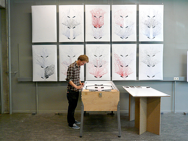
STYN traces the path of a pinball through the pinball machine surface simply by applying paint to the ball and letting the trail evolve. This project stands out from the others because it doesn’t rely on fancy computer transformations of the data; everything is generated simply by playing the pinball game. Because of this, anybody can walk up and be directly involved in creating the visualization, as opposed to the passive, after-the-fact involvement in other projects. One component that I feel is missing from the documentation of this project is video of the tracings actually being produced, somewhat like the iQ Font project shown during lecture. This would add another dimension to the visualization, showing its evolution through time.

Ziyun

30 Jan 2013

{20Hz} – by Semiconductor ( Ruth Jarman and Joe Gerhardt )

CARISMA (Canadian Array for Realtime Investigations of Magnetic Activity)

Visualizing the immaterials and invisibles is a fascinating topic. This project turns an scientific data, a radio array captured at 20Hz into audio – “the tweeting and rumbles caused by incoming solar wind”, “a geo-magnetic storm occurring in the Earth’s upper atmosphere”.

They did both data sonification ( which interests me a lot) and sound visualization beautifully.

And the universe, universe, universe…


{Getting Lost} – by Marco Bagni

Not much to do with information, but very very eye-catching “infographically-stylized” animations.


{MTA.me} – by Alexander Chen

An old project in 2011, visualizing the NYC subway system into interactive musical instrument. Turning lines ( the subway routes) to strings is a very intuitive musical thinking. Simple idea but was very nicely done. And I can watch the lines growing for hours..

Kyna

30 Jan 2013

His and Hers Colors by Stephen Von Worley

his&hers

This piece utilizes a colorful and playful aesthetic to present information gathered from a survey about colors. Men and women selected colors that appeal most to them, and then those colors were graphed according to gender, with the amount of people who preferred the color indicating the size of its representative sphere, and its location being indicative of the gender preference. From the layout it becomes obvious that women tend to prefer a larger variety of colors with longer names whereas men prefer simpler colors, or those with shorter, earthier names.

Foodmood by Affect Lab, Jana + Koos, and Ai Applied

foodmood

Foodmood is an interactive site that scrapes Twitter for tweets about food and the mood of the tweet, and compiles this information by country. The end result is a representation of a country’s attitude towards a food at any given time. The countries themselves can be sorted by income, weight, or selected individually. The site utilizes a simple, easy-to-understand aesthetic when presenting this multitude of information, which makes side-by-side comparison of countries easy.

Wind Map by Hint.FM

windmap

Wind Map is a simple concept with a visually stunning execution. The site scrapes information about wind speed and direction from the National Digital Forecast Database and uses it to map the flow of the wind across the country in real time. I especially like the flow in the west, where what would normally be straight smooth lines are curled and warped by the Rockies.

Patt

29 Jan 2013

I have always been fascinated by stars in general – their formation, life cycle, position relative to each other, brightness, and much more. Thanks to wikipedia, I learned that “star formation is the process by which dense regions within molecular clouds in interstellar space, commonly referred to as ‘stellar nurseries’, collapse into spheres of plasma to form stars”. This following video is a 3D animation, made by Matthew Bate, models the collapse and fragmentation of a 500 solar mass cloud that produce more than 1250 stars.

http://www.astro.ex.ac.uk/people/mbate/Cluster/cluster3d.html

I was introduced to generative art when I first learned about the company Nervous System (n-e-r-v-o-u-s.com), where they use computer simulation to generate design and to create interesting products. They use a lot of biology-based simulations, and the one I find most interesting is their computer simulation inspired by the cell cycle. I think it is very cool to see familiar patterns that you might see in everyday life being used to produce something aesthetic. I want to create something based on common patterns, that might be overlooked, to make tangible products that look beautiful.

I still remember my first flight to Pittsburgh, and the moment I looked out the window to see the city: the formation of streets, houses, cars, and the green area. I must really have been drawn to what I saw because I can still remember it until now. I love seeing the city from that angle, where you see how the city is planned – seeing the big picture of an urban life. I think it should be interesting to use city plans, from different cities and countries, to generate art. Grid planning is one city planning methods that I want to look into.

city plan

(Source: http://www.noupe.com/inspiration/generative-digital-art-tutorials-and-inspiration.html)

Marlena

29 Jan 2013

There are some pretty cool projects out there that use procedural generation to “evolve” a simulation over time. An especially interesting area of both research and artistic expression is the use of procedural generation to simulate natural phenomenon like life and nature. A cool early example is a project developed by Karl Sims in 1994 that uses Darwinian evolutionary algorithms to develop blocky creatures. These creatures are developed randomly over time to achieve a set goal such as swimming quickly, fighting over a cube, and other tasks. The good designs are kept and improved until the a creature is developed that can best accomplish the task.

Since then there have been other cool projects that use procedural generation, especially in games. A great example of this is Minecraft–while the game is incredibly blocky and closer to Legos than landscapes, the algorithms used by Notch to create them make convincing and exciting areas to explore ranging from thick jungles to frozen tundra. Below is a link posted by Notch discussing his terrain generation techniques:

http://notch.tumblr.com/post/3746989361/terrain-generation-part-1

He discusses some of the technical issues involved with generating an infinite terrain for the player–in particular having to center the world around the player and making new world for them to explore as they get farther and farther from their spawn point. He doesn’t tell us the actual algorithm unfortunately, but it definitely shows the technical limits of certain kinds of generation.

Here are some additional links to projects that I either found or heard about through other sources.

http://www.field.io/project/communion
http://freshsim.org/discussion/11/established-alife-projects/p1
http://www.spore.com/ftl
http://vterrain.org/Elevation/Artificial/

Anna

29 Jan 2013

While trying to decide whether I want my next project to focus more on InfoVis or GenArt I definitely find myself stuck somewhere in between. What I do know is that I’m fascinated with 3D forms and physical artifacts generated through code, and, in particular, would love to explore means of being able to create unique objects through making sounds (singing, talking, screaming, etc), which reflect the nature of the sound. Below are a few nifty things I stumbled upon while exploring that space.

…But Narcissus & Nemesis

http://www.new-territories.com/blog/ncertainties/col12/scenariopair/luisandriana/

Let me be totally frank: At first, I had no idea what this was, and I clicked on it mainly because I was sick of looking at post-modern architecture and saw a link with alliteration and mythology in the title. In retrospect, I still am not sure I know what this is. Things I do know: 1) there are a lot of calculations going on here, 2) there is a lot of poetry and metaphysics going on here, 3) the presentation style leaves it incredibly ambiguous as to what falls under category (1) vs. (2). 4) Design fiction or fact, I’m a little bit obsessed with it. Maybe a lot.

I think the most interesting idea contained in this piece is that coded generative behavior can stem from something higher and more abstract than math models, biological transport systems, cellular behavior, plant growth, or basic instincts like hunger or fear. Here, the ‘machine’ is driven by the weighty and cerebral desire to ‘maintain a perfect image of itself” as it continually moves and melts sand into glass. As the environment shifts and the glass causes distortions, the machine must move, but in doing so, creates more distortions in its environment…. it all just screams kafka novel to me.

So much of this system is entirely narrative. You could, I suppose, invent any number of stories to superimpose upon the graphs generated by the code, but the fact that the code seems to have been written in order to bring this story to life, and to address such an interesting concept of self-image and paranoia, anxiety, identity, makes this piece stand out among other examples I’ve seen. It’s also fair to say that I may have interpreted the thing entirely wrong, and it doesn’t really matter to me, because I’m still moved.

ShapeShift
http://www.caad-eap.blogspot.com/p/exhibition_15.html

I was a MatSci geek in undergrad, and did a lot of experiments trying to create piezoelectric ceramic thin films. I liked the idea that a material that looked rigid and immoveable could take on a completely different character in the presence of electricity. From what I can tell, there’s no real code in this demo, but I appreciate the potential for interacting with this material using code. Consider, for instance, talking into a microphone, and watching the material cringe away from the words you say because of the way you said them. In a way, that’s both visualizing information, and generative art, but both are embedded within the polymer itself!

Digimorph
http://digimorph.org/

Um, no, this isn’t some odd genetic hybrid of Digimon and the Animorphs—but it does have something to do with genetics and weird animals. As the website explains (if you can suffer through its rather ugly design), this is a database of hi-res, x-ray computed tomography of a whole slew of animals, living and extinct. I’m including it both because they have a fairly interesting description of what goes into generating these scans, and how the computer constructs X-Ray tomographs from fragments and slices of images, and because it could possibly serve as an incredible database to mine for an infoVis project (there has to be a better way to display all these amazing images than that website! yikes…)

Joshua

29 Jan 2013

Coral Morphogenesis

I am really obsessed with corals, so this paper, and in general the research revolving around simulating coral morphogenesis (how corals grow) is my main focus for this class.  Corals are colonies of tiny polyps (like miniature sea-anemones).  Many corals have a photosynthesizing algae called Zooxanthellae living in their tissue.  Thus some corals “feed” in two ways: through photosynthesis and ingesting small organic matter.  Colonies of a signal species can form various morphologies depending on environmental conditions like light, flow, and nutrient availability.  Not only do corals exhibit this ‘morphological plasticity,’ it appears that the various forms they produce are adaptive.  This is pretty fascinating since there is no centralized organization: the polyps are all extraordinarily simple, yet there collective behavior is rather complex.  In this way they are similar to ant colonies and a multitude of other biological systems.

In order to understand these phenomena, a bunch of computational biologists have been modeling coral growth in massive computer simulations.  The video is the output of one of those simulations.  These guys are the main coral/sponge folks:

http://staff.science.uva.nl/~jaapk/

http://homepages.cwi.nl/~merks/Homepage/Home.html

The simulations are pretty complex (involving lattice simulation of diffusion and mesh manipulation) but the basic idea is simple: each node of the mesh represents a polyp, each edge a connection between polyps, and the polyps grow normal to their neighbors at a rate proportional to the food concentration in a small neighborhood. Edges that are to small fuse, edges that are too large grow new polyps.

I want to copy this stuff, and then tweak it. It would be interesting to take these models and fiddle with them not to model nature precisely, but to still retain some fundamental abstraction of the natural system, while exaggerating various parameters.  The effect, I hope, would be a form or process that looks vaguely organic or familiar, yet is somehow bizarre and ‘incorrect.’


A Collision Based Model of Spiral Phyllotaxis


spiralPhyllotaxis_img


There are numerous theories about why plants form such regular (and beautiful) spirals around their longer axis.  This paper presents a model/system for understainding these spiral patters.  The basic idea is that as new organs develop, whether they be seeds or stems, they collide with their predecessors and are forced into spiral patterns.  Oddly enough (or perhaps not oddly at all) the spiral patterns exhibit some mathematical consistency   The number of spirals going in one direction and the number going in the opposite direction are often two consecutive values from the fibonacci sequence.  In addition the angle change between successive units is sometimes the golden angle (the golden angle is formed from the golden ratio, but wrapped onto a circle).  I find this idea, that the dynamic nature of plant development causes these patterns, fascinating in its simplicity and exciting from a modeling perspective.  A computational model could be constructed which relies primarily on the simulation of physical interactions (collisions, deformations, etc.) to generate organic forms and processes.  I imagine a program where each organ or seed is modeled as a little balloon of springs, which can coalesce, grow, and then shrivel (the timing would probably have to be non-physical, or in the “genes” of the system).  Each balloon would exert forces on its neighbors and perhaps be constrained to lie on a surface or retain a distance from a central axis.


A Confidence of Vertices

I couldn’t find any explanation of this project, but I assume it is a spring simulation with some external forces pulling on each cube.  I find it rather humorous and alien.  These large collections of springs look like they have intention and are extraordinarily massive.  Its neat that physical simulations allow for exaggerated behaviors that would be extremely rare in the real world (ideal springs that are extremely soft, or massive or in giant arrays).

Can

29 Jan 2013

World’s most likely the biggest human-centric database

Facebook Dataset

I love this map. Ever since I first saw this map, I am in love with this map. Because it represents, how easily people share information about themselves. It represents a whole new branch of psychology, and even shows political decisions, and intercultural relationships. The fact that Russia, China and Brazil being dark is also amazing. It both looks like a political map, and an internet dominance map. (ex: Russia = VKontakte)

Budget for war

Budget

It hurts me a lot, every time I see an infographic like this. The fact that countries are spending more and more for war, and less for science, space discovery, or education is disgusting me. Coming from a not so peaceful country myself, I can clearly point why most of the countries are doomed to fail. I think this is a simple but effective infographic. It should be carved to stones for future generations to see how humanity failed.

Well crafted

Olympia looks great! The helix-alike titles, and the waveform movements are so gorgeous. The way it lists the countries, and champions are well thought and obsessively crafted. Color palette is great, and gives the whole presentation a beautiful and magical look.

Keqin

29 Jan 2013

The Internet map

The Internet map is a bi-dimensional presentation of links between websites on the Internet. Every site is a circle on the map, and its size is determined by website traffic, the larger the amount of traffic, the bigger the circle. Users’ switching between websites forms links, and the stronger the link, the closer the websites tend to arrange themselves to each other. It encompasses over 350 thousand websites from 196 countries and all domain zones. Information about more than 2 million links between the websites has joined some of them together into topical clusters.

This is very interesting because you can see every website’s traffic directly from the map or them. And the famous  website such as facebook, google and so on. They are really big circle in the map. And there are also many other small website that we may not know them at all.

You need to check out this link to see : http://www.visualizing.org/visualizations/internet-map


His And Hers Colors: Popular Color Names By Gender Preference

http://infosthetics.com/archives/2012/09/his_and_hers_colors_popular_color_names_by_gender_preference.html

His And Hers Colors by artist and scientist Stephen Von Worley is a beautifully rendered – yet HTML5-based – bubble plot of the 2,000 most commonly-used color names. The data was harvested from the huge sample results of XKCD’s color name survey.

Each color preference is sized by relative usage and positioned horizontally by average hue and vertically by gender preference (women at the top and men at the bottom). A dashed line represents the 50-50 split, or the equal usage by both sexes. Near the middle, the huge ovals correspond to the most common colors, such as green, blue, purple, and so on. The color cyan is most ‘male’, while women tend to describe colors according to warm-fuzzy descriptive names.


Comparing the World’s Richest People

http://infosthetics.com/archives/2013/01/comparing_the_worlds_richest_people.html

Bloomberg Billionaires , designed by the Bloomberg Visual Data team, is a daily-updated interactive dashboard of the world’s richest people.

Many filtering and graphing features are relatively hidden behind beautiful buttons, such as a number-only view in the ranking list, and the variable choice of the vertical and horizontal axes in the scatter plot view. Also, a dynamic timeline at the bottom allows one to explore the historical rankings of the last 10 months.

Accordingly, one can perceive how the large majority of billionaires has significantly been gaining wealth during the last year (and daily gains or losses of more than 500 million dollars in not uncommon), while very few have seen any relative losses. For those wanting to marry a billionaire without any direct heirs, the number of children can be plotted as well.

Caroline

29 Jan 2013

Phenomenon: Diffusion Limited Aggregation

This algorithm is one of a variety of reaction diffusion systems that is popular because of its ability to create a biological looking pattern.

xmorphia


Reaction diffusion in general is the mathematical study of how substances move in space as influenced by two parameters, chemical reactions and diffusion. Each cells behavior is defined by these two variables (expressed as J and K in the Processing library Toxiclibs). The image above shows the relationship between these two variables.

Method or Technique: Serial Art

Serial art is the presentation of a collection of pieces that are very similar in appearance and only gain their meaning in relation to one another.

url


Presenting a series of very similar images or objects is an established tradition in art. It was practiced by Sol Le Witt, that composer guys and Joseph Albers. My favorite definition of it is the following:


“characterized by the nonhierarchical juxtaposition of equivalent representations, which only yield their complete meaning on the basis of their mutual relationship”.[1]

To me the practice of serial art making references the scientific practice of conducting a study. It constructs a kind of authority in it’s numbers, just as a study would. It also calls upon the computational process of making new media works. Although the afore mentioned artists all worked in physical somewhat traditional materials, the process of making computational or generative art natural falls into the compulsive iterative process.

Generative artwork: Scumack 2 by Roxy Paine

Roxy Paine made a series of autonomous sculptures that generate objects using mechanical systems inspired by natures.

If I could of written this whole blog post on Roxy Paine I would of.

Roxy Paine (1966) has had three primary series of work: Replicants, exact replications of natural forms, Machines, machines that generate form through data and randomness, and Dendroids, huge stainless steel sculptures of trees. My favorite series and the one most applicable to this project is machines. He has created several mechanical systems that create form without his own physical intervention. I love how these pieces exploit the lusciousness and excess of material.


Screen shot 2013-01-29 at 7.48.58 PM

28f77c6b64216748d0ae225b961c634b-l paine_3